Learn With Us

Create a Website
with Elementor

The Goal

Build your own custom website.

Description

Learn how to create your website with this step-by-step guide.

What's inside

Step by step guide to edit a kit into your own website: 12 units, 47 steps.

Requirements

This guide is for editing an Elementor Hosted kit; an installed kit on an Elementor Hosted website is required.

How to use
this guide

Prerequisites:
An Elementor Hosted website
with an installed kit.

Instructions:

  • Follow the learning path unit by unit and step by step.
  • Each step in the learning path will guide you through the process of editing a kit and creating your own custom website.
  • Steps may explain concepts, demonstrate tasks, or both. When a step shows you how to do something, apply the instructions to your site.
  • After completing each step, refer to the additional resources provided to enhance your understanding before implementing the instructions.

Responsiveness

Your website will be accessed on various screen sizes, this ability to adapt to different screen sizes is referred to as Responsiveness. Although the Editor automatically handles most adjustments, you should review all your site pages and ensure they appear correctly. This unit will provide you with guidance on how to accomplish this effectively.

Your Goal

Make your site responsive by adjusting your pages to fit different screen sizes.

What is Responsiveness

  1. Users will view your site using various devices, so your site content should fit different screen sizes.
  2. Adjusting your content to fit different screen sizes is called Responsiveness.
  3. Elementor handles most of the work by automatically adapting the content to different screen sizes. However, it’s important to review your site to ensure it looks good on all screens.
  4. There are 3 default screen sizes: Desktop, Tablet, and Mobile.
  5. Screen sizes are defined by their width (in pixels).
    Each screen size is defined with a range. 
  6. By default:
    Desktop is any width larger than 1024 pixels.
    Tablet is a width between 767 and 1024 pixels.
    Mobile is any width under 767 pixels.
  7. These 3 ranges are separated with two Breakpoints:
    1024 px is where the design changes between Desktop and Tablet.
    767 px is where it changes between Tablet and Mobile.
  8. Each screen size has its own design.
    Desktop view serves as the basic design and the Editor adjusts this to fit the other screen sizes automatically.
  9. You must review and edit your content in each screen size to verify that everything looks good.

Enter responsive mode

  1. You can access Responsive mode in two ways:
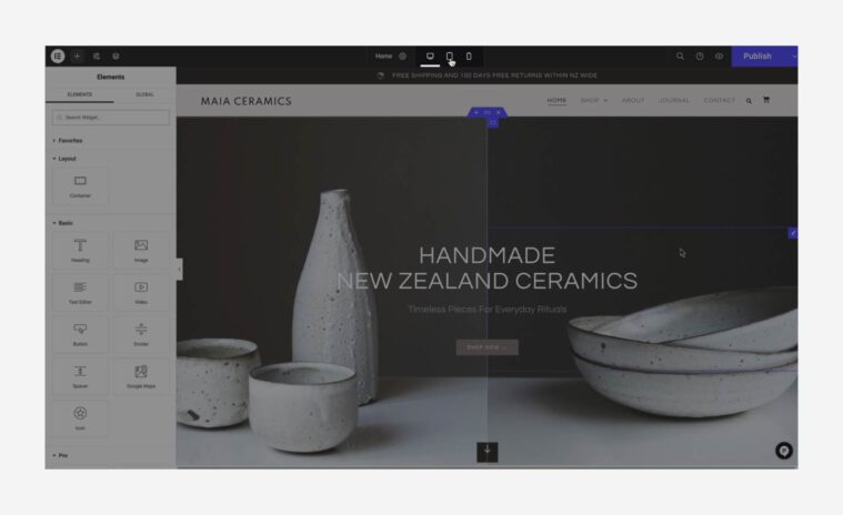
  2. The first is through the Responsive icon on the bottom left menu in the Editor.
  3. The second is through the Element settings on the panel:
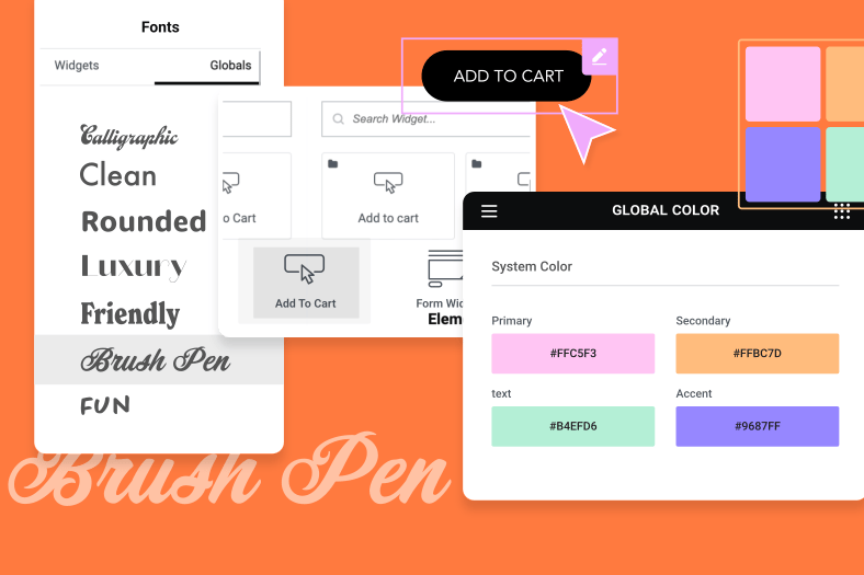
    Some of the container and widget settings can be adjusted in different screen sizes.
    Click the Desktop icon next to the element settings to select which screen size you want to edit.


Responsive editing

  1. The design you created for Desktop is used as the base to edit Tablet and Mobile views.
  2. You can edit the design in 2 ways:
  3. First, you can display different content for different screen sizes by showing or hiding content in a certain screen size.
    Example: You can set that a certain container will be displayed on desktop view, but not on mobile view.
  4. To use this method, click an element → Advanced tab → Responsive.
    Choose whether to show or hide the element in different screen sizes.
  5. The second (and in most cases, recommended) method is to select an element and set different values for every screen size.
  6. Some of the settings are fixed and cannot be modified for different screen sizes.
    Example: The content of a heading.
  7. Other settings can be screen size specific.
    Example: The text size of the Heading widget can be different for every screen size.
  8. To use this method, look for the Desktop icon next to each setting in the panel.
    Click it, choose the screen size you want to edit, and adjust the values.
     
  9. To edit, go to a page, start with the top container, edit its Tablet view and Mobile view, then move down, container by container.
  10. For each element:
    Choose if you want to hide it (method 1 above) or edit it (method 2 above).
  11. If you choose to hide it, you can create a new container to replace it.
    Example: If your hero doesn’t look good on mobile, you can hide it on mobile and create a new hero that’s seen only on Mobile (it will be hidden for Desktop and Tablet).
  12. If you choose to edit the element, review the container and the widgets settings and click the Responsive icon next to each setting.
    Set it to match the screen size you’re editing.
  13. While editing content to different screen sizes, a common action is to adjust the size of elements.
    Elementor offers a variety of units.
    Pixels (px) are a fixed unit that doesn’t change.
    Working with Relative units can save you time since they change according to the screen size.
    [simple_note] See the ‘First Steps’ unit  for more details on Units. [/simple_note]
Summary

You’ll work with both WordPress and Elementor- some actions will be done through WordPress but most of the time you’ll use Elementor. * Your Cloud Website account includes a pre-installed WordPress account and the Elementor Plugins, so you don’t need to install anything, you can get straight to work!

How helpful was this unit?

Do you have any feedback or suggestions to improve this page?

Do you have any feedback or suggestions to improve this page?

Do you have any feedback or suggestions to improve this page?

Do you have any feedback or suggestions to improve this page?

Do you have any feedback or suggestions to improve this page?

Thanks for your feedback!

Up Next