
User experience thrives on consistency, logic, and clarity. When viewing any website or user interface, visitors expect a visual design experience whose sizing, layout, and clickability don’t overwhelm or confuse them in any way. Instead, those exploring your website long for visual harmony, evenly distributed elements, a logical visual hierarchy, and of course, an intuitive user flow that makes sense.
This is exactly why we love wireframes. Because we know how precious visual design is to web designers (like ourselves), we believe that by learning the significance of wireframes and how to implement them in your design workflow, you will supercharge your capabilities and credence as a web design expert.
And rest assured, Elementor’s Drag and Drop Website Builder makes it easy to convert any wireframe or prototype into a WordPress site. This is just one option, of course, as most modern design tools have the option to add links and clickability between your wireframes, aka an interactive prototype mode.
It’s truly never been easier to complete your entire design process inside the Elementor platform, from start to finish.
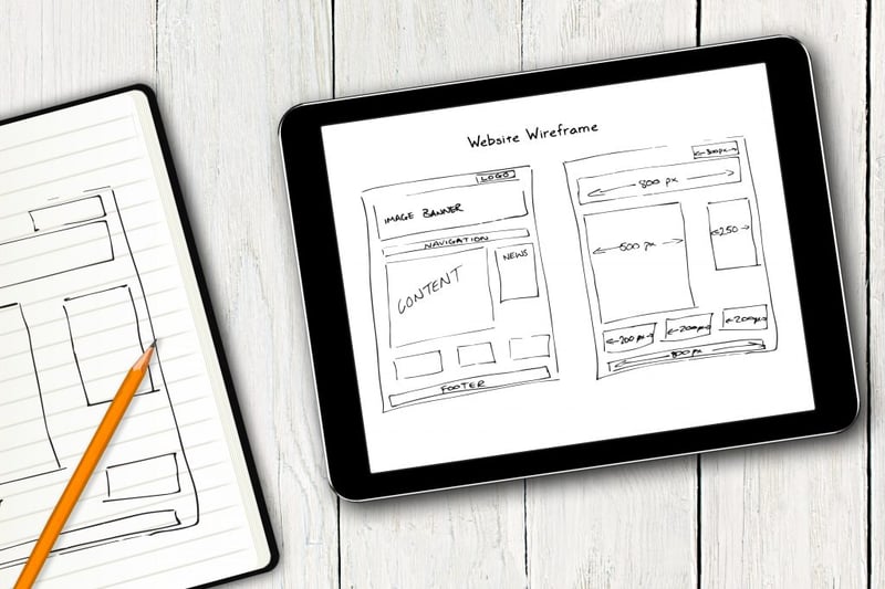
Table of Contents
- What Is a Website Wireframe?
- Why You Should Wireframe Your Website
- Wireframes Perfect Your Design Workflow
- Wireframes Simplify QA Testing
- It's Easier to Make Revisions
- Wireframes Allow You to Accommodate Client Needs
- Wireframes Prioritize Your Information Hierarchy
- Wireframe vs. Mockup vs. Prototype
- 1. Wireframe
- 2. Mockup
- 3. Prototype
- Website Wireframe Template
- How to Wireframe a Website
- Step 1: Create a Wireframe
- Step 2: Convert Your Wireframe into a Mockup
- Step 3: Convert Your Mockup Into a Prototype
Grow Your Sales
- Incredibly Fast Store
- Sales Optimization
- Enterprise-Grade Security
- 24/7 Expert Service

- Incredibly Fast Store
- Sales Optimization
- Enterprise-Grade Security
- 24/7 Expert Service

- Prompt your Code & Add Custom Code, HTML, or CSS with ease
- Generate or edit with AI for Tailored Images
- Use Copilot for predictive stylized container layouts

- Prompt your Code & Add Custom Code, HTML, or CSS with ease
- Generate or edit with AI for Tailored Images
- Use Copilot for predictive stylized container layouts
- Craft or Translate Content at Lightning Speed
Top-Performing Website
- Super-Fast Websites
- Enterprise-Grade Security
- Any Site, Every Business
- 24/7 Expert Service

Top-Performing Website
- Super-Fast Websites
- Enterprise-Grade Security
- Any Site, Every Business
- 24/7 Expert Service
- Drag & Drop Website Builder, No Code Required
- Over 100 Widgets, for Every Purpose
- Professional Design Features for Pixel Perfect Design
- Drag & Drop Website Builder, No Code Required
- Over 100 Widgets, for Every Purpose
- Professional Design Features for Pixel Perfect Design
- Marketing & eCommerce Features to Increase Conversion
- Ensure Reliable Email Delivery for Your Website
- Simple Setup, No SMTP Configuration Needed
- Centralized Email Insights for Better Tracking

- Ensure Reliable Email Delivery for Your Website
- Simple Setup, No SMTP Configuration Needed
- Centralized Email Insights for Better Tracking

- Ensure Reliable Email Delivery for Your Website
- Simple Setup, No SMTP Configuration Needed
- Centralized Email Insights for Better Tracking
What Is a Website Wireframe?
A website wireframe is a visual representation or outline of a website. Wireframes are a collection of placeholders (black and white outlined shapes) that represent how a website could be designed. Each shape represents a respective design element on the page, such as an image, a logo, menu items, buttons, and so on.
Wireframing is the web design and user experience design technique that serves as a low-fidelity mockup to illustrate the arrangement and layout of these placeholder shapes, which collectively form the basic foundation and structure of a web page or digital screen.
Essentially, every type of structure that your website will include, whether visual or textual, warrants a stage in your design process that focuses exclusively on its sizing, layout, and proximity to its surrounding page elements. Wireframing is one of the first stages of this multi-sequence process. Later in this post, we’ll discuss each segment of this process and where wireframing falls into place.
As you will soon see, wireframes are an entity in and of themselves in the world of UX and web design. They’re not just important. They’re crucial.
Why You Should Wireframe Your Website
As a web creator, one of the key values in building a wireframe is that it conveys layout ideas, content, and overall page-level design of the website you’re creating.
Once you decide to add wireframing to your design workflow, you’ll have enabled yourself to do the following:
- Visualize your content’s layout
- Save time and effort in your design process
- Test for and correct usability issues
- Perfect your information architecture
- Test and refine navigation
- Test usability with user testing and interviews
- Perform rapid prototyping of any page element
- Evaluate how your page layout applies UX and design best practices
Another significant benefit of the wireframing process is that they provide great clarity into how information will be organized on the screen, otherwise known as the page’s information architecture.
Wireframes Perfect Your Design Workflow
The UX/UI design process is a multi-step process, and can sometimes be very complicated and overwhelming. Wireframing is one of the very first segments of your design workflow and is a crucial ingredient for clear usability and polished user experience.
When you create a wireframe for a screen you’re designing, you’re allowing yourself to visualize multiple sizing and layout options for the elements on your screen. You’re free to explore different layouts and arrangements by moving elements around to see what works best.
It’s also a matter of functionality because you’re devising the visual process of a user flow that needs to take place, which is, in essence, a series of action items. Making sure that each of your screens’ layout and information architecture is based on ultimate clarity is what will make your user flow possible. Creating wireframes to map out this process is the most promising way to eliminate any functionality flaws that you may have otherwise missed.
You can even create multiple wireframes of one screen that show the different layout possibilities that you can use to then gather feedback from clients or potential users about which version works best.
Testing different wireframe versions of one screen is a great way to make sure that each segment of your design workflow is as comprehensive and well thought out as possible. When you have a wireframe that you’ve invested in and selected from a variety of options as the best possible layout, your next stage of prototyping will be a smoother, error-free process.
Wireframes Simplify QA Testing
If something doesn’t work on a wireframe, then there is a good chance that it won’t work when you come to design it. But discovering this when you’re already knee-deep in the design of your high-fidelity mockups would be frustrating, to say the least. It would mean starting from scratch every time you notice even the slightest mistake or functionality issue with your prototype.
When you’re looking to test multiple versions of your prototype, wireframing will make your life a lot easier. It’s much simpler and quicker to create multiple versions of a wireframe than multiple versions of a high-fidelity mockup.
When you’re assessing the functionality of a wireframe, you’re confirming that the layout and sequence of the elements on each screen enable users to complete the necessary tasks. When you’re doing this on a foundational asset such as a wireframe, it’s much easier to do so when focusing on core elements that may or may not need changing.
Identifying necessary changes or corrections within a detailed, high-fidelity mockup may not be as simple. This is because it’s more likely for mistakes to fall through the cracks when you’re sifting through a lot of design details and illustrations. It’s best to start at the foundation and progress accordingly as you solidify each stage of the user journey.
It's Easier to Make Revisions
Throughout a project’s design process, clients will often have feedback (more than once) about changes they’d like to see in the designs you show them.
These changes can be both minor or major, for example:
- Button sizes
- Font sizes
- Column layout
- Menu type (Hamburger, dropdown, etc.)
And many more.
It helps to understand the importance of design revisions in the context of clients’ decision-making. Throughout the design process, web creators are in constant contact with their clients about the progress of the website they’re designing. A large part of the discussion is getting clients’ approval for your design decisions. This approval process alone is one of the biggest incentives behind building website wireframes.
Wireframes Allow You to Accommodate Client Needs
As we’ve established, one of the most important stages in any web creation project is getting the client’s approval for design decisions.
Because you haven’t yet reached the visual design process when you’re at the wireframe stages, decisions that your client may need to approve probably won’t be related to branding-related matters (Logo design, color schemes, typography, etc.).
Instead, likely, the decisions you and your client will be making during the wireframing stage will be related to information hierarchy. As we know, as web creators, information hierarchy informs your content strategy from A to Z, so it is one of the biggest building blocks of creating a website.
One example of a scenario where your client will need to approve a design decision is when you’re creating an E-commerce store. Let’s say your project is to create a clothing store website, and you need to design a series of screens (such as a products archive page and single product page) and notification popups for when a shopper views an item and adds it to their cart.
Your client may have a strong preference over whether he wants to encourage users to keep shopping after they’ve added an item to the cart, thereby exiting the single product page and returning to the product archive.
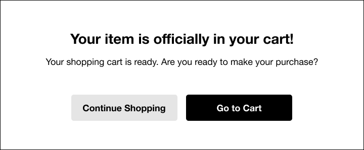
If the most crucial action item is for the shopper to keep browsing, the information hierarchy will look something like this:
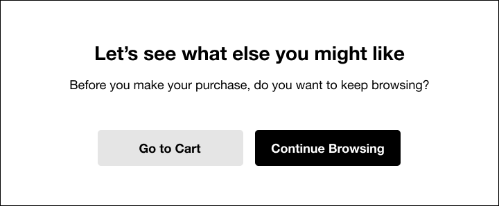
The primary action button is to continue browsing, and the “go to cart” option is less prominent.
Alternatively, if your client wants to encourage an immediate purchase, where the shopper would continue to his cart as soon as possible, the design (both visually and verbally) may look more like this:
Creating these two notification options takes only a few seconds, and presenting both choices to the client not only makes you look more professional, but it also shows that you understand the client’s potential goals. It also saves time with the back and forth of redesigning a screen in several sittings.
Given the likelihood that you and your client will spend a lot of time discussing information hierarchy, let’s go into greater detail about the importance of this topic and how it connects to you and your client’s design decision-making.
Wireframes Prioritize Your Information Hierarchy
The difference between the two examples from an online shopping website that we discussed above represents exactly what information hierarchy is all about. In the first example, the site owner’s goal is to encourage the shopper to keep browsing the collection and return to the product archive. This is why the heading on the notification screen directly emphasizes the benefit of returning to browse more products. The buttons make the same point. The primary button (on the right side, in the darker color), is the one navigating to the product archive.
Of course, there is no forced navigation going on, so the user does have the second option (secondary button) to go directly to his cart. But emphasizing the ‘Continue Browsing’ primary button encourages him to do the opposite.
The sizing and positioning of design elements are also indicators of information hierarchy. In the notification screen above, the most important message is “Your item is officially in your cart!”, which is why it has the largest font size and heaviest font-weight on the screen and placed at the top. The user automatically understands that this is the first sentence he should read.
Wireframe vs. Mockup vs. Prototype
Design terminology can be confusing, so let’s make sure we clarify all of the terms. Wireframes can be thought of as the architectural blueprint, a mockup as a colored, detailed drawing of the building, and the prototype of the display house. Each one serves a very different purpose, but they all share a common goal: to refine and solidify each stage of the design process.

1. Wireframe
Like we discussed earlier in the post, a wireframe is a static, low-fidelity, visual representation of an interface using only simple shapes.
Eventually, some placeholders may evolve to real graphic elements or actual text so designers and developers can gain a better feel for how everything fits together.
Because wireframes are composed exclusively of black and white placeholders, they focus on representing the exact format and layout of the webpage, including the spacing, margins, information hierarchy and sizing of elements. It is only after these low-fidelity mockups are finalized that designers proceed to begin choosing a color scheme and the entire visual design process, otherwise known as the user interface. Wireframes are the designer’s opportunity in the design process to perfect the core structure and functionality of each component found on their website or digital screen.
There is also a taxonomy for how to represent different design elements on a page, for example, when illustrating a wireframe element for your navbar, you’ll represent your logo with a simple circle. You won’t show design elements in detail, you’ll just indicate where they are and how they are laid out by drawing a square or circle to represent them.
In addition to shapes outlining your design elements, your wireframe will either include lorem ipsum text as a placeholder, or alternatively the actual text that you’ll write and insert into your website. This includes titles, paragraphs, buttons, etc. which should be shown in the sizing you’ll use in your high-fidelity prototype/final product.
Once the sizing, layout, and spacing of your elements is confirmed, your wireframe is complete and you’re ready to progress to the next stage of designing your website: creating mockups.

2. Mockup
A mockup is different from a wireframe in that it focuses on what a digital screen will look like, rather than only identifying what its structure will be like. That being said, high-fidelity mockups are usually static representations of the design, unlike prototypes, which are usually interactive representations. We’ll discuss this shortly. Ultimately, this is why mockups are what’s known as a mid or high-fidelity display of design.
Once you’ve begun designing your mockups, it means your branding, logos, typography, and UI elements have been designed (with room for revisions and changes). In comparison to wireframes, mockups actually resemble or at least look like a finished product or website. They indicate a turning point in your design process since your user interface is starting to manifest itself as a tangible, visual asset.
Another key difference between wireframes and mockups is that wireframes are built using either pen or paper, or any tool that lets you create boxes and outlined shapes on a digital screen. That being said, you can also use vector graphic tools and simply use them to draw black, white, and grayscale shapes and boxes.
When it comes to mockups, you’ll need to use a specialized mockup tool such as Figma, Sketch, Axure, InVision, or others. We’ll discuss our recommendations for wireframe and mockup tools later on in the post.
You may find it super helpful to read a previous blog post of ours that addresses how to convert your mockups and prototypes into a WordPress site.
3. Prototype
Prototypes are a closer representation of what your screens will look like. They can even be considered an early model of your design. Prototypes are almost always an interactive (clickable) simulation of your design that includes every design detail as well as every navigation element. The role of a prototype is to allow you to test your design by seeing what it will look like in real life and even see how users will interact with it on the screen.
Both designers and developers alike find great value in prototypes, as both design flaws and glitches in the user journey can easily be identified in a prototype.
Examples of issues prototypes can reveal are:
- Realizing that image sizes are too big for a section of the screen
- Realizing that different headings are not sized consistently
- Realizing that certain buttons aren’t clickable or link to the wrong screen
Another benefit that developers will gain from testing high-fidelity prototypes is assessing whether they can code each design detail used in the prototype, and if so, how. When developers assess a prototype, they can also be smarter about how they’ll need to budget their time.
Based on the complexity of the prototype, developers can gauge the amount of time and resources they’ll need to code the design. This allows for greater productivity and efficiency.
As for designers, a strong incentive in building high-fidelity prototypes is that it allows them to test the user journey that they are trying to facilitate for every visitor. Now that your prototype is clickable, you can construct the necessary user journey(s).
In addition to checking the functionality of each user flow, making sure that each button or link on each screen leads to the correct screen.
But functionality is only half the battle. Each designer needs to confirm (and this often takes multiple rounds of testing) that their target user will be able to understand the possible actions he can take by using the prototype. In other words, you want to make sure that your user journeys are clear and intuitive to your visitors.
If a button, piece of text, etc. is confusing or unclear, you’ll often be able to identify these loopholes when testing your prototype.
Now that we have a better understanding of the importance of each stage of the design process — both individually and collectively, we can take a deeper look at why wireframes, the most basic and foundational type of prototype, are so worthwhile.
Website Wireframe Template
You can find many wireframes templates on Envato, like this one from WebDonut:

How to Wireframe a Website
Building the bridge between your wireframes and your WordPress site can be quite a complex process. The distance or gap between a PSD or Sketch file and a WordPress visual editor like Elementor may seem too wide to comprehend. That’s why our Monday Masterclass made sure to cover this exact topic in one of its episodes.
Briefly, let’s review the basic steps involved in creating a prototype that you can easily convert to an Elementor site.
Step 1: Create a Wireframe
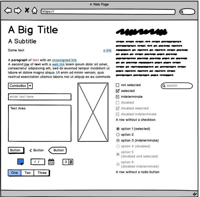
One of our methods of creating wireframes is through Sketch. But really, any prototyping tool of your choice will work equally as well. Your most standard wireframe will include the components shown in the image above.
As you see in the image, every design element is in black and white, with no color or design detail. It’s a simple, old-fashioned drawing that focuses solely on structure and layout.
Some rules of thumb that are good to keep in mind when creating your wireframes are:
- As you create your wireframe, think, and note down which widget you will use in Elementor to create this part of your website design.
- Create an artboard for each screen state. This means that if there is a ‘Sign up’ process, create an individual artboard for each step (Sign up, create a username, create a password, etc.). This way, there will be no confusion or forgotten elements when you’re designing.
- Decide on dimensions before you start building your assets. Each of your artboards should be a consistent size, and all of the design elements should be scaled accordingly. The best practice for sizing when it comes to UX and Web design is to adjust your artboards to represent real device screen sizes. This setting is available in most modern design tools.
- Wireframes must not go into too much detail. Think placeholders and only placeholders. Wireframes are the time to design your structure. Once that’s in place, you start thinking about the visuals.
- Wireframes don’t include color, font choices, logos, or any real design elements that take away from purely focusing on a site’s structure.
Best Wireframing Tools
Some wireframe tools that we like are:
Pen and Paper
Many designers begin their wireframing process with a blank sheet of paper and a pencil or black pen. They then start sketching away and creating what’s known as low-fidelity wireframes. These look just like regular digital wireframes, yet are hand-drawn and even easier to revise and tweak than digital wireframes. Many designers prefer starting out with these hand-drawn sketches as a way to create a foundation for their design layout and get their creative juices flowing.
Adobe XD
Adobe XD is a vector-based UX/UI tool that’s part of the Adobe Creative Cloud Suite. Unlike most other Adobe software, Adobe XD can be used for free with a one-project limit. Designers use Adobe XD to create wireframes, prototypes, and digital screen designs such as websites and desktop or mobile apps.
Sketch
Sketch is another vector-based digital design tool (Mac only) used to design websites and all digital interfaces such as wireframes, prototypes, websites, apps, and so on. Sketch runs on a one-year license-based subscription. It’s a highly popular option for Mac users looking for a cheaper and lighter-weight alternative to Photoshop or Illustrator.
Figma
Slightly newer to the design market, Figma is a browser-based (with a Desktop app option, too) UI design tool. Figma can open .sketch files and is a great option for designers, developers, and colleagues who are looking to work collaboratively as a team.
Adobe Photoshop
Photoshop is a graphics editor that specializes in image editing. Photoshop has many, many use cases, and web design is one of them (and so too, prototyping). Designers often choose to use Photoshop for editing photos, optimizing images, building web assets, and constructing page layouts.

Step 2: Convert Your Wireframe into a Mockup
Now that you’re well versed in the importance of wireframing when designing a website, let’s talk about what the next step is once you have your actual wireframe in tow.
The first step when going from wireframe to prototype is duplicating your wireframe. You’ll want to keep an original copy of your wireframe for future reference or future revisions. The file you’ll want to edit is the duplicate and not the original.
Then, we recommend the following steps:
1. Imagery
Replace your image placeholders with the relevant images and illustrations. This includes your logo and any other images, icons, illustrations you plan on using.
2. Text and Font
If you’ve used Lorem ipsum text, replace it with the real text, and apply your font and sizing of choice accordingly. If you’ve used your actual text, then apply your font and sizing directly.
3. Buttons
Apply your button design and sizing to buttons.
4. Visual Design
Apply your color scheme and all other visual design details.
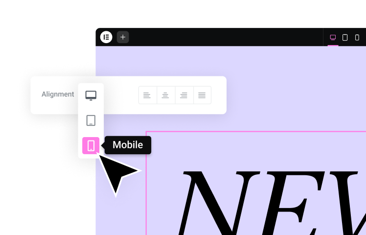
5. Alignment
Adjust the alignment, spacing, margins, minimum height, minimum width, and all details related to symmetry
6. Elementor Widgets
Identify which Elementor widgets you can use for each element on your prototype.
Step 3: Convert Your High-Fidelity Mockup Into an Interactive Prototype
An interactive prototype is, as the name suggests, an interactive version of your high-fidelity mockup where the designer has added click targets to the design and set response for each possible user interaction on each screen (or art board).
The goal of your interactive prototype is to add clickability to your existing high-fidelity mockup so that you can test the design’s user actions, and overall usability and functionality.
A topic of its own in the world of user experience, user testing is a stage in the design process where designers test the prototype – either by finding users and/or testing the prototype themselves, to confirm their screen designs and see if the clickability and overall UX/UI ‘make sense’ to their target audience. And, of course, to identify any mistakes or unclear design elements that need revision or fine-tuning.
In addition to (or in place of) creating an interactive prototype inside your design tool, you can also opt to create your interactive prototype when building your site directly in Elementor. This could be an interactive version of your high-fidelity mockup, once you integrate the call to actions and buttons throughout your website, but before you choose to publish it — Aka preview mode.
And finally, once you have chosen your interactive prototyping and have made the necessary revisions, it’s time to get your client’s approval for your high-fidelity prototype. Once they test the prototype themselves and provide feedback for any necessary changes, once you’ve done those revisions, it’s time to start working your magic in Elementor.
Wireframing Is the Way to Go
Now that you have a strong understanding of how important wireframing and prototyping are to your design workflow, you can expect great things for your upcoming Elementor projects. Keep in mind that the issue of which widgets you can use to translate your design choices into the Elementor platform is not a ‘black and white’ matter. There are often multiple ways to create one type of design in Elementor; it’s just a matter of creativity, which is something all web creators are well-versed in, to say the least.
Looking for fresh content?
By entering your email, you agree to receive Elementor emails, including marketing emails,
and agree to our Terms & Conditions and Privacy Policy.
