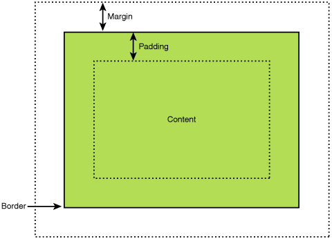
To help you understand this, let’s visualize the CSS box model. Imagine every element on your website (a heading, a paragraph, an image) residing inside a box. This box consists of several layers:
- Content: The actual text, image, or video.
- Padding: The space between the content and the element’s border.
- Border: The line that outlines an element (can be invisible).
- Margin: The space outside of the element’s border, separating it from other elements.
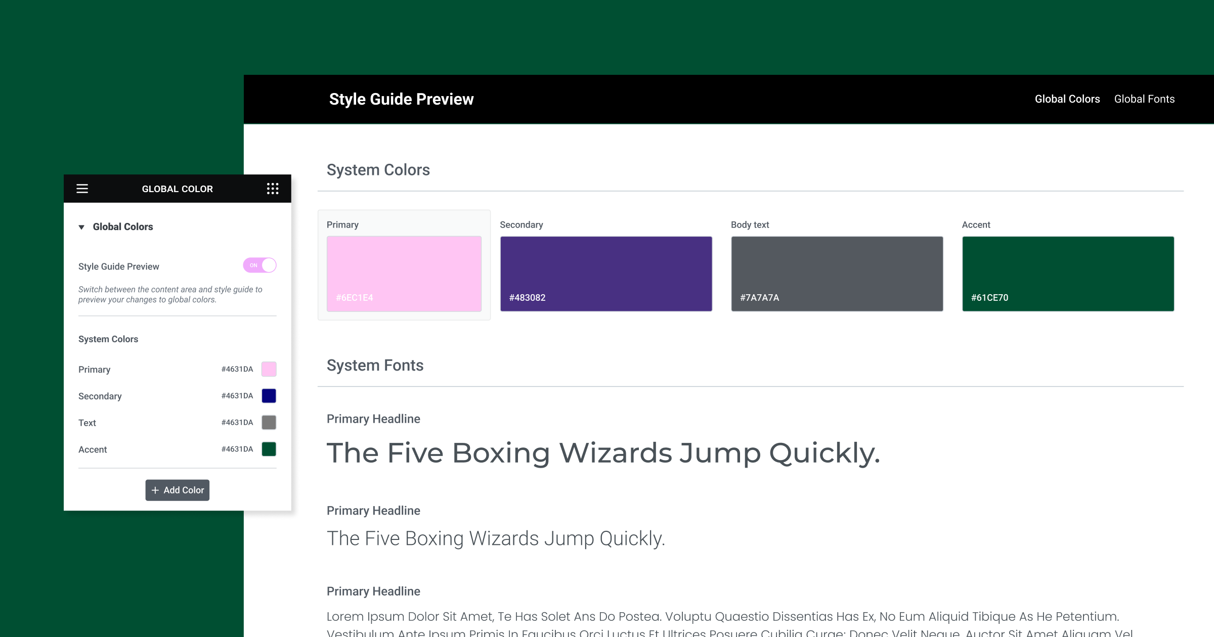
Whether you’re a beginner just getting started with web design or a seasoned pro looking to refine your skills, choosing the right spacing techniques can make a big difference. And if you’re building with Elementor, you have a powerful ally in achieving your layout goals-offering intuitive visual controls and an environment optimized for speed and performance.
What is Margin?
Defining Margin
In web design, the margin is the invisible space surrounding an element’s border. Think of it like the personal space you maintain around yourself in a crowded setting. Margins push other elements away, creating separation and preventing your website from feeling cramped.
Units of Measurement
Margins in CSS can be defined using a variety of units of measurement. Here are the most common ones:
- Pixels (px): This provides the most granular control over spacing, allowing you to specify precise distances.
- Percentages (%): Margin percentages are calculated relative to the width of the containing element, making them useful for responsive designs that need to scale across screen sizes.
- Em: This unit is relative to an element’s font size. It’s helpful for creating proportional spacing that adapts to different text sizes.
- Auto: The “auto” value allows the browser to calculate margins automatically. This feature is often used to center elements horizontally or create equal spacing on both sides.
Shorthand Properties
To streamline your CSS code, you can use shorthand properties for margin adjustments. Here’s how they work:
- Margin: 15px 20px 10px 5px; This sets the top, right, bottom, and left margins, respectively (remember the order: clockwise from the top).
- margin: 10px 20px; Sets the top/bottom to 10px and left/right to 20px.
- margin: 20px; Applies 20px margin on all sides.
Margin Collapsing
An interesting behavior to be aware of is margin collapsing. In certain situations, adjacent vertical margins overlap instead of adding together. For example, if you have two paragraphs with a top margin of 20px and a bottom margin of 15px, the actual space between them will be 20px, not 35px. Keep this in mind when precisely positioning elements.
What is Padding?
Defining Padding
While margin controls the space outside an element’s border, padding determines the space between its content and its border. Think of padding like the cushioning inside a package that protects its contents. In web design, padding adds breathing room within an element, making it visually pleasing and easier to read.
Units of Measurement
Similar to margin, padding values in CSS can be expressed in several units:
- Pixels (px): For fixed, precise spacing.
- Percentages (%): Creates padding relative to the element’s width, which is useful for responsive scaling.
- Em: Defines padding based on the element’s font size, promoting proportional spacing.
Shorthand Properties
Just like with margin, shorthand properties simplify how you control padding:
- Padding: 20px 15px 10px 5px; Sets the top, right, bottom, and left padding respectively.
- Padding: 15px 25px; Sets the top/bottom padding to 15px and the left/right padding to 25px.
- Padding: 10px; Applies 10px padding on all sides.
Background Visibility
One crucial aspect of padding is its impact on how background colors or images appear within an element. The background will extend into the padding area, visually filling the space between the content and the border. This can be a great way to add visual emphasis or stylistic effects to your website’s elements.
Key Differences-Margin vs. Padding
Let’s break down the main differences between margin and padding:
- Think inside vs. outside: Margin is like the space around your house, and padding is like the space between your walls and your furniture.
- See-through vs. background: Margin is transparent; you’ll see whatever’s behind the element. Padding takes on the element’s background color or image.
- Sizing matters: Margin makes an element bigger overall. Padding can make it look bigger, but the technical side might stay the same (this depends on a setting called box-sizing).
- Going negative: You can use negative margins for cool overlapping effects, but negative padding isn’t allowed.
Impact on Design and Layout
Whitespace and Visual Hierarchy
Whitespace, often created through the strategic use of margin and padding, is a fundamental element of well-structured web design. Ample whitespace does the following:
- Improves readability: Breaks up dense text blocks and prevents content from feeling overwhelming.
- Guides focus: Creates visual separation between elements and directs the user’s eye toward important content.
- Enhances aesthetics: Well-applied whitespace conveys a sense of elegance and sophistication.
Balance and Alignment
Margin and padding are essential tools for achieving balanced and visually pleasing layouts. Here’s how:
- Proportional Spacing: Use consistent margins and padding to maintain a sense of rhythm and consistency throughout your website.
- Element Alignment: Margins are commonly used to align elements horizontally (e.g., centering a button) or vertically within a container.
- Negative Space: The empty areas around elements play a crucial role in defining the overall visual hierarchy.
Grid and Flexbox Systems
Modern websites often rely on grid and flexbox systems to organize content in a structured way. Margin and padding play a significant role in how elements behave within these systems:
- Grid: Margins can be used to create gutters (spaces) between grid columns and rows, ensuring elements don’t crowd each other.
- Flexbox: Margins and padding can distribute space within a flexible container, control the alignment of flexible items, and even make flexible items grow or shrink to fill available space.
Note: Elementor’s intuitive visual interface simplifies the process of adjusting margins and padding within grids and flexbox layouts, giving you fine-grained control without needing to write extensive CSS code.
Responsive Design
Building responsive websites that adapt seamlessly to different screen sizes means considering how your margins and padding choices will need to change. Here are some things to keep in mind:
- Percentage-based values: Margins and padding defined in percentages can help create fluid layouts that scale proportionally with the screen size.
- Media queries: Use media queries in your CSS to apply different margin and padding values at specific screen size breakpoints, ensuring your layout looks great on everything from a smartphone to a desktop monitor.
- Mobile-first approach: Design for smaller screens first, then add more generous spacing as the screen size increases.
Mastering Margin and Padding with Elementor
Elementor’s Interface
Elementor takes a visual approach to web design, and this extends to how you control margin and padding. Here’s what makes it so intuitive:
- Drag-and-drop: You can adjust the spacing around any element by simply dragging the edges or manipulating dedicated margin and padding controls within the Elementor sidebar.
- Visual Feedback: As you adjust values, you see the changes reflected on your website in real time, making it easy to achieve the desired layout without writing code.
- Units and Shorthand: Elementor lets you choose between pixels, percentages, em, and other units, and it supports shorthand properties for efficient styling.
Live Editing
One of Elementor’s biggest strengths is its live editing environment. As you tweak margins and padding, you immediately see how those changes affect all the related elements on your page. This real-time feedback saves you from guessing how your site will look or having to preview changes in your browser constantly.
Advanced Features
Elementor offers a suite of advanced features that give you even greater control over spacing and layout:
- Theme Builder: With Elementor’s Theme Builder, you can design global templates for headers, footers, blog posts, and other elements and precisely define the default margins and padding for your entire website.
- Popup Builder: Create visually engaging popups with Elementor and fine-tune the spacing between the popup content, border, and the surrounding page.
- Custom Spacing: Elementor allows you to set custom margins and padding values for specific breakpoints (desktop, tablet, mobile), ensuring your design looks perfect on all devices.
Best Practices and Common Use Cases
Accessibility
When using margin and padding, keep these accessibility best practices in mind:
- Sufficient Space: To accommodate users with limited dexterity, ensure adequate spacing between elements, especially clickable items like buttons and links.
- Readability: Generous margin and padding around text blocks improve readability for everyone, including those with visual impairments.
- Screen Readers: While margin and padding do not directly affect screen readers, the visual spacing they create makes it easier for screen reader software to interpret the content structure.
Cross-Browser Compatibility
While Elementor handles the bulk of browser compatibility issues for you, it’s still good practice to be generally aware of how browsers handle spacing properties. Key points to remember:
- CSS Reset: Browsers have small default variations in how they apply margin and padding. Many developers use a CSS reset to create a consistent starting point for their styles.
- Testing: Always test your website on different browsers and devices to catch any spacing inconsistencies. Elementor’s device preview modes make this easy.
Specific Examples
Let’s break down some of the most common applications of padding and margin:
Navigation Menus
- Margins separate individual menu items.
- The padding adds space within each item, making links and buttons easier to click.
Images
- Margins create space around images, separating them from text or other visual elements.
- Padding can be used to create the illusion of a border around images.
Buttons
- The padding creates the internal space of the button, ensuring the button text is readable and clickable.
- Margins can be used to adjust button spacing within a group or to separate a button from other elements.
Forms
- Margins separate form fields and labels.
- The padding ensures that form input areas have enough breathing room.
Advanced Techniques and Considerations
Box-sizing: border-box vs. content-box
The CSS box-sizing property has a significant impact on how padding and element size calculations work. There are two primary settings:
- Content-box (default): When you set a width on an element, padding increases its overall size. For example, a box with a 200px width + 20px padding on each side will be 240px wide in total.
- Border-box: Padding is included within the specified width. That 200px box with 20px padding will remain 200px wide overall, with the content area shrinking to accommodate the padding.
Why it matters: Border boxes often make it easier to predict and control how elements fit within your layout. Many website frameworks default to border boxes for all elements.
Negative Values
While less common, negative margins (and sometimes, with caution, negative paddings) can be used creatively:
- Overlapping Effects: Negative margins can make elements overlap, creating layered visual effects or allowing elements to break out of their container slightly.
- Layout Shifts: Some advanced positioning techniques use negative margins to shift elements in specific ways without affecting the document flow.
Specificity and the Cascade
CSS rules are applied in a hierarchical manner. Understanding this matters when your margin and padding styles might be conflicting. Here’s the basic gist:
- More Specific Wins: A rule targeting a specific class will override a rule targeting a generic element.
- Order Matters: If rules have the same specificity, the one that appears later in your CSS file will usually take precedence.
- !important: (Use sparingly!). The !important declaration overrides other styles but can make your CSS harder to manage in the long term.
Troubleshooting Tips
Sometimes, your margins and padding need to be revised in order to work the way you expect them to. Here’s what to check:
- Browser Dev Tools: Your browser’s inspector tools allow you to examine the applied CSS rules and the visual box model of any element, helping you pinpoint the source of unexpected behavior.
- Caching: If you’ve made changes but aren’t seeing them reflected, try clearing your browser’s cache or hard-refreshing the page.
- Conflicting Rules: CSS can become complex. Search for other margin/padding rules on the same element or parent elements to see if they are overriding your styles.
Conclusion
Throughout this in-depth exploration, we’ve seen how margin and padding, though seemingly simple concepts, play a fundamental role in shaping the look, feel, and usability of websites. From creating whitespace and visual hierarchy to aligning elements and fine-tuning layouts, they are essential in every web designer’s toolkit.
Understanding the distinctions between margin (outside) and padding (inside), along with their behaviors in different contexts, empowers you to create beautiful and functional designs that work seamlessly across different devices.


