Table of Contents
There are many different approaches to web design — from minimalism, to flat design, to material design and the creative use of contrast. Another incredibly important tool in web design is white space.
Whit space encourages minimalism and balance. It can also improve user experience by creating, for example, paragraph breaks and spaces for better readability.
However, the use of white space has to be done responsibly and correctly. Use too little of it and you can greatly impair the legibility and usability of a site. Use too much of it and you risk sending the wrong message about the brand.
In this article, we’ll discuss what white space is, its different types, explain why you should use it, and more importantly, show you examples of good white space implementation.
Table Of Contents
- What Is White Space?
- Where Did White Space Come From?
- The Different Types of White Space You Should Know About
- Micro vs. Macro White Space
- Passive vs. Active White Space
- Why You Should Use White Space on Websites
- It’s a Classic
- It Leads to More Attractive Interfaces
- It Makes Websites Easier To Use
- It Improves Focus
- It’s Useful for Organization
- It Improves the Legibility and Readability of Your Content
- 11 Inspiring Examples of White Space in Web Design
- 1. Pittsburgh Zoo & PPG Aquarium Logo
- 2. Circa 1886’s Hero Image Gallery
- 3. Florian Schulz Productions’ Photos
- 4. Overstock Navigation Links
- 5. Udemy Line Spacing
- 6. Meetup’s Organized UI
- 7. Maison De La Luz’s Margins
- 8. Apple Product Focus
- 9. Lull CTAs
- 10. Flywheel’s Pricing Blocks
- 11. Salesforce Form Layout
What Is White Space?
Whitespace (also known as negative space) is the empty space around the content and elements on a web page.
It’s used to balance the page’s design, organize the content and elements, and improve the visual experience for the user.
If you look at the homepage of The New Yorker website, you’ll see examples of it all over the place:

The large spaces that frame The New Yorker logo:

The equidistant spaces that separate each of the navigation links:
The buffers built around each of the home page’s content blocks:

Even the designer’s choice of kerning, leading, and tracking for the typography shows how useful white space is in website design.
Take a look at the website from 2008 and you’ll see what a huge difference white space makes:
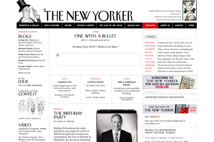
There’s some white space present, though it’s not as elegant or strategic as what we see on the website today.
Where Did White Space Come From?
The term “white space” is somewhat misleading. While some examples of white space are indeed white (like The New Yorker example above), that’s not usually the case.
In order to understand why white space got its name, we need to look at where it came from.
While there’s no person cited with creating white space or giving it a name, we can attribute it to the following parties:
The first is 20th-century Chinese artists and calligraphers. Empty spaces on the white rice paper they worked on weren’t treated as wasted space. They found meaning in the emptiness and believed that it contributed to the overall understanding of the whole picture.
They referred to this as “designing the white”.
Carol Douglas explains the value of white space in Chinese art:
“In Chinese art, empty space is expected to convey information through its very lack of imagery. The sizes and contours of the empty shapes create rhythm and unity. The solid shapes give meaning to the empty and vice-versa.”
White space later became a staple of print design thanks to Modernism, which focused on minimalism, structured grids, and negative space.
So, it’s also likely that we refer to it as white space because of the white paper the Modernists wrote on or the white canvases they painted on.
The Different Types of White Space You Should Know About
Typically, we divide white space into two different categories:
Micro vs. Macro White Space
Micro and macro white space doesn’t just define white space based on size.
Micro white space refers to the smaller gaps and buffers built around content. For example, micro white space can be found between:
- Letters
- Words
- Paragraphs
- Navigation links
- Images or content in a grid
- Form fields
The purpose of micro white space is to improve the legibility and readability of your content.
Macro white space, on the other hand, refers to larger areas devoid of content. For example, macro white space can be found:
- In the margins of a website
- Around the logo in the header
- Between sections on a page
- In hero images
- Separating the main content and sidebar
- In images
- Around CTA buttons
The purpose of macro white space is to improve the website layout and make it easier to understand and navigate.
Passive vs. Active White Space
White space can also be divided up into passive and active categories.
Passive white space refers to the gaps that naturally occur in design or typography. You can control how big or small these spaces are as a matter of aesthetics, but they’ll be there with or without you placing them there.
Active white space refers to empty areas intentionally added to a page to aid in the flow of traffic. The goal is to guide a visitor’s eyes down the page or through a process until they reach the inevitable conclusion and convert.
Why You Should Use White Space on Websites
Here are some of the major reasons why white space should be built into every website you design:
It’s a Classic
Unlike web design trends which may only look good or be relevant for a short while, white space is an enduring classic. Just look at how long it’s been around and how it’s evolved from Chinese calligraphy to Modernist works — and now to the web.
If you want to future-proof your web designs, white space must be a part of them.
It Leads to More Attractive Interfaces
Entering a website is a lot like entering someone’s home. All you need is a few seconds to get a sense of how comfortable you’re going to feel in it.
With the right amount of white space, you can create the perfect contrast between content and space.
But it’s up to you to decide what the right ratio is. For a brand like Google, this much white space works:
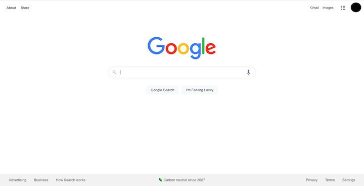
For another brand, however, an overly simplified UI could make the site look too empty and the brand devoid of value. But if you find the right balance, your choice of white space can certainly help make a website look attractive to its target users.
It Makes Websites Easier To Use
If you study the website design principles, you’ll notice that positioning and spacing are heavily featured within them.
When you apply these design principles to websites, you leverage user psychology to create interfaces and user journeys that are easy to understand and follow.
Take this example of Fitts’ Law:

The spaces around the content, links, and CTA button don’t just improve the look of these pages. They can improve the user’s click confidence and accuracy as well.
It Improves Focus
When you throw too much content at visitors at once, they can become overwhelmed and have a hard time focusing on one thing.
This is a phenomenon explained by Hick’s Law:
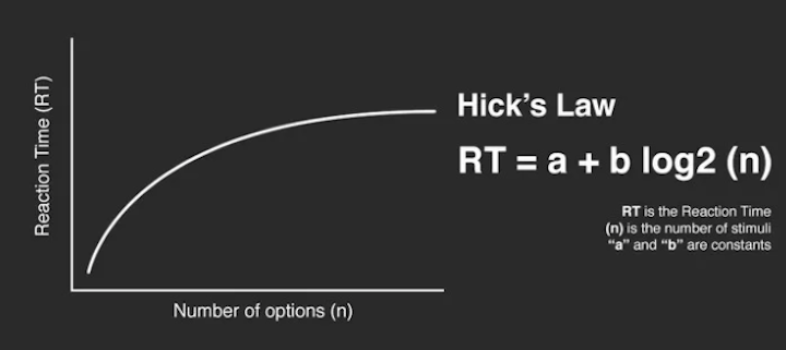
The more stimuli present at once, the longer it’s going to take people to react to it. And, in the case of a website, it could be enough to keep them from making any decision at all.
By building space around each area of your web page, you’ll allow your visitors to take a moment to breathe and consider what they’re looking at. It slows down the decision-making process… but in a good way.
It’s Useful for Organization
When you have a ton of content to include on a website, it’s easy enough figuring out how to break it up into different sections and pages. However, simply placing content into different containers isn’t going far enough.
When you add space around content or its container, you’re sending a signal about how important that content is and how it relates to what’s around it.
Nielsen Norman Group explains how this works:

In this graphic, you don’t see 20 dots. You see a larger section of dots on the left and a smaller one on the right. It’s the equidistant spaces between the grouped dots and the larger one between the groups that allow us to see them as related units as opposed to individual dots.
It Improves the Legibility and Readability of Your Content
Whether it’s a short bit of text in a hero image, a lengthy blog post, or a very descriptive product page, you want visitors to read the content that’s there.
Sizing your fonts correctly will help draw attention to your words, but it’s the spacing around the letters, words, and paragraphs that ensure they can be read with ease.
Nielsen Norman Group believes that spacing in typography is one of the three factors that make a design look good:
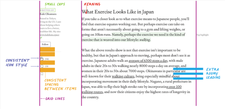
This graphic demonstrates the various ways in which legibility and readability are improved as a result.
11 Inspiring Examples of White Space in Web Design
Because there are so many ways to use white space to improve a website, I want to look at 11 examples that use different kinds of white space particularly well.
1. Pittsburgh Zoo & PPG Aquarium Logo

If you were to quickly glance at the Pittsburgh Zoo logo, you’d probably see the white tree and birds flying around it first. Upon closer inspection, though, you’ll see an image hidden in the negative space: A gorilla facing a lion.
This creative use of white space makes this logo and its brand quite memorable. What’s more, the hidden surprise is a great way to make a strong first impression with visitors.
2. Circa 1886’s Hero Image Gallery

The hero image on a website needs to be able to effectively capture a visitor’s attention. There are a number of ways to do this. You could design the hero image using mostly colors and shapes in order to let the copy shine. Or you can do as Circa 1886 does and allow your images to take center stage.
Notice how this gallery uses white plates, white linens, clear glassware, and shiny cutlery to frame the main subject of each photo. This literal white space keeps the focus on the food and not on the distractions of the restaurant or diners around it.
3. Florian Schulz Productions’ Photos

This is the website for conservation photographers and filmmakers Florian and Emil Schulz. As you might expect, the site is full of eye-catching nature photography.
This is proof that white space isn’t just something that improves the design of a website. By using photos that use white space well, you’ll be able to more effectively direct your visitors’ eyes to your subjects.
In the example above, we see how the dark mass of stingrays serves as the white space and allows the stingray in motion in the green waters to be the main focus.
4. Overstock Navigation Links

You might not think that you could fit 13 navigation links neatly into one line, but the Overstock website would prove you wrong. Here we see how the right amount of space between links can make a menu of this size easy to peruse.
What’s more, it doesn’t force the retailer to hide its categories under a Categories mega menu or under a hamburger menu icon (which many do these days).
5. Udemy Line Spacing

Take a look at how the modules and lessons are broken up for this Udemy course. The combination of lightly colored blocks, bold headers, and abundant spacing around each line makes it very easy for a learner to quickly scan through the course.
When there are over 150,000 courses available on a site, users must be able to quickly assess if a course is right for them. And a good amount of breathing room — but not too much — will help with that.
6. Meetup’s Organized UI

Meetup is a website that helps locals find groups of people with the same interests and plan events around them. In big cities, a site like this could become overwhelming for users who seemingly have too many groups and events to choose from.
Thanks to the well-organized UI and the white space that breaks it up, users can quickly filter through the options at the top of the site and the sidebar on the right. Then they can turn their attention to the narrowed down results by day in the center.
7. Maison De La Luz’s Margins
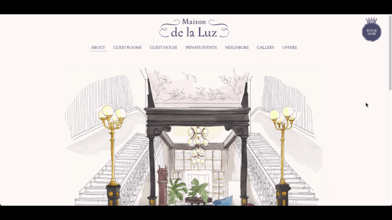
Maison de la Luz is a boutique luxury hotel in New Orleans. Its beautifully illustrated website isn’t the only thing that’s going to wow its guests.
On the About page, visitors will initially see an illustration of the interior of the hotel. As they scroll downwards, it mimics how their gaze might move up and down while admiring the hotel in person. Even without animation, this layout feels very engaging thanks to the narrowing margins of the graphic into the text below it.
8. Apple Product Focus

Apple has been around long enough that it barely needs to utter a word about its products. That’s why the majority of its website lets the products do the talking.
Even when copy and CTAs are present, they take up a small amount of room compared to the products and the heavy amounts of white space that draw the visitors’ focus to them.
9. Lull CTAs

The call-to-action button plays an important part in the user’s journey. It forces them to pause, consider what they’ve learned so far and decide if they’re ready to take the next step.
In order to get people to notice the CTA, you’ll need more than just good placement or color application to make it stand out. As with Lull’s two buttons above, plentiful white space around a CTA enables you to push everything else aside while your visitor makes their choice.
10. Flywheel’s Pricing Blocks

If you have a lot of details to share all at once, you can use size to establish hierarchy and spacing to group relevant details together. This will make the decision-making process go more smoothly for your visitors as they’re not just given a wall of text to consider.
Although what we’re looking at here is an example of pricing blocks on the Flywheel website, this kind of airy spacing is useful for any type of product or content block design.
11. Salesforce Form Layout

No matter what type of forms your website uses, you want them to be easy to fill out. In this Salesforce free trial form, we see how the right spacing can make a form feel more inviting.
The white space around each field helps users focus on one field at a time. There’s another reason why this ample spacing is useful. When someone starts filling out the fields, each label moves above it. And if an error occurs, the relevant message appears below it.
Use Whitespace Skillfully To Build Better Websites
White space might refer to the emptiness of a website, but there’s a lot of meaning and purpose that lives in that emptiness.
By taking control of the spacing on a website, you can create an all-around better experience for everyone who enters it.
While we’ve shown you some ways in which this can be done, applying it to your designs is another story. But don’t worry. The Elementor page builder makes it easy to add white space to your designs.
Looking for fresh content?
By entering your email, you agree to receive Elementor emails, including marketing emails,
and agree to our Terms & Conditions and Privacy Policy.


