
Table of Contents
- Table of Contents
- What Is a Website Color Scheme?
-
- 1. Get To Know The Color Wheel
- 2. Understand Color Combinations
- Analogous Colors: Side by Side
- Complementary Colors: Opposites Attract
- Triadic Colors: Evenly Spaced
- 3. Consider Color Psychology
- 4. Address Visual Hierarchy
- 5. Focus on Actionability, Especially Clickability
- 6. Keep Responsive Design In Mind
- 7. Embrace Neutral Colors
- Following the Rules
As experienced designers of all backgrounds can tell you, color schemes require a profound amount of thought and consideration in the web creator’s design workflow. Because of the large scope of this topic, there are many best practices to master in order to create the perfect color scheme. After understanding the significance that color schemes play in the website design process, we will be even better equipped for our future design-related decision making and our careers as web creators.
When it comes to branding, specifically, color schemes are almost always a key component in a brand’s design system or style guide, which is a set of guidelines that defines a brand’s personality, brand messaging, brand imagery, and content assets. Branding, as we know, is one of the most crucial components in the website design process. As such, a defined, carefully crafted color palette will solidify our brand identity so that our websites and their content become a polished, professional brand asset.
There are many best practices and “rules” that, when put into effect by web creators, will maximize the potential of their web design skills and best represent their prestige and competence as a web designer. It’s time to learn and understand just how valuable website color schemes are in website design and the rules you can follow to make yours the very best.
Table of Contents
- What Is a Color Scheme
- Why Are Color Schemes Important
- 7 Rules for Creating Website Color Schemes
- 1. Get To Know The Color Wheel
- 2. Understand Color Combinations
- 3. Consider Color Psychology
- 4. Address Visual Hierarchy
- 5. Focus on Actionability, Especially Clickability
- 6. Keep Responsive Design In Mind
- 7. Embrace Neutral Colors
- Our Favorite Website Color Scheme Examples
- Following the Rules
Grow Your Sales
- Incredibly Fast Store
- Sales Optimization
- Enterprise-Grade Security
- 24/7 Expert Service

- Incredibly Fast Store
- Sales Optimization
- Enterprise-Grade Security
- 24/7 Expert Service

- Prompt your Code & Add Custom Code, HTML, or CSS with ease
- Generate or edit with AI for Tailored Images
- Use Copilot for predictive stylized container layouts

- Prompt your Code & Add Custom Code, HTML, or CSS with ease
- Generate or edit with AI for Tailored Images
- Use Copilot for predictive stylized container layouts
- Craft or Translate Content at Lightning Speed
Top-Performing Website
- Super-Fast Websites
- Enterprise-Grade Security
- Any Site, Every Business
- 24/7 Expert Service

Top-Performing Website
- Super-Fast Websites
- Enterprise-Grade Security
- Any Site, Every Business
- 24/7 Expert Service
- Drag & Drop Website Builder, No Code Required
- Over 100 Widgets, for Every Purpose
- Professional Design Features for Pixel Perfect Design
- Drag & Drop Website Builder, No Code Required
- Over 100 Widgets, for Every Purpose
- Professional Design Features for Pixel Perfect Design
- Marketing & eCommerce Features to Increase Conversion
- Ensure Reliable Email Delivery for Your Website
- Simple Setup, No SMTP Configuration Needed
- Centralized Email Insights for Better Tracking

- Ensure Reliable Email Delivery for Your Website
- Simple Setup, No SMTP Configuration Needed
- Centralized Email Insights for Better Tracking

- Ensure Reliable Email Delivery for Your Website
- Simple Setup, No SMTP Configuration Needed
- Centralized Email Insights for Better Tracking
What Is a Website Color Scheme?
A website color scheme is the collection of colors that a designer chooses for their website design. Also known as color palettes, color schemes can include as few or as many colors as the designer sees fit. Each color can be used for a variety of elements throughout the website, meaning the same color may be used for different types of components.
That being said, color palettes are generally divided into two sets of colors: primary and secondary. The primary colors are generally the more dominant colors in the site, accounting for background colors, logo colors, menu colors, etc., and secondary colors are often used as accent colors, among other use cases. Very often, you’ll also see that a color palette will include several shades of the same color, which gives the website a varied yet consistent feeling throughout its design.
Consistency is actually one of the fundamental values in creating a color scheme for your website. Because brand personality is so crucial to a successful website and business, having a consistent color palette solidifies your brand identity, as your repeated use of color and styling will create associations between your brand and your audience.
Why Website Colors Are Important
1. They Present Your Visual Identity
Your crucial choice of color scheme becomes your visual identity, and it is how your brand will resonate in the minds of your visitors and prospective customers, otherwise known as brand recognition. This form of visual identity materializes into a communication medium between you and your target audience, as different user personas will be drawn to various types of color palettes. Color schemes also visualize your brand messaging, which is why they influence a large part of your user experience.
2. They Make a First Impression
As web creators, we know that while we design (and redesign) our websites in the back of our mind, we are often thinking, even if subconsciously, “what kind first impression will this design make on my visitor?”. That’s one of the main things website color schemes are about: first impressions. This is true to the extent that in one survey conducted in 2018, 94% of respondents said that their first impressions of a website are design-related.
3. They Create Emotional Connections
Finally, even if you don’t realize it at first, different color palettes trigger different emotions and associations in the eye of the beholder. Depending on how you want to communicate with your audience and visitors, your choice of colors will play a strong role in the dynamic of your “conversation” and in shaping your voice and tone. The topic of color psychology is a world of its own, which we will soon discuss.
7 Rules for Choosing a Website Color Scheme
1. Get To Know The Color Wheel
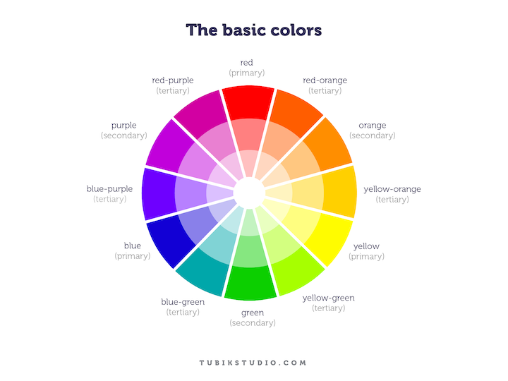
The fundamentals of color theory begin with understanding the three groups that the color wheel includes: primary, secondary, and tertiary. The primary colors, red, blue, and yellow, are the color wheel’s base colors, and all of the remaining colors are derived from these three. Next, come secondary colors. Secondary colors are what you get when you mix any of the three primary colors together, otherwise known as orange, green, and purple. Finally, there are tertiary colors, also referred to as “middle colors”. These are what you get when you combine a primary color and a secondary color. Examples of these are red-orange, yellow-green, or blue-purple.
Understanding relationships between colors doesn’t stop here. But now that we’re aware of how colors are formed, we can define how they “interact” with each other, or in other words, how they work together, and how we build our own color combinations.
Ironically, although the types of relationships between colors on the color wheel fall into concrete relationship “categories”, there are also many options for how these colors can combine with each other, and that’s where color combination-types come into play.
2. Understand Color Combinations
Just as each color bears a personality and significance alone, the same is true for the relationships between each color. When you choose a color combination, you’re often conveying a certain message or concept to your website visitor, depending on how the color’s “personalities” combine.
If, for example, if you choose a complementary color scheme that includes red and blue, red, which represents urgency and strength, and blue, which represents peace and loyalty, your end result is a blended atmosphere of strong, forthcoming loyalty and stability.
Alternatively, if you choose two or more colors that strike a harmonious balance rather than a contrast, you are creating a completely different vibe. It’s up to you as a web designer to decide which type of color combination is a better fit for your website.
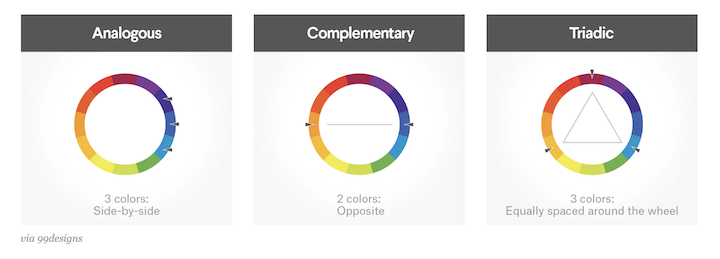
Analogous Colors: Side by Side
Analogous color schemes consist of three colors that are directly beside each other on the 12-spoke color wheel. Web designers often choose analogous color palettes when looking to create a modern yet sophisticated website. For example, an analogous color scheme consisting of red, red-orange and light orange will emphasize the vibrant relationship between the red and light orange.
Complementary Colors: Opposites Attract
Examples of complementary colors are red and green, blue and yellow, blue and orange, red and blue, among many others. What these pairs have in common are that they are two opposites of each other, and you can identify them by finding two colors that are directly opposite one another on the color wheel. In practice, the significance of primary color combinations in web design is that because a sharp contrast exists between them, they can make one color, especially accent colors, stand out.
In the context of website design, using complementary colors bears great value for elements such as buttons or navigation menus. When your objective is for visitors to notice a button and click it, using a complementary color scheme as accent colors for your text and its background, is much more likely to grab user attention because of the stark contrast and differentiation between the two.
Similarly, designing a button with a font color that contrasts with the button’s background color will make the button text a lot easier to see. This can often result in higher clickability and conversion rates, and the same is true for navigation menus and menu items.
Triadic Colors: Evenly Spaced
Considered to be the most basic type of color scheme, a triadic color scheme is defined as any three colors located 120 degree from each other on the color wheel. In some way, triadic schemes can be considered the most flexible of the three combination-types, as there are many directions you can go in to measure 120 degrees. Different to analogous, which is limited to three somewhat similar colors, or complementary colors, which can only be contrasting colors. Triadic can be seen as a mixture of the two, as triadic color schemes can combine both analogous and complementary colors, and there’s (even) more room for creativity. As you can see, the options of color combinations that a web designer can create truly are endless.
3. Consider Color Psychology
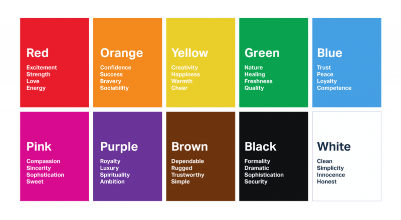
The world of color psychology is built on the idea that certain colors trigger specific feelings and emotions, which trigger certain courses of action. If you haven’t encountered color psychology until now, you’re up for a true intellectual discovery.
Color psychology suggests that choosing your website color scheme based on the emotional experience you want to deliver to your users will not only impact your brand’s personality, but it will trigger certain visitor reactions based on the emotional environment you create.
Once we understand what each color is known to represent, choosing the most appropriate color palette for our website becomes profoundly intuitive. For example, if you’re building a website for your spa business, it makes sense to use colors that represent nature and healing, such as green, and possibly blue, which symbolizes peace and trust.
With so many color palette options that exist within the color wheel, using color psychology as a guiding principle when choosing your color scheme allows you to make more informed design decisions, and focus your theme and style in a way that suits your industry and business persona.
4. Address Visual Hierarchy
As web creators, investing in visual hierarchy is a natural step in our design workflow. Last year, the Shutterstock blog published an article naming “6 Rules of Visual Hierarchy That Will Help You Design Better”. These rules, they explain, are based on the overarching goal of arranging design components based on importance, which “guides the viewer through the design and ensures the message is clear and concise.”
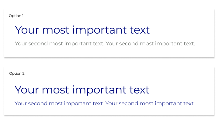
Of their six rules, Shutterstock’s first and foremost rule pertains to a website’s color scheme, and they state this rule as: “Make a Focal Point with Color.” What we can understand from this is that when you’re addressing your website’s visual hierarchy, your color palette is one of the most fundamental design choices to take into consideration. This is true for the colors you choose for your text, your button colors, your backgrounds, and so on.
According to this mindset, when you have a hero text, and then a description beneath it, your choice of font colors is crucial, as is your choice of background color. In the image above, for example, it’s much easier to distinguish between the heading and the subheading when they are given two different colors. This way, the more “important” text is in a dark color, and the “less important” text is in a contrasting, lighter color. The eye addresses the h1 before the subheading, simply because it’s much prominent, and it’s easy to see each in its own light. In the second visual, both text elements are in the same color, so the eye instinctively sees them as one unit, and is slower to separate them into two different entities.
The design principle of color palettes as a determinant of visual hierarchy pertains to almost every visual component in a website. This is true for text colors, as we described, but also for background colors and button colors. Emphasizing the importance of a specific button can often be achieved by choosing a button color that is most likely to draw user attention, and ultimately result in a higher clickthrough rate.
Generate the CSS style for border-radius, fonts, transforms, backgrounds, box and text shadows with the online CSS code generators.
5. Focus on Actionability, Especially Clickability

Looks aren’t everything. What we mean by this is that yes, a visually-pleasing color palette is one of the fundamental factors in top-tier web design. That being said, the way your color palette affects your user experience is of equal importance. When you want your website visitors to take a specific course of action when browsing your site, the colors you choose can play a very dominant role.
The example above from IC Creative illustrates the impact that a brightly colored button in front of a dark background overlay can have on your user activity. The black overlay allows the clear white text and bright orange button to stand out without clashing with the background photograph. At the same time, the transparency in the overlay still allows the people in the image background to be subtly visible.
This is visual proof that choosing two or more colors that bear a strong contrast between them, such as black and bright orange, is a powerful choice of color scheme. Alternatively, you can also choose multiple shades of a color and apply them to a cluster of elements, which can convey that those elements are indeed related to each other, yet some are more “important” than others.
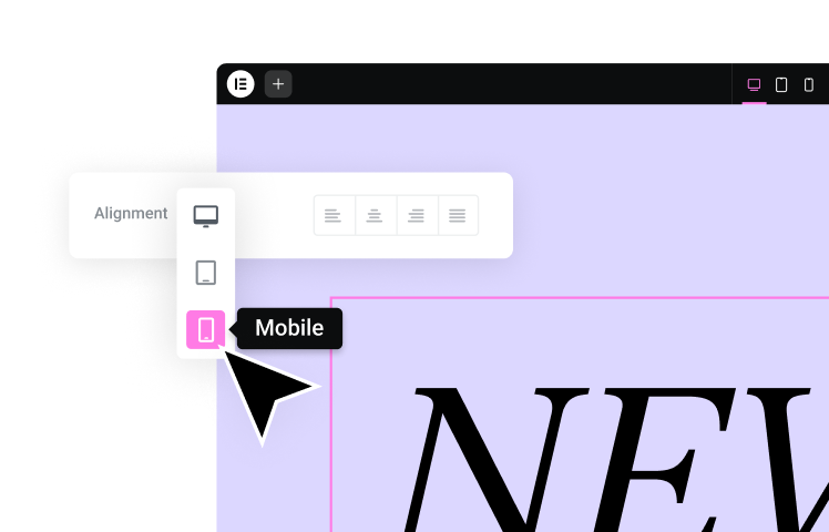
6. Keep Responsive Design In Mind

The importance of responsive design is a rule of thumb for any web creator. But what may be less intuitive about how to make your website responsive, is that responsiveness goes beyond the sizing and layout of your site. Choice of color palettes is also a strong contributor to how a website will look on mobile.
In fact, keeping mobile responsive in mind when crafting your color palette will often make your design process much easier. This way, you can guarantee that your text elements are equally legible regardless of screen size, and that icons and buttons are also just as visible on mobile as they are on desktop.
Given how much smaller mobile screens are than desktop view, you may find that you’ll need to use fewer colors for mobile than you do for desktop. The smaller interface might look overwhelming if it has too many colors, yet the added space you have on desktop can handle a larger number of colors without seeming too busy.
This is where Slack’s website becomes a perfect example of choosing a primary color for a color palette based on responsiveness. Their choice of bold purple is engaging and visible on any screen. It is loud enough to make a small (mobile) screen fun and exciting, yet dark enough that on a desktop view it won’t be “too much.”
Another helpful way to ensure that you don’t have too many colors on your mobile UI, yet still obtain visual hierarchy and uniqueness, is to add multiple shades of one color to your color scheme. The similarities between the color shades are similar enough that they’ll make the mobile interface look clean and cohesive, yet different enough to keep your website interactive and engaging.
7. Embrace Neutral Colors

Although they may be less exciting, neutral colors are a necessity for any correctly-crafted color scheme. Even if you only use them for text elements, every professional color palette should include neutral colors. As beautiful as non-neutral colors are, website visitors will, at one point or another, need a “break” from visual stimulation, especially when trying to process qualitative information through text.
In the example above, although dang’s website has a rich, colorful color scheme of orange, green and brown, the simple use of white is still a necessity. Using white is what makes their call to action texts visible (“buy now”), what makes their navigation icon and menu look neat and visible, and what makes their logo be prominent among the dark, detailed imagery.
Our Favorite Website Color Scheme Examples
1. KLM iFly 50

KLM iFly 50, the iFly KLM Magazine’s 50th anniversary edition, uses an analogous color scheme of medium-light blue, greenish light gray (this one is a derivative of blue) and dark-grayish green. Analogous color schemes, as we discussed earlier, are two or three colors close to each other on the color wheel, including shades and tints of those colors. These colors seem to be derived from the site’s hero image, a detailed photograph of a waterfall on a high cliff below a bright blue sky. It’s no wonder that the colors appear to be such a natural combination, as they are all derived from the colors moss on the cliff, the white waterfall, and the blue sky.
2. JOCO
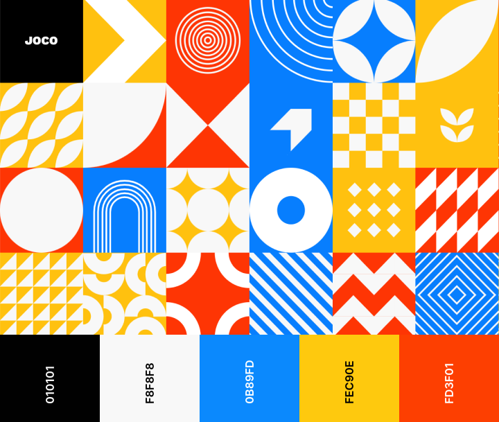
Joco.io, a portfolio website belonging to developer Jon Corbett, shows a unique way to use a complementary color scheme that features bold shades of the three most basic primary colors (blue, yellow and red). By choosing bright blue, sunflower yellow and bold red-orange, Jon illustrates the potential of how to make the most fundamental set of three primary colors look unique yet traditional all in one.
3. Embacy.io
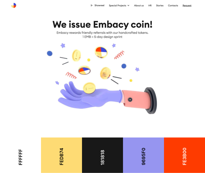
Embacy.io uses a split-complementary color scheme as a sophisticated way of blending delicate shades of complementary colors (yellow, light purple-blue, red). This collection of colors is derived (and slightly adjusted) from their logo, which includes unique shades of the three primary colors, red, blue and yellow.
4. Odopod

Odopod, a San Francisco-based digital design agency, successfully portrays themselves with an individualistic flair, all with one multiple shades of a single hue, otherwise known as a monochromatic color scheme. Odopod takes this deep pink-orange color and creates a gradient background that transitions into a more traditional orange. This is what we consider to be the perfect balance of colorful yet minimalistic website design.
These four examples are only a short list of the vast choices we have as web designers when it comes to website color palettes. The options are endless, and all it takes is some dedication and creativity to find the color combination that best suits your website.
Following the Rules
Now that we have a better idea of what website color schemes are and why they are a must-have stage in every web creator’s design workflow, it’s time to see if we’ve followed the rules in our own websites. As we mentioned in the beginning of the post, one of the most, if not the most, important principle when crafting a website color scheme is consistency.
In order to attain that consistency, there are many principles, as we mentioned, to keep in mind. This includes, to name a few, navigating the color wheel, exploring different possible color combinations, considering color psychology, prioritizing visual hierarchy, actionability, and responsiveness, and finally, using neutral colors. When a beautiful color palette is used wisely throughout a website, visitors will not only enjoy navigating your site in the moment, but it will also leave a lasting impression in their minds.
Looking for fresh content?
By entering your email, you agree to receive Elementor emails, including marketing emails,
and agree to our Terms & Conditions and Privacy Policy.
