This month’s showcase boasts variety and creativity in all directions, accounting for the many interests, personalities and industries found among the web creators in the Elementor community. We’ve compiled a list of websites from a diverse collection of websites, each one built for a unique use-case and target audience. From online platforms, e-commerce stores, media streaming sites and branding agencies, once you’ve read this month’s showcase — you’ll truly have seen it all.
Be prepared to see mind-blowing, inspiring examples of how to leverage Elementor features and effects to truly bring out the best your web creation skills have to offer.
10
Hone: Leadership Training With Consistent Branding
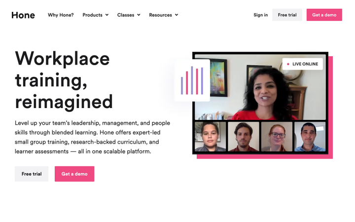
Hone is an online learning platform that provides live classes on subjects such as team leadership, management and interpersonal communication skills. Hone’s main user base includes human resource executives, learning and development leaders, and department heads looking to provide training for their teams. Hone’s website was developed by their Director of Marketing Acquisition, Matthew Parry.
In terms of the website’s design characteristics, we couldn’t help but notice how well the site’s typography and color scheme are implemented. The website’s eloquent use of fonts is expressed, for example, in how it leverages Elementor’s Design System capabilities. Using the Global Colors and Global Fonts features creates global settings for the website’s color scheme as well as typography choices — providing for a consistent, streamlined design identity.
Thanks to this visual consistency, the classy yet upbeat white, black and hot pink color scheme is integrated seamlessly throughout the site, coming to play in button colors, icons, illustrations bordering the images, and so on. In parallel, the unified use of the Circular XXTT font family (in various font weights throughout the site) gives every text element a clean, highly legible presence.
Theme: Hello
Plugins: Essential Addons Pro, JetEngine, JetMenu, Perfect Images, Shortpixel Adaptive Images, and RankMath SEO
Design & Development: Matthew Parry
09
PHROOM: Experiencing Top-Tier Visual Artists
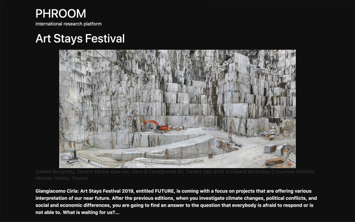
PHROOM is an online digital archive and research platform dedicated to contemporary photography and visual culture. The archive consists of published author works from around the globe, which the website owners curate through their own research. PHROOM’s audience is composed of artists, art lovers, art and communication professionals and photography lovers.
The website was created by Giangiacomo Cirla, Director of PHROOM, and an expert in visual culture and communication. Giangiacomo is the Editor in Chief and Creative Director of PHROOM magazine, and also works as Gallery Manager at the Office Project Room in Milan.
Unique features of PHROOM’s site are the way they use the Nav Menu Widget, which opens to a full-screen menu — where each menu item is an individual post. The full-screen nav menu’s background is a semi-transparent overlay, which creates an engaging, photography darkroom style feel. This motif integrates the brand personality nicely into the site, giving visitors an authentic and visual experience of the world of photography.
Consistent with the dark room vibe, the solid black background used throughout the site emphases the visual content found within each photograph. The contrast created by combining detailed photographs with a single dark color encourages the visitor to focus on every minute detail, developing an in-depth appreciation of the sophisticated, talented group of artists featured on PHROOM’s platform.
Theme: Hello
Plugins: Contact Form 7, Essential Addons for Elementor, Ivory Search, Jetpack, Newsletter, WP Paypal, Yoast SEO
Design & Development: Giangiacomo Cirla
08
Presidio Speech & Learning: Children’s Therapy Services
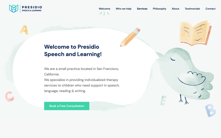
Presidio Speech and Learning is a children’s therapy practice in San Francisco, California. These therapy services cater to children who need support in speech, language, reading and writing. What’s unique about Presidio is that they utilize their qualifications and clinical training to implement individualized treatment plans for each child.
Focusing on their target audience of the parents of potential students, Presidio’s website design and content choices are astutely focused on the interests of their business’s user personas. The choice of pastel watercolors creates a calm, child-friendly ambiance which is what parents seeking an attentive, sensitive response to their child are looking for. The illustrations are child-like and friendly, such as the animated floating balloon, which is precisely what will appeal to children in need of specialized and therapeutic services.
In addition to the quality of the website’s design language, we were also impressed by the advanced design effects used throughout the site — such as the hover effects on each menu item in the header. Presidio’s site illustrates just how far you can go with visual branding on any site, no matter the industry or target audience.
Theme: Hello
Plugins: Yoast
Design & Development: Design and Development Minds
07
Terrasol: A Sicilian Winery With Character and Style
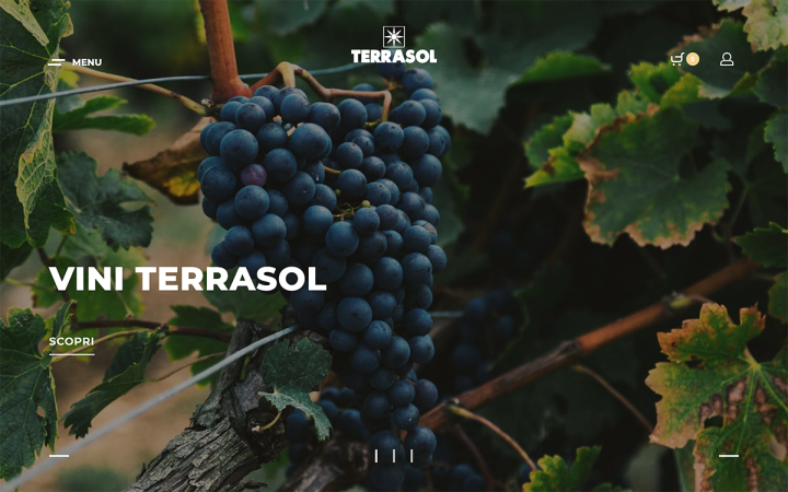
Cantina Terrasol is a Sicilian, family-owned winery dedicated to the production of native Sicilian wines. The love, passion and energy of the owner family gave rise to their specialty in producing wines that are distinguished by character and style. The Terrasol website was created by Ena Granulo, an Italian designer and videographer.
When the Terrasol owners decided to rebuild their website with Elementor (after having previously built the site on another CMS), they listed several goals that they wanted to achieve in their website makeover. These goals include emphasizing simplicity, minimalist design, ultimately creating a website that would represent the essence of their brand: “Sun, Soil, Tradition, Technology”.
We see this page as being highly sophisticated, as the wine bottle photographs are clear and vivid, lined up with each product’s details legible and modern-looking lettering. This vivid imagery trait is also true for the fullscreen slider background, which creates an all-encompassing, close-up perspective of the scenic vineyard itself.
We also immediately took notice of both the entrance animations and the hover effects used on the product archive page. At first glance, the archive page has the simple look of a photo gallery. Then, it’s only once you hover over each wine name that the “Add to Cart” button appears, as well as the option to save it as a favorite product. This subtle hover effect goes a long way — giving visitors the opportunity to browse through the wine choices as a matter of culinary interest, before engaging with the products as a shopping experience.
Theme: Rey
Plugins: WooCommerce, Rank Math SEO, Smush, WP Fastest Cache, Complianz
Design & Development: Ena Granulo
06
Leafboards: E-Commerce Site for Longboard Enthusiasts
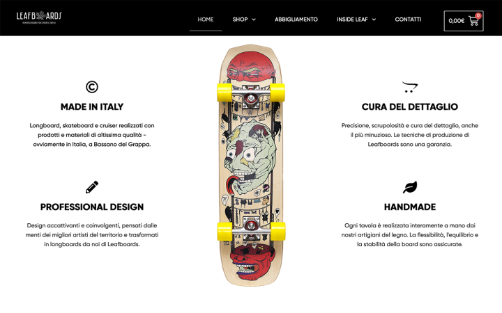
Leafboards is an Italian online longboard brand designed with the aim of “rediscovering the true essence of longboarding and skateboarding”. Made in Italy, Leafboards’s merchandise are defined and differentiated by their attention to detail, professional design, and artisan craftsmanship. Fabris Giovanni, a Digital Marketing freelancer, designed and developed Leafboards’s site — executing the brand’s aim of promoting, selling and making longboards accessible to longboard fans of all ages and levels.
The black and white color palette is a wisely chosen color scheme that complements the design details of each longboard. The plentiful white space and simplistic sans-serif font (a custom font created by Leafboards, by the name of Leafboards Gilroy Bold) — give each individual longboard and its intricate illustrations the spotlight.
Leafboards’s online store utilizes multiple WooCommerce Builder widgets and templates, such as the product page template. The store’s product pages include such detailed and elaborate information and details about the buyer’s product experience — such as where and how he can use each longboard, its flexibility, and so on.
What makes this e-commerce site of truly high caliber is how it employs many best practices for building an online store, as suggested by experts, such as:
- Display customer reviews and ratings.
- Use personalized product recommendations.
- Include relevant product information of interest.
After seeing an e-commerce site such as Leafboards, we can see why investing in the creation and design of your online store can go a long way.
Theme: Hello
Plugins: WooCommerce, ElementsKit Pro, Rank Math SEO, SG Optimizer, Smush, Smash Balloon Instagram Feed, Header Footer Code Manager, CartFlows
Design & Development: Fabris Giovanni
05
The Wise Travellers: The Eco-Friendly Travel Blog
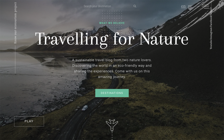
The Wise Travellers is an ecotourism travel blog created by Tiago and Sandrina, a couple from Portugal who describe themselves as nature lovers, who created the blog to “share our travels and consciencialize travellers to have a sustainable mindset.” The blog website was designed and developed by Tiago himself, whose career originally started in nursing, and he is now a full time web designer with a passion for photography and video production.
Tiago’s love for photography is evident in almost every section of the blog — from the homepage image background, to the “Latest Posts” archive, the unique website footer, and much more.
What caught our attention right from the start, for example, was the beautifully designed Flip Box Widget found towards the middle of the homepage. Initially, the three card-style buttons appear in an attractive yet simple, monochrome color scheme with basic-looking icons and standard fonts (Arapey and Roboto). The flipboxes’ black background on the front allows each box to blend seamlessly not only into the background of the image background behind it, but also with the solid black background beneath it.
Across the entire site, the usage of subtle scrolling effects creates a more dynamic experience for the visitor when seeing the website’s images. This is true, for example, on the homepage, where images move slightly upward as you scroll down. This is an understated yet powerful visual representation of what the travel blog is all about: journeys, exploration, and moving forward to see more and more.
Theme: Kava
Plugins: Accelerated Mobile Pages, Interactive World Maps, ShortPixel Image Optimizer, Polylang, JetElements, JetEngine
Design & Development: Tiago Ferreira
04
Duck You: A One of a Kind Rubber Duck Manufacturer
Duck You is the online version of a unique store in Tel Aviv that specializes, manufactures and sells a wide range of specialized, one of a kind rubber ducks. The rubber duck is of particular interest in pop culture over the past few years, having seen a revived popularity of its classic, nostalgic childhood associations. The website was created by sitrus, a WordPress-Elementor website design and development agency based in Israel.
As an agency, sitrus works with well-established companies looking to “take their offline successes online or to improve their current online presence”. Duck You’s website creator Ravid Nir shared with us that for Duck You specifically, the website goals are to increase sales and showcase the novelty and beauty of the merchandise.
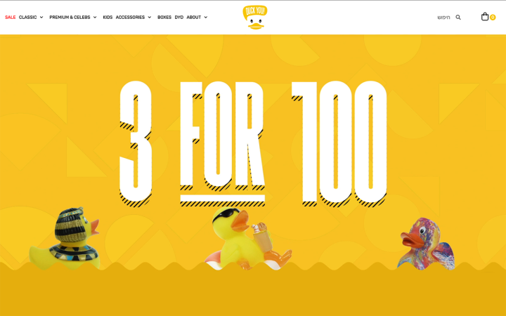
Duck You’s site, particularly its homepage, illustrates a creative way to create a video background as the layout design of the hero content. The combination of an illustrated yellow background, the animated rubber duckies and the rotating wave-like border finds a fine balance between an engaging, animated hero section that is not too overwhelming or distracting for the visitor.
The website’s entire color scheme stems from what characterizes their physical product itself — the bright yellow rubber duck that everyone has come to know and love. The vibrant color choices found in the website’s images, such as the bubble gum style pink and brightly colored sky blue work together to create an upbeat, cheerful ambiance. Conveying these positive and uplifting sentiments is yet another way that the store’s website is able to take the unique brand and extend its presence unto the website, beyond its physical brick and mortar store. Likewise, the choice of injecting humor and pop culture-themed rubber duck merchandise, such as Madonna and Superman personify the brand identity as well.
Ultimately, the comic-like font, the informal and casual microcopy, and of course, the many poignant branding motifs, come together to create a website that motivates us to take our design thinking where no brand has gone before.
Theme: Hello
Plugins: WooCommerce, JetElements
Design & Development: Or Froind, Ravid Nir
03
#3 Pillar VC Founder Playlist: Words of Wisdom and Growth
Pillar VC is a venture capital firm located in Boston, Massachusetts. The firm supports founders with early-stage and seed VC funding, investing in their professional and personal growth. The Founder Playlist is an online initiative started by Pillar VC, featuring a curated collection of online resources for entrepreneurs, startup founders and CEOs, etc. to inspire and support their growth as tech entrepreneurs.
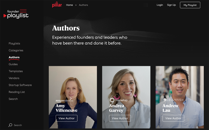
From a design perspective, there are many high-caliber visual details that indicate the modern and professional stature of Pillar VC and the online content they offer to listeners. The sticky sidebar blends smoothly with the hero section’s background video and thumbnail images throughout the page, all tied together with black backgrounds and overlays.
Another example of the website’s sophisticated design style is the choice of typography — both each individual font family as well as the font pairing. The two fonts we see here are Cambon and Apertura, two unique yet elegant font families that actually represent a growing web design trend. Many designers have been gravitating towards elegant serif fonts, which have been avoided by designers in the past due to what was considered its lack of legibility.
The Founder Playlist’s choice of Cambon, a contemporary flared serif font, is used for several headings throughout the site. Due to its carefully crafted heavier font weight, white font color and well-balanced, dark background overlay, what we see is a way to ensure the legibility of a serif font, in line with the most recent and stylish web design trends.
This up-to-date artistic presence is well-aligned with the essence of Pillar VC’s raison d’être: being an industry leader and up to date with the latest business and tech trends, including branding and design.
Theme: Hello
Plugins: Advanced Custom Fields, Gravity Forms, Relevanassi, Yoast SEO, Founder Playlist Widgets, Wistia API for Video Player
Design & Development: Katie Okolita
02
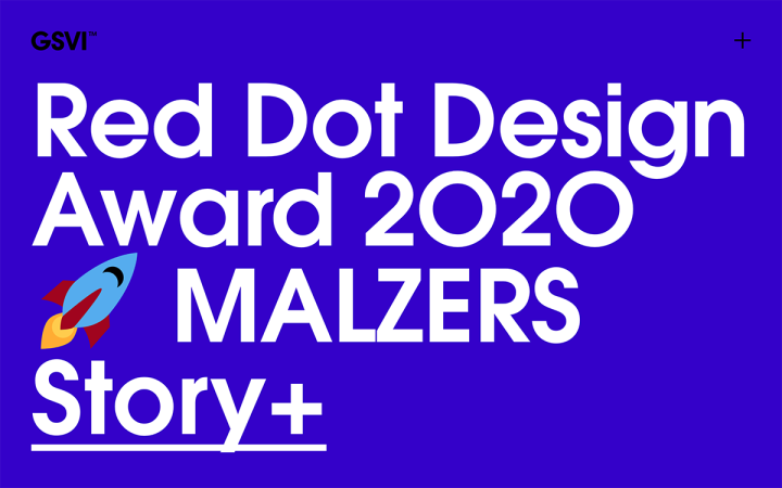
GSVI: Visual Identity Agency of the Future
GSVI is a creative agency in Bochum, Germany that specializes in visual identity, branding, and design. GSVI presents case studies of their work with well-known German brands and companies, such as Küper Wear Technology, Weber Ultrasonics, B2 Mobility, Malzers Retail, and more.
The homepage introduces the website visitor to the remarkable, wide variety of client case studies published by the agency. The headings as well as the call to action links (labeled as “Story+, linking to each individual case study) are vertically aligned, and all integrate seamlessly into each heading’s background, be them solid color or image backgrounds.
Above all else, GSVI’s homepage uses the transparency scrolling effect on their one of a kind design presence. As you scroll down, the different headings on the page change their opacity and become more transparent. Combined with this transparency change, the headings also use the scale motion effect, where the elements shrink according to the user scrolling activity.
We also took note of the element of clarity that dominates the website’s “Work” page. This is true both for its content strategy and its design layout, as the agency’s belief of what design work is about is started clearly, in a large, bolded font — using visual hierarchy to convey the impact of its message. This method of emphasizing the value proposition that their design projects are built on — both as individual projects and as an agency, is also applied to the descriptions beneath the thumbnail images. And the theme of clarity doesn’t stop there. Not only is the verbalized messaging clear, but the images themselves, whether photographs or illustrations, are clear and poignantly focused on each project’s significance.
GSVI’s website illustrates just how far creativity can take you when adding special effects to simple static images and headings. The element backgrounds and images may seem standard on their own, but simple techniques that allow interactive movement, triggered by user activity — can take their visual identity to new heights. Given that GSVI is a branding agency that values visual identity above all else — it makes perfect sense for them to use special effects to take their straightforward design assets and make them stand out.
Theme: Hello
Plugins: MediaElement.js, Yoast SEO
Design & Development: Christian Wohs, Adam Zemla
01
Justin Strohbach: Media Design Meets Creativity
Justin Strohbach is a media and web designer from Germany whose two passions in life are making music and building websites. His website boasts creativity in every corner, with a navigation scheme that is as original as it is engaging. Accounting for his limitless artistic skills, Justin’s homepage and its navigation menu embrace the ability to be atypical and profess your creativity through the art of web creation.
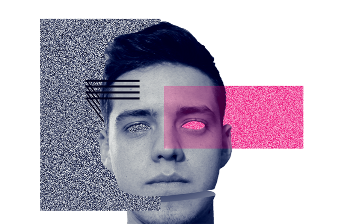
Rather than your run of the mill header or sidebar menu, Justin’s homepage comprises one single, modified photograph with low-key illustrations around it. At first glance, there are no words or menu items on the page, as the navigation elements that do exist on the page are remarkably hidden and discreet, yet still easy to find.
That being said, the illustrations and divided sections of the photograph aren’t simply there for artistic detail. When you hover on each design component or section, they each lead to a separate page on the site. In the case of the illustration of black lines, those actually expand into a navigation menu that’s composed of three masonry-style square-shaped elements. In line with the design language of the entire website, the popup menu centers the user’s navigation scheme and ensures that he has a clear understanding of how to navigate and explore the site. Beyond its logical navigation layout, the change in menu structure is still perfectly consistent with the design scheme used on the homepage menu — nicely integrating the pink and grey patterned box as well as the uniquely designed animated head.
Among the website’s many points of inspiration, what we can learn from this personal yet powerful website is how to channel design creativity in ways that maximize the potential of web creation.
Theme: Hello
Plugins: Essential Addons for Elementor, Yoast SEO
Design & Development: Justin Strohbach
Think your Elementor-based website or landing page should be featured in our next Top 10 Websites column? Give it a shot!
