Table of Contents
This month’s template kit was designed for psychology and mental health professionals looking to display their treatment offerings to potential clients. It’s minimalistic and focuses on the vibe that mental health professionals seek to convey: a professional, understated environment that evokes calm and serenity when clients encounter it.
For this particular Template Kit, our designer at Elementor, Rachel Skiba, the creator of this kit –– shares her personal thought process and design thinking when crafting this unique kit:
“The sensitivity and the delicateness of the subject of mental health are expressed visually by light, modest colors of light blues and greys. The goal of the design is for potential clients to begin an interaction with mental health professionals in a space where they feel safe, confident, and trusting of those they interact with.”
This ambiance of trust, emotional comfort, and focus on the patient is always illustrated by the choice of photographs that you’ll find throughout the template: human expressions of intent listening, concentration, and a warm environment where a client can feel free to express himself comfortably.
As we explore the template kit and the design choices we made while building it, we will understand how the different design components and visual elements correlate with the goals of the kit. All that being said, the simplicity and minimalism which the template kit represents allow it to be versatile and usable for other business owners that don’t necessarily work as psychologists or therapists, such as life coaches, personal trainers, medical professionals, and so on.
Homepage: Vivid Storytelling
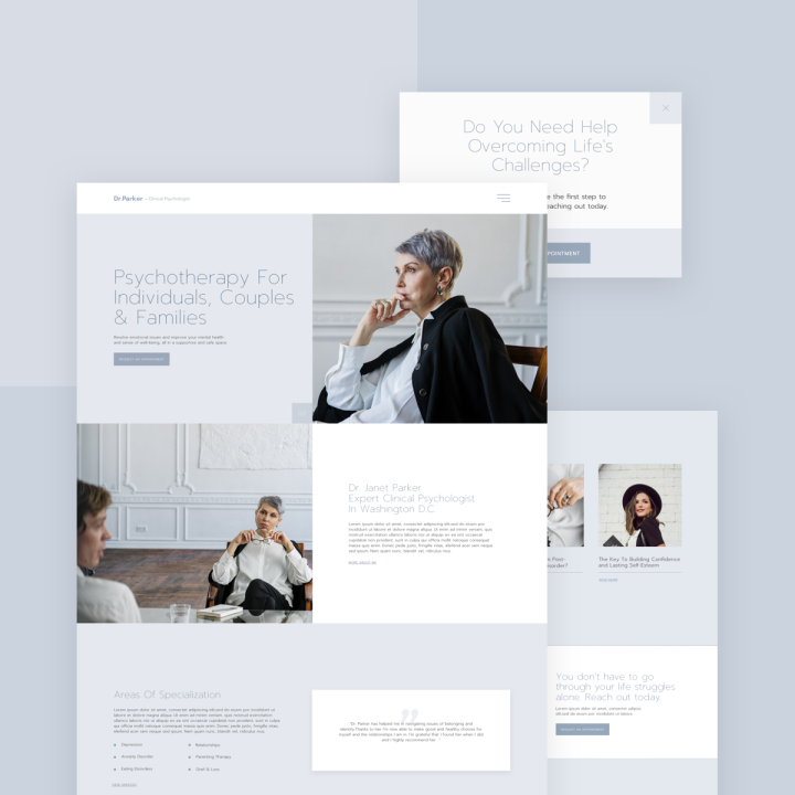
One of the strongest characteristics of the homepage design is the choice of large, crisp photographs that tell the “story” of the personality and professional approach of the psychologist. The images of a psychologist deeply engrossed in the conversation with the client, focused and pensive, shows prospective clients just how professional and dedicated the practitioner is as a professional. This is exactly what individuals seeking mental health treatment are looking for, especially when they are potentially in a mindset that they are exposing their vulnerable points by asking for help.
What we can learn from this is just how powerful the impact of a website can be when careful thought goes into the process of choosing which images best tell the story of the website and its business owner. At first, photographs must seem like a secondary, less crucial design detail on a page, but really it can have the opposite effect, and leave a lasting impression on the website visitors.
The Homepage is a Page template.
You can download it from Editor > Open Library popup > Pages tab > scroll the page and find it or search for “Psychologist”.
Treatments: Using Gentle Design
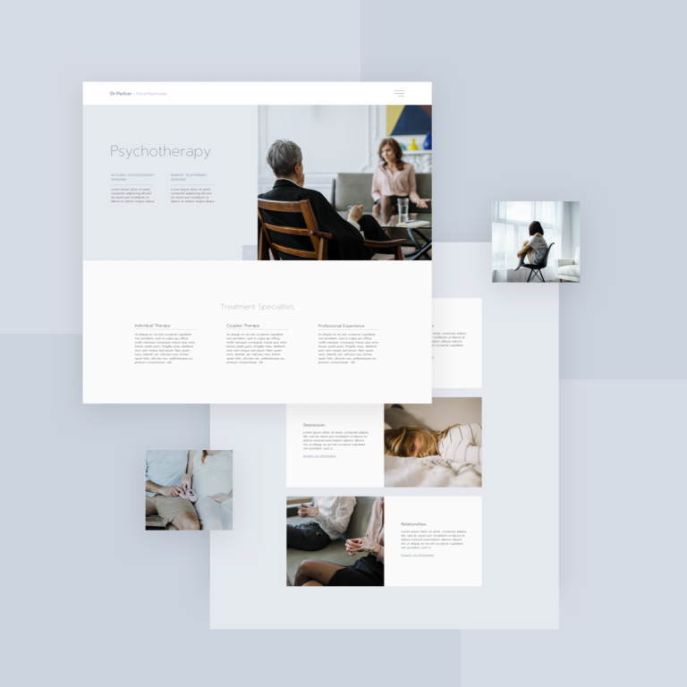
For the psychologist template, the Therapy Services page is a crucial component in the website, as it answers many questions that the client will have about whether or not his needs will be met should he start treatment. This is all bearing in mind that when reading the various service options, the reader is in a delicate, vulnerable place, so the choice of words is extra crucial when describing each treatment offering.
One way that the template kit leverages design choices in order to make sure the content represents the services well is with the choice of typography. Our designer chose Montserrat, a typeface provided by Google Fonts, that in its description, is said to have been inspired by the principles of “work, dedication, care, color, contrast, light and life, day and night!”. This is precisely the motif that the template kit seeks to convey. More specifically, we chose a thin variation of the font in order to convey the “gentle design” approach.
The Treatments page is a Page template.
You can download it from Editor > Open Library popup > Pages tab > scroll the page and find it or search for “Psychologist”.
Single Treatment Page: Creating Conversation
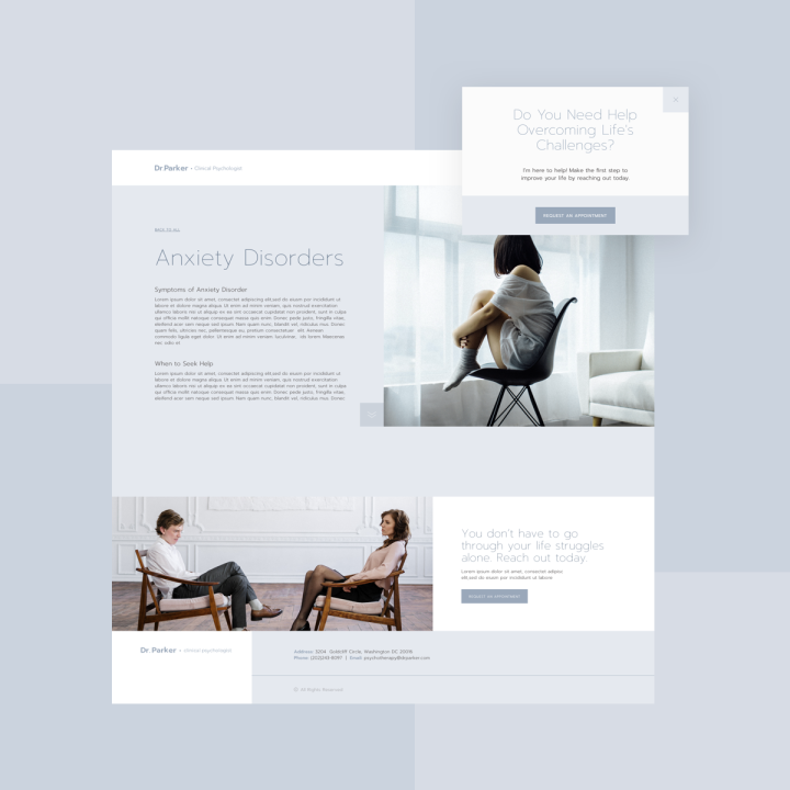
Because most clients reading the page text that describes each treatment will either be a potential patient themselves, or alternatively, a caregiver, family member, or loved one of one seeking help, the entire page design, layout and text must be composed very carefully as to not convey the wrong messaging or sentiment to the reader.
As it is, the topic of admitting one needs help and confronting the weakness that they need to attend to is a complicated position to be in. Therefore when a person suffering from depression or anxiety, for example, reads about the hardship they are experiencing –– must be subtle, empathetic content they can identify with.
For this reason, we chose a simple yet dynamic layout of a uniquely styled grid –– a two-column layout that also bears a broken grid flair to it but very subtly in doing so. Ultimately, the page is dominated by large images of real people experiencing their therapy sessions –– and the website visitor can immediately feel like there are other individuals they can relate to, and that they aren’t alone in their struggles.
The Single Treatment page is a Single Post template.
You can download it from WP left panel > Templates > Theme Builder > Add New > Choose “Single Post” > Library popup > scroll the page and find it or search for “Psychologist”.
Menu Popup: Intuitive Navigation
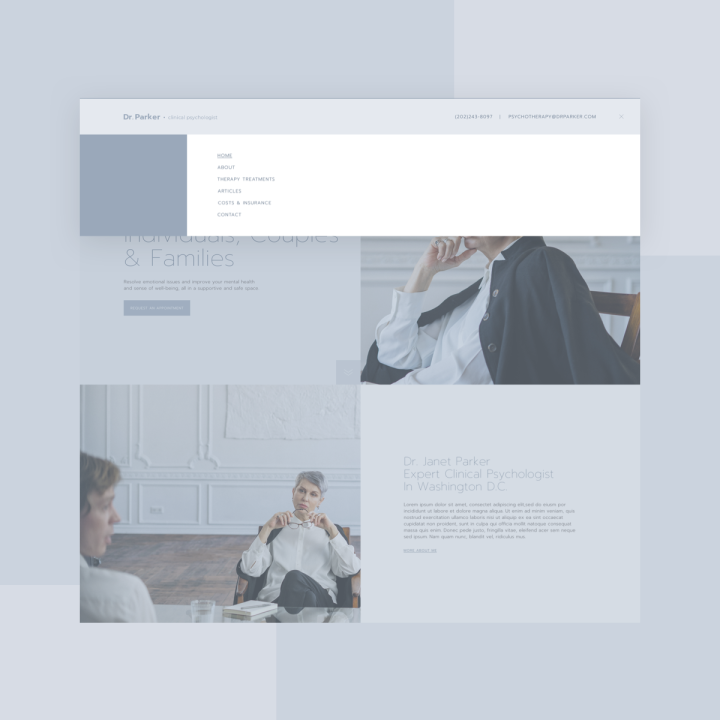
The design of the menu popup aims to master the art of user experience and provide a foolproof navigation scheme for every website visitor. The white background and smooth capitalized letters for each menu item make their text easily legible, with clear spacing and organized alignment.
The color scheme of the popup was also carefully thought out: as the blue column that matches the menu item text, placed alongside the white menu background, creates a balanced visual harmony that makes the menu pleasant to look at and easy to process visually. This is exactly the idea that we are looking to achieve in each navigation menu to create, as stated by user experience design laws themselves: navigation should be as least overwhelming and easy as possible for the eye to process.
The Menu Popup is a Popup template.
You can download it from Popup the “Popups” section.
WP left panel > Templates > Popups > Add New > Choose “Popup” > Library Popup > scroll the page and find it or search for “Psychologist”.
Design That Feels Good
Now that we’ve developed an understanding of how to design a website that welcomes people of all backgrounds and particularly those seeking a calm, comfortable ambiance, you’re fully equipped to build your own website that achieves this very creation. The kit’s versatility makes it easily convertible to other color schemes, choices of typography, and of course, other imagery. We look forward to seeing what you come up with! Don’t forget to share your websites with us once you’ve downloaded this kit!
To see the full Psychologist Template Kit, check out this demo.
If you have Elementor Pro, all you have to do to enjoy this cutting-edge kit is to go into Elementor, open the template library, and search for ‘Psychologist’.
Here’s a short gif showing how to search for the kit:
Which templates would you like to see next? Let us know in the comments below.
Looking for fresh content?
By entering your email, you agree to receive Elementor emails, including marketing emails,
and agree to our Terms & Conditions and Privacy Policy.
