
Table of Contents
Our online course template is a simple, modern and easy to use template kit that is versatile for all types of web creation needs. With the Corona crisis in mind, we’ve identified that many freelancers and entrepreneurs are looking to create online courses with the content they have, and need a simple yet effective way to do so.
As we mentioned in a recent blog post, creating online courses is a great way to monetize your website, especially in a time like this where many businesses are experiencing a dip in their earnings. But the template kit is in no way limited or exclusive to online courses. It can also be used for cooking videos, learning languages, parenting blogs, etc.
One thing to keep in mind is that this isn’t a learning management system (LMS). The difference here is that this is an education template, not an interactive course site that can be paid for on the course, set up users and so on. We did it with just Elementor and no other plugins/tools.
Here’s an explanation showing how to get this kit.
Homepage: Delivering the Main Benefit of the Online Course
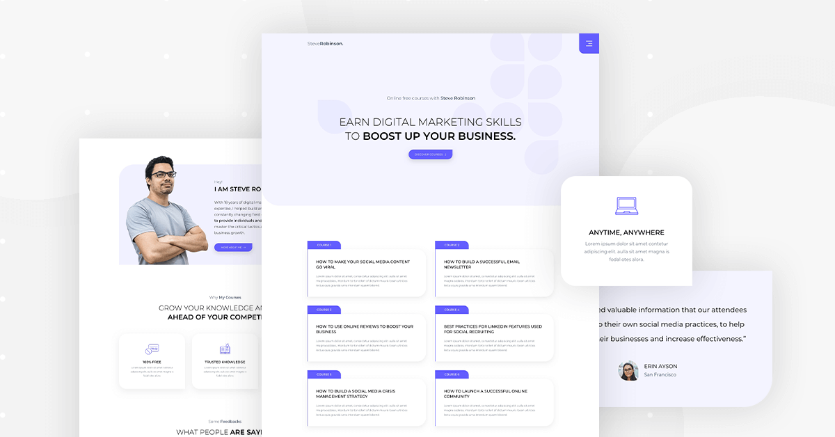
The Template Kit’s homepage sets the tone for the entire template. It’s a clean, minimalist background with a subtle pattern, with the added value of the website owner’s online courses as the focus of the page. This way, the messaging is clear, emphasized, and engaging.
Our thought process behind this minimalist and simple design is that the visitor should immediately understand why the business owner’s online course is beneficial to his career advancement or alternatively, to his general knowledge interests.
As you scroll down, the content becomes super actionable. The visitor can immediately understand what your course offerings are and what he would be learning in your course. He will also understand the practicalities, as you can add details like how long the course takes and what kind of materials become available to students.
Each section of the homepage maintains the minimalist, simple and ‘content-first’ design scheme. The focus of the page is the benefits of the course, the background of the course provider, and testimonials from previous students.
Another unique design feature on the homepage (and throughout the entire site) is the button design. If you notice, the uniquely shaped button not only corresponds to the shape of the faded purple pattern elements in the page background, but its shape is also identical to the popup’s shape. This allows for an engaging, intricate yet simple design scheme that really defines the entire website UX/UI.
Having such a consistent design element be present throughout the site lends itself to strong branding and personality.
Course Page: Cutting to the Chase
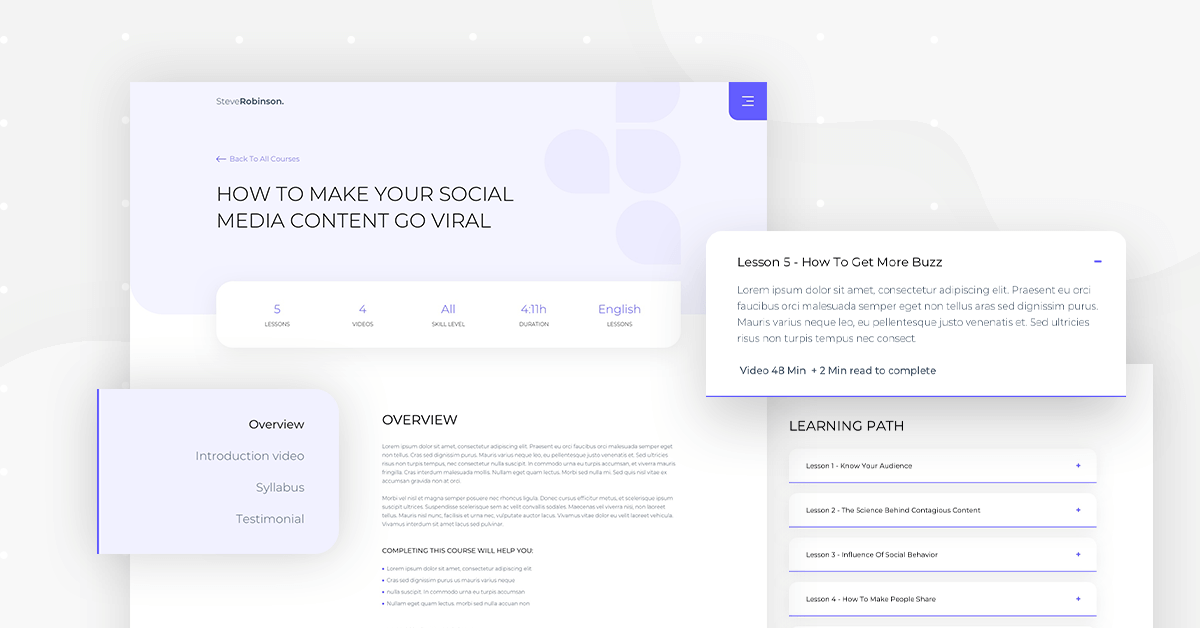
You’ll notice that on the left side of the page there’s a consistent column-shaped menu that’s a sticky element. It stays with the user as he scrolls down the page and sees new content in the right-side column beside it.
The idea here is that the visitor has an easy time navigating to the most important content on the page. Prospective students will want immediate access to things like the course syllabus, feedback from other students, and how to begin the signup process.
Having a sticky menu on the side of the page that’s available no matter where the user scrolls, lets the user have an easy time finding what he wants to know about the course.
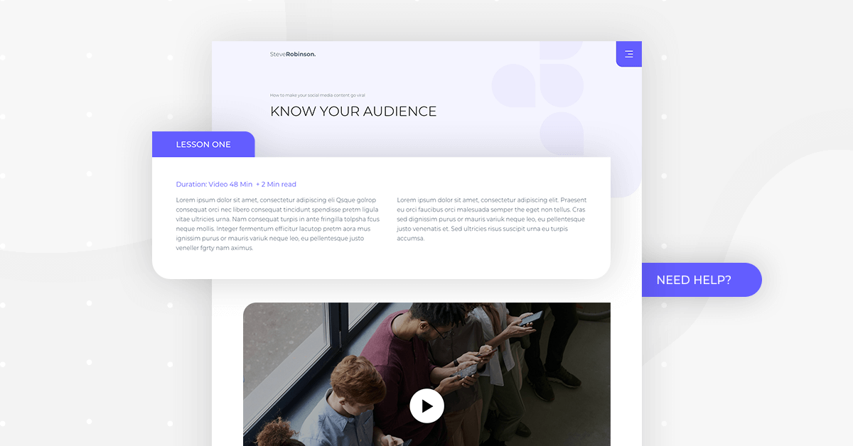
Lesson Pages
About & Contact Us
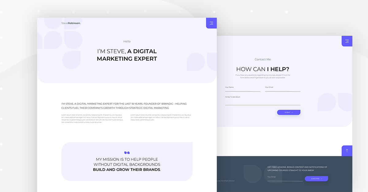
The simplicity of the About page’s design gives the prospective customer a calm setting for getting to know you as an expert and course provider. There’s a focused heading on the top for your name and a short bio, followed by a more elaborate introduction and description further below.
The enlarged quote inside the rounded rectangle creates a personal vibe between the website owner and the visitor, striking a brief conversation with a communicative edge.
The minimalist, understated Contact Us page encourages the visitor to concentrate on contacting the site owner, without any distractions or excess cognitive load.
This is why there are only three fields in our forms. The visitor’s decision to submit an inquiry should be simple, quick, and effortless in doing so.
Header, Footer and Menu Popup
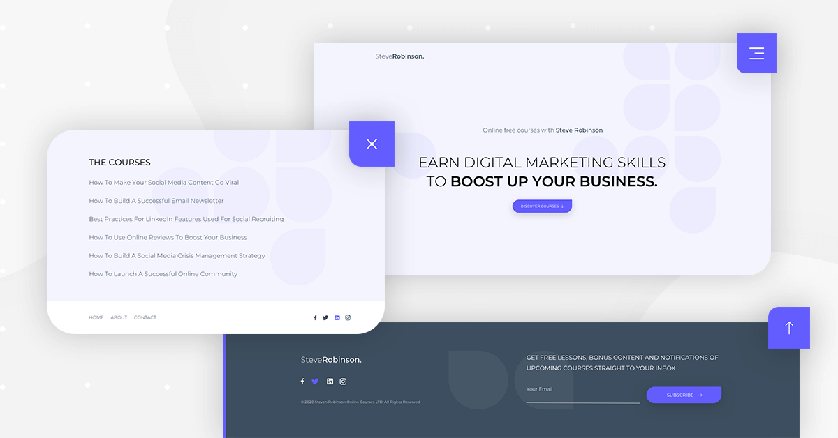
As for the header and footer, you’ll notice that the header is ‘just’ the logo and a hamburger menu, no navbar in sight. Once you click on the hamburger menu, you’re taken right to the popup that lists the available courses, which is essentially the most important information on the website.
The unique footer of this popup is basically what a typical header or footer on a homepage will look like. On the one hand, this feels very natural to the user because it follows the most common practice for what header and/or footer layout will include. At the same time, it’s super unique in that there’s a footer on the popup itself. It’s definitely a great balance!
The Menu popup is one of the most uniquely designed elements in the template kit. It’s not only delicate yet engaging, but it cuts to the chase right away, without being too aggressive.
Potential students are most interested in the course titles and learning more about each course, so the menu popup delivers exactly what they’re looking to find out.
Another uniquely user-friendly feature of this popup is the version of the header menu that runs across the bottom of the popup.
This eliminates the need to exit the list of courses in order to find the page you’re looking for. It really makes the Menu popup feel like a fluid and seamless section of the website, which is definitely what we’re aiming for as web creators.
The footer is a well-designed, standard website footer. It shows the minimum viable information needed for any website footer, making sure to show visitors the site owner’s social channels, with a subtle opportunity to subscribe to the site’s newsletter.
404
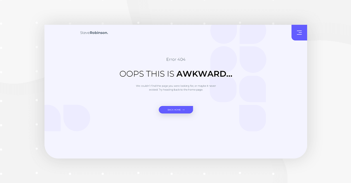
The concept of simplicity carries over to the 404 page. There’s no room for confusion. The visitor is well aware that he’s on a broken or unavailable page, yet he also knows that he’s still on the site and can return the previous page.
Help Popup For Increasing Leads
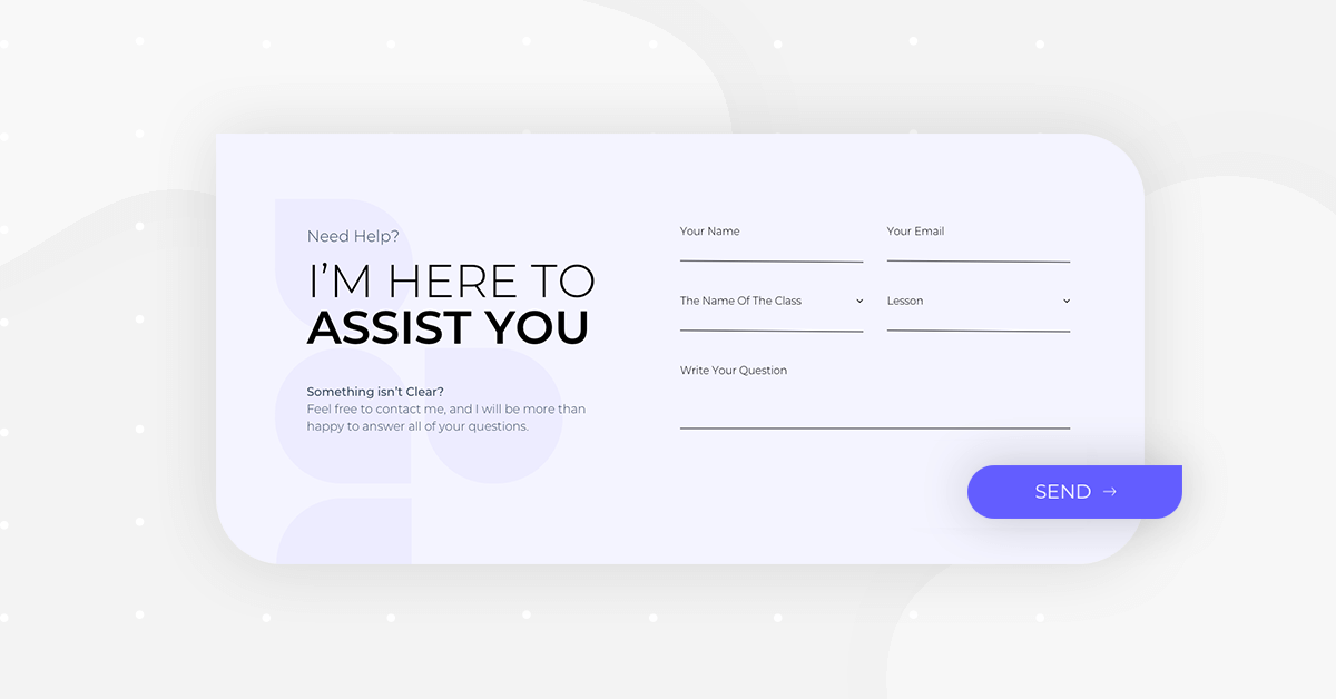
The Help popup clearly indicates that it has two key objectives: first, a short message written by the business owner that needs to be conveyed to students. Second, a quick submission form that makes it easy for students to voice their questions or concerns, without spending too much time writing it.
As always, the design is delicate and simple, with modern yet engaging detail that creates a positive flair in the “conversation”.
Course Completed Popup
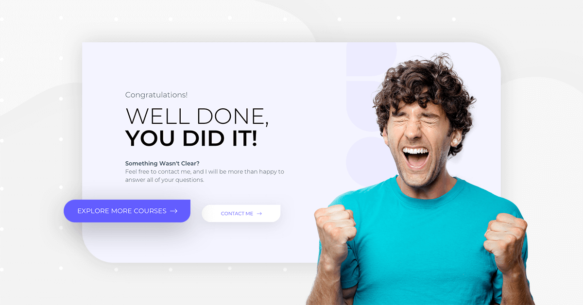
Much like the other two popups we mentioned, this popup is personable, yet sleek and subtle all the same. The space for visible and clear text in one column, with a large image in the other column makes the messaging all the more pronounced. A sense of rewarding positivity is present, and the friendliness of the popup encourages the user to “explore more courses” as it says in the first CTA. If you choose to insert a large image of yourself the same way the template does, you’re making your chances of the user clicking Contact Me even greater.
You Have Skills, Why Not Monetize Them?
Modern professionals have a lot to share nowadays. Between skill sets, certifications, thought leadership and more, almost every online user can benefit from an online course.
What’s more is that once your website includes online courses that you’ve published, your services and expertise get a real boost in their reputability and prestige.
The stronger you can present your experiences and capabilities, the more your business performance will benefit, and the more others can benefit from your accomplishments!
Grab This Kit Now!
If you have Elementor Pro, all you have to do to enjoy this cutting-edge kit is to go into Elementor, open the template library, and search for ‘Online Course’.
Here’s a short gif showing how to search for the kit:
What templates would you like to see next? Let us know in the comments below.
Looking for fresh content?
By entering your email, you agree to receive Elementor emails, including marketing emails,
and agree to our Terms & Conditions and Privacy Policy.


