
Mobile search and browsing has long since outpaced desktop. And, yet, conversion rates remain much lower among mobile users than their desktop peers. So, what’s going on here?
When it comes to designing landing pages for mobile, there are a number of issues that keep smartphone users from converting at higher rates. For instance:
- Slow-loading web pages
- Cluttered designs
- Hard-to-find CTAs
- Endless scrolling
- Tedious conversion processes
Now, these kinds of issues aren’t unique to the mobile user experience. However, they’re greatly exacerbated on mobile — and desktop vs. mobile conversion rate trends directly reflect this.
This is a big problem. The main purpose of a landing page is to turn visitors into subscribers, followers, members, customers, clients, and so on. If your marketing campaigns and web referrals are driving mobile users to your page and it’s not in a good position to convert them, you’re going to end up with a leaky and very costly funnel.
What web designers need to do now is come up with a new game plan. While responsive design has made it possible for mobile traffic to surpass desktop, more is needed.
Below, we’re going to look at why you need to build mobile-specific landing pages and how to do so so that they convert.
Table Of Contents
Grow Your Sales
- Incredibly Fast Store
- Sales Optimization
- Enterprise-Grade Security
- 24/7 Expert Service

- Incredibly Fast Store
- Sales Optimization
- Enterprise-Grade Security
- 24/7 Expert Service

- Prompt your Code & Add Custom Code, HTML, or CSS with ease
- Generate or edit with AI for Tailored Images
- Use Copilot for predictive stylized container layouts

- Prompt your Code & Add Custom Code, HTML, or CSS with ease
- Generate or edit with AI for Tailored Images
- Use Copilot for predictive stylized container layouts
- Craft or Translate Content at Lightning Speed
Top-Performing Website
- Super-Fast Websites
- Enterprise-Grade Security
- Any Site, Every Business
- 24/7 Expert Service

Top-Performing Website
- Super-Fast Websites
- Enterprise-Grade Security
- Any Site, Every Business
- 24/7 Expert Service
- Drag & Drop Website Builder, No Code Required
- Over 100 Widgets, for Every Purpose
- Professional Design Features for Pixel Perfect Design
- Drag & Drop Website Builder, No Code Required
- Over 100 Widgets, for Every Purpose
- Professional Design Features for Pixel Perfect Design
- Marketing & eCommerce Features to Increase Conversion
- Ensure Reliable Email Delivery for Your Website
- Simple Setup, No SMTP Configuration Needed
- Centralized Email Insights for Better Tracking
- Ensure Reliable Email Delivery for Your Website
- Simple Setup, No SMTP Configuration Needed
- Centralized Email Insights for Better Tracking

- Ensure Reliable Email Delivery for Your Website
- Simple Setup, No SMTP Configuration Needed
- Centralized Email Insights for Better Tracking
What Is a Mobile Landing Page?
A mobile landing page is a web page that’s designed specifically to convert mobile-device users.
Like a regular landing page, mobile landing pages act as a destination for users arriving from ad campaigns, online referrals, marketing campaigns, and search results.
A mobile landing page typically has only one call-to-action throughout it. In order to improve the chances of conversion on these pages, the navigation may be minimized, though that’s not always the case.
What’s the Difference Between Mobile and Desktop Landing Pages?
While the aims of both are basically the same (i.e. to convert), the design and call-to-action may not be.
This is because mobile user intent sometimes differs from that of desktop users. For instance, someone wanting to make a reservation from a restaurant’s home page might prefer to use the booking system on desktop and the click-to-call option on mobile.
The mobile experience isn’t always as easy to navigate on desktop either, so the ideal user journey may look different from device to device. For instance, a desktop user looking for auto insurance quotes gets directed to the following landing page on the Nationwide website:
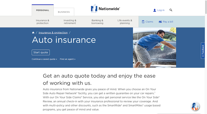
It’s minimally designed, well-organized and its goal is to help users start the quote process. Mobile users encounter a similar, though not identical, landing page:
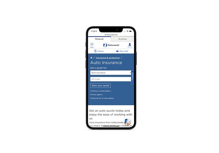
The hero section in both landing pages looks similar. However, the desktop version only gives users a “Start Quote” button whereas the mobile page provides them with a short form where they select which type of insurance quote they need as well as what their zip code is.
This is likely meant to cut down on how much work mobile quote shoppers would have to do if they ended up on the wrong type of quote page.
Why Do You Need a High-Performing Mobile Landing Page?
Let’s start with why designers need to create mobile-specific landing pages for their campaigns. According to 2019 data from SaleCycle published by Think with Google:
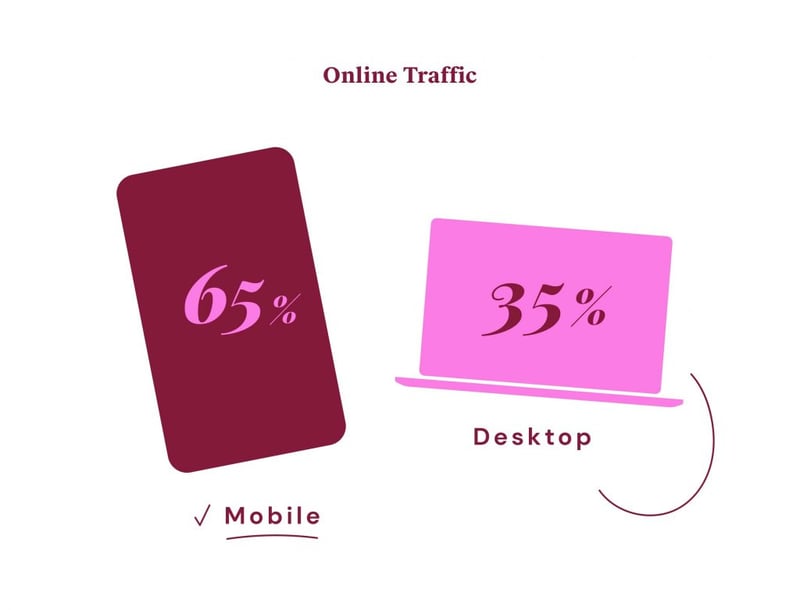
This gap between desktop and mobile traffic has been widening for years. It’s not just in search where we’re seeing more mobile users than desktop either.
Take Facebook, for example. It’s the most popular social media network, which makes it a highly valuable place to market and advertise one’s business and website.
According to 2021 Statista data, Facebook is primarily used by mobile users:
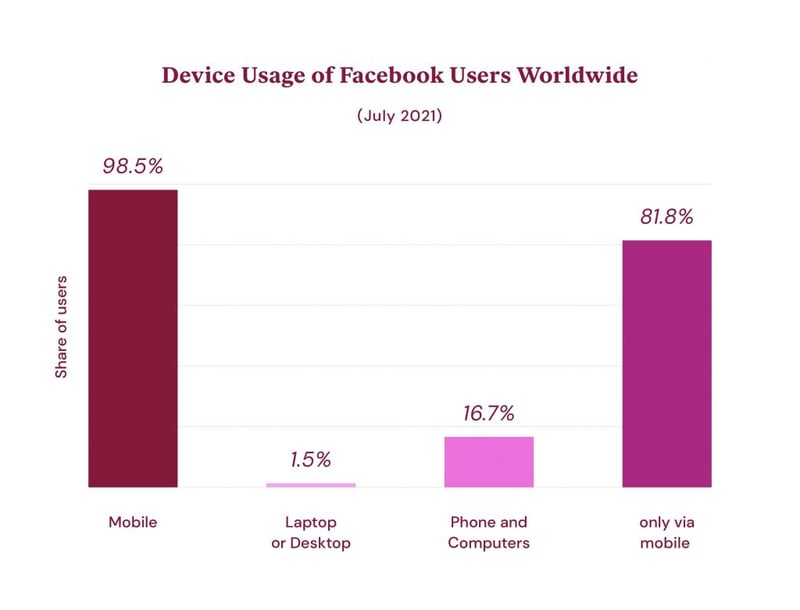
Only 1.5% of Facebook users access the application through a laptop or desktop computer. 16.7% have used both phones and computers to use Facebook. And a whopping 81.8% of Facebook users only access it via their smartphone.
It doesn’t matter how your clients are hoping to reach users online. Organic search results. Pay-per-click Google ads. Social media marketing and ad campaigns.
The majority of these marketing and sales campaigns are going to reach leads when they’re on their smartphones.
Unfortunately, data from the latest KIBO Ecommerce Quarterly Benchmarks report reveals that mobile users are not as likely to convert as those on desktop:
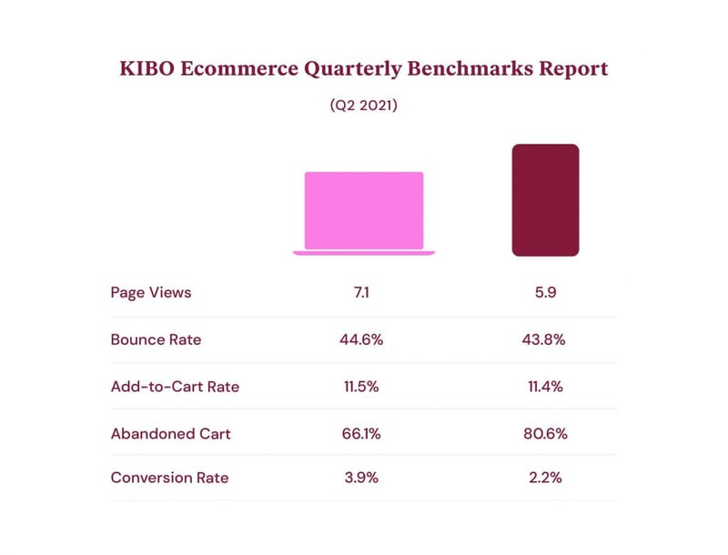
Despite mobile and desktop users having roughly the same add-to-cart rates, mobile users convert at nearly half the rate of desktop.
Now, there’s no data available on how many mobile users switch devices in order to complete their purchases. However, is that something you should be okay with? The goal is to make the user experience as fast, convenient, and enjoyable as possible, and making users jump from device to device in order to convert is not really conducive to that outcome.
If that’s not enough of an incentive, Google’s mobile-first indexing will be. In fact, Google doesn’t just reward optimized mobile landing pages with better rankings. It also tells its users when an ad is “Mobile Friendly”:
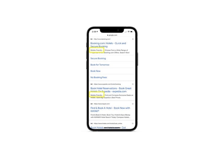
If your clients are going to spend money on Google ads to get their mobile landing pages in front of users, having a “Mobile-Friendly” differentiator could get them a bigger return on their investment.
Best Practices for Designing Mobile Landing Pages
Let’s quickly break down what you can do to maximize your mobile landing page’s conversions:
1. Design the Landing Page Using a Mobile Page Builder
In order to create a truly responsive and mobile-first landing page, you should design it with a mobile editor and tools. Let’s quickly look at how you can use the Elementor page builder to design a mobile-specific landing page.
The first thing to you can do with it is create a dedicated landing page:
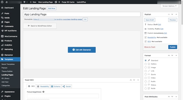
Unlike regular web pages, you’ll find Elementor’s Landing Pages under the Templates menu.
When you open the Elementor page builder, you can either build your page from scratch using Elementor widgets and features or you can pick out a responsive template for your landing page:
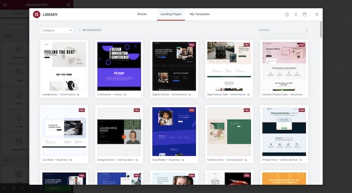
There are templates here for some of the most common types of landing pages. Sales pages. Event promotions. Product giveaways. And more.
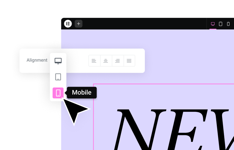
After you’ve loaded the landing page template to your page, switch to responsive mode so you can access Elementor’s mobile builder:
The mobile builder allows you to design and edit from an interface that’s the same size as the target users’ devices. You can also make edits that only apply to the mobile landing page.
2. Be Mindful of What Your Design Does to Loading Speed
Studies have found a direct correlation between mobile page loading speeds and bounce rates.
A recent report from Google, Deloitte, and 55 looked at 37 leading global brands and how changes in mobile speeds impacted their sites’ performance. The study found that just a 0.1-second improvement could significantly increase mobile conversions.
For example, retail sites experienced an 8.4% increase in conversions and a 9.2% increase in average order value. Lead generation pages, on the other hand, improved their bounce rates by 8.3%.
An older study from Google in 2017 backs up this relationship between mobile page speed and conversion (or lack thereof):
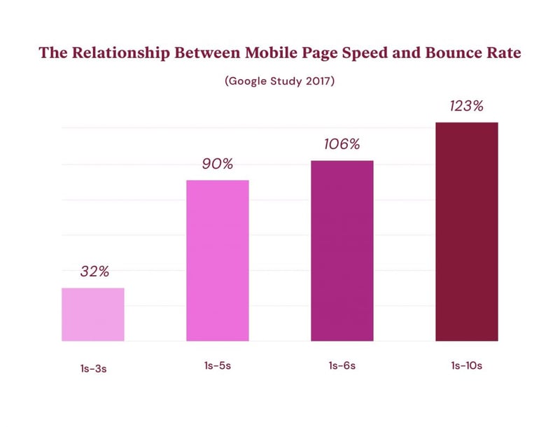
Anything you can do to make your mobile landing pages load more quickly is a must. For example, our experts are huge proponents of image optimization and recommend using images that weigh no more than 22KB-33KB to keep sites loading lightning-fast.
Want more speeds optimization tips? Here are 19 optimizations to get you started.
3. Go Minimal With the Design
When it comes to designing mobile landing pages, you want to commit to all of the good design practices you’d apply to the rest of the site. That said, be mindful of how long these pages can get.
Some mobile landing pages don’t end up being all that long. Take Marie Forleo’s landing page:
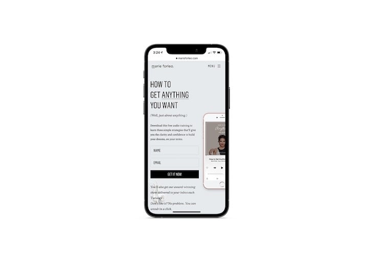
What you see is what you get. Beneath this invitation to download her audio training, there’s nothing but a footer with some “As Seen On” logos.
Even so, this page could’ve ended up being longer if the designer had used a traditional responsive wrapping approach. Here’s why:
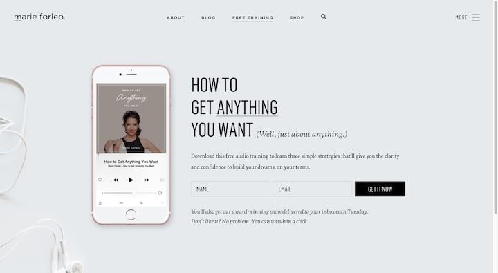
If this page had been allowed to reshape itself responsively, the phone graphic would’ve appeared on its own row and the text and form would’ve been pushed down. This essentially would double the length of the page on mobile. It’s not a big deal on a landing page this small, but it could have a significant impact on a lengthier one.
So, when designing mobile landing pages, always think about what you can do to make them as short as possible without compromising the content. Can you remove images? Close up spacing? Place the CTA and form above the fold so visitors can convert without having to scroll through everything else?
These are all things you should be thinking about.
4. Include Sticky Bars and Buttons When Relevant
It used to be that sales landing pages didn’t come with a header. The design choice made it easier for visitors to focus on the page’s offer and nothing else.
However, when designing lengthy landing pages on mobile, that might not be the best idea. Unless the page is mainly attracting highly qualified visitors and a good portion of them are guaranteed to convert, a navigation-less landing page may leave your mobile users feeling “stuck”.
You also have to think about how it can affect their scrolling experience. Without navigation or, at the very least, a sticky “Click to Scroll” button, they’re going to have to do a ton of scrolling to get back to the top of the page, to the very bottom of it, or to back out to another page.
That’s why it’s a good idea to build your mobile landing pages with minimal and sticky navigation.
With Elementor, this is easy to do.
Let’s use this mobile app landing page template as our example:
All you need to do is add a header to the top of the page (which you can do using Elementor block templates) and then use Motion Effects to make it sticky.
5. Add Visual Breaks to the Copy
While you can’t always dictate how much content goes on a landing page, the design choices you make can improve how quickly users can scan through and read it.
When it comes to copy, hierarchy and spacing are going to be really important.
Here’s another example of an Elementor landing page template:
This one is for an ecommerce store that sells cameras. These kinds of pages tend to be chock full of information about the product’s features, specifications, uses, reviews, and so on.
To make sure the user can find the most important bits, use big header tags to introduce and organize the content. And shorten the paragraphs whenever possible. You never want your mobile users to have to scroll in order to be able to finish a single paragraph. Bolded phrases, testimonial quote boxes, and icons are other ways you can make your copy’s design more mobile-friendly.
6. Don’t Bury the CTA
Your landing page has one goal: To convert.
For a regular web page, you might not want to introduce your call-to-action until the very end of the page — until after you educated them a bit. However, landing page visitors don’t always need that level of hand-holding.
Because they’re usually directed to a landing page from a targeted ad or marketing campaign, they’re somewhat familiar with what they’re going to find there. So, there’s no sense in burying the CTA in the middle or bottom of the page, especially on a long mobile page.
Instead, put it right up front and then again at the bottom of the page. Depending on the length of the mobile landing page, it might also be a good idea to place the CTA in the middle of the page as well!
This is another reason why it’s a good idea to start with an Elementor landing page template. The CTA always appears above-the-fold and again at the bottom. This goes for buttons as well as forms.
8 Examples of High-Converting Mobile Landing Pages
There are so many ways to convert visitors to a landing page. Buy Now. Subscribe to Our Newsletter. Schedule a Demo. Because there’s so much you can do with mobile landing pages, there’s no one-size-fits-all solution in terms of designing them.
Let’s look at some of the different ways that popular landing pages have optimized the mobile experience for conversion:
1. ClickUp
ClickUp is a productivity app that helps professionals do a number of things, including managing their time. In fact, this is one of the first landing pages people see in Google when searching for a time management solution.
The above-the-fold area is well-designed. It includes a quick sale of the product with a single-field form to get the user started.
If they need more time to read about the product before making up their mind, that’s okay. The bottom of the page has the same CTA. And they can always use the sticky header at any point if they want to bypass all this information and just sign up.
While there’s a ton of information here, the designer has done a great job breaking it up into digestible chunks.
The headers are big, bold, and easy to find, which makes for a great scanning experience. The animated graphics also contribute to an easy scanning experience as visitors can quickly focus on the visual storyline on the page and not miss anything important.
2. CoPilot
CoPilot is a service that connects its customers to fitness and nutrition coaches. This particular landing page we’re looking at is the CoPilot home page.
The top of the page is perfect. There’s a small image paired with a tiny bit of copy that sums up what users will find here.
Rather than bog down the landing page with a lengthy intake form, the designer has moved it out of the way and left users with a “Find your coach” button instead. Once you see how many steps there are in the long, yet well-designed form, you’ll see why this was a smart choice.
For visitors who don’t jump right into looking for a coach, the rest of the landing page offers just as streamlined of an experience. It takes just a few scrolls to look through the “As seen on” logos, list of benefits, and pricing.
If you’re designing a mobile landing page for a service or product that users urgently want or need, designing it to be as concise and intuitive as CoPilot has is a good move.
3. Fandango
Someone looking forward to going to the movies will usually have a specific flick in mind. While they could just as well go to the Fandango home page and use the navigation to find the movie’s landing page, a quick Google search or a click on a social media ad for it could instantly take them there as well.
That was the case when I searched for Malignant showtimes.
There are so many great things about the design of this mobile landing page. For starters, it’s not the usual information overload you find on the main Fandango home page. This page is solely dedicated to this movie.
What’s more, the movie details are presented in an orderly fashion.
- The user can watch the trailer if they want a one-minute reminder of what it’s about.
- They can read the movie’s synopsis or explore reviews to further help their decision-making process.
- The site automatically detects their zip code so they see the most relevant location results first.
- They can then use the date selector to search for showtimes. No dropdown is needed. The times appear as individual buttons.
- When showtimes are available, the user can click on the time they want and they’ll be instantly directed to the checkout process.
The sticky header and footer are also noteworthy. They make this website feel more like a mobile app than a mobile website, with quick-action links available within the thumb zone.
4. HoneyBook
HoneyBook is a client management software, so it makes sense that it would give away professional contract templates. Templates are always a great way to get leads in the door even if they’re not ready to become full-fledged clients just yet. They also provide extra value to existing clients.
If you were to look at this page in its entirety, you’d see that it’s a pretty standard landing page. The call-to-action sits above the fold for users who are ready to convert. For those who need a little more persuading, they can scroll down and explore the various features and benefits of using high-quality contract templates.
If at any point they decide they need no further convincing, there’s a “Get Started” button ready to take them back up to the form.
The reason why I called out this form, in particular, is because of how mobile-friendly it is.
For starters, users can bypass the form and “Connect with Facebook” instead. Considering what we saw earlier about the percentage of Facebook mobile users, this is a great idea. They won’t have to fill anything out, which will make converting all the easier.
For those who don’t want to sign up through Facebook, the form won’t pose any obstacle to conversion either. The keyboard input changes as they enter their details into the two fields: “Full name” and “Email”. All that’s left to do is click “Start a Free Trial”.
5. ResortPass
ResortPass is an interesting service. It gives people the ability to book day passes to pools, spas, and resorts.
Similar to the Fandango example, users don’t need to sift through the entire ResortPass site in order to find the pass they want. They can use Google search results or one-click ads that will take them directly to the landing page of the place they want to go.
This page for InterContinental Miami is designed a lot like an ecommerce page — images at the top, description in the middle, reviews at the bottom. The main difference is that it’s distraction-free (i.e., no ads or “Similar Hotels” recommendations), and there are multiple CTA buttons that appear throughout the page for their convenience.
This is going to be a really effective design for conversion.
Let’s say someone is out and about in Miami and gets the urge to spend the rest of the afternoon poolside. A quick mobile search will take them to this page, which does a beautiful job promoting the experience and clearly and logically explains the features of the pass. What’s more, the “Book Now” button is never more than a scroll away on mobile.
6. Rocket Lawyer
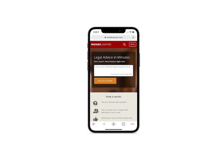
When you need quick legal advice and assistance, a service like Rocket Lawyer’s can really come in handy.
There’s actually not a lot to this mobile landing page, just the open-ended “Legal Advice in Minutes” form at the top and some basic information about how it works below.
What I wanted to do for this example is to show you how making small tweaks to the desktop design can create a much more streamlined experience for mobile users.
Here’s what the desktop landing page looks like:
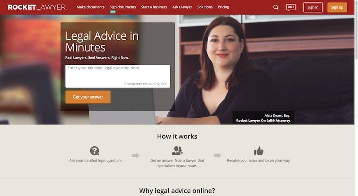
It’s just as well-designed as the mobile page. However, there’s a bit more to it.
There’s a background image at the top that introduces one of Rocket Lawyer’s attorneys. On mobile, this image doesn’t exist. Also, the desktop page lays out the “How it works” section as a process with arrows taking visitors from one step to another. On mobile, the steps are laid out vertically and the arrows are gone.
Was anything lost by doing this? Not really. In fact, mobile users have more to gain from this simplified design.
The removal of the background image means there’s one less thing they have to review before submitting their legal question. Plus, the lack of background image probably also helps this mobile landing page load more quickly.
7. Teachable
Teachable is a course-building and hosting platform for anyone who wants to publish their own online courses.
The page above was promoted in the notification bar of the main site in early September. It’s for Teachable’s training webinar “How to Sell More With a Powerful Sales Page.”
This is much more along the lines of what a high-ticket sales funnel page would look like. All the key elements are there:
- Call-to-action above-the-fold
- Acknowledgment of the users’ pain
- Benefits of the training
- Call-to-action
- Introduction of the experts
- Testimonials
- FAQs accordion
- Call-to-action
That said, the design of this landing page is nowhere near as long as many sales landing pages end up being, which is a good thing. Teachable is a known and trusted brand, so it doesn’t need that much space to convince visitors to sign up for their free training. All it needs is this attractive design and concise copy to get the job done.
This is a great example of how less is more in mobile design. If you can tap into your client’s brand reputation and design a more efficient landing page for mobile users, do it. The page will be more likely to convert if it takes less time and works for them to get through it all.
8. WP Engine
WP Engine is a managed WordPress hosting company. They’re especially focused on providing high-speed hosting for WordPress website clients, which is why this Performance landing page is a really important one in their marketing and sales process.
While we could examine the attractive design of this mobile page, there are two features of this site I want to call your attention to instead.
The first is its telephony features. Notice what happens when I get to the end of the page.
When I click on the live chat widget, it doesn’t open a tiny pop-up in the corner, which is what we’re used to seeing on desktop. It opens a full-screen chat module, not all that different from the one you’d use to text or DM someone.
After that, I click on the “Sales” phone number at the top. The page then opens my phone’s dialing prompt.
Both of these are essential landing page features when selling high-ticket or complex items. While it would be great if visitors were ready to convert by the time they got to the end of the page, they’re probably going to need more convincing than that. And mobile-friendly sales chat features like these can really help your landing page turn more of those on-the-fence leads into conversions instead of bounces.
The other impressive feature I want to point out is how quickly it loads. From PageSpeed Insights:
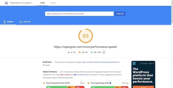
I have tested lots of pages with this tool and it’s very rare to see a mobile landing page score this high. Not only is this a testament to the high-quality mobile design of the page, but also to WP Engine’s speedy hosting services.
Conclusion
The data doesn’t lie. There’s more online activity taking place over smartphones than on other devices. However, smartphone users still remain hesitant about converting on these devices.
Because of this, web designers need to pay extra attention to the mobile experience when building landing pages. The whole purpose of these pages is to convert visitors, so they need to be designed in a way that puts smartphone users’ minds at ease.
That means:
- Minimizing how much content they have to scroll through
- Applying your visually creative touch to copy as well as the surrounding design
- Not being afraid to remove the excess from desktop in order to create a more streamlined mobile experience
- Adding sticky elements to the page so mobile users don’t feel stuck or overwhelmed
- Making sure the call-to-action is always within a scroll or two of the mobile user, no matter where they are on the page
Since there is a formula to this, it’s a good idea to get yourself a mobile editor and toolkit that’ll enable you to quickly design mobile-specific landing pages for your clients. As we’ve seen above, Elementor’s page builder and collection of widgets, features, and templates can help you do just that.
Looking for fresh content?
By entering your email, you agree to receive Elementor emails, including marketing emails,
and agree to our Terms & Conditions and Privacy Policy.
