Table of Contents
About the author: Mark Gerkules, Web Designer @ Elementor
Mark is a Web Designer at Elementor. Apart from his love for UI/UX, he loves football, traveling around the world, and a good schnitzel.
If you’ve ever asked yourself “what’s a hero image?”, you’ve come to the right place. In this post, we delve into the subject of hero images in web design and how you can build and design them to create powerful visual effects.
A hero image is the term used by web creators to describe oversized content at the top of a webpage (“above the fold” content, to be exact). This content falls within the encompassing “hero section”: any visual content or text that falls above the fold.
The role of a hero image is to welcome your visitor at their first glimpse of your company or organization. The abundance of hero image-types in the web creation toolbox make it easy to imagine why there are so many reasons to include a hero image in your site. Let’s understand the top benefits of doing so, and whyHow To Design a Hero Image: Best Practices and Examples these techniques have become major web design trends among web creators.
Table Of Contents
What Is a Hero Image?
Embracing the virtue of “a good first impression”, hero images usually have one or more of the following characteristics:
- A high-quality photograph
- An engaging video
- An image slider or media carousel
- An animated or static illustration
- Headings and descriptions next to or in front of the visual content
In terms of styling, common design details that you’ll see applied to hero images include:
- Background images or videos with background overlays
- Fixed or sticky positioning
- Hover effects the change the transparency or overlay
- Elements of contrast that differentiate the image from the header above it or from the content that ensues
The novelty of hero images in web design is that on the one hand, you’re working with a very specific, defined space on the web page. On the other hand, the choices of styling, effects, and techniques to use when designing this part of your page content — are absolutely endless.
Why Should You Use a Hero Image?
When the design and functionality of your hero image hold a high caliber, you automatically attain credibility and user trust. Your hero image and its surrounding hero content often present your first opportunity to relay your organization’s unique selling point, and the main user touchpoint for conversion. When you’re looking to trigger certain user behaviors, a powerful top-notch hero image that makes a strong first impression on your visitors is the way to start.
You Can Make a Lasting First Impression
First impressions matter in many areas of life, but especially when it comes to how users relate to website aesthetics.
Human-Computer Interaction (HCI) and Visualization expert findings at Google Research attest to the influence hero images have on a website’s success:
This study, “The role of visual complexity and prototypicality regarding first impression of websites: Working towards understanding aesthetic judgments” investigates how visual complexity and prototypicality impact a website’s design and its users’ first impressions.
The authors showed 119 real website screenshots to their study participants, and found that visual complexity and prototypicality affect user aesthetic perception within the first 50ms of exposure, and sometimes even within 17ms.
As web creators, our takeaway from these findings is fairly straightforward: the hero image we choose and how we present it on our page influences user sentiment and behavior(s) in a major way.
You’ll Make the Most Of Your Above the Fold Content
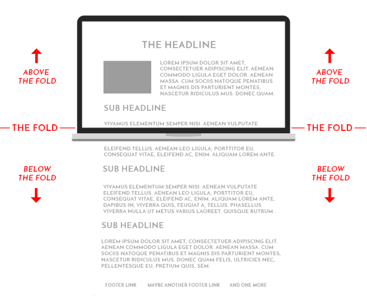
A webpage’s “above the fold” section can be defined in simple terms: the content that fills your screen/appears above the web browser window’s bottom border once your page loads. If the content requires scrolling in order to be seen, it means it’s located “below the fold”.
The “above the fold” concept originates in print design and publishing, long before the days of digital media. We all know what it’s like to immediately notice something on the top half of a front page, and it’s even safe to say that front page content is often what makes us decide whether or not to buy a newspaper, or simply stop at a newsstand.
This is exactly why your above the fold content can be a major deal-breaker in your website success.
What do we mean?
If a site visitor is confused by your above the fold content and imagery, he may be quick to exit your site. If your hero image and its surrounding above the fold content are clear, engaging, and well-representative of your value proposition, he’s more inclined to stay put.
Ultimately, the more you invest in your hero image and content, the less likely users are to make a quick exit.
Don’t Forget Responsive Design
Keep in mind that the location of a screen’s fold is subjective to the device’s screen size. This is an important consideration in responsive design, as above the fold content must be styled and configured in a way that’s applicable to more than one device size.
Web designers and developers often use device-specific breakpoints to guarantee this responsiveness. This gives you complete control over your site design’s adaptivity to relevant screen sizes, and avoids compromised appearance or impact of your hero image.
You State Your Value Proposition Without Information Overload

You might be familiar with the concept “information overload” in website design and user experience: we want to prevent using too much content, especially written content, when representing our brand and business value.
In this sense, using a picture, illustration, or video is worth 1,000 words. Honing down on effective brand imagery will capture your entire story in one visual medium. Instead of verbalizing your brand story and proposition, you may be able to lighten your user’s cognitive load in a simple, user-friendly way.
The screenshot above is taken from Millbrook Construction, a Perth-based construction company specializing in “residential construction with a high-end finish and attention to detail”. For their Elementor site, the homepage hero image makes perfect use of its “above the fold” interface. The appealing, crisp photograph of a blissful, modern home and outdoor pool triggers positive, relaxing vibes.
Taking this one step further, the styling choices of full-height and “Cover” sized background image indicate the company’s robust talent for creating luxurious residential properties. The value proposition is as clear as the pool water, and users comfortably absorb all the information necessary.
Your Hero Images Can Help Convert Leads

Engaging, visible touch points are a basic ingredient for a conversion-breeding user flow. This is why the relationship between hero section’s call to action and your hero image itself can make or break your website creation goals.
Whether your CTA texts read “Sign Up Now”, “Learn More”, “Contact Us”, and the like, your hero image must be seamlessly coordinated on all fronts: visibility, messaging, color scheme, look and feel, and more.
Credible, effective conversations with prospective customers rely on a comfortable, natural atmosphere; visually pleasing imagery is the way to make this happen.
This is exactly what we see on the Elementor site created by Caricature STL, a team of caricature artists who provide event entertainment services. The animated headline (hero text) accounts for the happy customers in their hero images, showing what the caricature artists provide for each person.
The 4 Types of Hero Images
So, once you’ve rolled up your sleeves and start addressing the practicalities, what goes into the decision process of which type of hero image to use?
Let’s explore the four different types of hero images and how to evaluate which one will fit your site best.
#1 Product Hero Image
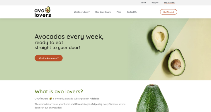
A product hero image is a large, high-definition image of the brand’s product. These images can be presented in static or in motion/in action — as long as they visualize the product’s value proposition.
Popular ways among web creators to present and style their product hero images can include:
- A detailed example/snapshot of an individual product, as we see above on Australian subscription company avo lover’s site.
- A screenshot of a digital product interface, such as a dashboard.
Product hero images are commonly found on e-commerce sites (although not exclusively). Prospective shoppers expect to see real product examples, fostering educated decision-making about the store’s relevance to their shopping needs.
Avo lover used Elementor to build their e-commerce site, used by their customers to sign up for weekly subscriptions of fresh avocados delivered to their door.
Avo lover’s customer base is a niche market within a narrowly defined area of interest, and so their product hero image choice makes perfect sense. Prospective subscribers are avocado enthusiasts; seeing an up-close, intricate photograph of the produce is exactly what they’re looking to see.
Best Practices:
- Invest in the Quality of Background Images
Whether your background image is a photograph, a video, an illustration, etc., the image file should be as lightweight as possible, with crystal-clear resolution.
- Pay Attention to Levels of Contrast
If you’re adding text in front of your hero image (or a component of any kind) — make sure the contrast between the website elements is strong and easily visible. This is where background overlays and filter effects can be extremely helpful.
#2 Customer Hero Image
The next type of hero image used by online businesses takes an alternative approach to showing their added value: showing their customer using the product. This perspective is a strategic way to empathize with your online visitors, succinctly demonstrating that you understand their pain point and can satisfy their needs.
The video snippet above is taken from the Elementor site created by Alexander Fischer, a Stuggart-based personal trainer who provides an array of health and fitness-related services.
Alexander’s customer hero image was shows more than just a satisfied client enjoying a healthy, fit lifestyle. The hero image goes the extra mile by presenting a video that presents his client bonding and connecting with loved ones. Clients become up to the task of engaging in youthful activities, since their personal trainer has helped them get back into shape.
Best Practices:
- Convey Your Use-Cases & Customer Experience
Differentiate your product by showing its most dominant use-case. An image that conveys your business goals and value demonstrates how the visitor will benefit from your one-of-a-kind offering.
- Relate To Your Target Audience
Make sure your target audience is accounted for when you select the type of person to feature in your image. Choose an image that communicates your understanding of the field and ability to delight your clients.
#3 Founder Hero Image
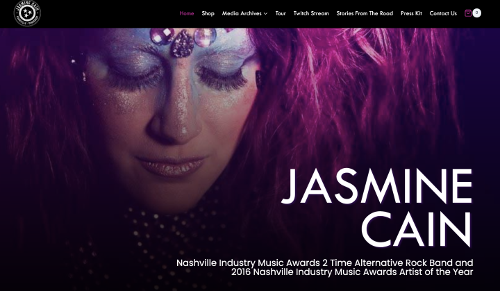
A founder hero image is a large image of the founder of the business owner, placed in the hero section to greet the site visitor upon arrival.
Founder hero images are often used in independent portfolio websites, individual business owners like a psychologist, makeup artists, or musicians, as shown in Jasmine Cain’s Elementor website above.
A founder hero image’s greatest virtue is that it puts a face to a name; it connects the website visitor to the service provider, creating a personable dynamic between the two individuals.
Choosing the footage for your founder hero image should be handled with care. With many options to choose from, what it comes down to is: what will convey your brand message in the strongest possible way? Is it a picture of the founder looking directly at the camera and smiling, or perhaps looking in a different direction? Or, would a candid photograph of the business owner hard at work be a better fit?
Best Practices:
- Pay Attention To Sizing & Dimensions
Use a clear, correctly-sized image (or video) that shows visitors the exact details they need to see. If necessary, you can focus on more important areas in your images by cropping them and removing less important content.
- Focus On What Your Image Should Convey
The role of the background should be to emphasize the person in front of it, not the other way around. The most impactful founder hero images will show the business owner smiling, implying his passion for customer happiness.
#4 Non-Contextual Hero Image
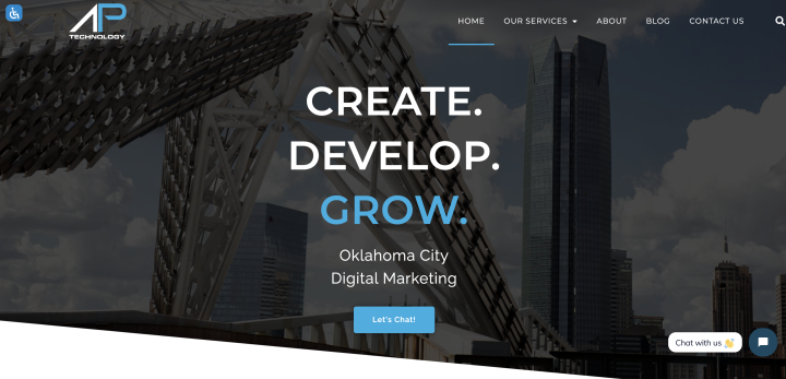
Non-contextual hero images are, as the name suggests, footage that displays something seemingly “unrelated” to the product or business owner. The goal of a non-contextual hero image is to make an impression on the visitor through visual association or subliminal messaging. Seeing the non-contextual image shows the user what the product or brand is about, but in an indirect way.
This technique is used, for example, in the sample above from the Elementor site built by Oklahoma-based digital marketing firm AP Technology. The firm’s website uses a wide and clear background image that shows a unique angle of Oklahoma City skyscrapers. This photograph depicts the business’s value proposition, as stated in the site’s hero text: build your business and watch it grow, as tall as the city’s highest office towers.
As soon as the human eye sees the physical structures towering over the sky, it understands that these marketing professionals work to lift businesses off the ground, as far as sky-high.
Best Practices:
- Make Sure Visitors Understand Why the Image Is Relevant
Although you’re not displaying a direct visual of your product itself, make sure your product value’s connection with your non-contextual hero image is still easy to identify. Users shouldn’t need to spend time thinking about its relevance.
- Draw a Clear Connection Between Hero Image and Hero Text
The hero text you place in conjunction with your image must be directly related to its visual content. This is a necessity, even if it requires multiple iterations of your text and choice of wording.
- Create a Cohesive Design Scheme
The colors you choose for button texts and backgrounds, headings, or descriptions should be coordinated with the hero image or illustration. This also applies to your site’s clickable accents: the nav menu items, the logo, etc.
We all know how important a consistent visual language is to our website prestige, brand presence, and professional credibility. This is where design style guides can be really helpful, especially to ensure that your hero images are aligned with your website design.
How To Test Your Hero Image: Methods We Love
Once you start testing multiple options for your hero image, you can immediately gauge which option drives more engagement and derive insights into which design is more effective — and ultimately stick to that one.
Here are some go-to testing methods that are easy to set up, and provide a wealth of knowledge for making sure you’re using the best hero image possible.
A/B Test Your Hero Image
A/B testing requires the designer to create two or more options for the hero section (be it two versions of the headings and their copy, the hero image itself, the section’s layout, the font sizing, or anything else you can think of) — it’s completely up to you.
Imagine that you’ve decided to use a blend mode for when users hover over your hero image, but you’re not sure which mode will enhance the user experience most.
Performing an A/B test between two different mode options (there are 13 blend mode options, after all), lets you try out more than one mode to see which one generates more hovering, clicking, and ultimately more engagement.
One of the most common and important steps in A/B testing your hero section is to also test at least two CTA button options — to identify which button breeds the most conversions.
More specifically, testing the color of a CTA button is always a helpful experiment that lets you understand which button color attracts and engages users the most. Button color A/B tests are widely popular among web creators, as they’re quick and easy to perform and barely require any additional design resources.
Use Heatmap Tools To Discover User Behavior
Heatmap tools identify and analyze where users click on a webpage. These tools allow website and landing page owners to see exactly how users are actively navigating the content. This is accomplished once the tool identifies whether or not users engage with the main elements (and how so), such as links, buttons, opt-ins, and of course, CTAs.
Some insights that website owners can derive from using heatmap tools include:
- Non-clickable elements are distracting users.
- Button sizes are too big or too small.
- Button colors aren’t visible.
Be Your Website’s Hero
Designing your hero section and its hero image is one of the most crucial and influential decisions in your web design process. Web creators often relate to a website’s hero section as the “opening act” of your website presentation, essentially your welcome gesture.
Website trends constantly evolve, adding new features to web creation possibilities. It’s always important to keep your hero section at the forefront of your design considerations — making sure it always reaches its potential in introducing your website to the crowds.
We’re always looking for inspiration and ideas for powerful hero images and how to create them in a unique way.
Show us your examples in the comments!
Looking for fresh content?
By entering your email, you agree to receive Elementor emails, including marketing emails,
and agree to our Terms & Conditions and Privacy Policy.


