In this era of digital acceleration, every few days we hear about a new AI tool that can shift our work processes. Add that to the incredible speed in which ideas and information is consumed, climate issues, and the recession, it’s no wonder we feel a bit overwhelmed. Everything is extreme. Do we actively participate in the exploration of new technologies and innovations, or do we stay in the comfort zone of the familiar?
Beyond that, how do we mediate content to users who have short attention spans with little or no capacity to focus? How do we get them to engage? In this article, we will try to mirror the spirit of the day to web practices and highlight some of the inspirational ideas we have found that are bound to spark and stimulate the mind. Join us in this portrayal of 2023 trends in web design.
01
Goblin mode – maximalism
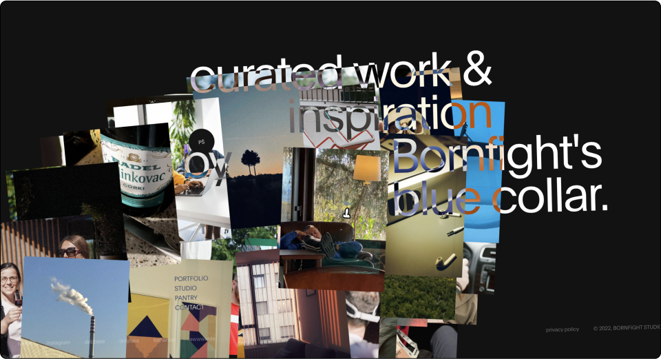
‘Goblin Mode’ has been chosen as the 2022 Oxford Word of the Year. The term refers to “a type of behavior which is unapologetically self-indulgent, lazy, or slovenly, and typically rejects social norms or expectations. ”It has become the first word of the year to have been decided by public vote.
It’s no secret that we, as a society, have slowly slipped into self indulgence over the past few decades. At times, it’s embarrassing and at times excessive, but you can see this in all aspects of western life. Athletic fashion wear, shopping everything online, ordering fast food when we feel lazy, and binging on the latest TV series. These are just some examples of modern-day living that create the perfect atmosphere for our inner goblin to break through, and it’s intriguing to think how this will affect web design in the future.
These newly evolved social norms, as the goblin term reflects, are interesting when we correlate them to UI and UX design. At its core, UI and UX design is a field based on standards, best practices, and the study of users, while trying to be as inclusive as possible. One of the ways we see this trend in action is through goblin websites that put the brand first, before the user. Ignoring best practices and even accessibility at times, these websites question what is “beauty.” They aspire to strengthen the brand presence, making the website memorable and engaging using a rough style, overflow of imagery, duplications, strong colors, loudness, harsh entrance animations, multiple objects, etc. We can fall in love with these websites, or criticize them, but we can’t pretend that we have never used one or two of those gimmicks to enhance a website’s presence.
Bornfight studio is a small agency that specializes in web production. Their Goblin attitude is manifested through their website’s tone of voice, which is very “in-your-face,” uninhibited and somewhat cheeky. Take their amusing cookie banner, for example – “life is bitter so we use cookies,” or the candid claim that they work for compliments and money, and the overwhelming, yet gorgeous, hover animations of overlapping imagery.
02
Simplicity and minimalism
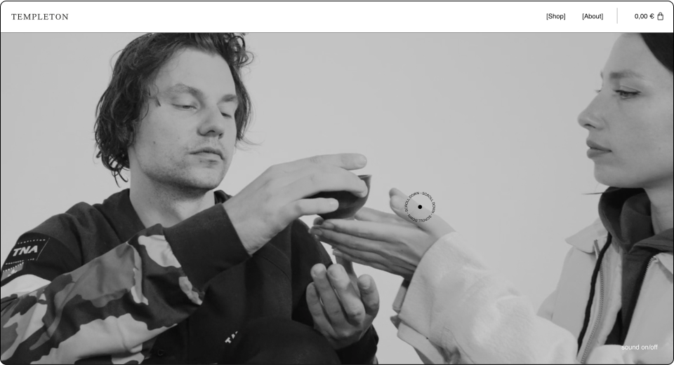
On the other side of the spectrum to maximalism, we see a simplicity movement that claims all we need is some balance – an exercise in “slowing down.” This trend creates a pleasing and relaxing experience for the user and is opposite to the “all about appearances culture.”
We will see more and more websites that explore simplicity through the reduction of details, asking to reach anonymity.
These websites sometimes act like a structure or designed wireframe, using minimalistic typography, a limited range of type styles within the site, muted colors that co-align with big images or with amorphic illustrations that replace detailed UX-illustrations. Moreover, at times a sweet animation scroll wraps the website, and makes you float into serenity.
Surprisingly, It can be a tough process to design a website like this, as designer maturity is required to understand where the essence lies and what is redundant. These websites sometimes pop more, both in terms of style and performance, making them stand apart from competitor websites that are loaded with content and images.
Templeton Clothing is an ecommerce website from the Bavarian Northern Alps. A quick look at their hero section is enough to understand their attitude; slow motion animation, no promotions or no CTA. Using no words, they are asking you to ease in and scroll. The overall black and white linear borders and big images fit their “anti-design, spotlighting the products as the main thing and the branding as secondary.
03
Hyper-delights in a website journey
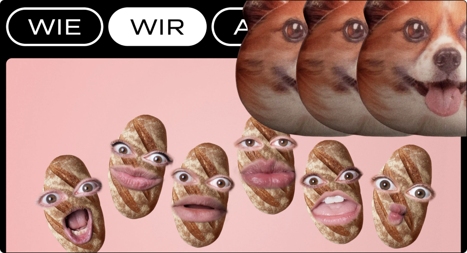
Last year we talked about scrollytelling, and although it feels like a decade ago, this year, it seems like the web experience took several steps forward with new ways to engage.
Before we create a website, we map out a user journey and for functional reasons – we create a structure and framework. If we parallel it to the real world, the website is a path we want the user to walk along towards conversion. The question this trend raises is, what is this user journey and what is it supposed to look like in 2023?
This ‘delight’ approach inspires us to start thinking about the website as more than just a set of pages, but rather, as a 3 dimensional experience. The overall goal of course, is to keep users involved and curious, and to lead them forward in the path with surprises and joyful easter-eggs along the way. A great example for such a cheerful delight is the animated cursor, which can play an important role in enhancing the user experience in web design.
Out of this school of thought, we can think of the features we used to dismiss as technical, forks in the road, such as the menu or internal links, CTA and the ends of the road as well – such as the footer or 404. In these “areas of conflict,” we can map the feelings users might experience such as success or failure, interest, trust or suspicion, etc. Adding animations, marketing messaging and humorous motifs can ease the user experience and tighten the bond between the user and the brand. It seems, for the time being, clients don’t have strong feelings regarding these areas, which makes them the ideal place for letting our creativity loose.
Studio Brot is a design agency that focuses on advertising and branding. Their services are broken down and simplified, presented to the user in the form of a bread baking metaphor (Brot – German for bread). We fell in love with their navigational techniques and the various animations throughout the website that always keep you on edge, making you wonder what to expect next.
04
Ecommerce – A near-touchable experience
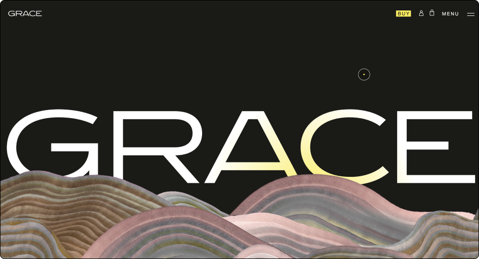
As part of the blurring of boundaries between the physical and virtual, it’s fascinating to dive in and foresee the changes in the e-commerce arena. It’s a bit of a paradox. On the one hand, physical design is becoming hyper digitized, yet on the other hand, some daring ecommerce websites suggest a sensual, touchable buying experience.
For good reason, a lot of us enjoy entering a clothing store, the smell of new clothes, or trying on a shirt and feeling the softness of the fabric. This web trend tries to reproduce a real shopping experience through interactive product displays that add another layer of dimension to make the whole buying process almost tangible.
Even with a small budget, we can try to stimulate the user’s senses using lottie animations, rotation, and 3d animations – all to encourage the user to explore and engage with the product we are selling. This creates a powerful, memorable feeling of discovery of the product’s features, angles and lighting with a great sense of playfulness. The trick is to understand how your product is different from others and how to make the user interact with it.
Grace is a nutritional product, with an impactful approach to marketing. They let users simulate the experience of unboxing, playing with the package, and revealing the product through a carefully crafted user journey that isn’t even possible at the physical store.
05
AI is knocking at our door
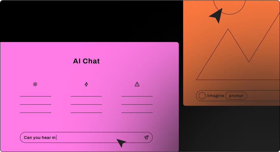
Though we’re far from the early stages of AI technology, only recently has it become approachable to the public and it seems like everyone is talking about it. In the past year we’ve witnessed the breakout of several online AI engines that seem to be game changers. Engines like ChatGPT, dall.e2, Midjourney, Stable diffusion to name a few, along with deepfake technology, have sparked wide debate about what our role as creators would look like in the future.
Much of the conversation is around a notion that AI will soon make the need for creative professionals obsolete. This is quite a dystopian approach. Truth of the matter is that AI in its current state is more of a tool for us to use rather than a future replacement. And use it we will.
We’ve seen this trend accelerating in the past few months with the explosion of dall.e2 and Midjourney onto the scene with their jaw dropping image-making capabilities. Most recently, the introduction of ChatGPT into the mix, and microcopy never felt more approachable. But it’s important to remember, the results we get from these engines require work, and like any tool, the more we master it, the greater our control will be. Let’s focus on image making. If we take Midjourney for example, you can easily create images from simple text prompts. These are images that used to take forever to create or even find and buy the rights to. But simple prompts only get you so far. The key is to refine your queries as you go, focusing on the areas you feel need work. The deeper you dig, the faster you’ll get to the desired results.
06
Nostalgia in times of digital overload
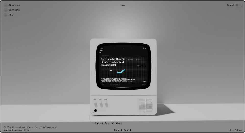
In May we will celebrate 20 years of WordPress. The introduction of WordPress triggered a kind of revolution of its own, bringing web creation to the masses. Now, we are in 2023 – and every few weeks we read about a different, sensational digital development.
At times, we want to be on the forefront of technology like good early adopters, read an article and learn a new tool or technique and share our discoveries with our web-creator community. But from time to time, we prefer to skip the learning curve, snuggle in and cling to the comfy past even in this era of digital acceleration. We still see a great deal of 80-90’s motifs. The thing we find intriguing is the longing for old technology, like the first computer we had at home or the compact goofy-looking disc player.
So, for the laggards amongst us, or for the ones with Y2K fondness, we especially take notice of collages, pixelization, strong colors, MS-DOS-like UI, and old arcade game influences.
Hie is a talent agency for content creators. They use nostalgic objects and reimagine them from a contemporary point of view. This playfulness is designed to tickle our curiosity and draw us in.
07
Motion begets emotion
Peoples’ attention spans drop lower and lower every year. We can blame this on social media, Tiktok, and Instagram of course, but we are also consumers as well as creators. Given this reality, UI cannot remain static. Motion is a great tool to draw users in, and can be a very effective and immersive experience. In the past year we’ve seen how motion is used to keep us engaged, bringing us to consume more content. It lets us as users feel we’re interacting with the website on a higher level than before, and in a more meaningful way, at that.
Our users are accustomed to seeing pixels moving and jumping around; they expect to get indications for every single action. This feedback lets the user feel like an active participant, thus making them feel present and focused. One way to create such an experience is through soft scroll animation, made by using floating parallax effects in between sections that ease-in micro animations. Another example, we expect to become more popular, is motion that exceeds the norms – even going as far as playing with the user’s sense of balance and gravity. We will see more animations or integrated videos that aim to play with your eyes, with rough entrance animations, powerful blow-ups, zoom-ins, variable fonts, rotation stickers and so on. It can be exhausting at times but the user’s attention is so precious that we will try to attract it by any means necessary.
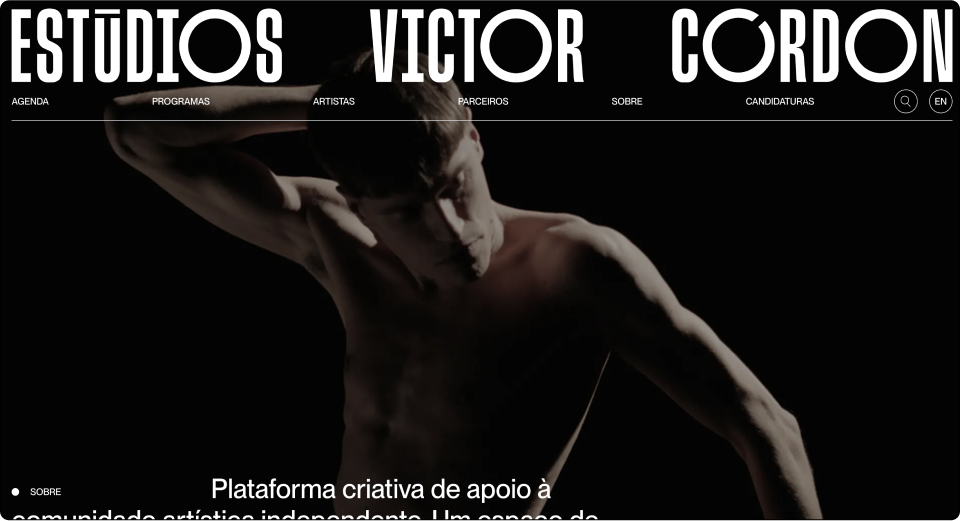
Estudios Victor Cordon is a creative platform that supports the independent artistic community. They use constant seamless motion as you scroll from section to section. One thing to notice, which we found both beautiful and unique, was that the components on screen are actually static, but the motion created by the background gives a sense of fluidity and constant movement.
08
Typographic layouts – We miss you print
In contrast to clean design aesthetics, we see more and more websites that literally push the boundaries to the edge with unique typographic layouts. This trend is quite surprising considering this design practice is common on mediums that are short on space, like backside packaging, music festival posters, labels and signage, etc. Maybe this trend has to do with our longing for designs that use real materials, which we abandoned in favor of the screen and the interactive experience.
Aiming to attract attention, the most interesting ones play with typography and grids while letting go of conventional web layouts in their mission to create a memorable text-based viewing experience. These websites tend to use big-sized letterheads with brutalist style typography, which is not typically used on the web. As part of this movement, we might also see more websites with sections that have only one paragraph with a type size so large that it takes over the entire section. All together, it adds a dynamic element to the page, even when it’s static.
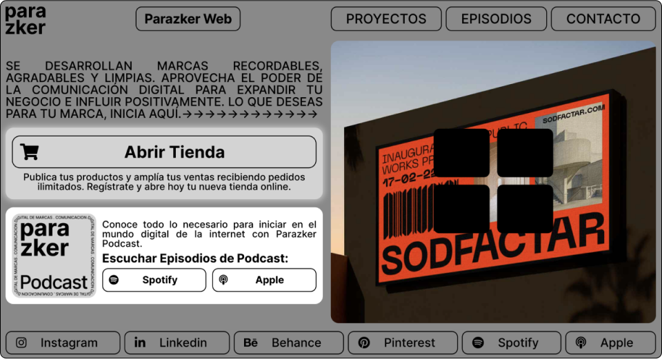
Parazker’s web page has a lot to take in. This single fold could have been easily spread out over several folds and pages, yet this presentation creates a sense of familiarity, like labels on packaging or barcodes. The designers here condensed all the information to one fold, so users can view all of it in one glimpse.
09
Accessibility – let’s make the web be a better place
In a time of rising voices of extremists out there in the real world, we have the opportunity to make a difference here in the alternate web universe we created. Afterall, we as web creators, are a big community. We have an opportunity to add more value and make the world wide web a better, more inclusive place.
Along with the increased digital reliance in our society, ever since Covid19 hit, users are spending much more time online to get even the most basic of services. When starting a project, we usually create an accurate brief and tailor the design for a specific user persona and need. Maybe this year, our new year’s resolution can be trying to see the Internet through the eyes of others – making technology usable for all people, regardless of their abilities, economic situation, age, education, or geographic location.
It’s a small shift of the mindset and a small workflow adjustment. It starts from the kick-off stage with a responsibility to educate the clients about accessibility and the legal requirements it entails. Thinking about it from the early brief stage and investing a little more time and effort can help shape the website’s design style. We can use colors and font sizes wisely, as well as alternative text, and support for keyboard navigation. Designing through the lens of this challenge can not only create new styles and conventions but can change how we experience the web as a whole.
10
Link in bio index webpage exploration
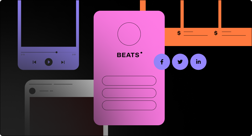
Social media, with its endless possibilities, still has a few limitations; sharing only one link in your profile is certainly one of them. Thus, the ‘Link in bio’ was born. Link in bio is basically a landing page designed to connect social, websites, stores, videos, music, podcasts, events and more. They all come together in this page designed to connect, form new relationships and convert.
With the increasing number of users that are coming through social media, the question that comes to mind is, how should this bridge between your social profile and your website look? Is it simply an extension of your profile page?
As of now, the link in bio layout is very basic. The capabilities and opportunities hidden in this landing page layout haven’t been completely explored yet. List-like views or a gallery – they’re designed mostly with buttons or photos that are equal in size and hierarchy. The question arises though, should they be? Do all your links carry the same weight?
How will navigation methodologies be integrated in these simple pages? We’re likely to see this field expanding in the coming year, with creators suggesting new visions of how this digital business card should look.
Summary
Now that we’ve explored all these examples, from goblin mode and maximalism through accessibility to the different uses of typography and motion, one obvious question arises- what is the designer’s role in all of this? How do we approach our next website design with a forward-looking point of view?
Remember, every website promotes a different product or service, designed to solve a particular problem with specific goals. So, we shouldn’t just follow the trends blindly.
When we have a better understanding of the goals and products we sell, we can cleverly apply some of the trends and discover new ways to go that extra mile – making users smile inward with satisfaction and delight.
Even though it seems our status as creators is being questioned at the moment as AI steps into the scene, it also seems that our role is expanding. Understanding how to create engagement has become more and more complex and we are required to keep up with new technologies, strategies, and fads. This is going to be a hell of a year my goblins, so just remember, follow your web-creation intuition.
Looking for fresh content?
By entering your email, you agree to our Terms of Service and Privacy Policy.