Table of Contents
A web design portfolio is a hand-picked showcase of projects and case studies that a designer chooses to present his best and most promising work examples to potential clients or employers. In the web design industry, portfolios are considered a point of introduction where designers have their first opportunity to introduce themselves, their personality, their artistic style, professionalism, and so on. Web design portfolios can include anything from live websites that the designer built, sample projects, case studies, web design templates, or even smaller-scale assets such as typography design, illustrations, logos, etc.
As budding web creators, the time has come for us to develop a solid understanding of how web design portfolios can accelerate our careers as designers, and of the strategic thinking and planning that must go into the process of creating an impressive, sophisticated design portfolio.
In this post, we will identify the key features that every web design portfolio should include, and derive best practices from some of the most powerful web design portfolio examples that we have come across during our research.
Table of Contents
Why Do Designers Need a Web Design Portfolio?
There are many indisputable reasons why every web designer needs a killer web design portfolio in order to put his best foot forward and get hired for the web design projects he has equipped himself to master. This is true not only for establishing his own credibility, but also for increasing his likelihood of getting hired for promising, high-caliber projects.
Reason #1: Online Portfolios Make You Searchable and Accessible To Clients
Everybody knows that nowadays, it’s all about Google. When employers are looking for a web designer, whether they specialize in a certain vertical or are located in a specific location, searching accordingly online will bring them one step closer to their candidates.
When potential clients are looking, for example, for a freelance web designer based in Seattle, Washington, they’re likely to search for “freelance web designer in Seattle”, or something similar. If your design portfolio meets the SEO requirements, so that you’ll appear in those search results, you’re in good shape for landing that gig.
Reason #2: Online Portfolios Demonstrate Your Expertise
When looking to hire an independent web designer or a design agency, clients are primarily interested in seeing the concrete work that the designer or designers are capable of producing.
True, stating different factors such as which tools you use for design, which design niche you specialize in, and so on, are questions that clients want to tick off on their hiring checklist, but they are in fact most interested in seeing work examples. Once they see what you can come up with, they can get a better sense of whether or not your design expertise, style, etc. are a good fit for what they’re looking for.
This means they want to see real, tangible projects that creative professionals have done in the past. Clients want to see what your thought process involves, and how you would take their ideas and turn them into visual content, and apply your creativity and design skills while doing so. They want to see how you respond to challenges, and how you take a blank canvas and produce a unique, impressionable website that effectively communicates who they are and what they do.
Reason #3: Clients Are Short on Time
There’s also a practical side involved to why those looking to hire find project showcases and case studies to be a more efficient way of evaluating designer candidates. Clients who are seeking design professionals to create their website often receive hundreds of portfolios and resumes. Time is of the essence, deadlines need to be met, and people are looking to have their questions answered quickly.
This means that sifting through pages of explanations of who you are as a designer and why your experience is relevant is less appealing to those short on time. Instead, reviewing projects you have completed can be a time-efficient way for clients to evaluate whether your skills are a good fit for what they need.
Reason #4: Let Clients Get To Know You
The client-designer relationship is a crucial element in a successful design project. It’s more than just building a mutual understanding of what the client needs and what the designer can create. There’s communication involved, and a personal connection that needs to “click”. This is why when viewing your portfolio, prospective customers will want to get to know you as a person, as an individual, to understand who they’d be working with and what kind of dynamic will be contributed to their team of professionals.
The forum for letting your portfolio visitors get to know you is often on your About page, which you can think of as an individual or one-on-one version of the standard About Us page page that you’ll typically see on company websites. We’ll delve into this portfolio component later in the post.
Letting clients get to know you isn’t only about writing your story in the About page. It’s about identifying which elements in your personality you want to emphasize, such as your bold taste and knack for bright color schemes, or your way with words which is manifest in the titles and descriptions you use throughout the portfolio. You can also consider your choice of imagery as a way to represent your personality, whether it’s choosing photographs of beautiful scenery and landscapes, contemporary illustrations, pictures of you hard at work with walls of mind maps around your workspace, and so on. The floor is yours.
Reason #5: Define Your Design Niche or Specialty
As seasoned web creators, we know that designers often categorize themselves based on what types of businesses and websites they’re experienced with and are passionate about. These design niches can range from Ecommerce websites, to online news sites, or personal services such as personal trainers and therapists. Potential clients will want to not only see work that you’ve done that is similar to what they’re looking for, but they’ll also want to know that you understand their industry both in terms of business needs and audience interests.
Design niches are not only about industries and verticals, they’re also about web design trends and website styles. If, for example, a business owner is interested in creating a website that contains video backgrounds and savvy motion effects, they’ll want to see whether or not you’ve worked with those types of features before.
What Should a Web Design Portfolio Include?
When it comes to fundamentals, there are five key questions that a web designer’s portfolio should answer:
- Who you are
- What you do
- Your location
- The work you have to share
- How to contact you
As we discussed earlier, web design portfolios are about cutting to the chase – answering the key questions that prospective clients may have when they’re interested in learning about your work and services. Dedicating one section or page to each of these questions will be a thorough and organized way to make sure your portfolio delivers every answer your site visitor is looking for.
Boost Your Portfolio’s Performance with Image Optimization
High-quality visuals are essential in a portfolio, but large image files can negatively impact loading speed. To ensure your portfolio loads quickly and delivers a smooth user experience, use an image optimizer plugin to compress your images without compromising quality. This small optimization can make a big difference in keeping potential clients engaged as they browse your work.
Homepage: A Brief Introduction
You can think of your design portfolio’s homepage as serving a similar purpose to any website’s homepage: creating an infrastructure and understanding that will allow the website visitor to navigate your site. In the case of design portfolios, the homepage will generally include a 2-3 sentence short bio that describes “who you are” in a nutshell, as well as specifying where you’re located. If a potential client is based in Barcelona and is only looking to hire a designer who’s based in Spain, he’ll want to know right away whether you fit that criteria.
Alternatively, many companies are open to hiring remote-based designers, so if you’re open to working remotely, it’s helpful to specify that as well. Be sure to include the services you provide, although this section can also appear on your About page (or both). It’s important that website visitors understand exactly what you specialize in and if what you can offer is relevant to what they might need. In fact, many web design portfolios will have a separate page called “Services”, that’s dedicated to explaining the type of services the designer or agency provides.
About: Who You Are
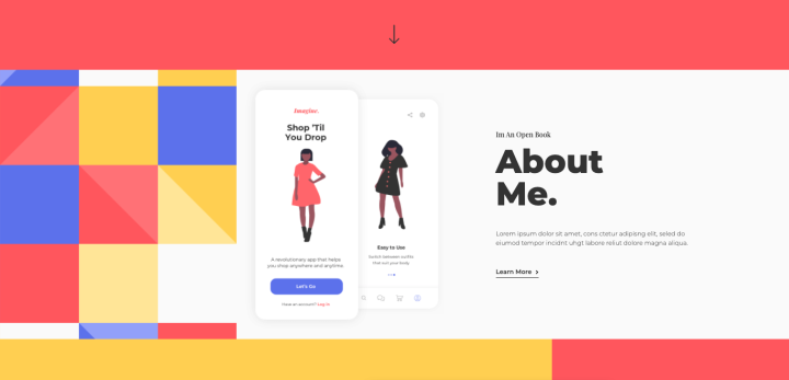
This is where things get personal, and it’s your time to shine – to tell your very own personal story. It’s good to answer questions such as: “What introduced you to design?”, “Why is design important to you?”, “How can you use design to make a difference?”. You’ll want to be as unique as possible (but still conventional, on some level), and use the opportunity to shine among your competition. Employers look for designers who are bold, confident, and passionate about the work they do. This is exactly what you want to communicate.
You can also think of your About page in a similar light to how you go about a job interview. This entails answering questions like “Describe a problem you experienced and how it made you want to be a designer”, “What makes you unique in your design work?”, “How can you contribute to a company?”, and so on. Ultimately, your “About” page should give an idea of the kind of person you are to work with, and how you can breed amazing results by creating the client’s website.
Work: What You Have To Share
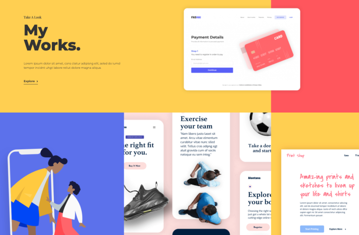
This is where you need to think carefully about which of your web design projects best represent your skills, experience, and style as a designer.
It’s also good to specify what your design workflow involved, such as what tools you used, etc. You should also make sure to include a link to the prototype or to the live website itself.
Don’t forget the value of adding testimonials to your portfolio, whether on the Work page or on a different page or section as you see fit. Potential clients will want to see good, positive feedback from real customers that you’ve worked with, and the value of customer reviews is not to be sniffed at. These also account for a positive, enjoyable relationship between you and your employers, which those looking to hire always like to see.
Contact: The Best Way To Get in Touch
Your Contact page is possibly one of the most important components of your design portfolio site. Without it, you may lose prospects simply because they couldn’t figure out how to get in touch with you. That being said, your Contact page is possibly the easiest page to design among all your other pages. It’s basically just a landing page, and the more minimalistic it is, the better.
We recommend using a large image (ideally a portrait or candid photo of yourself), and a simple contact form. It’s also helpful to add a social icons bar to your most active social media channels. This way, if potential employers prefer to contact you on LinkedIn or even Facebook Messenger, it will be convenient and comfortable to do so. It’s all about accommodating the customer’s wishes!
12 Stellar Examples of Web Design Portfolios
1. Robert Bürgel: Using Motion Effects To Showcase Your Talent
This visual communication office’s opening design (hero section) knocks us off our feet. Building his website with Elementor, Robert Bürgel definitely knows how to make his and his agency’s presence known, yet in such a sophisticated, classy way. The swimming fish motion effect is captivating to say the least, and this Düsseldorf-based graphics agency is clearly full of talent, creativity and uniqueness.
2. ZORiN: Emphasizing Your Personal Brand
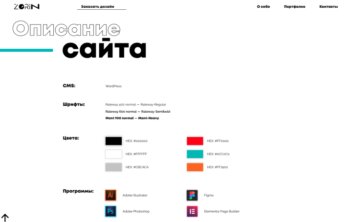
Roman Zorin is a Russian web designer who exhibits a succinct talent for taking the conventional design portfolio format and using Elementor to infuse it with creativity and a thought-provoking flair. His website does exactly what we mentioned earlier about the designer showing their thought process and design workflow that take place throughout their projects. Each section of the homepage communicates the necessary content, including the design tools he most commonly uses for his web design projects.
Finally, he provides a professional brand guideline for his personal brand, which indicates just how experienced and sophisticated his design approach is.
3. Ueno: A Portfolio Showcasing Products, Brands and Experiences
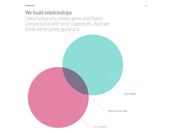
Ueno is a world-class branding agency that serves some of the world’s biggest brands with branding, product design, websites, etc. Their portfolio site is full of their brand personality, and each page immediately gives you the sense of what they’re about: relationships, humor, creativity, and top-class design.
4. Adrien Gervaix: Sharing Your Product Design Process
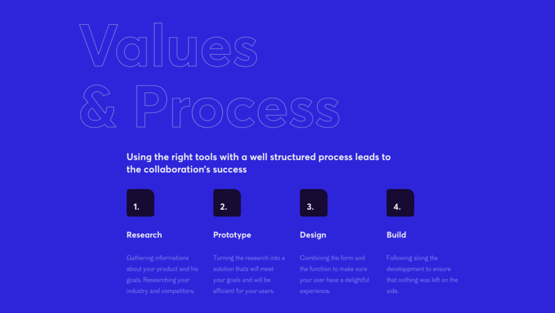
Adrien Gervaix is a freelance Product and UX/Ui designer based in Lille, France. Adrien uses a bold blue background to surround his modest presentation of his impressive project showcase. There are many unique design details that Adrien enhances his portfolio with, such as the animated paper airplane on the homepage,the navigation scheme in the header, and especially the “Values & Process” section which maps out the process of his design workflow and how he approaches each project.
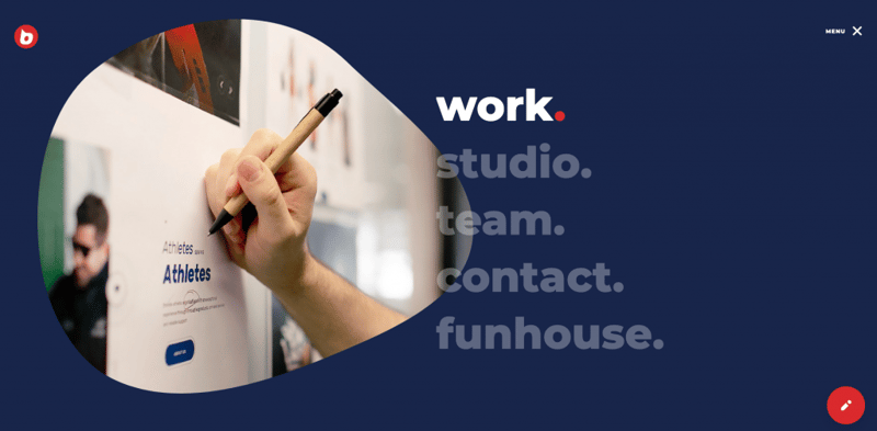
5. Buzzworthy: Portfolio Meets Personality
Buzzworthy is a Brooklyn-based digital studio that specializes in developing custom WordPress sites. In terms of their portfolio site’s design, they definitely take the cake with uniqueness, as the centered, vertical menu down the middle that directs visitors to each of their portfolio projects is truly like none we’ve ever seen before. That, among other design details, is what we love it for.
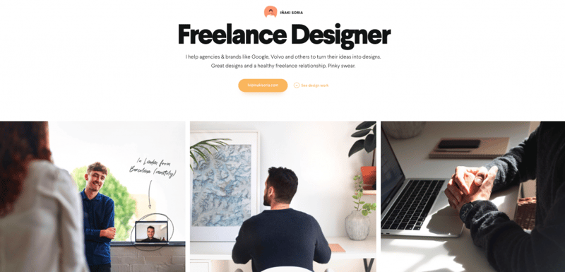
6. INAKI SORIA: Building Client Relationships Through Remote Freelancing
Inaki Soria is a Barcelona-based (but works remotely) freelance designer whose profile emphasizes his guiding principle of how important the communication and relationship between designer and client is. His choice of imagery and screenshots that represent samples of projects he’s done are each crystal clear and easy to browse, so the visual communication is also top-notch.
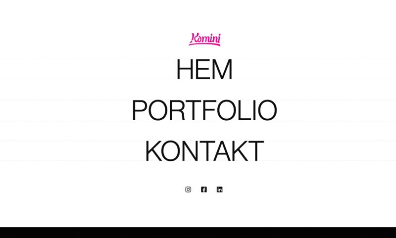
7. Komini Media: Using White Space Wisely
Komini Media is an advertising agency based in Gothenburg, Sweden – who built their website with Elementor. Their site caught our attention for many reasons, one of the main ones being their clever use of white space throughout the homepage and the variation font sizes as you scroll down. If you take a look at their navigation menu, it also boasts some unusual yet beautiful hover effects on the menu items.
8. BALLSY MEDIA: Portfolio Meets Personality
BALLSY MEDIA is a digital agency based in Northumberland, a county in the northernmost county of England (bordering Scotland). Built with Elementor 3.0, what sets this agency website apart as a design portfolio is how much its design scheme mirrors its uniqueness as a business: it’s located way, way up north on the globe. The agency chooses to take this character trait and integrate it into their design identity: the interactive dark sky, the rocky, mountainous landscape, and the deep blue that represents the infinite, surrounding sky. Ultimately, this portfolio illustrates how impactful it can be to take one of your individual character traits and use it to define your portfolio’s design scheme.
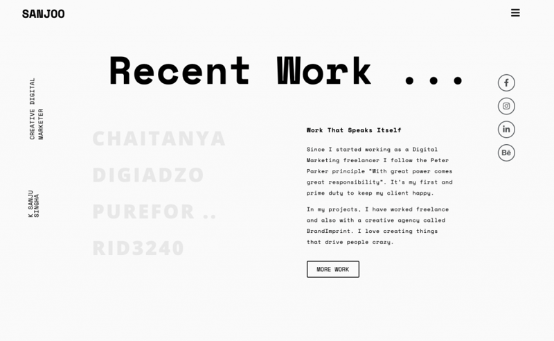
9. SANJOO: Using a Content-First Approach
SANJOO is the Elementor-built portfolio website of K Sanju Singha, a digital marketing freelancer based in India. His site is actually one page only, yet is still varied, interesting and completely dynamic. We enjoy his text-based design approach, as well as combined menu popup and contact form that are triggered by clicking on the menu icon.
10. Elegant Seagulls: Communicating Your Identity Through Design
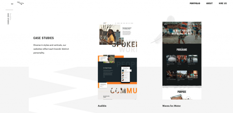
Elegant Seagulls is a digital creative agency based in Marquette, Michigan. This portfolio is what we consider to be a prime example of making your mission statement as a designer (or designers) known. This is prevalent on their homepage, their About page, where they outline their “strategy”, “concepting”, “refinement”, and so on. Last but not least, their sophisticated “Portfolio” page which features their case studies indicates the importance of presenting case studies in your design portfolio. Once you click on the case study thumbnail, the project page dedicates a clear, content-first page, filled with white space and crisp images of their polished UI designs.
11. Codepuffin: A Colorful Portfolio That Stands Out
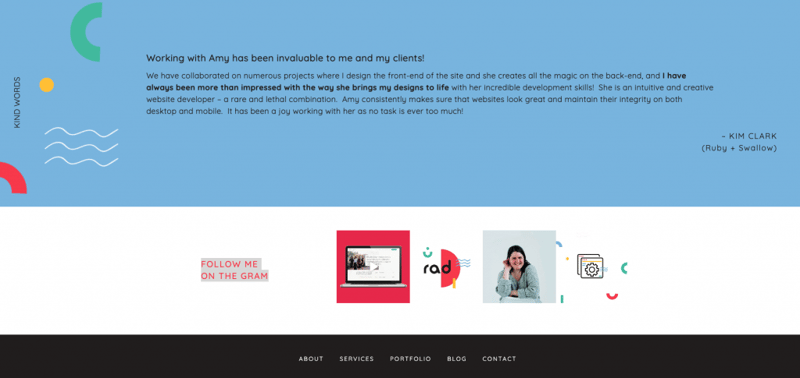
Codepuffin is a web developer business (a one woman show) run by a New Zealand-based developer named Amy. Amy’s portfolio, built with Elementor 3.0, is bold and beautiful in every sense: bold colors, a logo with unique typography, and many other visual highlights. One truly unique component of Amy’s site is the way she features customer testimonials as well as her link to her Instagram page just below it. The testimonials quote is integrated smoothly into the page, with clear, readable text and an inviting blue background to finish off the page-scrolling experience.
12. Studio 081: Always State Your Value Proposition
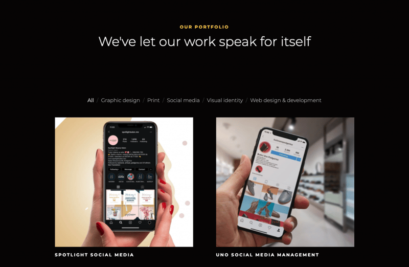
Studio 081 is a boutique web and graphic design based in Montenegro. This is another clear example of a brand/professional who uses Elementor to build a website that positions their brand as being fully at one and clear with their value proposition. This strategy allows website visitors and potential clients to understand what the added value of working with these designers and professionals is all about. On the whole, their contact page and form are clear and accessible, their social icons are easily visible, and the thumbnail images used in their portfolio gallery do justice to their beautiful work.
Show Us What You’re Made of
In this article, we saw how creating a design portfolio can leave a lasting impression on employers. By doing this, you’re embracing your chance to show (and even prove) your unique talent – making it clear and obvious for people to understand where your strengths and talents as a designer lie.
Portfolios that are overly generic suggest that as a design professional, there is no real specialty or niche, nor a clear message in the designer’s work. Finding the balance between following best practices of a web design portfolio, all the while adding your individual, one-of-a-kind style and skills – will attract potential clients to explore your portfolio further and take an interest in hiring you for their next project.
Make sure to share your portfolio with us, by posting it in the Facebook community and sharing it in the comments below.
Good luck!
Looking for fresh content?
By entering your email, you agree to receive Elementor emails, including marketing emails,
and agree to our Terms & Conditions and Privacy Policy.
