About the author: Mark Gerkules, Web Designer @ Elementor
Mark is a Web Designer at Elementor. Apart from his love for UI/UX, he loves football, traveling around the world, and a good schnitzel.
Selecting the typography for your website is an important decision. It not only affects the overall style of the site but can also impact its usability. With so many font choices, combinations, and layout possibilities, it’s easy to get a bit overwhelmed.
Fortunately, looking at some of the latest typography trends can help you make your decision. As an added benefit, incorporating some contemporary styles can keep your website from looking outdated.
In this article, we’ll go over why your typography choice is so important. Then we’ll share ten typography trends for 2022. We’ll wrap up with some tips for applying these trends to your site and share places to find inspiration. Let’s go!
Table of Contents
- The Importance of Web Typography
- List of the Top 10 Typography Trends for 2024
- 1. Brutalist Style Typography
- 2. Big and Bold Headlines
- 3. Outlined Fonts
- 4. Broken Typography Layouts
- 5. Black and White
- 6. Layer or Blend Text and Images
- 7. Psychedelic Colors
- 8. Fat Low Fonts
- 9. Glitchy Text
- 10. Animated Typography
- How to Apply Typography Trends in Your Web Design
- Where To Find Great Typography Inspiration
The Importance of Web Typography
Simply put, web typography refers to how you arrange text on your website. It encompasses everything from font selection and size to how you lay out your written content. However, although looks are important, web typography is about more than just aesthetics.
Thoughtfully chosen web fonts can help your site stand out and contribute to your overall branding efforts. Typography also comes into play when for User Experience (UX), as a typeface that is difficult to read can be a significant turnoff for your audience.
Typography is one of the most crucial elements to consider when designing a website because so much of the site’s success depends on it. It’s likely that every part of your website, from content to navigation to forms, includes text. Poorly chosen typography can create a lot of friction for your users, which can lead to lost conversions. Adding too many fonts, for example, can cause confusion, loss of focus and bad user experience. To avoid that, we recommend using two fonts, as it is the perfect amount for a website.
In contrast, combining typography with other current web design trends can help keep your site looking fresh and relevant. It’s a relatively simple way of showing that you’re investing time and effort into keeping your site updated.
You can check out our list of the best web typography tutorials to learn how to implement these trends in your website’s design.
List of the Top 10 Typography Trends for 2024
Now that we’ve covered how important typography is for your website, let’s look at ten awesome typography trends for 2024.
1. Brutalist Style Typography
Brutalism is a style that emerged in architecture and is usually characterized by harsh, straight lines and a lack of decorative elements. It manifests in digital typography as large, imposing lettering that is sometimes placed in unexpected ways.
Today’s brutalist typography is a bit softer than in the past. However, it still maintains an arresting and formidable air, as you can see displayed in the following example:

Brutalist fonts work exceptionally well with more muted colors, but that doesn’t mean you can’t shake things up by using a bright yellow or pink. In fact, the next trend we look at could be an excellent opportunity to deploy a brutalist font.
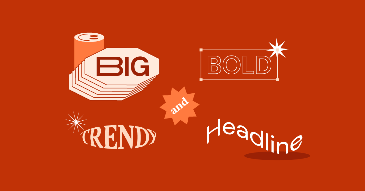
2. Big and Bold Headlines
Making your headlines prominent and eye-catching can help get your message across. With bold headlines being popular this year, you can create dramatic headlines while still staying on-trend.
You can see examples of this highlighted on the Over Covid website:

Since most web users skim content rather than read deeply, you want to be sure your most critical messaging stands out. Try building an impossible-to-ignore heading to grab your audience’s attention. Some fonts that work well for bold headlines are Franklin Gothic and Benton Sans.
3. Outlined Fonts
Outlined fonts can be a solid addition to your hero section. You can use them to make a strong first impression on your visitors.
These fonts work well with simple backgrounds:

It’s important to be extra mindful of color contrast when employing outlined fonts, as readability can be a concern. You might try combining outlined fonts with bold, filled-in text for dramatic contrast and impact, as you can see in the example above.
4. Broken Typography Layouts
Broken typography layouts may combine words in unexpected ways. While the effect can be jarring, when done correctly it can attract attention without sacrificing readability:

Broken typography is useful for headlines or other text you want to stand out. Keep in mind that depending on the particular font you choose, these fonts can be somewhat difficult to read. Therefore, you may want to avoid using them for crucial information.
5. Black and White
Minimalist web design has been a trend for some time now. So it’s not surprising that clean, simple black and white typography is making an appearance in 2024:

While it’s known for its simplicity, minimalism doesn’t have to be boring. You could try combining black and white in unassuming ways, alternating which you use as the text and which is the background. The example above uses two very different fonts to produce an elegant yet exciting effect.
6. Layer or Blend Text and Images
Layering text over images or other elements can add another dimension of meaning to your content. In this example, a colored filter is applied over the image, enhancing readability:

By combining several layers, you can achieve a three-dimensional effect. You might even take it a step further and thoroughly mix text and images.
However, it’s essential to make sure that the effect doesn’t obscure important information. You might try using different colors in your text so your words don’t blend into the background.
7. Psychedelic Colors
This fun throwback trend is about as colorful as it gets. You can really get creative with the psychedelic colors and bring a lot of excitement to your website, as Special Offer, Inc. did:

Adding a rainbow tie-dye effect as a background is a lively way to set off black or white text. You might also incorporate fun, psychedelic colors into the text itself, although you’ll want to be mindful of contrast.
8. Fat Low Fonts
These fonts have a low x-height, meaning they tend to be a bit wider than they are tall. This makes for chunky letters that stand out.
Brandon Grotesque is a popular font of this style:

These fonts work well when there’s plenty of real estate to help preserve readability. You’ll likely want to maintain a good amount of space between letters and words. While fonts like this probably wouldn’t be the best choice for an entire blog post, they work well for headlines or short pull quotes.
9. Glitchy Text
Glitchy text can add an edgy, artistic element to your site. It can be challenging to use but can bring a lot of energy and uniqueness to your hero section:

As this style is difficult to read by design, you’ll want to limit its use. By including glitchy text in moderation, you’ll make a significant visual impact without obscuring important information. On the other hand, if you’re not overly concerned about readability, glitchy fonts are an excellent candidate for combining with animation.
10. Animated Typography
Animated typography is an excellent tool for capturing and holding a reader’s attention. Adding a bit of animation to a website can make your content more engaging, as you can see demonstrated on the SurveyMonkey home page:

You have nearly endless possibilities when it comes to animation. Some popular options include:
- Scrolling text across the screen.
- Flying letters from offscreen.
- Changing the shape of important letters upon mouse hovering.
- Text fading from the background.
If you decide to animate your text, be sure the font you choose is simple and easy to read. You’ll also want to have a backup plan, so users can still access your content even if the animation doesn’t work.
How to Apply Typography Trends in Your Web Design
When designing the typography for a site you’re building, it’s helpful to think about your brand’s voice as well as what you’ll be communicating through your text. Keep in mind that typography can be a wonderful expression of a brand’s personality.
While trends can be exciting and a lot of fun to play with, too many competing styles might create problems in your design. If you try to incorporate every trend, you’ll likely find that your site looks messy and confused, so be cautious when it comes to font pairing. Try to limit yourself to one trend or perhaps two that work well together.
This example uses the same font throughout the main section of the content. However, it combines the trends of outlined fonts and black and white. The result is simple yet appealing:

Try to stay organized and create a clear design system for your typography, to keep consistency across your entire site as well as business cards or flyers. Adding guidelines for typography to your style guide can help you remain on track.
Where To Find Great Typography Inspiration
If you’re feeling stuck, there are plenty of inspiring examples across the web for you to explore. You may even decide to use a custom font on your site.
You can check out Elementor’s monthly showcase. Here, you’ll find carefully curated websites built using Elementor. Each month, our showcase focuses on a different theme, such as single-page websites or wedding sites:

Elementor also has a template library that you can browse through for inspiration. We have kits and templates available for different website elements in a wide variety of verticals:

Design Shack is an online magazine for web designers and developers. You’ll find plenty of actionable information as well as a design gallery:

Creative Bloq is an excellent resource for designers and includes reviews, tutorials, and plenty of inspiration. There’s even an entire section dedicated to web design:

The Logo Creative covers all aspects of branding. You’ll find case studies as well as a logo portfolio to browse through:
We also recommend taking note of the typography trends on websites you visit frequently. Once you start paying close attention to typography, you might be surprised at the amount of creativity you find.
Typography for 2024 and Beyond
Typography can impact many aspects of a website ranging from branding to UX. Your choice of fonts and how you incorporate text with the rest of your media can make a lasting impression on visitors.
If your primary concern is readability, you might want to stick with brutalist typography. For an edgier look, you could try adding some glitchy text, especially in your hero section.
What typography trend are you most excited to try out? Let us know in the comments section below!
Looking for fresh content?
By entering your email, you agree to receive Elementor emails, including marketing emails,
and agree to our Terms & Conditions and Privacy Policy.

