Table of Contents
Gather around everyone, let’s start our tour of Elementor’s brand new travel template kit.
The travel industry is one of the best niches web designers can choose, and not just because it’s fun to travel!
The global online travel market was worth more than $629 billion in 2017. According to Google, the tours and activities sector is rapidly growing, and by next year it will be worth $183 billion.
It’s the perfect time for Elementor to release its tour agency kit. So pack your bags and check your passports… Here’s Elementor’s new template kit of the month!
There are many types of travel sites. It doesn’t matter if you’re building the next Airbnb site, or a page for your bed and breakfast — this kit is for you!
We built it to serve any type of travel site, including:
- Small travel agency
- Hotel, hostel or apartment booking sites
- Travel and tour deal sites
- Personal tour guides
Fasten your seatbelt, and enjoy a pleasant flight. Destination — template land!
15 Tailor-Made Pages & Elements That Make Up the Perfect Travel Website Template
A quick look at the website reveals an elegant travel site. The fonts are a perfect fit ini their subtle elegance, and the images compliment the style and atmosphere of the site. Each and every page and element has been edited to be fully responsive and look perfect on any device.
Our Travel kit comes with several unique designer-made templates:
- The Travel Agency Homepage: Deliver the main messages of the tour company.
- About and Contact pages: Tell tourists what you’re about, and get them to contact you.
- FAQ page: Answer the most frequent tourist questions, like: “where’s the best place to get a baguette in Paris?” (BTW, it’s Boulangerie 2M 🥖😋)
- Gallery page: Show off your little ‘Tour de France’ with some tantalising imagery from the trip.
- Testimonials page: Gather up those TripAdvisor comments and convince clients with social proof.
- Tours & Single Tour pages: Display dynamic information about the different trips, treks and excursions you offer.
- Travel Blog – Blog Posts & Main Blog page: Keep a steady stream of travel updates to win that sweet Google traffic.
- Header, Footer & Popup Menu: While the footer is pretty standard, the header goes above and beyond.
- Travel Deal Popup: Tourists are flocking the main attractions. Don’t let them leave your site without having them convert.
- 404 Page: Each template kit we’ve released so far has had a unique 404 page design element, and this one’s no exception!
The Travel Agency Homepage
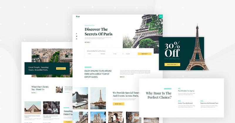
We purposely chose to dedicate this template to a specific destination, Paris. Most travel agencies work locally around a specific location, and we wanted to create a template as true to real travel sites as possible.
When building a travel website, or any website for that matter, it is important to convey the business’ unique selling proposition (USP) right at the start. The two headlines: ‘Exclusive Private Tours’ and ‘Discover the Secrets of Paris’, both describe the essence of the business as well as its target audience.
Below the hero, we placed a contact form, offering the potential tourist an easy way to get a quote for a specific travel destination.
If you plan to build a booking or hotel chain site, the same section design can be customized to become a search engine for deals or destinations, similar to sites like Airbnb and Booking.com.
As you scroll down the homepage, you’ll notice the call to action section, decorated with one of Elementor’s recently released fancy dividers.
It is our practice to include several versions on each page of our kit, to give you greater choice for your preferred style. This is why we included 3 different types of CTA sections.
The homepage ends with a gallery of Paris imagery, befitting the importance of visuals in travel sites.
As with the rest of the pages, the homepage uses an elegant serif font ‘Playfair Display’, a perfect fit for Paris. It also uses ‘Dosis’, and the two fonts pair nicely.
Travel About and Contact Pages
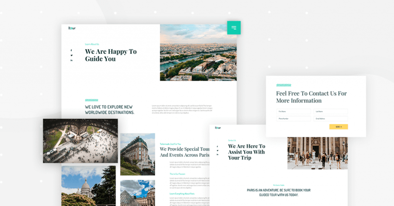
Creating a well-structured About page is a difficult task. We managed to nail a unique About page. The page starts with the main statement. This usually relates to the mission of the agency, and in our case, it references the agency’s role in guiding its tourist/client. This area is followed by more detail about the agency, written alongside more inspiring tour photos.
Following this, we created a services section, which includes original icons we crdeated specifically for this travel kit.
At the end of the about page, we highlight the founder of the travel agency, Anne Farber. She might be a bit of a free-spirit for her role, but that is just what Paris is all about (plus this is what creative commons had to offer…)
Moving on to the Contact page, you’ll see the same use of the fancy divider we saw on the homepage. Another design element that consistently appears in the kit is the parallax effect, subtly added to various images and sections, improving the flow between sections.
FAQ Page: What Do Tourists Want to Know?
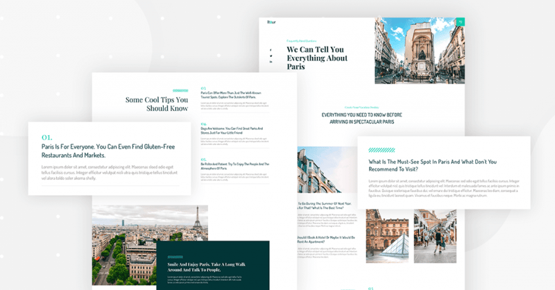
I recommend you pay special attention to the FAQ page. The reason for this is that the FAQ page we created is by no means limited to our travel site.
FAQ pages have recently been receiving special attention after Google added structured data support for FAQ. If you are still not familiar with this topic please read our recently released Rich Snippets guide, published last week.
What’s great about the travel FAQ page is that we included different layouts for frequently asked questions. There’s a side-by-side layout as well as numbered paragraphs. In addition, we included more sections that help break up the text and make it more interesting.
Gallery Page: What Makes the Travel Website Template Visual
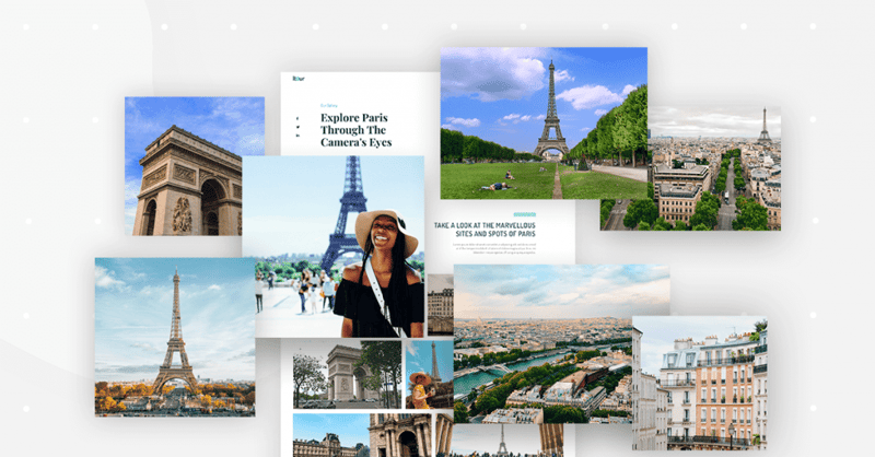
I really love how our designers built the travel gallery page. First of all, I love pictures of Paris.
Besides that, it presents a nice use of the Pro Gallery widget we recently released. A gallery page seems simple since it mainly displays images. However, for a business that has a highly visual aspect, like a travel agency, this page has crucial importance in getting the visitors to become your tourists.
Testimonials Page: It Worked for TripAdvisor...
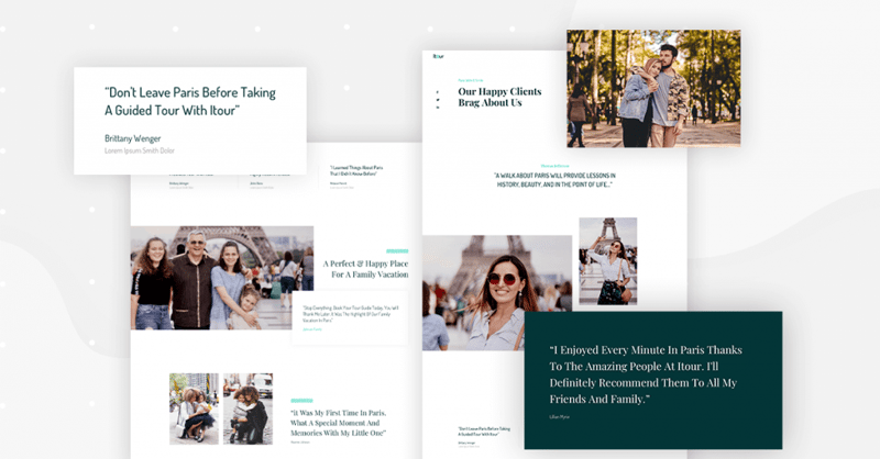
I view hundreds of websites a week, and one of the most common mistakes I notice the way that testimonials are displayed.
In order to build a proper testimonial page, a lot of thought needs to be given into making each testimonial fit the type of business we’re dealing with.
For the travel testimonial page, it was crucial to combine written recommendations by clients with their image, to give each testimonial credibility.
Main Tours & Single Tour Pages
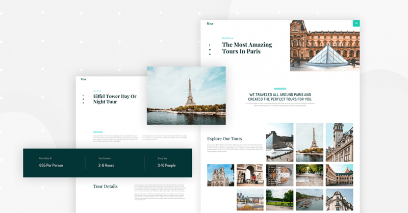
The main tours page includes a gallery-like display of images. These are actually blog posts that we included in the kit.
Go into a single tour page, and you’ll discover something special. The tour page includes information about the tour: duration, group size, and starting price. These are dynamic elements that you can set up by adding custom fields to each of the tour pages.
This way, you enter the fields as custom fields, and they will display beautifully on the tour page. You can use either ACF or the native WordPress custom fields with Elementor’s dynamic content function to add these fields to your pages.
Travel Blog (Main Blog Page & Blog Post Templates)
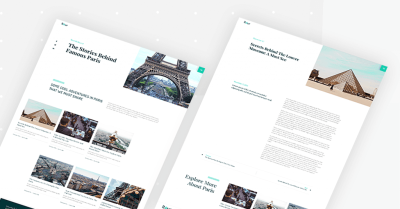
If you are looking for blog design inspiration, maybe our travel kit can be of service. The main blog page includes a classic blog design, with two different post layouts. The single post contains the main feature image positioned next to the title, a main block for the content, and related posts at the bottom.
Header, Footer & Popup Menu Templates

For this kit, we included a hamburger menu for the header, which opens an impressive animated menu that takes up a large area of the top of the screen.
The menu happens to incorporate the creative utilization of Elementor’s popup builder. By enabling the drop-down of the menu, we managed to include many more elements, including social icons, contact details, and a subscribe form. This way, the header doesn’t take a lot of valuable page real-estate, yet still includes a lot of important information.
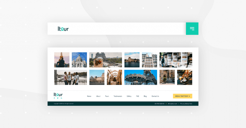
The footer is pretty straightforward and includes links to the main pages, as well as a call to action to book a tour.
Travel Deal Popup
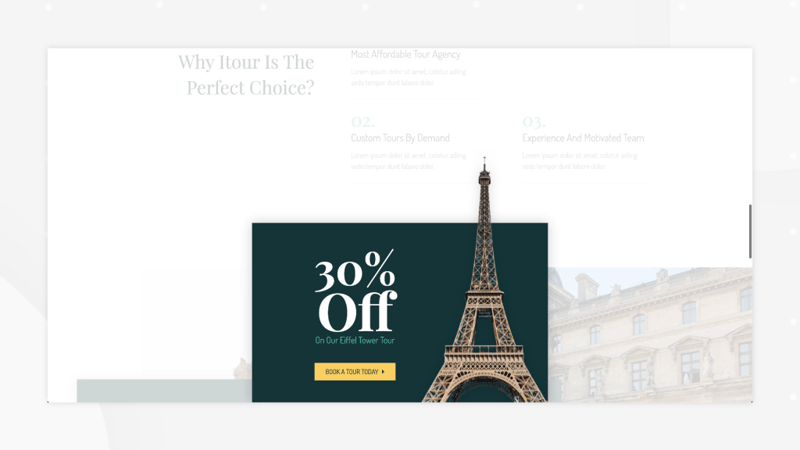
Scroll to the bottom of one of the pages, and the popup will appear, showing the discount offered by the agency, along with the lofty image of the Eiffel Tower. The travel industry is in large part driven by deals and discounts, so Elementor’s Popup Builder is a viable candidate for use in such websites.
Travel-Themed 404 Page
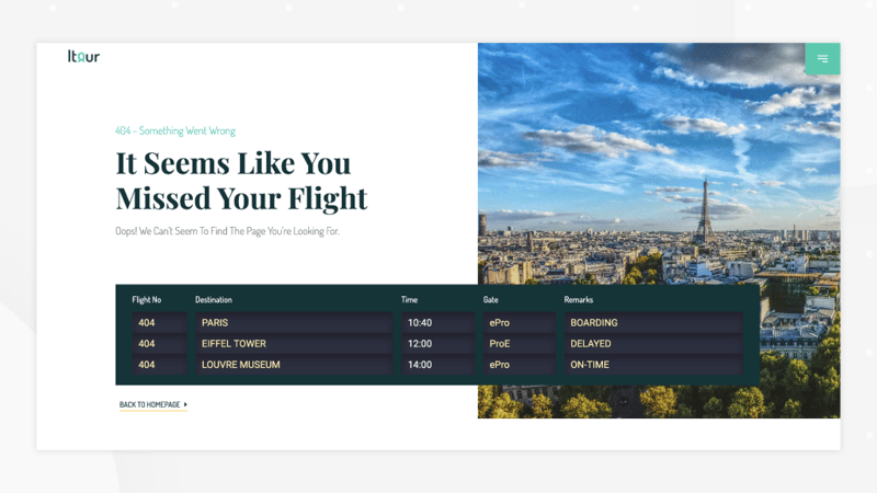
Saving the best for last, what did our designers cook up this time for the 404 page?
Since we are dealing with a travel-themed website, we created an arrivals/departures board using one of our features. Can you guess which features we used?
Best Use of Travel Templates
I don’t know about you, but this kit gave me the travel bug. All those images of the city of love…
There’s a huge and fast-growing tour market out there, and with it comes a growing market for professionals who build travel sites.
According to Facebook, 66% of US leisure travelers in 2019 discovered flights online. There are many more interesting travel stats and facts to discover in their study. Most stats point to the amazing potential that the online travel industry holds.
Now is the right time to get on the bandwagon of travel websites and build websites that serve tourists around the world. Take a tour of Elementor’s stunning travel template kit and use it for your next website!
How to install this kit? Easy. If you have Elementor Pro, open the template library and search for ‘Travel’. The full process is explained in this video:
What template kit would you like to see next? Let us know in the comments below.
Looking for fresh content?
By entering your email, you agree to receive Elementor emails, including marketing emails,
and agree to our Terms & Conditions and Privacy Policy.
