Table of Contents
We tend to think that design trends are dreamed up by some artist in a magical studio apartment in New York.
The truth is that a variety of design trends have been popping up in quite varied and unlikely locations. Some even from channels that designers infamously despise!
You’ll be surprised to read that one major influencer for recent design trends comes from no other than… wait for it…
Social Media!
I Know what you’re probably thinking:
“What? Social media impacts MY design?? I’m not even on Facebook!”
Hold on, Jackson Pollock! You’d be surprised what I discovered.
Here are a few memorable examples showing the impact of social media on our work as designers.
The Impact of Instagram
Today, users are able to edit amazing images with a click of a button. Designers need to step up their game and look for the ‘next thing’ in image editing.
Let’s start with the most basic design must – images. And it’s impossible to talk about images without mentioning Instagram.
Instagram is an app considered the ‘lesser of all social evils’ in the design world. The use of a picture without any text gives it a place of honor, a cut above the rest.
When Instagram appeared on the scene, it suddenly enabled any user to edit images and turn them into something no less than AMAZING with just a click of a button.
That’s why nowadays, when a designer is working on their latest project, there is this perpetual need to discover the ‘next best thing’ in image editing. Not to mention, how to avoid the pitfalls of design clichés – like applying filters to images.
There are some approaches that desigers use, to help make their images stand out:
- Experimenting with photography by setting up interesting compositions in a studio.
- Playing with editing styles in Photoshop.
- Adding crafty typography elements to give it that extra-added design touch that only a designer can offer.
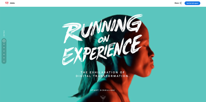
One fine example of such exceptional photography can be seen on Adobe’s landing page. This page uses images and videos shot in a studio, edited in Photoshop, featuring the duotone-look we love so much, topped off with an artsy paint-brush font.
They wrapped all this up into their charming landing page, which even includes an interactive infographic! OMG!
Your Life Through the Lens
Users document everything. The stories have to be authentic - 'the real thing'. As a designer, I am propelled to share the behind-the-scenes of my creative process.
Contrary to high-level image editing and the constant quest for elitist design, the dawn of a new phenomenon has arrived: documentation.
Nowadays when creatives start designing, their main focus is on the underlying message they are trying to convey, and how to share it most authentically. That’s why the use of stock images has become a thing of the past and users themselves have become the presenters of the product.
Since most designers, myself included, are accustomed to being behind the scenes, it may be quite a challenging shift to appearing on-screen. Suddenly you are supposed to appear in front of a crowd of strangers yearning to know what you’re working on and what’s the next thing you’re going to publish.
If I choose to share this information and use it before I publish the design, I need to do it ASAP. So, this isn’t really the place for a long, serious editing process. This is where the authentic aspect comes in.
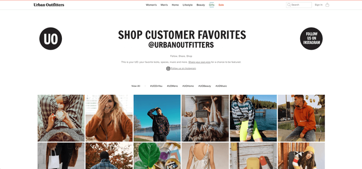
Urban Outfitters is a great example of a company that enlists users as presenters of their product. They saw the potential of using social networks and decided to ask their clients to tag UO in their photos; in exchange, the clients would get the chance to be featured on the UO website.
Any fan of this brand knows that UO is not just a clothing store, but a leading trendsetter in the design world. And the second you appear on UO – you too will be perceived as a leader. So why not do it? And so the UO tag page was born.
On this page, you can see a mix of photos with links to the user’s account on the one hand, and to the product page on the other. It’s a win-win situation.
Gif It. Gif it Good!
Present-day consumption of information is lightning fast. This means we get bored faster than ever, and quickly move on to the next thing. So if a picture is worth a thousand words - a gif is worth a million.
Another tendency that has cropped up lately in the design world is the return of the Gif.
Gifs have been around since the beginning of the Internet. Back then, it was technically problematic to upload videos to the web, and Gifs were the only option.
Because users can now upload nearly anything to the web, the way we consume information has changed dramatically. Due to our information overload, as users, we have begun to scan info much faster, and inevitably we also get bored real quick.
Enter the Gif comeback.
But this time around, they are being used a bit differently. Gifs came back as their own type of language to express feelings or as an ultra-fast story-telling device.
Designers who are aware of this comeback on social media are starting to incorporate Gifs into their designs. The aim is to engage viewers with attention-grabbing animation that will communicate a key message swiftly and make viewers fall in love with their website.
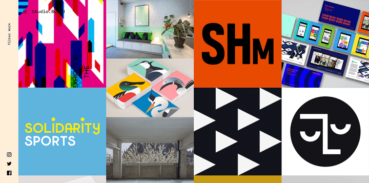
Build Studio‘s portfolio page is a remarkable example of this. Here the studio decided to throw some Gifs into the mix of their displayed images. This small addition transforms the entire page into something more alive, kicking, communicative, and fun.
So what’s your 5-second story?
Mix It Up & Go Wild
You simply can’t ignore this type of design style. Let’s give a big round of applause for... Brutalist Design!
Some social networks provide creative tools that enable users to let their imagination run wild.
I’m talking about Snapchat, Musicly, Instagram and the like. You know what I’m referring to – adding those bunny ears, doodling or sprinkling on a bunch of silly special effects. It’s never been so easy to turn spur-of-the-moment thoughts into one visual.
Designers took this concept to a whole other level and gave it an intriguing twist.
Everyone is buzzing about the genre of Brutalist page design. The name ‘Brutalism’ in web design comes from the post-war architectural movement. The style of Brutalist sites was initially a reaction to the overly polished, shiny aesthetic on so many design and tech industry websites. But ever since social networks and their design hit the scene, Brutalism was upgraded and morphed into the images/gifs that are common in users’ feeds.
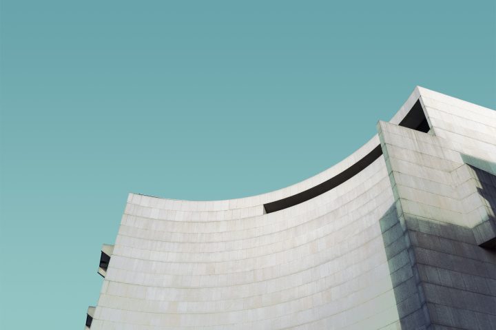
In the ‘old days,’ Brutalist design was all about raw typography, being bold, and above all, basic. It was similar to the Punk movement. Brutalist design has since become much edgier. It is hyper-vibrant, with a gazillion font styles, audacious images, infinite Gifs and animation, and surprising sounds all over the page. And, the lack of a defined grid creates a total visual-element-overload that’s more like a Pop Art collage or a 1990s video game.
But somehow this seemingly drug-induced design looks downright cool. It will appeal to some, to others not so much. For now, it’s here to stay and commands quite a lot of attention.
As a designer – I couldn’t be happier! I just adore this bizarre playful design. The ability to blurt out all your thoughts and emotions on a single canvas, and have fun along the way is thrilling.
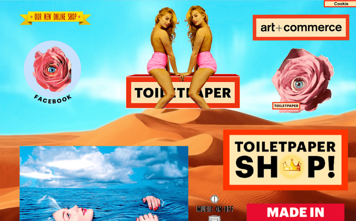
A site called Toiletpapermagazine took Brutalist design to the max. The first thing you notice here are two women riding the magazine logo, surreal roses with eyeballs, striking headlines and Gifs lining the length of an endless scrolling page. Don’t miss the quirky audio bursts when hovering over various elements. This site is definitely a one-of-a-kind experience.
Rewriting this article, I noticed that it is constantly updated, so be sure to visit the site and see what’s new.
Put a Sticker on It
Speaking of attention-grabbers, using emojis and stickers is dynamite for expressing emotion, plus they give it an extra design touch.
We already talked about the increasingly direct connection between creator and audience.
Leaving a text comment doesn’t always work.
I mean, how would you properly comment, only using text, on a delicate topic like “Why it makes no sense that cats don’t eat pickles”?
This was why emojis were invented – to use smileys, to sum up what you feel, based on what you’re reading or seeing.
Another great thing about emojis is that they fit right into the fast pace of information consumption that we mentioned before.
💩
👍
Still, emojis don’t quite do the trick.
Emojis are very basic and limited.
Enter: Stickers.
Stickers, in their earlier print version, were great, accurate, with a super cool design. They were just the icing on the cake until ultimately they began serving design and not just the user.
Contrary to emojis, Stickers express a kaleidoscope of thoughts and feelings. Even more so than the written word. One sole sticker can even symbolize a complete sentence.
Designers who caught on to this, began to integrate them into their work, giving an extra ‘wink’ to their design. Stickers can either express the designer or writer’s opinion, or relay the user’s view of what they are evaluating.
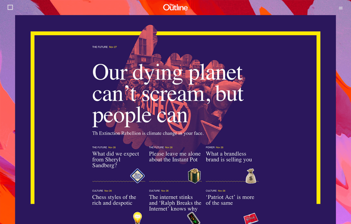
The Outline website puts stickers to good use. Each headline has its own individual sticker that spares users from having to read full headlines. Another original use is in the menu, where the stickers switch according to the daily headlines. A really cool and fun experience, definintely worth the visit.
'Enough With Your Phone Already!'
The mobile takeover has transformed the structure of sites to something that is faster, more comfortable and easier to digest.
Mobile first! This is the first thing people will tell you about web design. And it’s true. Most users consume their information on the go. On the train, the bus; waiting in line. Few users browse websites on their personal computers. The intersection of mobile and fast consumption is leading to a complete overhaul of website structure and user experience.
The ‘long pager’ structure is already passé – who wants to spend their life scrolling?
Instead of the current strategy that usually has a single responsive design for both desktop and mobile, why not change the whole approach and create an extended design for desktop and a shorter version for mobile? Because the truth is that nobody really reads in-depth articles on mobile (except you, you’re reading every word right? 😉).
This way the experience on mobile will be quick, comfortable and easy to use. Perhaps this is what is to come in 2019? Let’s hope so.
Before You Go
Bottom Line: Social Media is not a creative crime. Designers, embrace it! And design a gif for it 😉
Social networks, like it or not, are what’s viral now and feed inspiration to the design world.
The customer has never been so right. And the biggest payback for these users is that they have become the muse for today’s designs. So don’t forget to comment and share (with gifs and stickers of course).
I can’t end this article without a proper Gif:
Looking for fresh content?
By entering your email, you agree to receive Elementor emails, including marketing emails,
and agree to our Terms & Conditions and Privacy Policy.
