Spring is here, along with the March 2021 showcase. There is always much to learn from the inspirational talent of our web creator community, and there’s never been a better opportunity. This month’s websites cover truly unique topics and disciplines: industrial design projects, creative portfolios, humanitarian causes and social initiatives, to name a few.
Keep your eyes peeled for breathtaking examples of how to engage users with interactive motion effects, bright color schemes that spark emotion, and world-class branding that gets businesses moving and shaking.
Prepare to be amazed, let’s get on with the show.
10
gidimo: Learning Platform of the Future
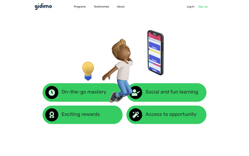
gidimo is a Nigerian EdTech company that created an online learning platform for learners of all backgrounds and stages of life. gidimo’s mission statement is to deliver a fun learning ecosystem for the developing world’s young populations — empowering them to fit the global economic graph and create livelihoods at scale. The platform’s technology uses gamification techniques and customized user journeys that “make it fun and easy to learn anything on the go”.
gidimo’s site design aligns with their brand values, messaging, and the product’s value proposition. The child-like, upbeat hero section mirrors the learning experience with a savvy animated video: 3D, clay-like figurines undergoing a “before and after” evolution from child to young professional. This brand imagery permeates throughout the site — adding an optimistic flair to each content section that tells the brand story and customer experience.
Theme: Hello
Plugins: Yoast
Design & Development: Gidi Mobil
09
Trelements: Award-Winning 3D Tile Design
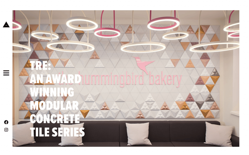
Trelements is a website built for interior designers and architects inquiring about TRE, an award-winning 3D tile design concept and product line by industrial design brand Kaza. The TRE website was built by Next Ship, a brand consultancy agency based in Hungary.
TRE’s one-page website uses the three boxes website layout: one main graphic content area for its hero section, followed by two smaller boxes or sections as you scroll down. As we immediately see, the hero section comprises a full-width background slideshow of clear, high-quality photographs that depict use-cases of the modular tile series.
The two-column section that ensues accounts for refined information architecture, applying the typography best practice of using a single typeface (Proxima Nova) in numerous weights and sizes. This effective variety indicates the hierarchy of the three text elements: heading, subheading, and description. Finally, the site design’s content-first approach elegantly illustrates the brand in a minimalistic way.
Theme: Hello
Plugins: OoohBoi Steroids for Elementor, Smush, Yoast
Design & Development: Levente Fignár & Kristóf Bán
08
Fabsn: A High-Performing One-Page Portfolio Website
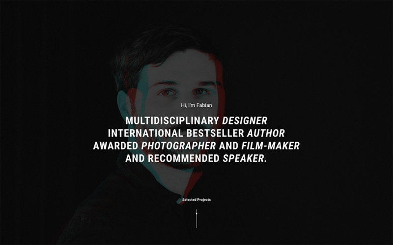
This is the portfolio of Fabius Sixtus Körner, a Berlin-based graphic designer, photographer, and consultant. Fabius’s website-creation goal was to use Elementor for an “ongoing/post-pandemic portfolio that stands out” as he pursues his design career path. His broad areas of expertise call for a way to “speak to all possible clients, whether they’re interested in design work, writing, or speaking engagements”.
To showcase his work comprehensively without weakening site performance or SEO, Fabian minimizes the need for elaborate homepage text by using large, detailed project images. Fabian uses the Elementor Popup Builder to display each in-depth project explanation — instead of adding a secondary page for each project and its style guide. This design choice allowed him to build a one-page portfolio website, an out-of-the-box technique for creating a faster, lighter, albeit compact website that captures the web creator’s full scope of design work.
Theme: Hello
Plugins: GDPR Cookie Consent, Preloader Plus, Yoast, WP Fastest Cache, Smush
Design & Development: Fabian Sixtus Körner
07
AI and Human Rights Forum: A Virtual Event To Protect the Future
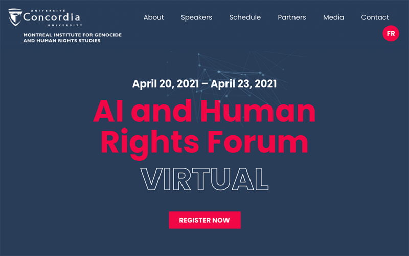
Created by Canadian front-end developer Alexandre Michel, this virtual event landing page site is the event website of AI and Human Rights Forum 2021. This online conference focuses on how advances in AI intersect and raise questions on global human rights.
Alexandre’s chosen complementary color scheme portrays an innovation-oriented event that honors a timeless, worldwide humanitarian value. The intersection of bright red (representing strength and energy) with dark, bold blue (trust and loyalty) visualizes the holistic goal of the event. Taking this fusion of principles one step further, the hero section’s mouse track motion effect uses futuristic particle imagery that follows the user’s mouse movement. Ultimately, the visitor’s active discovery of the conference content is amplified by innovative design elements and effects.
Theme: Hello
Plugins: Make Column Clickable Elementor, Simple Custom CSS, JS & WPML
Design & Development: Alexandre Michel
06
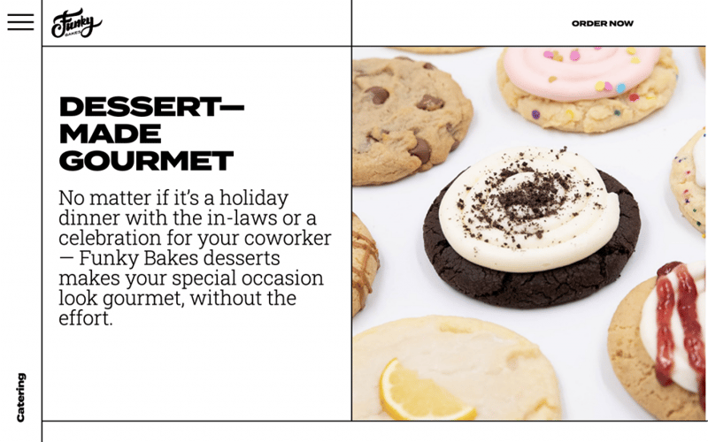
Funky Bakes: Online Cookie Shop With Style
Funky Bakes is a Miami-based online cookie shop specializing in homemade dough and batters. Their WooCommerce site was created by brand designer Geneviv Morales of STKT, a marketing and design studio in Miami specializing in restaurant branding.
Funky Bakes’s target market ranges from families and parents of school-aged children and teens to younger millennials. As such, the online shop website’s functionality and design scheme are designed to attract this focused, yet wide bracket of visitor types.
The site’s mobile responsiveness is enabled by its “black on white” theme — prioritizing readability with large, clearly legible text in bold, funky typefaces. When communication with an audience that includes teenagers, millennials, and busy families, anticipating that they’ll access the store from mobile devices makes perfect sense. The baked goods can only be ordered by phone, another reason why making sure the site works well on mobile is a top priority.
Theme: Twenty Twenty
Plugins: WooCommerce, Gloria Foods
Design & Development: Geneviv Morales
05
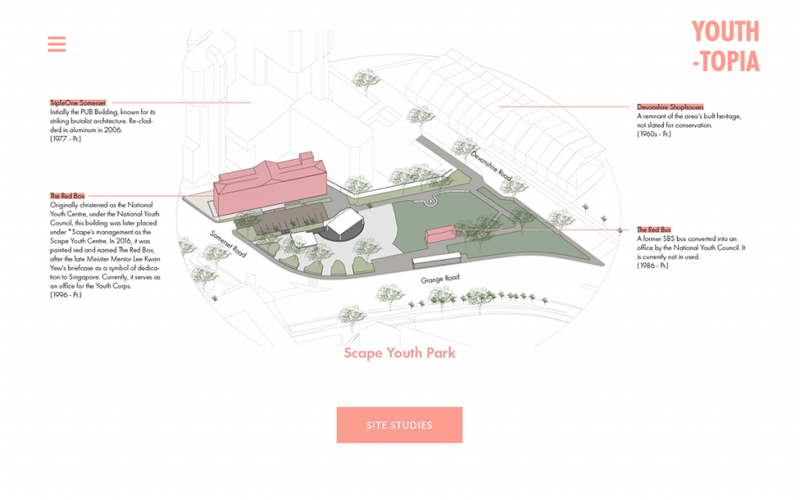
Youth-Topia: Building Singapore’s Youth Through Design
Youth-Topia is a sustainable design studio within SUTD/ASD (Singapore University of Technology’s College of Architecture and Sustainable Design). The studio’s mission is “to explore multi-dimensional issues of sustainable design through a variety of lenses and at diverse temporal and spatial scales.”
Youth-Topia’s project archive page was of particular inspiration to us; Its architectural model illustrations demonstrate the studio’s esteemed professionalism: telling a visual story of the visionary architectural design processes they are bringing to life.
Each project page also embodies a “mixed media” theme: the thin, sans-serif typeface Futura PT combined with an array of image types. This includes two-dimensional outline graphics, colorful, detailed illustration models, and vivid photographs of handmade artwork in the making.
Theme: Twenty Twenty
Plugins: Child Theme Configurator, Draw Attention, Google Analytics for WordPress by MonsterInsights, Stratum – Elementor Widgets, The Plus Addons for Elementor Page Builder Lite, WebP Converter for Media
Design & Development: Rachel Song
04
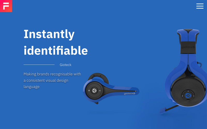
The Fuel: Industrial Design Born With Identity
The Fuel is an award-winning, B2B industrial design studio hailing from Surrey Hills, UK. The website focuses on attracting new clients, using an elaborate and personal “Who We Are” page to provide a narrative for their team’s product and hardware design samples. The studio website was created by Wingnut Websites, a website design and SEO agency for small businesses building their online presence.
Improving the website’s UX was a pivotal design choice in building The Fuel’s website, as shared with us by its web creator, Ben Morrell. The hero section originally used a vertical slider to create a “staccato viewing experience” — but was ultimately replaced with background transitions for a smoother effect. The site’s branding was also carefully crafted, creating a “striking” logo that incorporates the hero content’s animated background gradients.
Theme: Hello
Plugins: Spotlight Instagram Feed, Premium Addons for Elementor, Rank Math Pro
Design & Development: Wingnut Websites
03
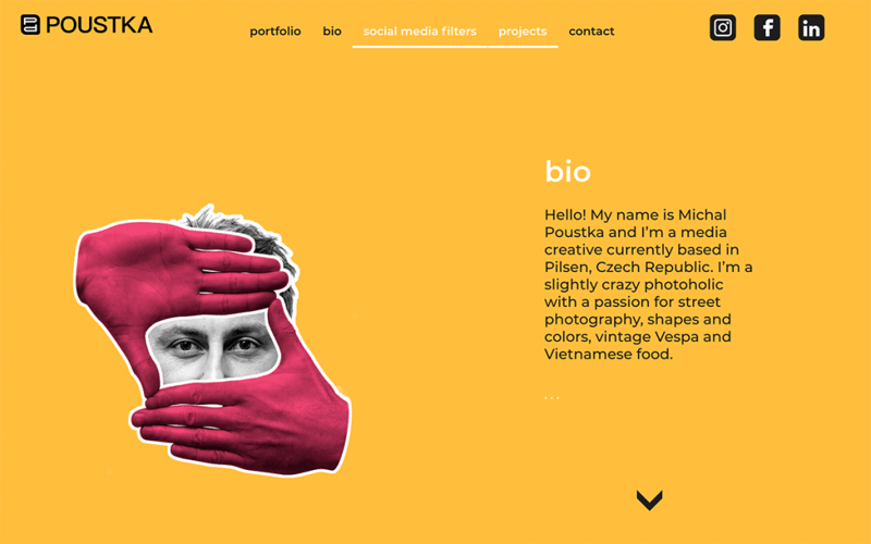
Poustka: Portfolio of a Photoholic
This portfolio site showcases the work of Michal Poustka, a media creative based in the Czech Republic. Michal describes himself as a “photoholic with a passion for street photography, shapes and colors, vintage Vespa, and Vietnamese food.” Michal communicates his expertise and artistic interests through a bold color scheme, 3D illustrations, image choices, and an image gallery of his work samples.
Michal’s color choice of a bold yellow background stems from the positive sentiments it conveys, and in the inspiration he derives from airport and highway navigation signs. In parallel, what’s most creative about Michal’s site is how he applies interaction and motion effects to static image content. This is especially prevalent in the bio section’s image sliders rotating over Michal’s headshot, adding vitality to his simple, yet friendly personal black and white photograph.
Theme: Hello
Plugins: WP Rocket, Imagify, JQuery Updater, Wordfence, SiteKit
Design & Development: Michal Poustka
02
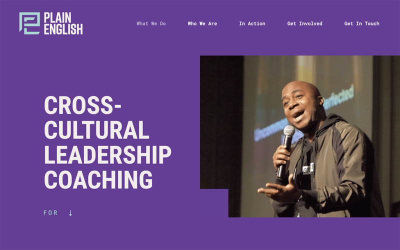
Plain English: Uniting Communities Through Coaching
Plain English is a cross-cultural leadership coaching organization created by Jay English (known as “Pastor Jay”) in Milwaukee, Wisconsin. The organization’s website was created by EPIC Creative, the creative agency that built his website and new brand to help Pastor Jay tell his story and succeed in his outreach initiatives.
Pastor Jay’s underlying website goal is to position himself as “a trusted resource in the local and national diversity and inclusion conversation”. The EPIC Creative team chose deep orange and red brand colors to represent Pastor Jay’s passionate, proactive beliefs in making a difference. To fortify his value of brand trust, the team uses video and testimonial content that personify Pastor Jay’s dedication and commitment to real action.
Finally, the site’s ultimate action item is to contact Pastor Jay. The entire site navigation scheme is built around this objective, namely the contact page whose form explicitly identifies the organization-types that Plain English accommodates: businesses, faith groups, and community organizations.
Theme: Hello
Plugins: Advanced Custom Fields Pro, Yoast
Design & Development: EPIC Creative
01
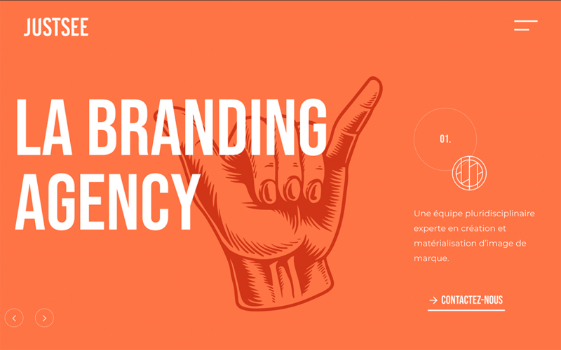
JustSee: Branding Agency Gone Interactive
JustSee is a France-based communication and branding agency that helps companies improve their brand identity and objectives — fortifying how the organization represents themselves towards its target audiences. These objectives are largely met by the work of JustSee’s marketing workshops and the graphic studio’s design work, namely marketing, design, and print materials.
JustSee accounts for the essence of their client services with comprehensive case studies that show the design processes they undergo with each client: print materials, logos, style guides, brand imagery, and the like. JustSee shared how their website’s design features and techniques illustrate their agency’s value proposition: interaction and engagement with clients.
This interactive engagement factor is used in the full-screen popup menu and in entrance animations that appear as the visitor scrolls through the pages. The popup’s menu items (built using the heading widget, each within its own individual column) turn from grey to white on hover. Ultimately, every design detail in JustSee’s website design is rooted in their brand value of user engagement and dialogue — materialized through interactive design techniques that vitalize the agency’s entire site.
Theme: Hello
Plugins: Advanced Custom Fields, Slider Revolution, Essential Addons
Design & Development: Maxime Deadwater & Gael Kyeo
Think your Elementor-based website or landing page should be featured in our next Top 10 Websites column? Give it a shot!
