Table of Contents
Photographers have a lot to show and tell. More than just the images they’ve produced, each picture also tells a story. But what’s the best way to present a large compilation of photographs and projects in a way that makes sense to both the artist and the viewer?
When we’ve come across photographer websites in the past, some of the mistakes we’ve noticed include the following:
- Focusing too much on design (aesthetics) and not enough on functionality/logic
- Distracting backgrounds
- Too many menu items
- Images are too small
- Text-only blog pages
- No explanation of the meaning behind the project images
- Omitting a 404 page
- Website isn’t personal enough
- Overcrowding the header (or footer)
Let’s see how we can address these challenges in our brand new Template Kit #7: The Photography Website. Flourishing photographers are constantly taking more and more pictures, which means their websites are only growing. We’re here to help you make sure that just because your photo reels are becoming more robust, doesn’t mean your website can’t handle it.
We built this Template Kit to help photographers maintain a clean and pristine photography website and not waste time sitting for hours in order to do so. There are many more precious ways to maximize your time — such as taking pictures!
Put Your Photos in the Spotlight
When visitors are evaluating your photography collection, they want to understand how your different collections and projects relate to one another.
This is your chance to introduce your style and personality as a photography expert. Is there a certain genre or topic that comes up a lot in your work? Are there specific photography methods and styles that you are an expert in?
Think of how you can organize and present your work in ways that give visitors a sense of your specialties, your hobbies, and anything that shows your professional character.
When designing our template, we choose a black background that creates a sharp contrast between the colorful creations of nature that we show. This photographer decided to focus on his expertise in lighting effects and capturing different elements of color.
As our viewer scrolls down the page, the black background is constant, so the only transition effect is through the photo’s focused object, and his eyes pay very little attention to the background throughout the page.
Images are the most important element in a photographer’s portfolio website. That is what visitors want to see in full view, and that is what defines the photographer’s professional and artistic value.
Homepage
Featured Image
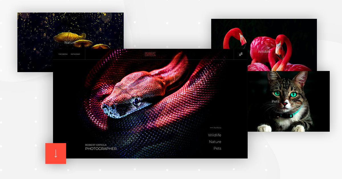
The homepage features immaculate design, using a sharp contrast between the snake’s colors on the black background. This is also enhanced by the subtle reflection of blue tints on his skin.
This represents not only ‘lightweight’ photography, emphasizing one sole object on a clear, solid background, but also a minimalistic portrayal.
Page Navigation
The very intricate scrolling effect lets the viewer transition smoothly throughout the features images. Each image is styled in the same way, with a black background behind bold and bright colored animals. Again, the photographed animals are conveyed with a minimalistic yet richly visual presence.
Project Page
Functional, While Fine-Tuned
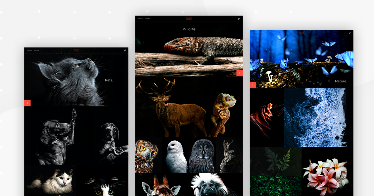
Take our ‘Nature’ page for example. There are ‘only’ two projects. How is it possible that the homepage doesn’t seem boring to the viewer? Don’t they suspect that there’s only a small amount of images in this photographer’s portfolio?
A common mistake made by many designers is adding too many menu items to their main menu. The more menu items you add, the less importance you give to each item. Don’t you want to substantiate the value of each photo collection? The way to accomplish this is to group your photos into as few menu categories as possible.
Header and Footer
Header
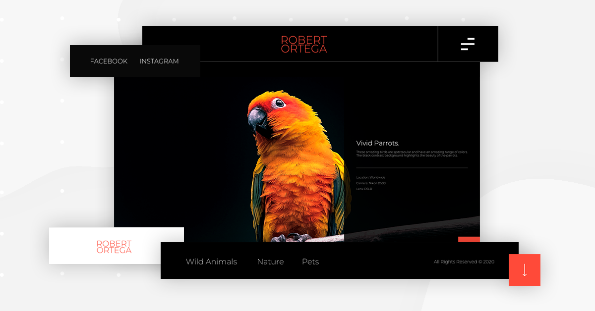
In the sticky header, there is a hamburger menu that expands into a popup menu and shows three parent categories and two projects in each one.
The header is fixed, so the user can click on the hamburger at any point, seeing the categories and sub-categories.
If you notice, our header has three elements on it. That’s not so many. But this is actually what we want. Most likely, he will either click on the hamburger and then click on a menu item once it expands, or he will continue scrolling down the page to see your work samples. Sounds good to us.
Like we said before about having too many menu items, the fewer options your header has, the better. Not only is your visitor more likely to click on one of the header items, but, if he doesn’t, then he is alternatively more likely to click on an element in the page body.
Footer
Simple, please. Remember that the footer is all about navigation and is simply a means to an end. Just use it as a way to make sure that your user has a way to get back to your site content.
And we love the arrow at the bottom, giving the visitor a quick boost up to the top of the page, without the need to upward scroll until he can no longer feel his finger.
Main Pages
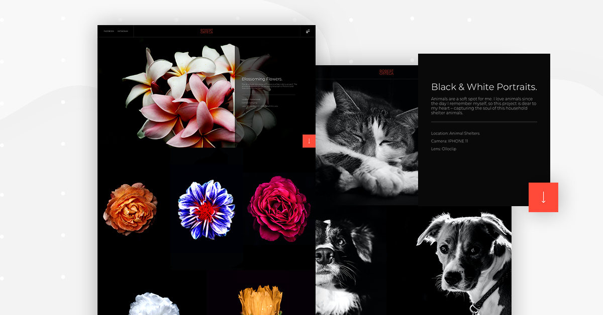
We go as far as using an image as the heading’s background instead of choosing a ‘Large’ image size. It is large, clear, and very much in charge at that point on the screen.
Many ways to emphasize and accentuate the pictures as much as possible. We made this possible with our ‘Pro Gallery’ widget. But it doesn’t stop there. There are plenty more ways to emphasize each photo and making each one meaningful in its own ways.
Effects Make It Special
We also upped our ‘effects’ game here — as the user scrolls, the (full-screen) images do things like zoom in, move around a little bit, zoom out a little bit, darken, and some of them just stay in place.
Main pages are particularly tricky, as you want to give viewers an interesting preview of your areas of work, yet you don’t want to overload the main page. You want to maintain their attention, and not overwhelm them so that they end up clicking ‘Exit.’
Imagine all the pictures you’ve snapped up throughout your career. Now comes the challenge of defining your artistic photography experience according to specific criteria. The photography template alleviates this challenge for you with the project page element — it’s specialized but still holistic; it’s clear, it’s great.
Add Background Information
What we made sure to add to our projects page is some technical details:
Why the pictures were taken and how they are artistically significant. What kind of camera was used, and the lens-type.
This is your chance to build a relationship with the user. Let him know your personality as a photographer and where you like to go for your photoshoots.
Posts & Archive
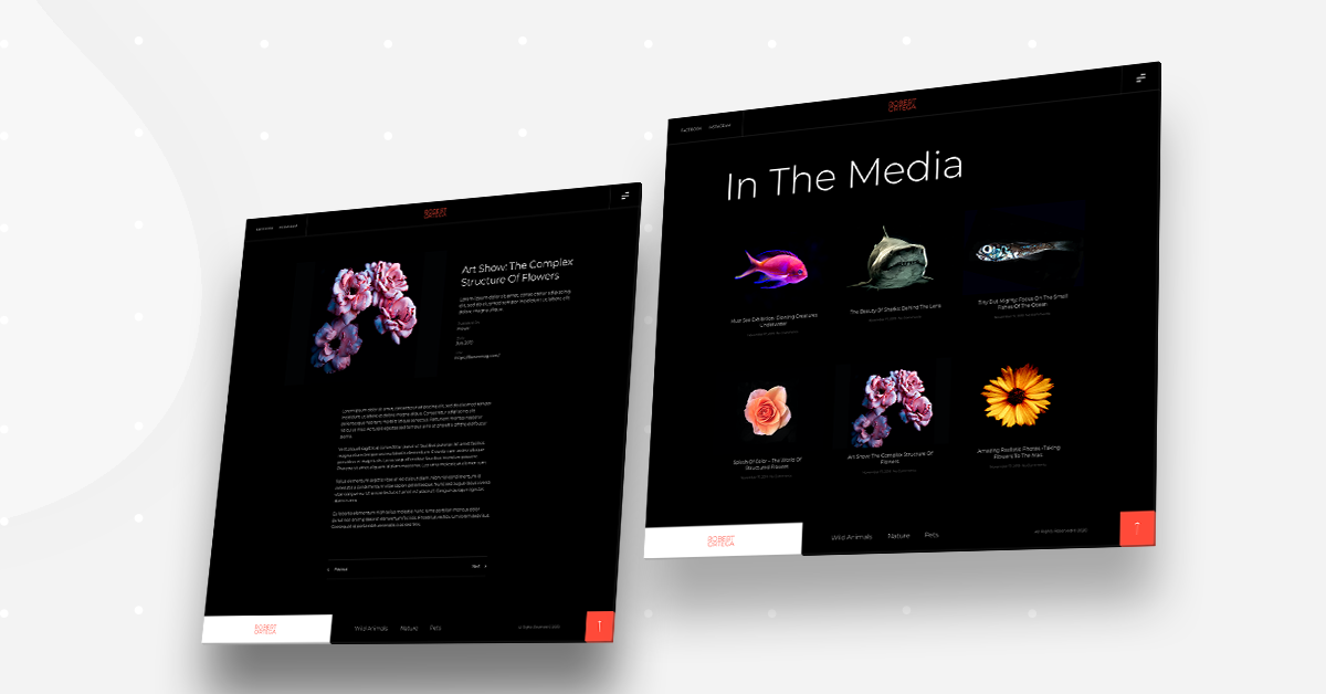
We make sure that for each post on the archive page, each featured image is also an example of the photographer’s stunning work. Not only does the post seem more engaging and worthy of a read (click), it provides additional testimony to the high quality of the photographer’s creations.
On the ‘In the media’ page, this is where the photographer shares online articles that mention him and his work. But just because the main point of the blog is to showcase writing pieces and not photos themselves, doesn’t mean the visuals shouldn’t look immaculate.
About & Contact Us
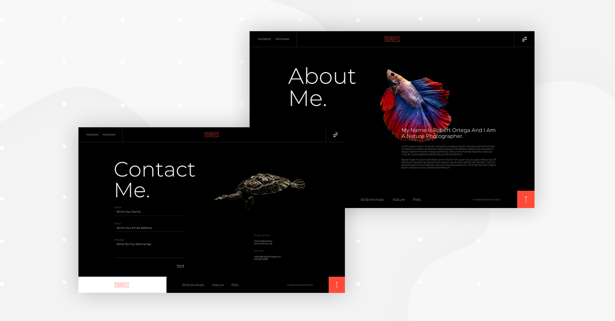
Website visitors do indeed want to know about your professional journey as a photographer; your experience, your perspective on photography, your areas of expertise. They’re interested, so speak your mind!
Don’t forget to tie this part of your dialogue into your design mindset. Above the fold, which eliminates any need to scroll down. Once again, we want the visitor to look only, only at the essence of the page.
404 Page
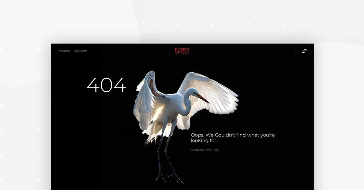
If the user sees a 404 page, he’ll get the memo that your site is definitely alive and kicking; it’s just not working right this second. He’ll maybe try again in five minutes, and succeed in his browsing attempts. Let’s make sure that happens.
What we believe is super important when designing your 404 page is to consider it as an additional part of your photography showcase. Why not take advantage of the fact that your user is looking at the browser, and remind him that your work is awesome? It’s now or never…
Templates Are the Way To Go
Imagine having to revamp your online portfolio layout every time you add a new collection of pictures. Or every time you realize there’s a way you could improve the current version of your website. It doesn’t sound like much fun, does it?
This is why we decided that our Template Kit for this month should address the photography website crisis. Now that photographers have one structured template kit to apply to every page of their site, you don’t need to worry about spending hours redesigning the web pages.
Let’s make your photography site picture perfect. And pixel perfect.
Looking for fresh content?
By entering your email, you agree to receive Elementor emails, including marketing emails,
and agree to our Terms & Conditions and Privacy Policy.
