Table of Contents
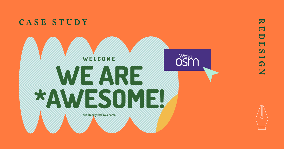
We at OSM are a team of creative, analytical individuals who accomplish awesome things together. Our pack consists of over 50 employees who love to brainstorm, work, and drink coffee together (we are proud of our vintage espresso machine!).
We’ve been around for over 12 years now, and despite the fact that our team is based in Belgrade, we welcome clients from all over the world. Most of our clients are startups and small businesses, but we have some well-established enterprises in our portfolio, as well.
As a design and development agency, we consider it important to keep up with the latest trends and provide our clients with the best possible solutions. Our website has always been our business card: a place where we can show our creativity and provide visitors with an OSM experience.
Our new site was launched one year ago, and now it is time for a revamp.
The timing of the Elementor 3.2 release was just right! Jovan Lakić, our main website designer, used Text Path Widget, Mask Option, gradient buttons, and sticky columns to freshen up our main site’s pages.
Take a look at what has he done so far:
If you are seeking inspiration and guidance on how to make the most out of new Elementor features — you’re in the right place. My aim for this post is to show how to get these stunning effects without writing a single line of code. But let’s be honest — that’s why you started reading it in the first place, right? 🙂
Let’s dive right in.
Wavy Subheadings, Thanks to the Text Path Widget
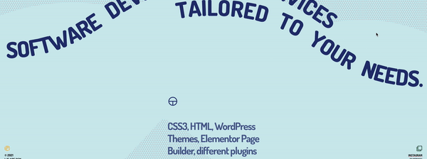
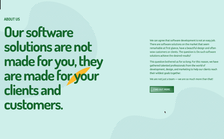
The Website Development Service page is one of the most visited pages on our site, so we wanted it to be more engaging. With the Text Path Widget, we managed to get these stunning, wavy subheadings. Take a look.
Before:

After:
How Can You Create a Wavy Text Like This One
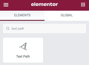
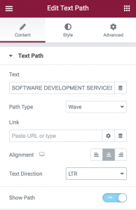
1. In the Elementor editor — search for the Text Path widget and drag it in:
2. Replace the placeholder text with your own.
3. In the Style tab, adjust the Font Family, Size, and Color.
4. Click the Show Path toggle, so you can better visualize your text path. You can switch it off later if necessary.
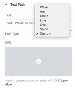
5. Choose an option in the Path Type. We’ve opted for “Wave”. If you want an even more curvy look, you can always choose the Custom option. Simply by clicking on the + button, upload a curve that you’ve previously drawn or downloaded:
6. Align the positioning of the Text Path widget — we’ve chosen to align it to Center. The default widget size of 500 pixels takes up the whole column — so you might not be able to see the alignment change before you change the size.
7. Choose a Text Direction. We’ve mixed things up a bit so that the first line of text is LTR (left-to-right), and the second one is RTL (right-to-left):
Simple as that!
Here are more examples of how we used this neat feature.
Before:


After:
How To Turn Patterns Into Shapes With a Gradient Feel
Creating patterns with shapes is a cliché. Let’s go the other way around.
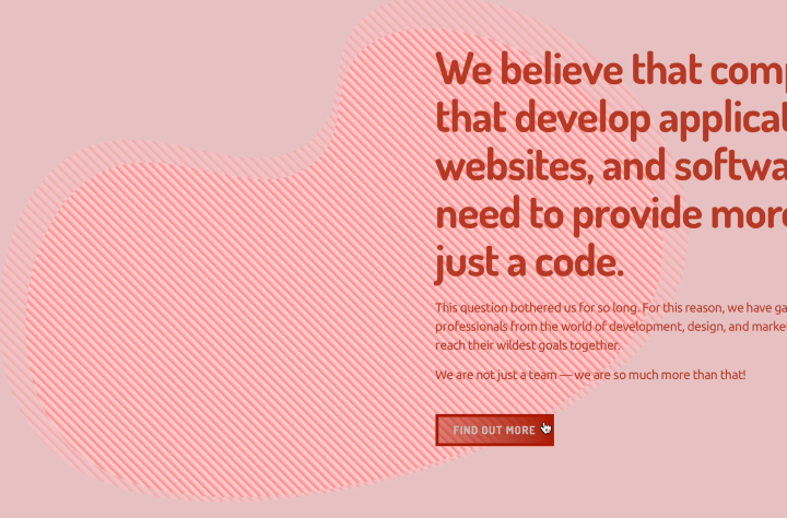
We must brag a bit, and say that everyone was wowed by the patterns on our Homepage.
Before:
However, we did a bit of a pattern makeover after playing with the Mask feature. How do you like our patterns’ new look?
After:
How To Use the Mask Option To Create Shapes Like These
1. Drag the Image Widget from the Editor and upload your image of choice (or a pattern, like in our case).
2. Find the Mask option in the Advanced tab and click to toggle it on:
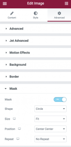
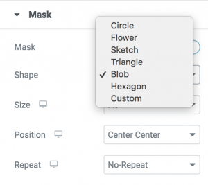
3. Choose a Shape from the list (we used “Blob”), or upload your own SVG or PNG format:
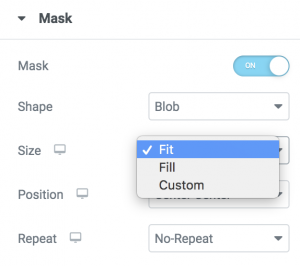
4. Set the size of the Mask to specify how it should fit its container. Go for either the “Fit” or “Fill” option, or play with the mask size in the Custom Size section:
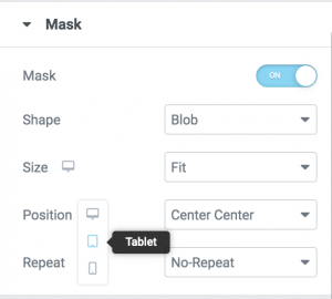
5. Tweak the mask for different screens (tablet, mobile) by clicking on the device icons:
6. Add some Motion Effects to make your design even more fun! Select the Scrolling Effects or Mouse Effects toggles to turn the animation on and pick the effect that you like:
That’s it!
Ah, one more thing — have you noticed our revamped CTA buttons? We’ve added the gradient button effect to make them more engaging. After all, 2021 design trends are very much about gradients.
The buttons on our current website just have a frame with a solid color hover state.
Before:
After:
How To Add the Gradient Button Effect to Your Button
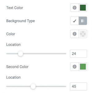
1. Go to the Style tab and click the Gradient icon in the Background Type option to turn the solid color background into a gradient background:
2. Pick two colors and adjust the location of each one. That way, you can control the transition between the gradient, and how sharp or subtle it’ll be.
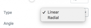
3. Choose the Gradient Type: “Linear” or “Radiant”. We implemented the linear one, but you should test and decide on the best fit for your website design.
4. Use the slider or type in an exact value to adjust the gradient “Angle”.
5. Add a hover effect to make the button more interactive.
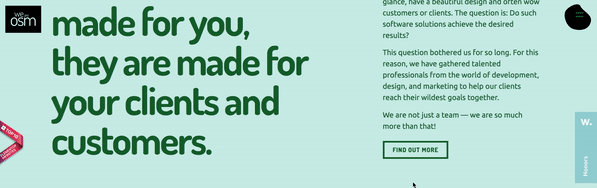
Don’t Let Your Visitors Get Lost — The Sticky Column Can Come in Handy!
It’s often the case that when visitors scroll down a page, they simply forget why they were on the page in the first place. Even if this isn’t the case, imagine how useful it would be to have sticky sub-headings or important info. This is something we’ve tested on our Brand Development page. Check it out.
Before:
After:
How To Implement the Sticky Column
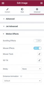
1. Select the Inner Section widget (within the main one) and go to the Advanced tab.
2. In the Motion Effects section, choose the Sticky effect -> Top.
3. In the Offset, add the value 100 (0 is the default).
4. Select “Stay in Column”. This means that the inner column remains within the main section.
Not that hard, right?
Utilize New Features To Show Creativity!
Hope that we’ve encouraged you to explore Elementor 3.2., and to play with these cool features we’ve described. We are still in the process of updating our website and can’t wait to see what you’ve come up with for yours — maybe we can get even more ideas! Let us know in the comments down below.
Looking for fresh content?
By entering your email, you agree to receive Elementor emails, including marketing emails,
and agree to our Terms & Conditions and Privacy Policy.


