Table of Contents
The website design is inspired by Japanese culture, namely their sleek, sophisticated style. These restaurant website templates cater to restaurants and online businesses looking to build their online presence with a modern, polished website. The simplicity and straightforward-ness of the template’s structure and layout is versatile in its essence, allowing any business type to use it and adapt it to their unique needs.
We chose a clean design with a minimalist background that accentuates the deep color and clarity of the images placed throughout the template. With that, we embraced the world of culinary art, showing highly-detailed photographs of the food dishes served at the restaurant. In this post, we will explore the design choices and design thinking that we used when creating the template, such as the photography approach, how we designed the website color scheme and layout to complement the images, and more.
Homepage: Setting the Tone

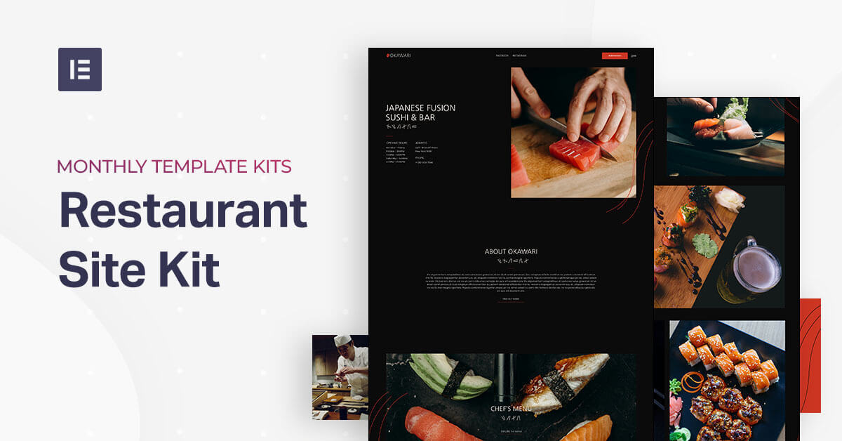
The template’s homepage creates an atmosphere of serenity, intimacy and sophisticated minimalism — all thanks to its color scheme. We chose a dark color such as black to portray the traditional Japanese color palette of dark colors, as well as white and shades of red. The goal of the overall design is to create the same vibe as customers do when they enter a Japanese restaurant, with understated yet modern furnishings and decor.
One of the most unique, actionable design elements in the Homepage (and header) is the hamburger menu, and this is actually one of our favorite things about this template. We’ve used a small chopsticks icon to represent the hamburger, which we were able to do by uploading an SVG file. You’ll also notice that when you click on the horizontal chopsticks, the pop up opens up and its exit icon is also a chopsticks illustration, but positioned as an X. The chopsticks imagery is one of numerous usages of the line-like designs throughout the website.
What’s unique about the design scheme used here is that the template’s entire color palette is based on the details of the homepage’s hero image: a deep red-orange slice of raw salmon. This exact shade of red is used for the ‘Reservations’ button and in the Okawari’s logo in the top left corner.
You’ll also notice that the logo’s red graphic has thin, subtle lines going through it, which is meant to mirror the lines sliced through the piece of salmons in the image. We took this design concept one level further, which you’ll notice throughout the entire website, where we placed red curvy vertical lines going down the page, which also indicate that there is more content once you scroll down below the fold.
On the whole, given that the color scheme we used is built around the red-orange color of the salmon, our finished color palette is an analogous compilation of red-orange, black, white, and an off-white color known as “Spring Wood.” We enjoy the inviting, understated vibe created by this palette, which is a good way to express the restaurant’s hospitality and inviting vibe for people looking for a delicious meal.
When you choose to insert the homepage template into your website, take note that this template is a ‘Page’, which you download from:
Editor > Open Library popup > Pages tab > scroll the page and find it or search for “Japanese Restaurant”.
Header and Footer: The Beauty of Contrast

Similar to what we discussed about the homepage, the color combination that you’ll find in the header and footer creates a delicate contrast, especially between the red and the black, which is a clear representation of the restaurant’s vibe: combining traditional cuisine with a modern and trendy restaurant.
In terms of usability, this contrast helps website visitors notice the attractive ‘Reservations’ button that stands out boldly in the header. Ultimately, one of the website’s main goals is to encourage visitors to make reservations, and a bright, inviting call-to-action button is a great way to make that happen.
In fact, visibility is one of the most important factors when you’re designing your call to action button. Your button standing out among its background and surroundings is crucial to its success.
The footer’s minimalist design is characterized by its unique font choice for the text in each of the four columns — Poppins, a thin, rounded sans-serif typeface. In the template, we actually chose two different typefaces, both of which are sans-serif: Poppins and Nanum Gothic. Both are thin, lightweight, minimalist fonts, while Nanum Gothic is slightly less rounded and more straight and linear. This style corresponds well to the recurring thin lines imagery throughout the template.
When you choose to insert the Header and Footer templates into your site, you can do so by doing the following:
Header:
WP left panel > Templates > Theme Builder > Add New > Choose “Header” > Library popup > scroll the page and find it or search for “Japanese Restaurant”
Footer:
WP left panel > Templates > Theme Builder > Add New > Choose “ Footer” > Library popup > scroll the page and find it or search for “Japanese Restaurant”
Chef’s Menu and Bar: Starting Your Meal

The Chef’s Menu and Bar pages accentuate the colors, textures and uniqueness of the ingredients used in Okawari’s authentic Japanese food creations. Abiding by the broken grid layout, the black background behind the detailed, rich food and drink photography gives the visitor a “so real you can touch it” kind of experience.
As you scroll down, the Appetizers and Salads section is composed of two wide columns, with an image widget beside the Price List widget on their respective sides. Because the section’s image is given a large size of 514×795 px, the details of each ingredient really come to life, from the texture of the salmon to the precision of the cucumber slices, to the frosty and crunchy rock candy.
Those exploring the menu and considering booking a table at the restaurant get an astute visual sample of the type of food and drinks they will enjoy.
This vivid imagery style is true for every image on the page, and just as we saw on the Homepage, the lightweight white text describing each menu item is an effective design tactic to enhance the beauty of the menu’s food photography.
Both the Chef’s Menu and Bar pages are Page templates. You can insert these by doing the following:
Editor > Open Library popup > Pages tab > scroll the page and find it or search for “Japanese Restaurant”.
Gallery: Showing Your Work

The Gallery page in this template kit takes the beauty of culinary art to the next level. It also maximizes the potential of what the Gallery widget has to offer. Maintaining the broken grid layout, the gallery page mixes things up a little bit by adding full-width images, alternating between a two-column and one-column layout as you scroll down.
Another technique that we used for each image on the Gallery page is lazy load, which by the way, is one of our most favorite design tactics here at Elementor. Lazy load not only optimizes page loading time as well as your site’s overall performance, it also keeps the user engaged as they scroll down the screen. Fundamentally, lazy load means that image content doesn’t load at page load time, rather only when the website visitor has scrolled to that content’s section of the screen.
This expedites the page-loading process, and it stimulates user engagement because the images actively appear on the screen as he scrolls down, creating a dynamic visual interaction.
Colorful imagery is used yet again in each dish’s photograph, the vibrant ‘colorful eating’ theme present in every corner. It’s an all-encompassing experience, to the point where you can imagine what it’s like to bite right into each roll of sushi or nigiri.
The Gallery page is a Page template. You can insert these by doing the following:
Editor > Open Library popup > Pages tab > scroll the page and find it or search for “Japanese Restaurant”.
Events: Radiating Hospitality

The Events page uses a ‘people-first’ attitude by showing detailed, crisp images of Japanese women dressed in authentic garb. Their happy expressions create a welcoming, upbeat atmosphere, just as any restaurant or event guest would want to feel when walking into a restaurant entrance or event room.
Showing the lanterns and thematic decor of the restaurant also conveys the message that attending an event or party at Okawari is a truly traditional Japanese celebration experience, with a friendly lighting scheme that gets users excited about walking through the door.
As on all of other pages, we used the chopsticks imagery as dividers between different bodies of text as well as the red lines theme that matches both the color scheme of the salmon and the overall look of the website.
The Events page is a Page template. You can insert these by doing the following:
Editor > Open Library popup > Pages tab > scroll the page and find it or search for “Japanese Restaurant”.
About: The People at Okawari

The About page takes the concept of ‘people-first’ content design even further. The first image of the sushi chef making eye contact with the website visitor while in the middle of his craft, adds a personal connection to the About us page. Without visiting the physical restaurant, prospective customers get an authentic, tangible sense of who they will interact with at the restaurant.
Further down, the intimate view of Okawari’s Executive Chef working his expertise in the palm of his hands conveys a “behind the scenes” type of experience for the website visitor. His entire kitchen workspace is visible, portraying a professional atmosphere that is prestigious yet humble.
Placing the iconic red line design over the image connects the Executive Chef’s work and contribution to the restaurant’s branding and the overall website experience.
The About page is a Page template. You can insert these by doing the following:
Editor > Open Library popup > Pages tab > scroll the page and find it or search for “Japanese Restaurant”.
Reservations: Getting in Touch
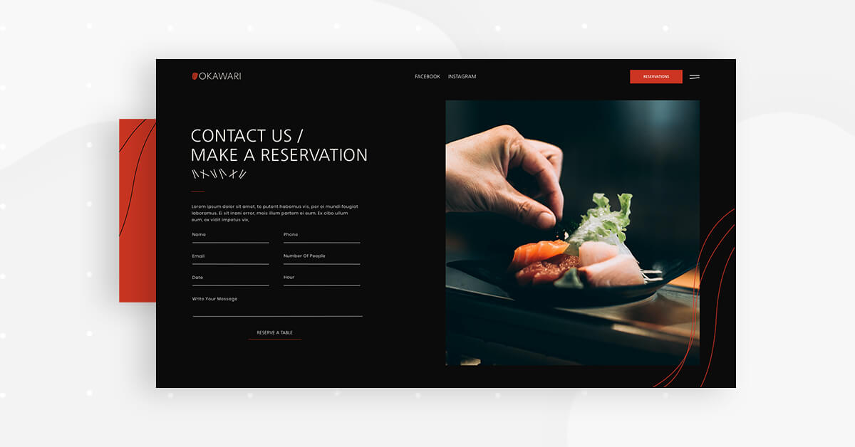
The Reservations page uses the form builder to create a simple, user-friendly form. The choice of photograph next to the form bears added significance as the hand adds a ‘human touch’ to the page design. The underlying implication here is that the website visitor is initiating human contact with the restaurant and coming one step closer to getting a taste of their delicious food. This is just the beginning of a positive relationship.
Another widget we used on the Reservations page is the Google Maps widget. Customers are definitely going to be looking up how to get to your restaurant, and there’s nothing easier to navigate than good ol’ Google Maps. And in the same way that you’re making it easy for customers to find you, you yourselves will find it easy to add the Google Maps widget to your site. After you enter the location you want to display, you have full control over how zoomed in the map is when visitors first see it, what size it is, and you have complete freedom to style your map as you see fit.
The Reservations page is a Page template. You can insert these by doing the following:
Editor > Open Library popup > Pages tab > scroll the page and find it or search for “Japanese Restaurant”.
404: Getting Back On Track

The 404 page utilizes the beauty of black and white design to emphasize just a few short words. Less is more in this case, as our attention is immediately directed towards the 404 message, despite its small font size and the short length of the sentence.
Our main priority when a user ends up on our 404 page is to redirect him back to the website as soon as possible and to eliminate any possible distractions or confusing navigation. Therefore, using a minimalist, brief message and visual scheme is the best way to facilitate that.
The 404 page is a 404 template. You can insert these by doing the following:
WP left panel > Templates > Theme Builder > Add New > Choose “Single – 404 Page” > Library popup > scroll the page and find it or search for “Japanese Restaurant”.
Navigation Menu and Happy Hour Pop ups: A Clear Course of Action

The navigation menu popup is an extension of the template’s elegant red-orange color scheme. The contrast between the red and the black background is harmonious here, and the deep red coloring lets the delicate, lightweight menu items text stand out and be completely visible despite their thinness and modest size.
The Happy Hour pop up follows the same color scheme and styling of the navigation menu popup, yet repackages the content into vertical form. What we focused on here is the precise information hierarchy, given that we are presenting a discount offer that might encourage users to come and try the restaurant even sooner than they had originally planned to.
Finally, the red-orange background is an astute reflection of what a happy hour represents: a refreshing, energetic experience that’s meant to lift your spirits. There’s no doubt that an hour of sushi and cocktails will do the trick.
The Reservations page is a Page template. You can insert these by doing the following:
WP left panel > Templates > Popups > Add New > Choose “popup” > Library popup > scroll the page and find it or search for “Japanese Restaurant”.
It’s All About Presentation
Foodies like us know how important it is for your food to look as good as it tastes. The same is true for your restaurant website. Once you create a website that presents your signature dishes and your business as a whole in an inviting, visually pleasing online format, your future restaurant guests will be eager to wine and dine with you.
To see the full Japanese Restaurant Template Kit, check out this demo.
If you have Elementor Pro, all you have to do to enjoy this cutting-edge kit is to go into Elementor, open the template library, and search for ‘Japanese Restaurant’.
Here’s a short gif showing how to search for the kit:
What templates would you like to see next? Let us know in the comments below.
Looking for fresh content?
By entering your email, you agree to receive Elementor emails, including marketing emails,
and agree to our Terms & Conditions and Privacy Policy.


