Table of Contents
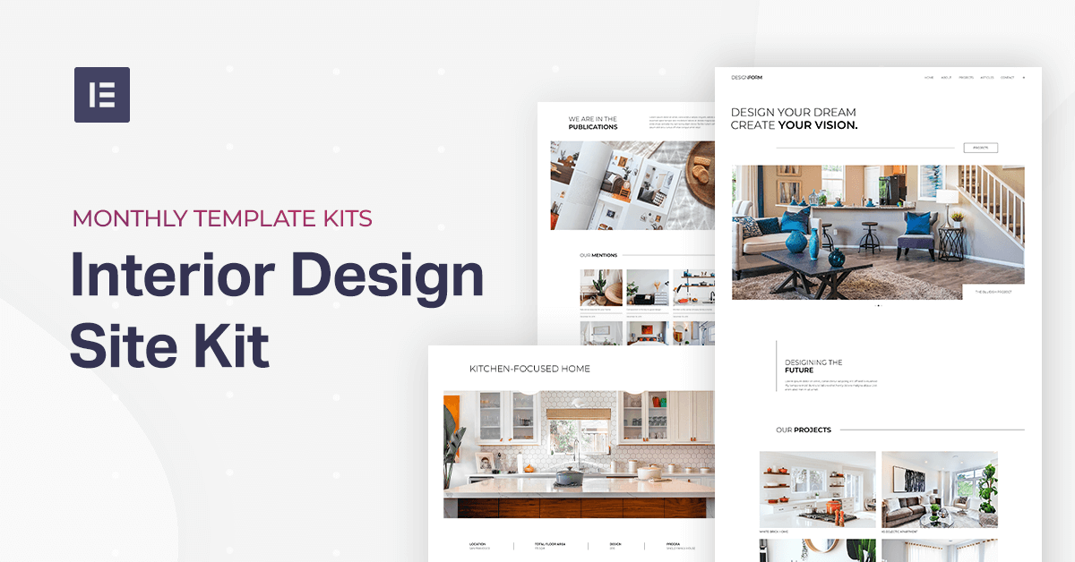
This month’s template kit is a prime example of a minimalist website created by a small business, this time a boutique interior design firm by the name of DESIGNFORM. Business owner Jackson Miller chose a website style that embraces the visual strength of plenty of white space and thin fonts with a subtle emphasis on detailed photographs. The clean and light vibe that’s present in every element of the website reflects the design firm’s unique style of sophistication and serenity.
Meet the Template
Our Interior Design Template Kit is an asset not only to interior design and architecture businesses but to any small business across the spectrum. Any small business or freelancer that wants to create a website that puts their images and visual assets at center stage, all within a clean and minimalist ecosystem.
The abundance of white space and black and white color scheme, in general, is also not limited to design or art-specific business. On the contrary, because it’s a ‘no color’ color scheme (black and white only), the template is a perfect fit for any person or business who wants an uncomplicated and straightforward looking website.
Homepage
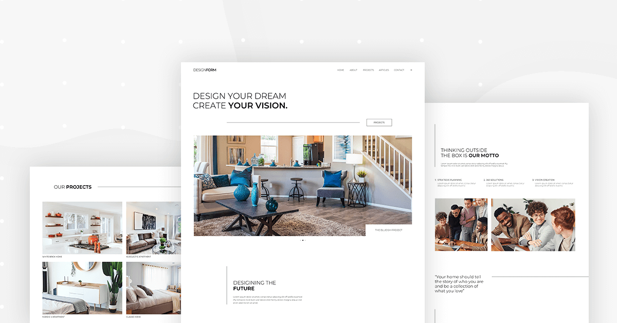
Projects + Single Project
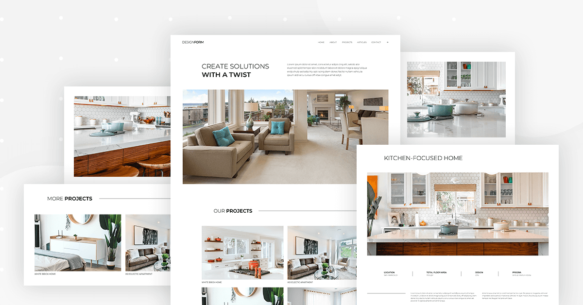
The project page of this template really embraces the art of photography. What really takes the cake here is the image layout — within one column, the wide-angle view into a room in the project makes the entire webpage all about feeling the presence of every detail that the architects create.
It’s almost what we’d call the ‘next best thing’ after going to the site of the design and entering the room yourself. True, it may be limited to a browser on a screen. Still, the visual experience is so real and tangible, thanks to the balance between vivid photography and a modest, simple presentation. It’s all about the project.
About + Contact Us
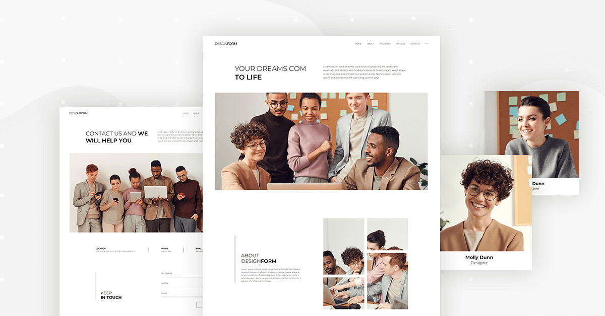
The ‘About’ page, like the ‘Projects’ page, begins with a one-column image layout, with a large width, giving the visitor a detailed, up close and personal perspective on the design firm’s team that works with each client.
Just like before, since the visitor has yet to sit down to a meeting with the interior designers with a friendly handshake and face-to-face meeting, the next best thing is a group image of the firm’s team to get the vibe of their professional dynamic and rapport with one another.
Yet again, the page is all about the emphasis that the web creator is conveying to every visitor. But just because the first image is one column, doesn’t mean the entire page needs to be limited to a single-column layout.
As you scroll down the page, the number of columns becomes two and then three and then two and three again. This keeps the user experience interesting and varied yet consistent and smooth—the perfect balance. There’s great harmony between the images, and the visitor is given the opportunity to learn about each team member in their own light: the business owner and his employees. It’s as real as possible, captivated into one screen.
Archive and Post
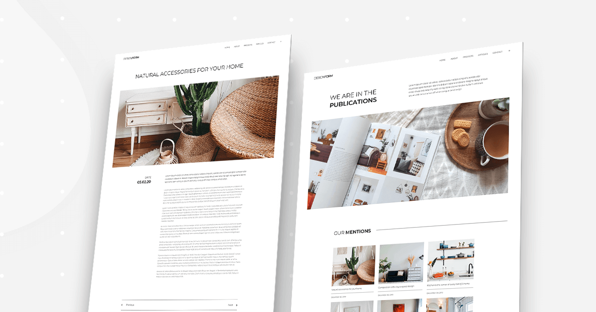
If you notice, one unique trait of the archive page is that it really conveys a conversation with the reader. Coming to life, the design firm is excitedly telling visitors about their achievements and showing them their best work, as published in a magazine.
The standard way to encounter a blog or archive page is your eye going directly to a captivating image, rather than to a list of or gallery of posts. This is yet another way that the website design succeeds in hosting a conversation between the website owner and the visitor as if they’re sitting together having tea and cookies (as shown in the ‘Archive’ page featured image).
More than just achieving a friendly conversation, the dynamic created by this page design encourages users to keep scrolling down and reading the various articles about the design firm.
Header and Footer
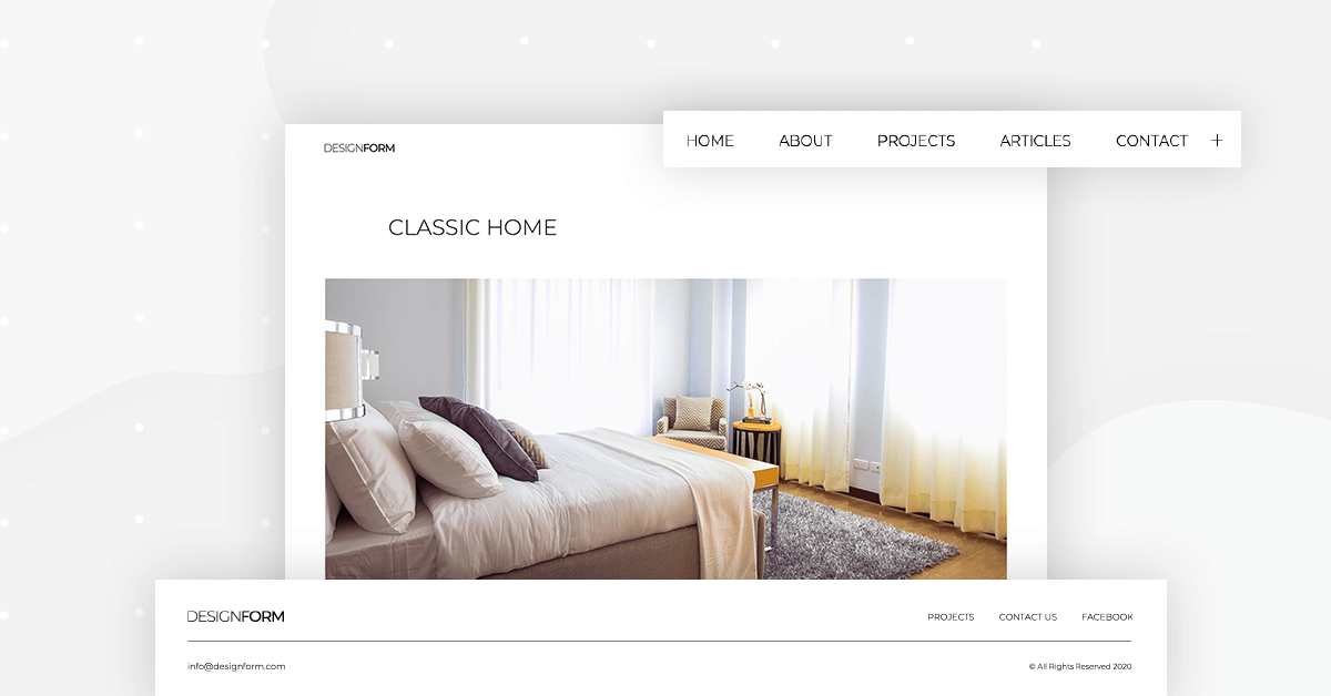
The header and footer used in this template represent somewhat of a visual irony. Our initial reaction to a plain white header with thin, black font would be along the lines of “boring, not engaging, or sophisticated. But on the contrary, the understated, modest menu is what draws attention to the large, vivid imagery that characterizes each page of the design firm’s site.
This template actually uses minimalist design to let each photograph convey their maximum level of detail.
404 Page
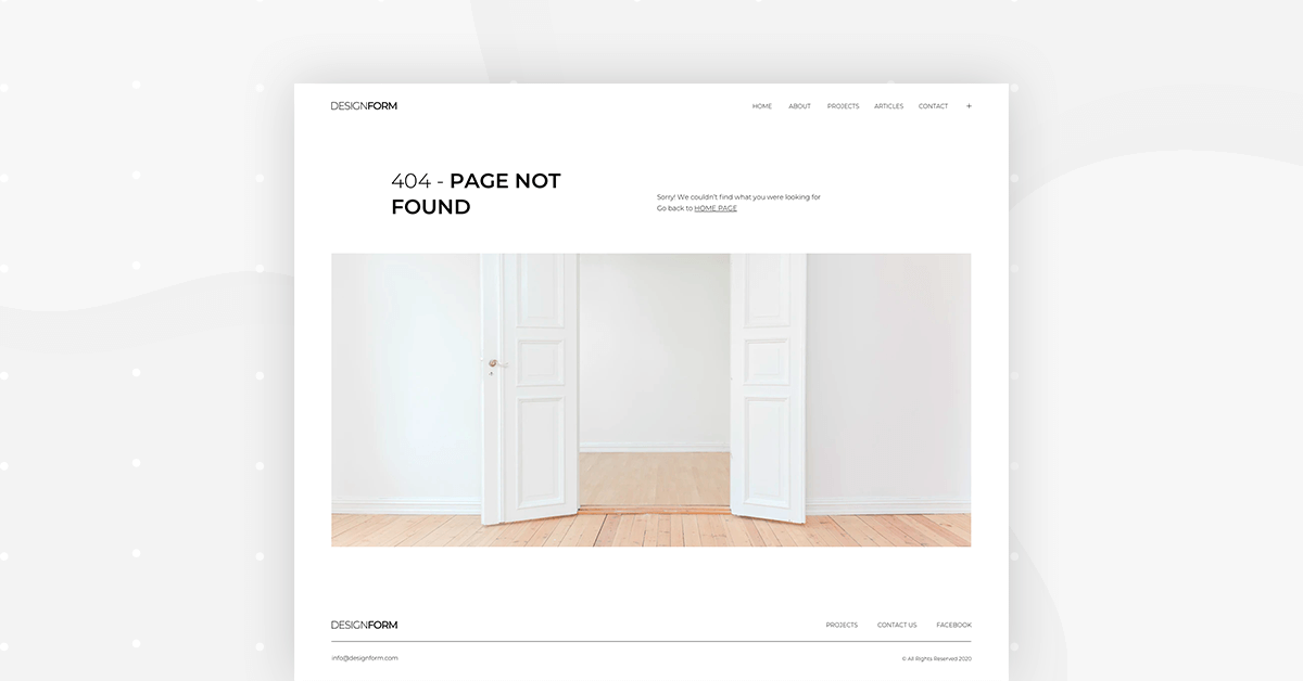
The 404 page is a great example of how one simple image can take care of all the hard work that goes into designing one page of a website.
This is true mainly for two reasons:
- Using a large image takes care of the design needs, there’s no need to spend more time on graphics or patterns to illustrate the 404 page.
- The image content says it all — the messaging is clear: ‘Out of all the rooms we’ve shown you, this one is empty’. The same exact statement can be said about the pages on the site!
This clever use of imagery isn’t limited to architecture-related websites that show different photographs of rooms. There are plenty of ways to capture a ‘404 message’ with other photographs or large images, with no need for more than one or two sentences.
Popup
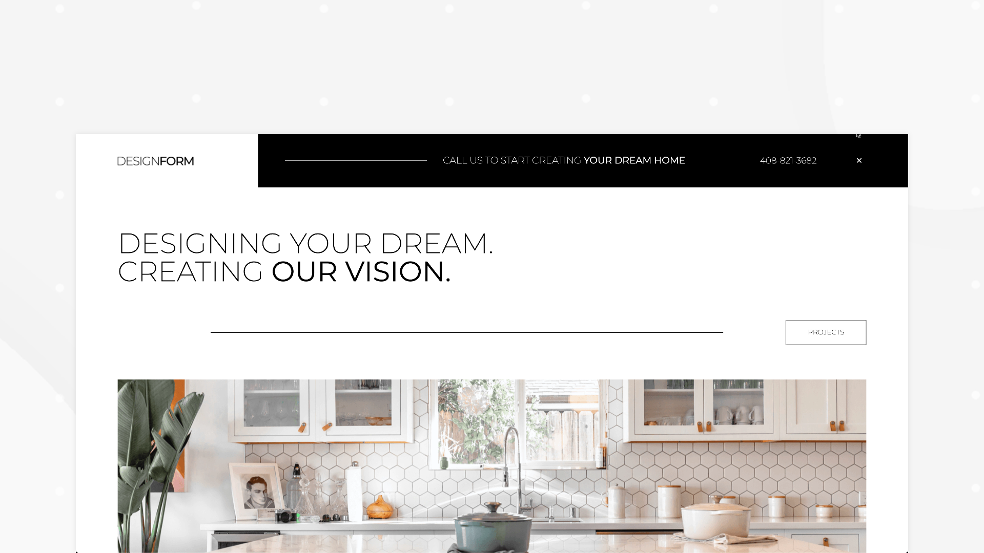
The popup located on the right of the header is also a subtle, understated design element. The button to view the popup is a small black ‘plus’ sign beside the navbar menu items.
It gives an extra personal touch to the dynamic between the design firm and the website visitors because it becomes very easy to call the interior designers directly rather than spend time looking for their contact information in the footer (which is the standard way to show business contact information on a website).
Logically, making the firm’s phone number so accessible to website visitors increases the likelihood that they will pick up the phone and call. This is a great way to generate leads and engage with potential clients.
Build Your Dream Website
The same way you can build your dream home with the right interior designer, you can also build your dream website with the right template.
We know how challenging it can be for small businesses to choose a website theme and style that best represents their business. Not to mention the time and resources involved.
This is why we strongly encourage you, whether you’re a freelancer, a small business, or really, anyone, to explore our Interior Design Template Kit or another kit that speaks to you.
We build our Template Kits with versatility in mind, so that they’re easy to apply to your website, and still be super versatile for any changes you might want to make.
As we’ve discussed, minimalist design has so many advantages for every web creator. We can’t wait to see you fulfill your design potential to the max!
Looking for fresh content?
By entering your email, you agree to receive Elementor emails, including marketing emails,
and agree to our Terms & Conditions and Privacy Policy.


