
Table of Contents
Keep your visitors motivated with a rigorously picked list of the funniest 404 pages.
Landing on a ‘page not found’ can really drive your visitors nuts.
One of the best ways to enhance your visitors’ user experience is by keeping them motivated and engaged with your site. This can be done with beautiful design, engaging content, or, a healthy dose of humor. A creative and clever error page goes a long way in turning your visitor’s frown into a smile. It can also have a positive effect on your SEO since by providing inner links, navigation and a solution to a problem — even if you simply provide a link to your homepage — you keep the user satisfied and within your sales funnel.
Table of Contents
- What is a 404 Page and Why Must You Have One?
- 1. Bluegg - A Play on Words
- 2. Drift - Embed quirky videos
- 3. 9Gag - Incorporate Absurd assets
- 4. Flywheel - Minimal and subtle humor
- 5. Slack - It’s funny because it’s weird
- 6. Dan Woodger - Sometimes a cute illustration is all it takes
- 7. Team Coco - Silly gifs
- 8. Comedy Central - Hysterical yet on-brand
- 9. NMFH - Dark humor at its best
- 10. HBO - Use Inside Jokes
- 11. The New Yorker - Take advantage of what already works
- 12. Blizzard - Surprise your audience
- 13. eharmony - Relate the topic to your service
- 14. Distilled - Accents are amusing
- 15. Emailcenter - Make it personal
- 16. IMDB - Being funny takes time and effort
- 17. Orangecoat - Add visual charts
- 18. Github - In-jokes
- 19. CSS-Tricks - less is more laughs
- 20. Mashable - Funny take on lost
- 21. Taco Bell - Another silly laugh
- 22. Steve lambert - Acknowledge the awkwardness
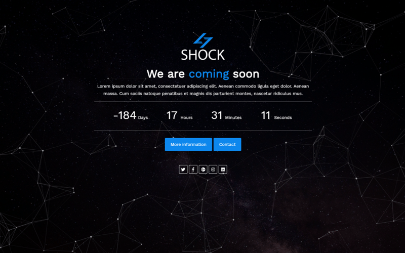
- 23. SHOCK - 404 Page Template for Sale
What is a 404 Page and Why Must You Have One?
A 404 page, also known as an “error page” is the page that users are directed to if they click on a broken or deleted link on your website.
Overtime, pages can get removed, or moved to a new URL without a permanent redirect. If a user tries to access this link, they’re sent to a ‘404 page’ that informs them the link they’re trying to access is broken.
When this happens, it’s important not to lose the user entirely, but instead you should strive to keep them engaged with the site and ideally direct them to the correct link. Some companies get real creative when designing 404 pages, by incorporating animation, illustrations, and interactive elements.
That’s all good, but there’s no doubt that the most effective and memorable 404 pages are the funny ones. That’s why I decided to collect the funniest examples of 404 pages on the web.
Humorous “not found” pages have the advantage of not demanding high budgets, so they are a good fit for freelancers and small companies, not just big brands.
In this post, we’ll explore the most hilarious examples of 404 pages, and analyze what makes each one work. Once you understand the underlying comedic strategies that these pages share, it’ll help you come up with your own original 404 page.
Here are 23 great examples of 404 pages done well.
1. Bluegg - A Play on Words
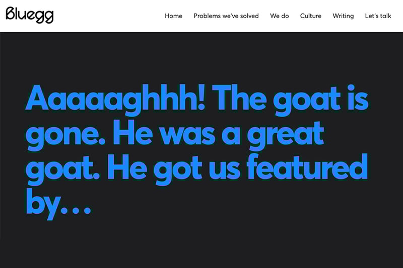
Visual imagery is common in 404 pages, but relying solely on content can also have just as much impact.
Bluegg made a kind of obituary for ‘the goat’, which apparently refers to their error page. You will see many death-related jokes in 404 pages. The same kind of gags can work for your pages if you are a fan of dark humor.
2. Drift - Embed quirky videos
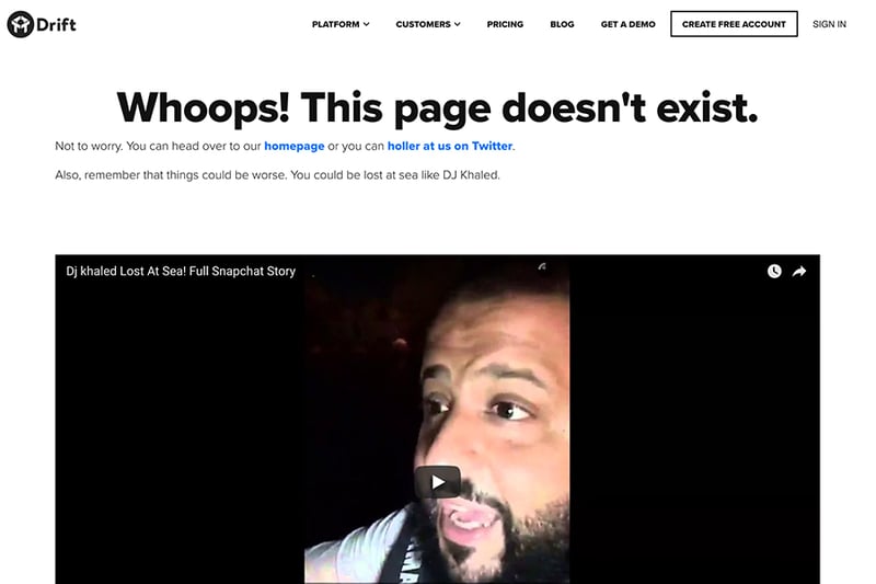
The element of surprise is key to successfully offering novel 404s.
Drift added a low-quality selfie video of Dj Khaled, apparently lost at sea. They turned the situation upside down by showing that things could be much worse – the visitor could be lost at sea like the DJ.
Showing an exaggerated scenario that overshadows the visitor’s current circumstances is a great way to make them feel better.
3. 9Gag - Incorporate Absurd assets
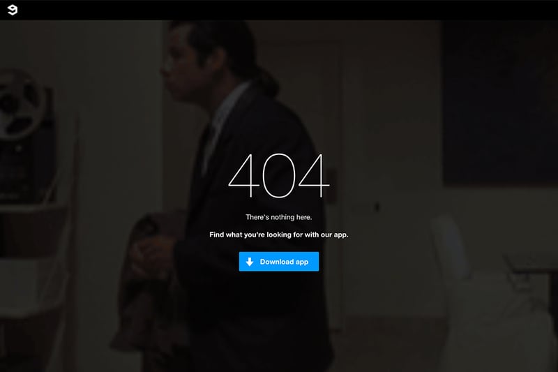
Steve Jobs said, “Creativity is just connecting things”. It’s hard to notice but 9Gag made a creative connection between one of the most popular gifs, a Confused Travolta, and their 404 page. The result might not be ‘haha’ laugh-out-loud funny, but it is a prime example of relating one of your brand’s visual assets to a ‘not found page’.
4. Flywheel - Minimal and subtle humor
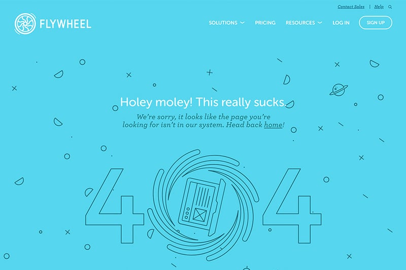
Flywheel created a 404 page that is a perfect fit for its sophisticated designer-oriented audience. Turning the ‘0’ into a black hole and adding ‘this really sucks’ is a nice spin. It’s simple and avoids trying too hard to jest.
5. Slack - It’s funny because it’s weird
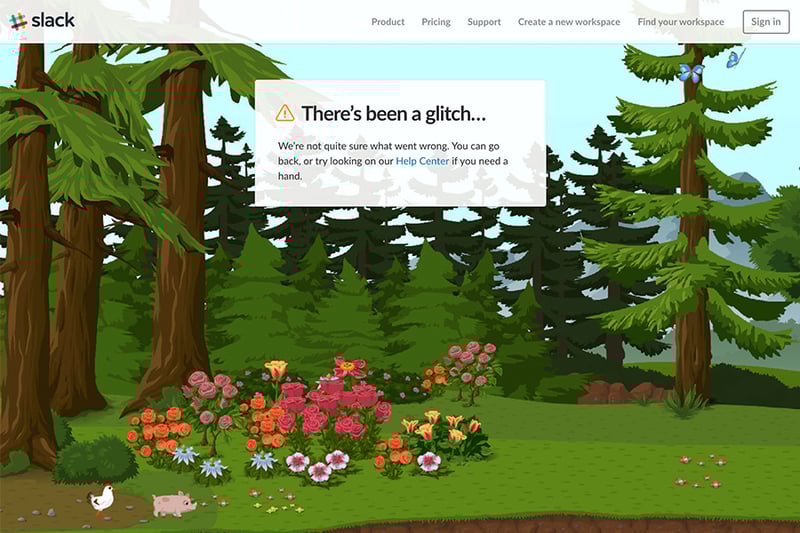
Slack’s 404 content is straight to the point, but they added a panorama illustrated background animation that is, well… so wacky that it works. You land in a Xanadu dream-like world with hovering farm animals. There’s no relation to a lost page other than the fact that if you’re there – you are surely lost.
6. Dan Woodger - Sometimes a cute illustration is all it takes
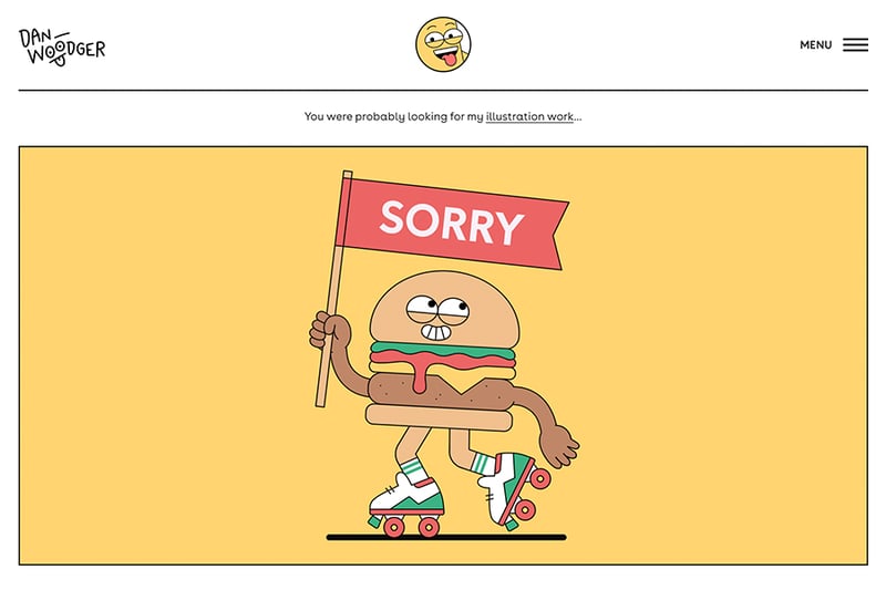
In this example, we see a cute hamburger cartoon on skates holding a sorry sign. It’s proof that a picture is worth a thousand words. Using illustration is a great way to make your 404 page witty without words.
Woodger also cleverly connects the visitor to his portfolio with the line ‘You were probably looking for my illustration work…’
7. Team Coco - Silly gifs
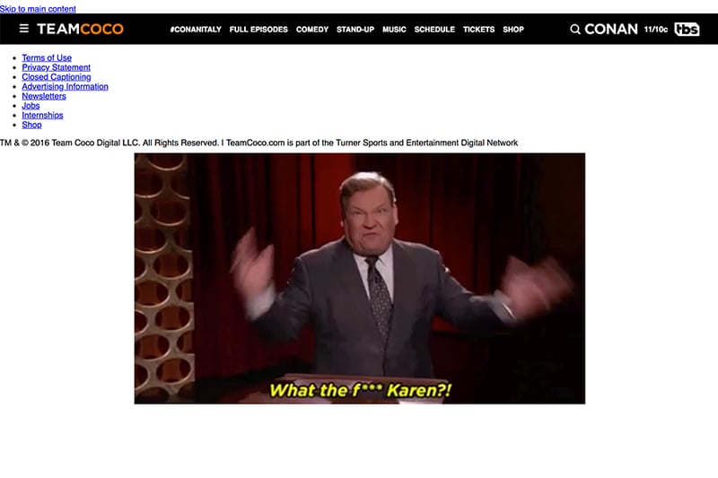
Even though it apparently has some bugs and shows bare HTML, Conan O’brien‘s site doesn’t fail to amuse, using a series of gifs to shine a spotlight on Andy and Conan’s predicament.
8. Comedy Central - Hysterical yet on-brand
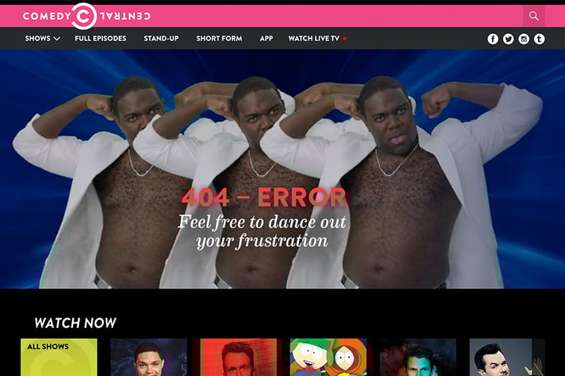
Comedy Central was smart enough to display several characters from their shows and to attribute a 404 page related quote to each one. For example, The Daily Show’s Trevor Noah appears with a confused face and a quote related to the ‘Moment of Zen’ segment from his show.
9. NMFH - Dark humor at its best
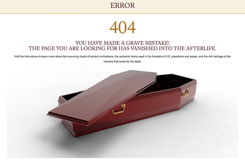
I just had to show this example, because it’s the 404 page for a small museum of funeral history. I’m sure they don’t have a huge web design budget, yet they still managed to devise a creative 404 page with an open grave, telling visitors: ‘You have made a grave mistake! The page you are looking for has vanished into the afterlife.’
10. HBO - Use Inside Jokes
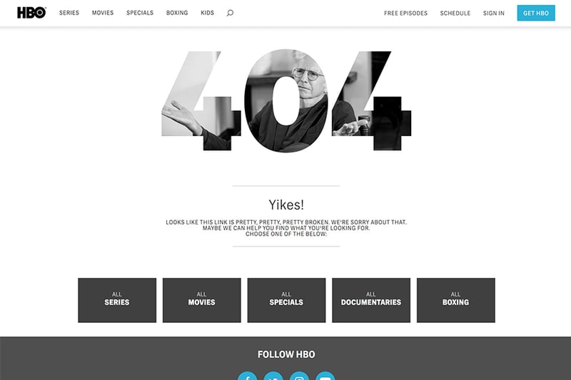
HBO’s 404 is one of my favorites. It shows how to use inside jokes to get a chuckle. In this case, they added the ‘Curb Your Enthusiasm’ image behind the 404 letters, and added the text: ‘Looks like this link is pretty, pretty, pretty broken.’ Anyone who has seen the show will immediately get it.
11. The New Yorker - Take advantage of what already works
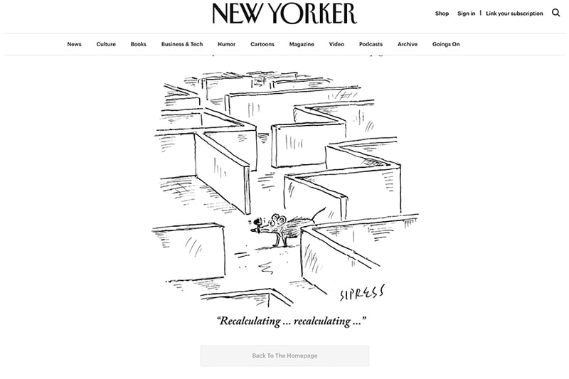
The New Yorker example shows just how to take an already funny brand asset related to getting lost, and featuring it on a 404 page. The cartoon is from a 2011 issue displaying a mouse wearing a GPS – the perfect cartoon to use on a ‘page not found’ page.
12. Blizzard - Surprise your audience
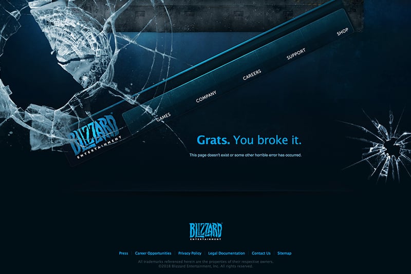
Here’s another 404 page design that is original and unexpected. Blizzard Entertainment has a broken window, a menu that appears to have fallen, and an accusation: ‘Grats (congrats). You broke it.’
Blizzard had the ‘chutzpah’ to turn the tables and blame the visitor. You get a kick out of it because it’s the exact opposite response to the expected apologetic tone you normally read on 404 pages. At the same time, it’s a very human trait to accuse someone else of your own mistake. It’s like a little kid getting caught by their parent for spilling milk and then blaming it on their dad.
13. eharmony - Relate the topic to your service
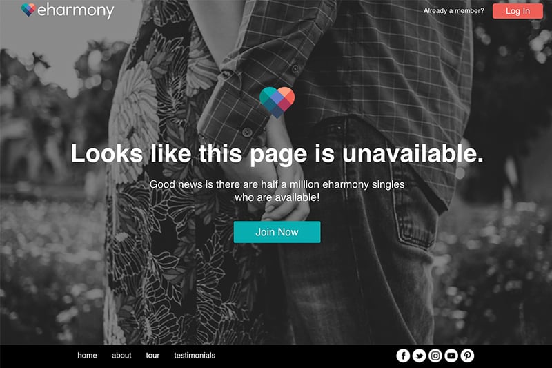
As we’ve already seen drawing unexpected connections between seemingly unrelated things requires both ingenuity and humor. You wouldn’t normally associate a dating site with a ‘page not found’. eharmony does this well by presenting a message that the ‘page is unavailable’, unlike a million other eharmony singles.
14. Distilled - Accents are amusing
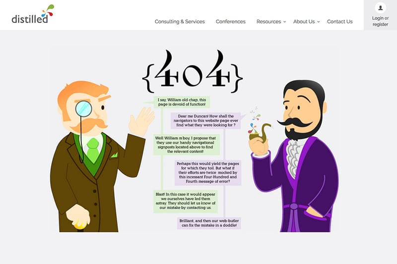
Distilled’s 404 page has a comic British conversation filled with phrases like ‘old chap’ and ‘blasted’. They call their 404 ‘Four hundred and fourth message of error’, which is funny in itself.
While accents are currently a controversial issue in comedy (as the Simpsons creators can attest), they are still bloody funny. Luckily, a posh English accent is still an accepted laughable target.
Distilled are themselves British, which makes the whole page even sillier. It reminded me of the Four Yorkshiremen sketch by Monty Python, which always cracks me up.
15. Emailcenter - Make it personal
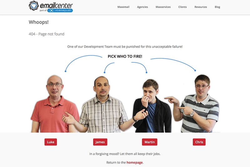
This error page is one of the funniest, precisely because it’s so personal. It also takes landing on a ‘page not found’ to the extreme by showing the four possible culprits from the development team and offering you the chance to pick the one to be fired for this ‘unacceptable failure’. It’s so off the wall, it proves this company has both a sense of humor and can poke fun at themselves.
16. IMDB - Being funny takes time and effort
IMDB presents a seemingly simple, yet well-thought-out error page that adapts famous film quotes to error messages. For movie fans that frequent IMDB, it delivers a delightful experience and entices them to refresh the page to read more quotes.
17. Orangecoat - Add visual charts
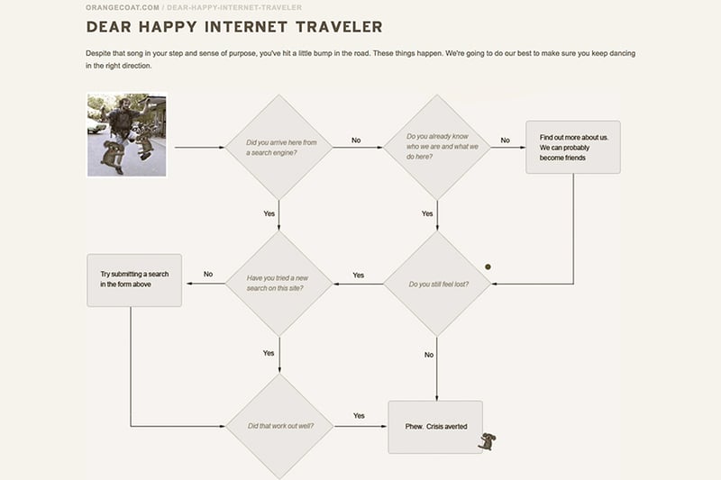
While this is not the most compelling 404 page, it does get points for delivering an inventive and interactive experience that is also visual in nature.
Using charts is actually a good idea for these pages. Whether it’s flowcharts, ven-charts, or any other chart you can think of. It works because it’s a completely different way to display the unavailable page. I wonder if a pie chart would also work.
18. Github - In-jokes
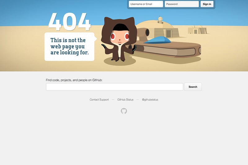
Github’s audience are geeky developers. Their Star Wars-inspired scene featuring the Octocat mascot and the quote ‘This is not the web page you are looking for’ is a well-matched message for their audience. Notice, also, how, by placing the search bar at the center, they provide an excellent solution for navigation from this page.
19. CSS-Tricks - less is more laughs

CSS Tricks manages to surprise visitors by using sheer minimalism. No text, no messages, just a blank page with a rip in it with CSS code revealed in the background. They successfully deliver a message without words, which is a challenging thing to do. It’s similar to why silent films still make us laugh today because they rely on non-verbal humor.
20. Mashable - Funny take on lost
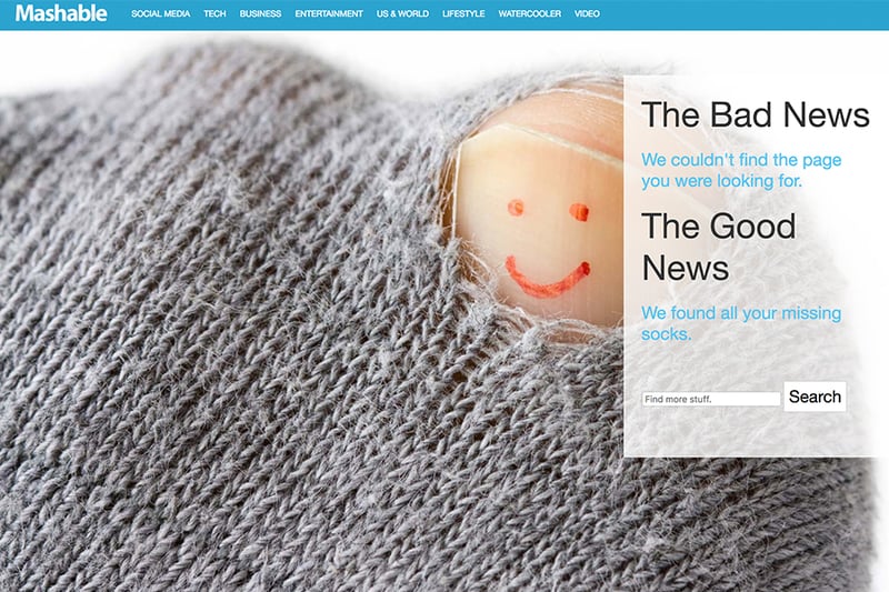
This page has all the elements of an entertaining 404 page. A giant image of a torn sock with a smiley drawn on the toe, alluding to all the single socks people lose in the laundry. Even though it has nothing to do with the actual website, it’s very silly and that’s why it works.
21. Taco Bell - Another silly laugh
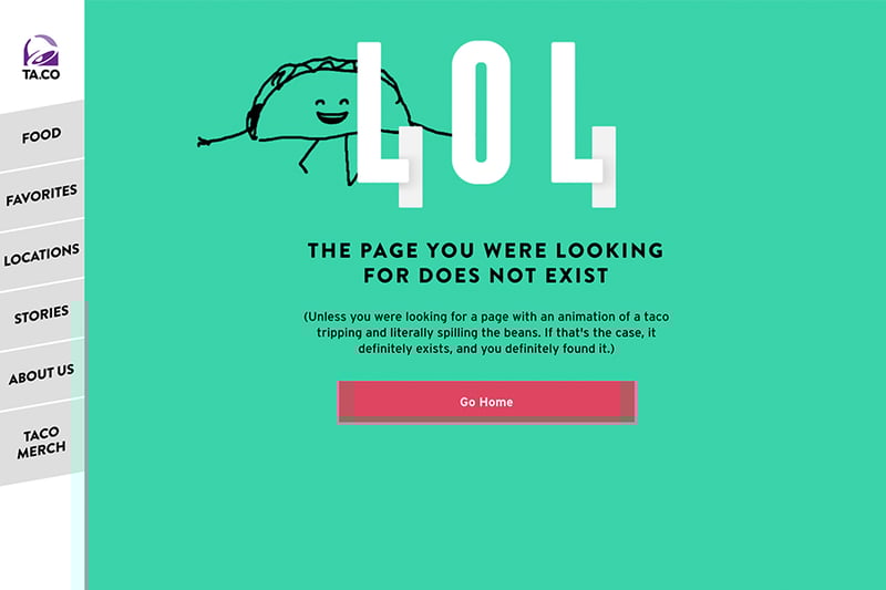
Taco Bell is known as a brand that knows how to crack a joke on social media. Their 404 page also gets a laugh, with its taco animation and silly text: ‘THE PAGE YOU WERE LOOKING FOR DOES NOT EXIST (Unless you were looking for a page with an animation of a taco tripping and literally spilling the beans. If that’s the case, it definitely exists, and you definitely found it.)’
22. Steve lambert - Acknowledge the awkwardness
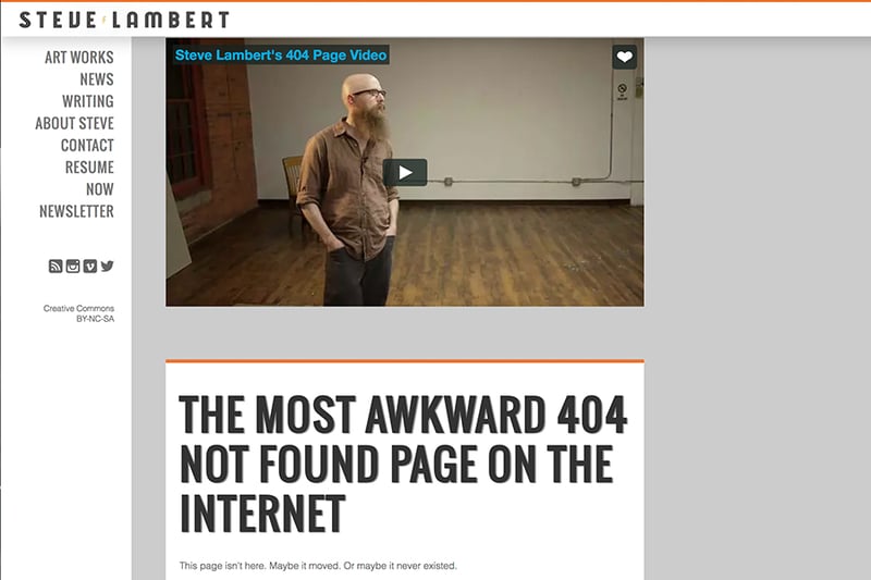
Last but not least, this hilarious 404 page was created with almost no budget or special effects. As if landing on a broken link isn’t awkward enough, Steve Lambert takes it to the next level by presenting ‘The Most Awkward 404 Not Found Pages on the Internet’. The page shows a video of Lambert mumbling strangely to the visitor. The video reminded me of the awkward moments of Silicon Valley.
23. SHOCK - 404 Page Template for Sale
Conclusion
We’ve seen a variety of funny 404 pages. Being humorous is not an easy task, and even the best brands with the highest budgets sometimes fail at it. I hope these examples will inspire you to create your own error pages that will make your visitors burst into laughter.
If you want to create your own 404 page, be sure to check out Elementor’s quick 404 page design feature.
Looking for fresh content?
By entering your email, you agree to receive Elementor emails, including marketing emails,
and agree to our Terms & Conditions and Privacy Policy.


