Table of Contents
Going back before 2016
To accurately recount our journey, we actually have to start two years back, when all the planning and development of Elementor started.
Like reinventing the pencil, changing the way people design with WordPress is not an easy task, and it took us quite a while, as well as quite a few versions, to get to the solution that suit our vision.
What had made it even more challenging was that our whole concept revolved around making an editor that would fill the needs of both developers and designers. These are two conflicting forces, each presenting views and values that are are very often conflicting.
I don’t think we would have been able to end up with a final product, without the unique combination of two opposing co-founders. One playing the part of the designer (Yoni), the other of the developer (Ariel).
I call it “playing the part”, because many times it had actually resembled a Roman play. Two rudimentary forces battling it out. Design VS Development.
It’s only natural for you, as a user, to regard the final product as a whole, and not really ponder about the many struggles that went along into making it. It has always been an interest of mine to try and learn how products ended up being designed one way instead of the other. What was the thinking behind it. This is why I found this interview of Slack’s founder so riveting.
I’d like to share four major dilemmas we had to face, and show how we eventually solved them. These had to do with personas, key product guidelines, UI and mobile.
Personas
Back in 2015, we were running a WordPress theme company. We noticed that website builders like Wix and Squarespace included really superb website builders, that surpassed WordPress page builders in almost every aspect. This was strange, given that WordPress was the dominant CMS, with almost 60% market share.
We decided to build the ultimate page builder for WordPress, one that would cater to both developers and designers.
There was another persona in mind, even though it was not our main focus. This was the site owners, the clients that hired the designer and developer to build their website. Each persona was different in their design approach and behavior.
Designer – The designer is someone who loves to have as many controls as possible. Just look at Photoshop, it’s more complex than a cockpit. Lots of icons, controls, windows. The designer wants to have a tool for every operation, but doesn’t want to code at all. The much preferred method is to use a visual control, and never have to write a CSS line.

Developer – Hates controls. Prefers a clean interface. I think Reddit is a good example of the kind of interface developers love. The developer doesn’t want controls that distract from coding. The developer thinks that regardless of the interface, if something needs to be done it can always be hardcoded.
Client / Novice – The clients don’t want to code AND don’t want too many confusing controls. The want the simplest of tools, to let them easily create their site (even though as most of you web designers know they can be very specific as to the end result they want to reach).
So, how would go about building a solution that would cater to at least two of these ever so different personas? Our answer was to handle it one decision at a time, and for each decision have an old fashion fight out. If the designer was more determined and strong willed, then the designer side won. If the developer’s side was more resolute, his side wins. Each side has the right to veto a decision, if the issue seemed important enough.
This might not seem like the best managerial decision making process. It certainly can’t be taught in business schools (“First lesson – make sure you have a designer and a developer as co-founders”). But for us I can think of no other way to make sure both personas end up loving the product, as they finally did.
Deciding on key areas that guided us
Apart from the personas, we had three key guidelines following our process:
- Fast frontend page editing
- An interface that was fun and easy to use
- The possibility to edit every small detail
These guidelines were important for our process, because they functioned as touchstones to which we could measure each feature and element added to the plugin.
Why did we choose these 3 guidelines and not others?
1. Fast frontend page editing.
The speed at which a product reacts to a user request has crucial importance for any user interface.
Think about going back to using a landline internet connection.
Think about going back to using one of the earliest version of a Samsung smartphone.
It’s torture. Inconceivable.

Eran from Dapulse puts it wonderfully in a long post that deals specifically of the importance of a lightning speed interface:
10 Seconds load time gives the user the odd feeling that something’s wrong. It’s like you’re just waiting and waiting… 10 seconds feels like the app doesn’t work.
1 second and up, makes users go into a “mental context switch”. In other words — they start thinking about other stuff, like picking up shirts from the cleaners.
0.5 load time — or anywhere between 300-1000 ms — makes users feel that it’s working. Nothing to write home about, but at least they’re engaged.
100-300 ms, feels OK. It feels like normal behaviour.
0-100 ms feels instant. This is where the magic happens. This is what we call the BOOM Effect.
To get lightning speed you have to have the right code infrastructure. You also have to make sure speed and performance are not sacrificed when adding or updating new features.
We knew that other page builders on WordPress were slow, and that by creating a page builder with no lag we would create the addiction effect discussed in the Dapulse post.

2. Easy to use interface
It’s a real painstaking process to make a user interface friendly and easy to use. You sometimes realize you have to make a complete and significant change only after you’ve implemented a certain design and found out it just doesn’t work.
This caused us to sometimes throw away weeks worth of work. It’s quite possible that similar changes will be made in our interface in the future.
A friendly interface is always important, but for a frontend page builder this importance is even more crucial. This is a visual plugin, one that is used every day. For designers, they sometimes use it for hours every day, as their main designing tool.
This means that all elements in the plugin must have the most convenience and logic, so even after a short test drive the user understand how it works. The user should also be able understand how a newly added widget works, because of the consistent build.
3. Designer oriented page builder
There is a serious drawback of Bootstrap: lack of customization.
When you get a page builder with default and limited set of widget settings, however finely crafted, it will produce designs that look very much the same.
This is a drawback we insisted on avoiding. We made every widget fully customizable, while still maintaining the previous friendly UI discussed above.
There is a fine balance we always had to juggle between full customization and user friendliness. We didn’t want to create a confusing interface that resembles a cockpit. Again I return to the Photoshop interface example. There are endless controls and menus that just aren’t a good fit for a browser based page builder.
On the other hand, we didn’t want to go the way most page builders go, and have a limited preset settings that don’t allow for a flexible and custom made design.
A great example is the button widget. You might think that it’s no big deal, it’s just a button. What special customization could you possibly have?
Let’s take the sizing of the button. With Elementor, we’ve made sure you could not only control the spacing of the button, and increase the space between the text and the border, but could also set a different width for the top, bottom, right and left space. This enables you to create a wider array of buttons. Narrow, wide, rounded, spaced out etc.
The panel dilemma
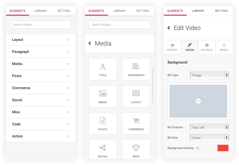
The panel is the place that lists the different widgets, and also lets you tinker with their settings.
There are two main ways of placing the panel: As a floating window or as a docked panel attached to the left/right of the page. Each of these choices have advantages and disadvantages, and we spent a long time thinking which way suited us most.

Going the floating panel way
A floating panel has the advantage that it doesn’t hide the screen, or rather that it hides a different part of the screen, and can be easily dragged to reveal it. This display allows for the screen to be displayed through the full width of the page.
Going the docked panel way
The docked panel is much more easy to use. You get used to the panel being in a set place, and can learn to work fast because of the habit to always go to the left of the screen. It doesn’t bother you in the content area, like the floating panel. It is always set apart. It is less limited in size.
The docked panel provided a content area which was 1,000 pixels wide. If you are using a small laptop, this means you are left with a very small content area. We finally decided to go with this option, because we researched and found out that our core target audience, designers and developers, used large screens that could manage this reduction in the content area size reduction.
For the users who did have a smaller screen, we added a scroll bar to the content area, so they could still get the real view of the entire width of the page.
A short time after we had launched, we made the panel responsive, so now it adjusts according to the user’s screen resolution. We also added the option to widen and narrow the panel, making it more convenient when editing text for example. This actually makes the docked panel an even better choice.
Choosing the interface and editing options
Deciding on docking the panel in the left side of the screen was a major decision, but was just the first step in our long journey towards the final interface we ended up launching. An even more difficult decision concerned the whole editing concept.
Because we had already developed a backend page builder in the past, we already had experience as to what it takes to build the architecture of the builder. Basically, you need to come up with an easy way to use one visual interface to edit 4 different layers: the widget itself, the row, column and section.
This poses a lot of UI questions, like: when a user clicks on a box to drag it, what exactly is to be dragged? The widget, row, column or section?
In all our interface versions one thing was clear. We wanted the user to only have one single frame to deal with. Photoshop was the inspiration here. You choose a layer and can edit and make changes only to that single layer. No fidgeting and moving the mouse in an effort to “catch” the right frame to edit. We actually went along and built over 100 interface versions, before finally deciding on our unique solution.
The drag and drop was also under debate. Another option is to have a plus sign that opens a menu with all the controls. This saves you a lot of screen real estate, but is less visually convenient.
Here is the current interface architecture
 You only see one layer at a time
The default is the widget. You have two buttons to the top left of the box that give you control over the column and the section. The row control is available by adding another column widget.
Having one layer has its pros and cons, and we are currently considering other options, so this may well change in the future.
The left panel is always divided into content, style and advanced settings
This consistency makes the whole process of learning to use Elementor much easier.
The three distinctions are used mainly to simplify the interface, and prevent the “cockpit” feeling of bewilderment when faced with too many controls.
We’ve used the same methodology to de-confuse each of the three tabs, and created more divisions by dividing the tabs sections or dividers. This is especially useful for the more advanced widgets that have more intricate settings like the Forms and Posts widgets.

Improved workflow
As mentioned, we went back and forth through various versions, and sometimes decided to throw away hundreds of hours of work. Apart from the basic three guidelines I mentioned, there is a flow that we’ve searched for. A speed of design and an intuitive feeling as if everything is within reach. For the first months our focus was on improving the workflow for the single page. Lately we started to move towards improving a wider extent of the designer’s workflow, such as how they manage sections that appear across the website from one place.
Mobile Editing
From the very early planning stages it was clear to us that Elementor had to deliver an outstanding solution for mobile. Responsive design has transitioned from being a trendy buzz word to a practical everyday task for every web designer. Today between 50-60 percent of all internet surfing is done on mobile.
The ‘100% responsive’ label you get with your theme is nice, but isn’t nearly enough for proper web design. Surfing with a mobile device poses many challenges, and this is why we created a list of features we call Mobile Editing. This includes many options to customize parameters, like font-size, text alignment and margins, and set them differently per device.
When we considered the UI management of mobile editing we had two options. One was to add a forth tab to each element (besides the current Style, Content and Advanced) that will present the mobile settings. The advantage of this solution is having one place where all mobile settings are set.

The downside of this is that you don’t really need the control over 100% of the settings, so going with this solution would force you to constantly zigzag between the different tabs just to design for mobile.
We finally decided to go with another solution, and today Elementor displays mobile buttons alongside each parameter. You can click on the mobile button and set different settings for mobile, and when you do, the editor automatically goes to mobile mode so you can see the result live.
Our plans for 2017
I’m proud of what we accomplished in 2016, and how we managed to further develop Elementor in the latter part of the year.
For 2017, with twice the development crew, and the infrastructure and bug fixes stages behind us, we look forward to achieve a lot more than before.
Open source and extendable plugin
Since our launch I kept stressing the fact that Elementor is designed to be extended by developers. Because we haven’t released an API for such a long time, I think developers started pondering if this message was true. “OK, Elementor is free and open source, but where the %$# is your API?”
Now, I’m glad to say we finally released the first version of our API docs, explaining just how to build extensions that extend the functionality of Elementor.
If you’re a developer, we invite you to thoroughly read the documents, and think of new ways to add further functionality to Elementor.
Even before releasing the API docs, we have seen experienced developers releasing addons. Notable mentions are Elementor Templater by Zulfikar, Elementor Addon Elements by Anand Upadhyay and WPPlugins.io by Rami Yushuvaev.
Keep enhancing the free and pro plugins
When we came out with Elementor Pro some people were concerned about whether we were planning to further develop the free plugin. One of our key goals for 2017 is to drastically increase the amount of users that choose Elementor as their page builder. We have a big feature release coming in the following weeks that we believe will help do that.
Plugin reliability
Recently there has been a lot of polls in the Elementor group asking why people chose to move from other page builders to Elementor. Time and time again, people mention the fast response to issues, as well as the plugin reliability. They feel confident that when they update another plugin Elementor is less likely to raise issues, and even if it does, they rely on our fast response.
I consider this is feedback as amazing, especially considering this year was the first life cycle of the plugin, whereas some of the alternatives have been around for years. We plan on preserving the same kind of reliability and support for Elementor and Elementor Pro in the future.
Elementor – not just a page builder
We regard Elementor as more than just a page builder, but as an advanced visual editor that in the future will extend to cover countless more capabilities on WordPress, other than the simple editing of a page. With our Embed Anywhere and Global Widget we have started to explore these options, and we will continue to develop them, with the help of the developers community.
Designer Workflow improvements
In the last year we released the template library and the global widget, two major features that drastically improve the workflow of the designer. With the template library, users can save their designs, then import and reuse them on other websites, so they don’t have to design each website from scratch. With the global widget, users can place a widget to multiple areas on the site, and edit them all instantly from one place.
The thought behind both features came from analyzing the day to day workflow of the web-designer, and thinking of ways to speed up repeating tasks with technology. We plan to keep this focus, and add more features that make website building easier.
Further improvements in the UI
In this article I went into much details as to how we ended up with our UI and editor. This doesn’t mean we regard it as perfect. In fact, we plan to add more UI improvements, making Elementor even more easy to use.
Conclusion
If you’ve read so far (this is a rather long article), it probably means you are a dedicated Elementor user. I want to give you a promise, from me and the rest of the team at Elementor, that we will continue to do all in our powers to deliver the best page builder we can. Your support is what allows us to continue and work on Elementor, and I want to send you my utmost appreciation for it.
Wishing you a happy new year!
Looking for fresh content?
By entering your email, you agree to receive Elementor emails, including marketing emails,
and agree to our Terms & Conditions and Privacy Policy.
