Table of Contents
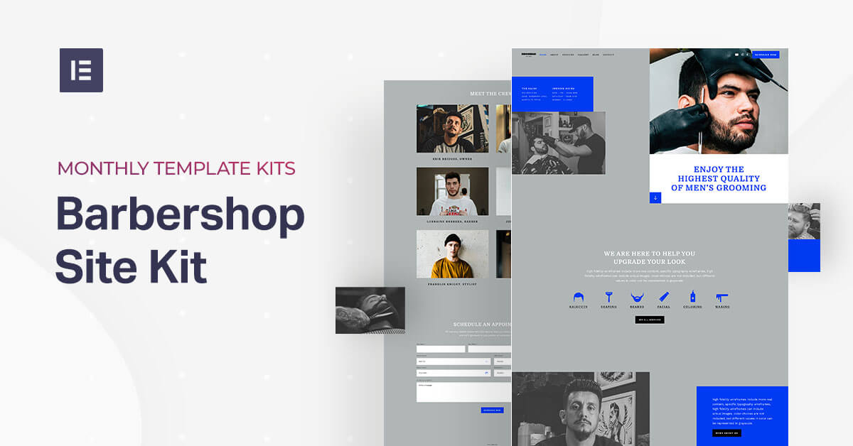
Our barbershop website template is perfect for barber shops looking to build a modern, fashionable website to increase their online presence. The look and feel of the template is geared to modern, male-oriented traditional barbershops. At the same time, the kit is also super versatile, multi-purpose if you will, so that other small business-types can adapt it to their specific branding and marketing needs.
Some examples of other businesses that can easily use the template and adapt it to their business personas are fitness gyms, hair salons, tattoo parlors, shops with simple services, and really anything that comes to mind – it’s not just to create a barber website!
Another key benefit of this Template Kit is that it utilizes advanced design features and makes them easily accessible for a simple design workflow.
As web creators, we love the idea of Template Kits. There’s actually been a new development recently with the options and availability of Template Kits that you can use for Elementor, thanks to a new feature offered by Envato.
This month, Envato launched 200 template kits that were built specifically to be used with Elementor. We highly recommend checking out their Template Kit marketplace so that you can find the best fit for any website you create, no matter the discipline and industry.
To see how to download this Template Kit, see this video.
Now for the different elements in the Barbershop Template Kit and how you can start using it to build your actual site.
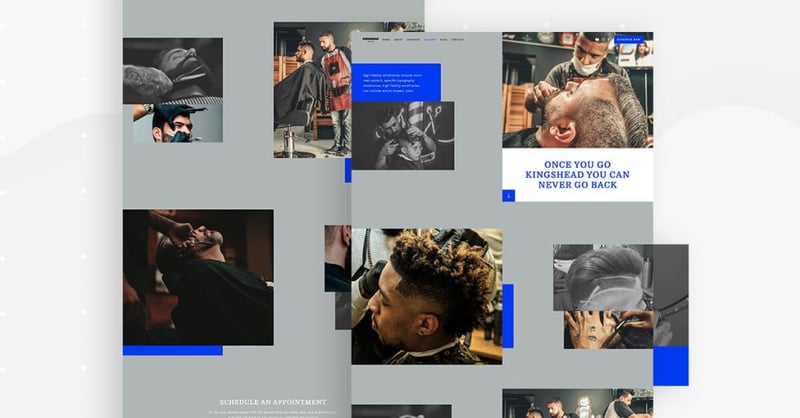
Homepage: Getting the Barbershop Vibe
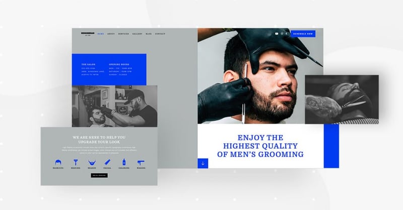
The Template Kit’s homepage uses a variety of design techniques to represent their brand messaging as well as the vibe of their brick and mortar business location.
The use of visual contrast on this page is very prevalent throughout the design elements. The most dominant, as we see it, is the black and white photograph juxtaposed with the colored, zoomed-in photograph that details the client’s facial expression and his hairstyling. This represents the combined vibe of an old-fashioned men’s barbershop with the modern, fashionable hairstyling that they provide.
To see how to replace the Template’s default image with your own image, watch this short gif:
When we built this template with Elementor, we simply used Blend Mode and CSS Filters when modifying our image upload. No need for Photoshop or other image editing software.
In addition, the color block style combination of royal blue (‘blue ribbon’/#003AF1, to be exact) with ‘dark gray/#B0B6B6, as well as the broken-grid layout both illustrate the barbershop’s style of traditional in parallel to modernity.
When you scroll down to the next section, you’ll see a row of flat icons with a color changing hover effect. This icon list is used as a visual representation of all the services offered by the salon.
If we had to guess, we’d assume that this information is one of the visitor’s key questions that he’s looking to have answered when browsing the site. He wants to know exactly what the business can provide him with and why he should choose them as a provider.
Keep in mind that these icons can easily be interchanged with other icons if you use the template for a different business-type. You can refer to our icon list widget to understand this technique in better detail. By the way, each icon file is in .SVG format. In practice, this means that the colors can be changed easily, which is especially helpful if you want to explore different color changing hover effects.
When you choose to insert the homepage template into your website, take note that this template is a ‘Page’, which you download from:
Editor > Open Library popup > Pages tab > scroll the page and find it or search for “Barbershop.”
About Page: Showing What You’re All About
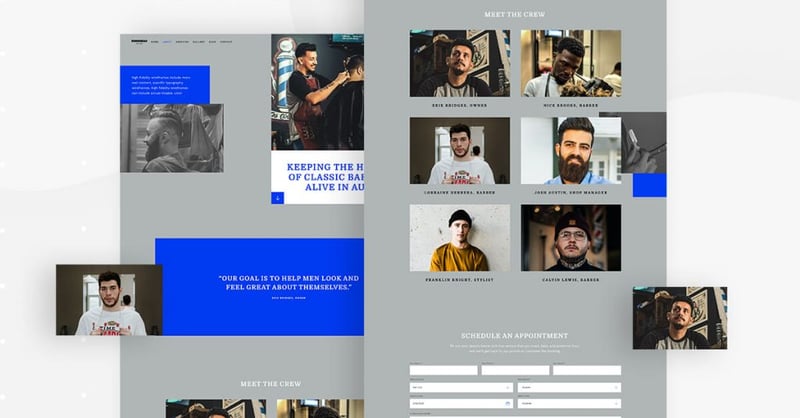
The About page sticks to the broken grid layout that was introduced to us on the Homepage. The broken grid layout is perfect for maintaining a uniform design scheme throughout the website while keeping a unique and interesting style.
On the About page, the choice of photograph is also very effective. The barber himself (in this case, the business owner) has a modern, fashionable haircut, a happy disposition, wearing an authentic-looking apron with tools in tow. The vibe of the salon is definitely present here, showing a glimpse of the salon’s decor in the background.
When visualizing your service or product, you’ll want to prove to your prospective clients that your team is passionate about what they’re providing.
Another crucial element of the About page is the section that introduces the barbershop’s barbers themselves.
Each photograph is detailed and professional, making sure each person’s hairstyle is well-groomed, and that their demeanor conveys personality and spontaneity.
In terms of layout, the image grid of the photographs is polished and uniform, creating a pleasant, appealing visual experience when looking at the photos.
Like the Homepage, the About page is also a ‘Page’ template.
You can insert it by going to Editor > Open Library popup > Pages tab > scroll the page and find it or search for “Barbershop.”
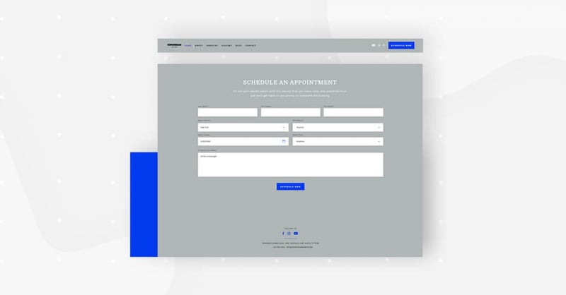
Services Page: What You Offer Your Customers
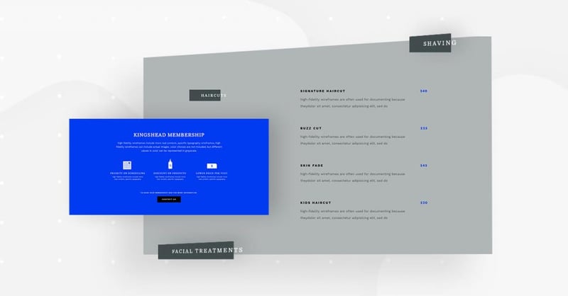
Next comes the Services page. The most important section of this page is the services menu. Any visitor who is considering scheduling an appointment at your hair salon is almost definitely going to want to see this menu.
This is why readability, and essentially, typography, is paramount when you’re designing any menu or list of services. Throughout the entire Template Kit, you’ll notice that we chose a wide variety of typefaces and fonts.
First of all, we chose to use two typefaces: serif and sans-serif. This combination goes back to the phenomenon we were discussing earlier about combining the old-fashioned traditional (serif) with modern and sleek (sans serif).
In terms of font families, we used Domine (serif) for the navbar list items and the menu category names (Haircuts, Beards & Mustaches, etc.). We then chose Work Sans (sans serif) for the body texts, buttons texts and menu items, such as the type of treatment and their descriptions.
On a user experience level, a sans serif typeface such as Work Sans is better for readability, which is important when there are full sentences or strings of many words.
Choosing the typography was another opportunity to inject the brand’s messaging into the website design.
Like the Homepage and About page, the Services page is also a ‘Page’ template.
You can insert it by going to Editor > Open Library popup > Pages tab > scroll the page and find it or search for “Barbershop.”
Gallery Page: Seeing Is Believing
When designing the template for the Gallery page, we decided to give the website visitor an up-close and personal view of how talented the barbers at the salon are. We chose detailed, crisp photographs that reveal the exact details of each haircut we’re sharing with the visitors.
This achieves two things: one, it represents the artistic prestige that each barber possesses. And as we discussed earlier, the imagery shows prospective customers how much each employee at the salon values and invests in their work.
We also distributed the images throughout the page in a way that gives full detail of each picture, yet the collection of images doesn’t look overbearing or messy.
The fact that our color palette doesn’t use too many colors is also helpful in this regard. It’s really all about the people and objects being photographed and not about bright, bold colors that steal the spotlight of what we’re trying to emphasize as designers.
Like the Homepage, About page and the Services page, the Gallery page is also a ‘Page’ template
You can insert it by going to Editor > Open Library popup > Pages tab > scroll the page and find it or search for “Barbershop.”
Contact Page and Popup: Simple and Practical
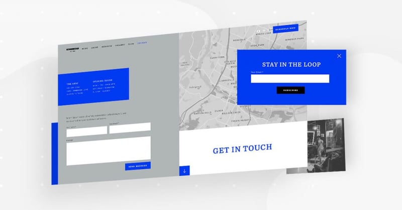
The Contact page is all about the action item that we’re trying to make happen: the website visitor contacting the salon. Conveniently, the salon has a form that sends customer details to the company email once a website visitor fills out the form, which is a significant benefit for the user.
We also made sure to use the Google Maps widget so that website visitors have an easy time finding out where exactly the barbershop is located.
We decided to use a CSS filter for the map so that it shows up in black and white. This way, it blends in perfectly to the Contact page’s gray background and doesn’t divert the visitor’s focus from either of the forms that we’d like him to fill out.
The ‘stay in the loop’ popup’s design is also centered around simplicity. The bold blue choice of color is dominant yet not overbearing. We do indeed want to catch the visitor’s attention so that he will take action, but we don’t want to overwhelm him while doing so.
Like the Homepage, About page, Services page and Gallery page, the Contact page is also a ‘Page’ template.
You can insert it by going to Editor > Open Library popup > Pages tab > scroll the page and find it or search for “Barbershop.”
To add the actual Popup, go to WP left panel > Templates > Popups > Add New > Library popup > scroll the page and find it or search for “Barbershop.”
Blog Archive Page: Elegant and Modern
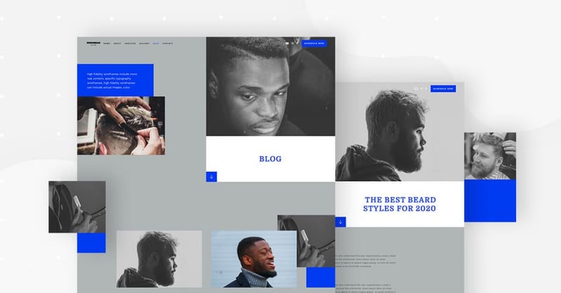
The blog’s archive page is unique in that its hero content has the exact same layout as the other website pages (Services, Gallery, etc.), and then once you scroll down, it starts looking more like a traditional archive page.
The subtle change in layout (broken grid morphs into a standard grid) doesn’t pose any issue to the user experience or the user interface of the page. The combination of black and white images with color images stays the same, so scrolling down the page feels just as natural as any other page.
This template is also extremely versatile for any typography combination. The same is true for the images. Whatever the Template Kit user would choose to replace these photographs with would almost definitely look clean and pristine as they do now, since the sizing and spacing are uniform and completely symmetrical.
Different from the pages we’ve discussed until now, the Blog page is an Archive page template, so the download process is slightly different. You’ll need to access it through Theme Builder.
To do this, go to the WP left panel > Templates > Theme Builder > Add New > Choose “Archive” > Library popup > scroll the page and find it or search for “Barbershop”.
Article: Casual Content for Clients
What’s unusual about the Article template page is that the featured image and post title are not placed in the center of the page, rather it’s aligned to the top right. This allows the page layout to stay consistent with the pages we’ve discussed until now. The large white text background behind the title makes sure that the visitor isn’t thrown off by the right-aligned title. The large font size also helps with that.
Because the article text’s font size is on the smaller side (16 px), this gives the article images even more room in the spotlight. This makes the article page even more unique, which is why we love it.
The Article page template is built as a Single Post. To access it, you’ll need to go to the “Theme Builder” section, and then Single Post.
To do this, go to WP left panel > Templates > Theme Builder > Add New > Choose “Single Post” > Library popup > scroll the page and find it or search for “Barbershop”.
Header & Footer: Subtlety at Its Finest
The header in the Template Kit is unique in that the hero image overlaps with the top of the header. Using a unique design technique, The image separates the page navigation items from the social icons and the call to action button. Despite this alternative design, the header looks exactly like your standard, run-of-the-mill header with a neat, horizontal-aligned navbar with plenty of space in between each menu item for nice readability and navigation. The image placement poses no interference or confusion to the header’s usability.
The footer maintains the page’s gray background, and has the option to contact the salon and provide details about the service you’re interested in. We created this by adding an extended form to the footer. The idea here is to encourage communication in a gentle, non-aggressive manner.
404: Combining Error and Humor
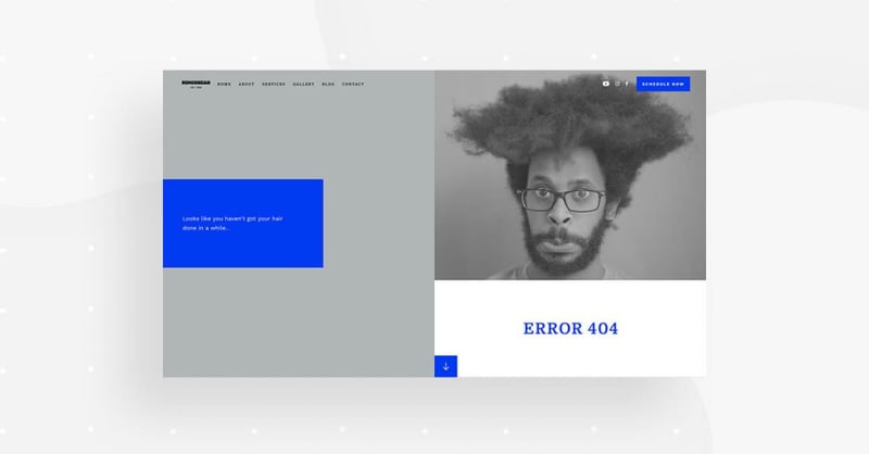
What we love most about the Template Kit’s 404 page is the image we used to indicate an error. Because almost every page has a black and white photograph as the hero image in the exact same place, it makes perfect sense to use a large black and white image here, too.
It’s no surprise that not much text is needed on this page. The picture speaks for itself. If the guy’s hair isn’t well-groomed, the website visitor is clearly not on the page he wants to be on.
We often see the 404 page as a good opportunity to maintain a good rapport with the website visitor, so that he shouldn’t lose interest in our website just because there was some sort of technical glitch.
Keeping up with the versatility of the Template Kit, any image can replace this one of the man with messy hair. This achieves a contrast between functional vs. dysfunctional pages.
When it comes to visual aesthetics, the white page background and clean design makes this a safe bet for any image or illustration.
The 404 page can be downloaded from the “Theme builder” section.
To access it, go to WP left panel > Templates > Theme Builder > Add New > Choose “Single – 404 Page” > Library popup > scroll the page and find it or search for “Barber shop.”
Get This Kit
This Template Kit can be yours in a matter of seconds. Whether you’re creating a website for a barbershop or for any other small business, you’ll find this kit especially easy to use and flexible for any style and branding.
Versatility is crucial to successful website design, as our content needs are constantly evolving and website content, both texts and visuals, need to be updated all the time. You’ll want to make your website management as easy as pie, and the Template Kit will be a big help in doing just that.
To see the full Template Kit, check out this demo.
Looking for fresh content?
By entering your email, you agree to receive Elementor emails, including marketing emails,
and agree to our Terms & Conditions and Privacy Policy.


