help center

On this page

Icon Box widget

Last Update: March 7, 2024

Add the widget

icon box icon Icon Box widget 1

To access and use a widget:

  1. In Elementor Editor, click +.
    All available widgets are displayed.

  2. Click or drag the widget to the canvas. For more information, see Add elements to a page.

What is the Icon Box widget?

The Icon Box widget allows users to showcase information using icons, titles, and descriptions in a visually appealing format. You can select from various icons or upload custom ones, pair them with descriptive titles, and provide detailed descriptions.

Common use case

Emma is building a website for a marketing agency. To promote their services and attract customers, Emma decided to add some eye-catching elements on the homepage.

Then, they add icon boxes to highlight different services. For example, each icon represents a specific service, and the titles and descriptions provide insights into each service’s details. This makes it easy for visitors to see what the agency offers, building trust and potential partnerships.

icon box use case Icon Box widget 3

Additional use cases

  • Display various services offered by a business or organization.
  • Highlight features or benefits of a product, software, or application.
  • Use icons to describe each step to show a multi-step process, workflow, or procedure.

Add an Icon Box widget: Step-by-step

  1. Add the Icon Box widget to the canvas. For details, see Add elements to a page.
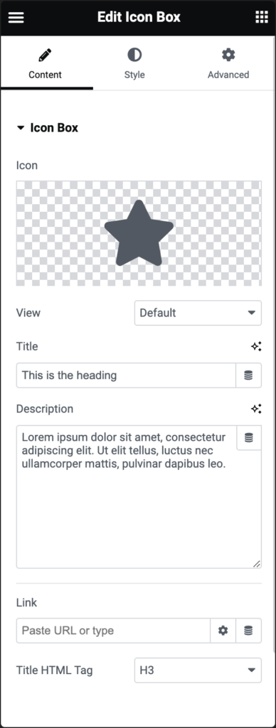
  2. In the Content tab, under Icon Box, use the Icon option to replace the star image:
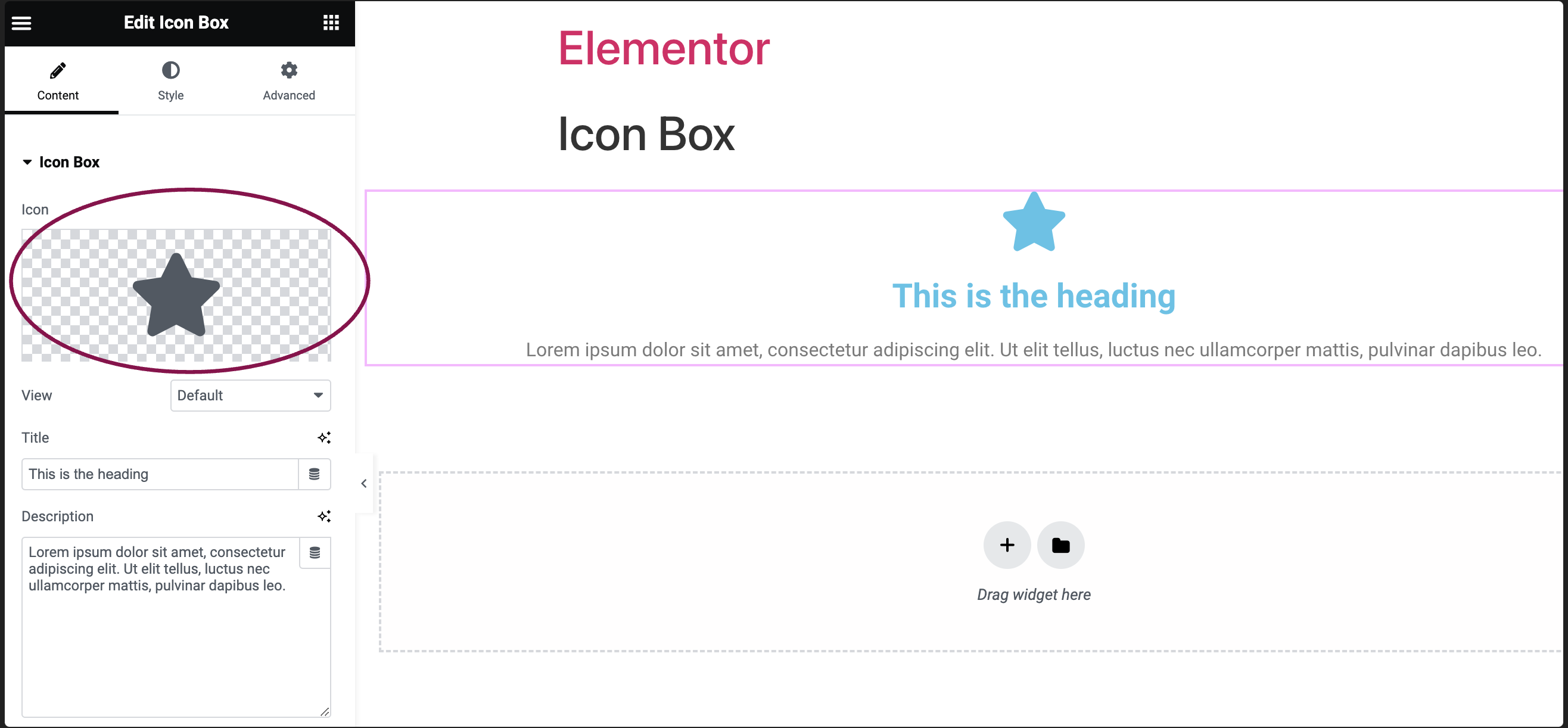
    1. Click the star button star Icon Box widget 5 to replace the star with an icon from the icon library.
    2. Click the SVG button svg icon Icon Box widget 7 to replace the star with an uploaded SVG image. For more details, see Enable SVG Support in Elementor.
      change icon Icon Box widget 9
  3. In the View field, set the view of the icon as Default, Stacked, or Framed.
    view Icon Box widget 11
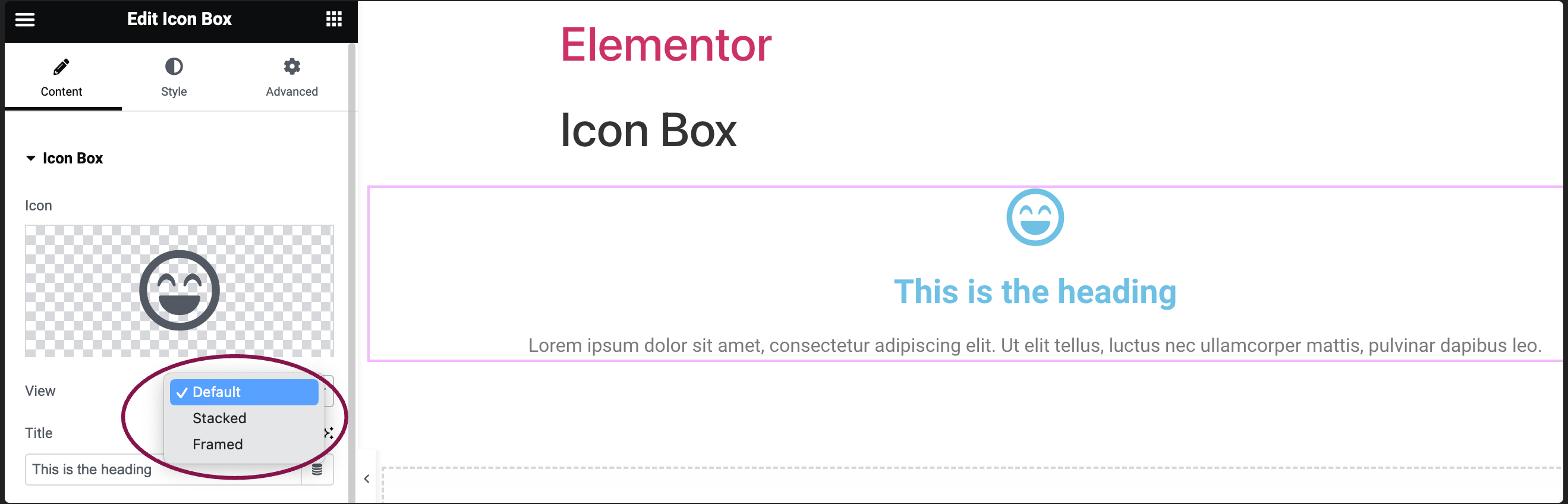
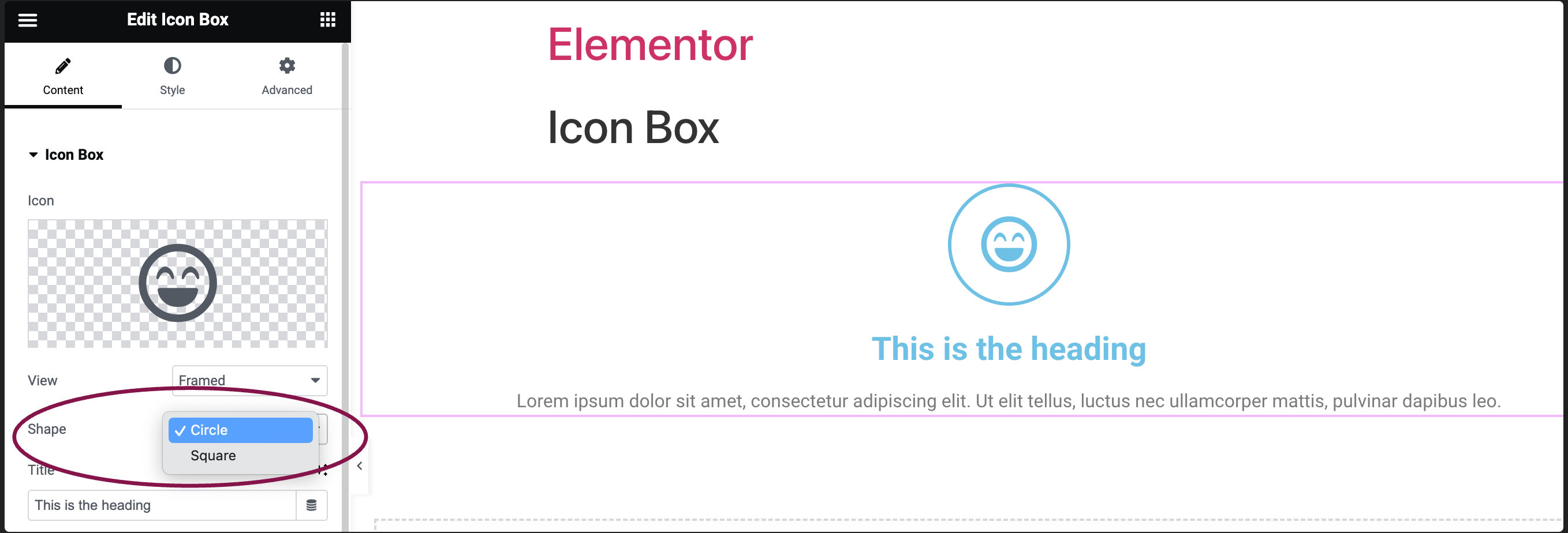
    1. When set to Stacked, the icon is displayed with its entire background filled. In Framed, it has a border around it. You can select either a Circle or Square shape for both view options.
      view shape options Icon Box widget 13
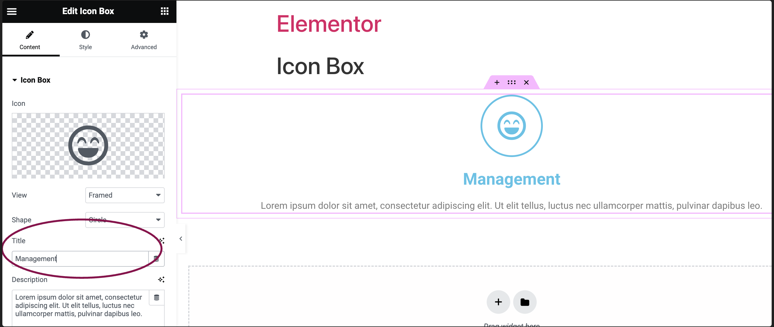
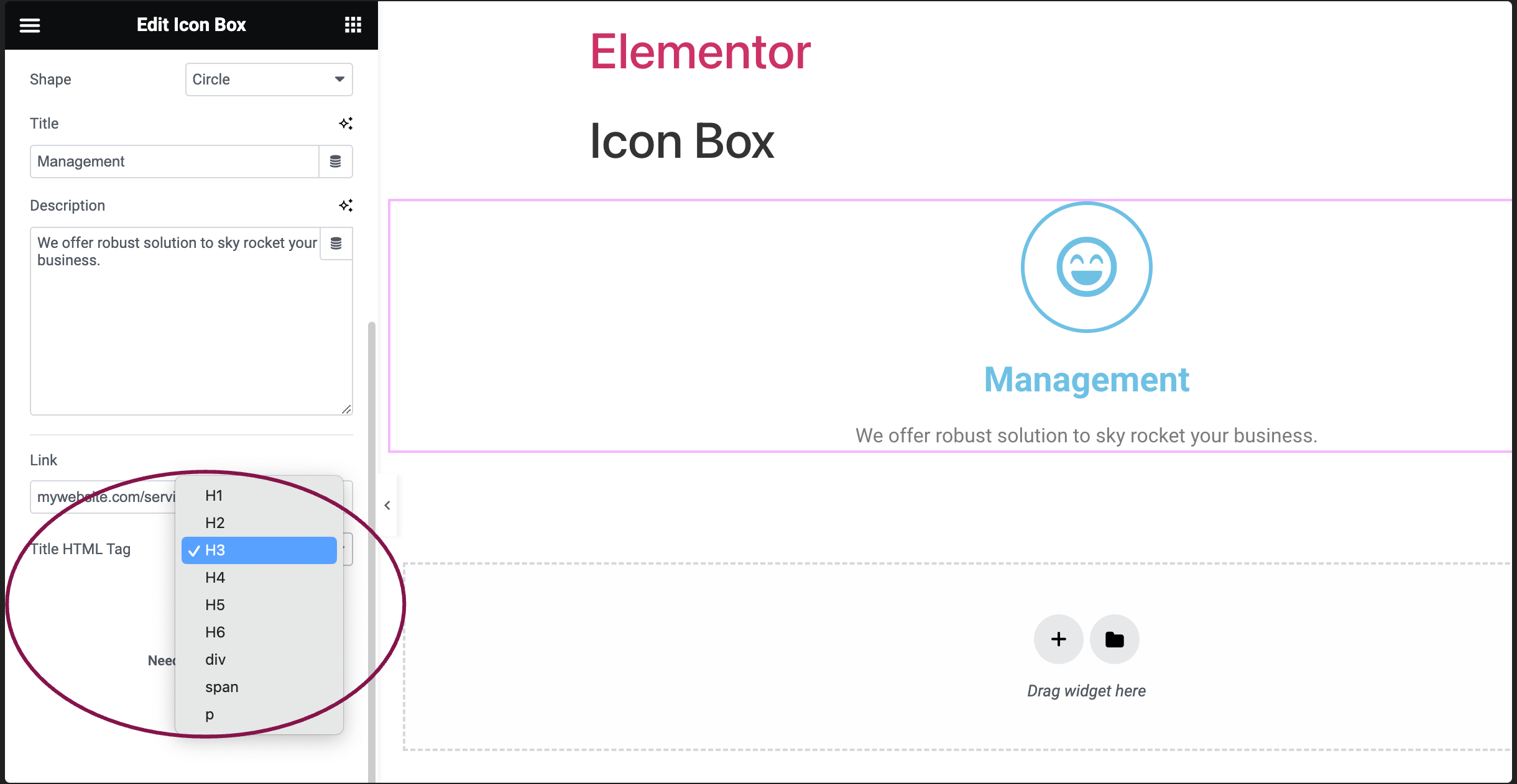
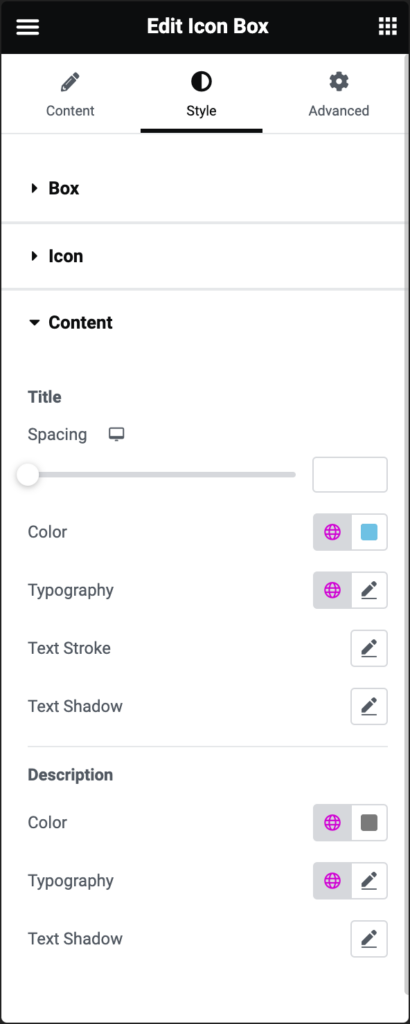
  4. In the Title field, add the name that will appear in the icon box.
    icon box title Icon Box widget 15
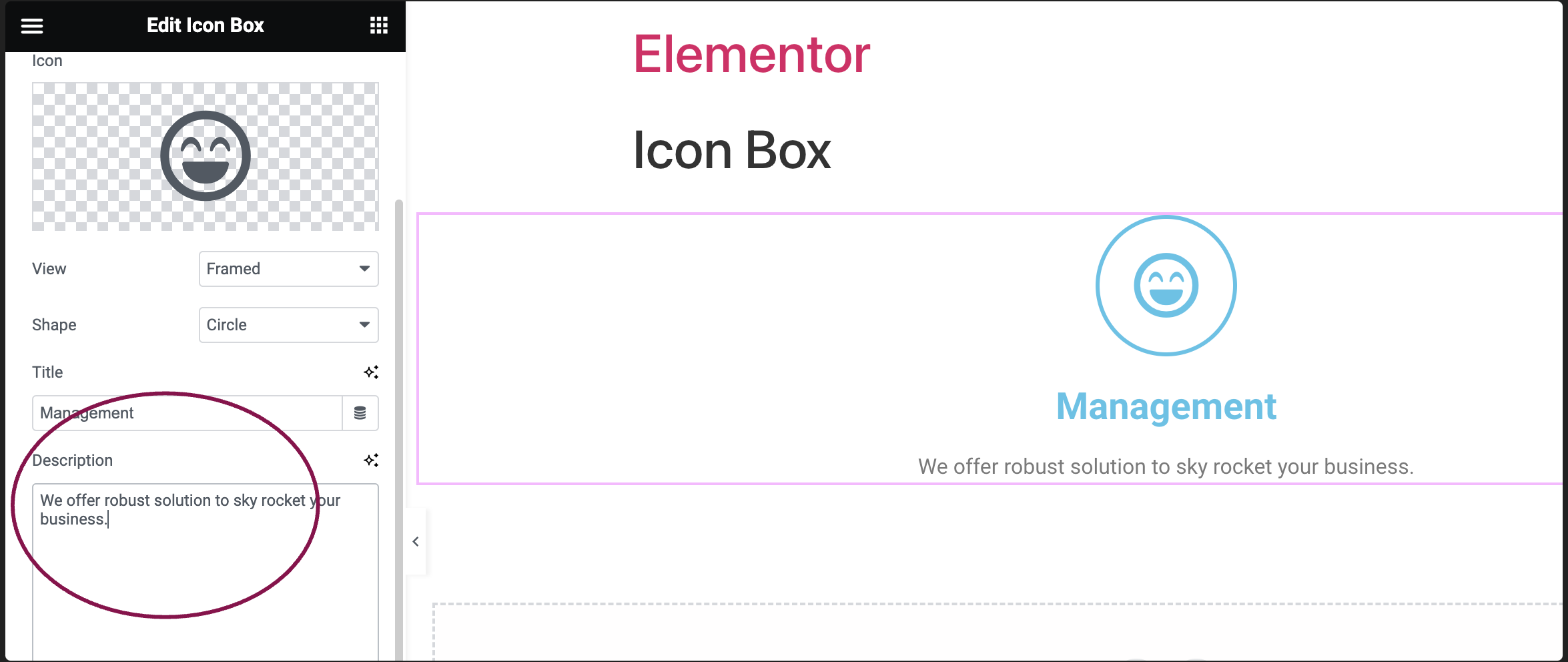
  5. In the Description field, add the text content that will appear in the icon box.
    icon box description Icon Box widget 17
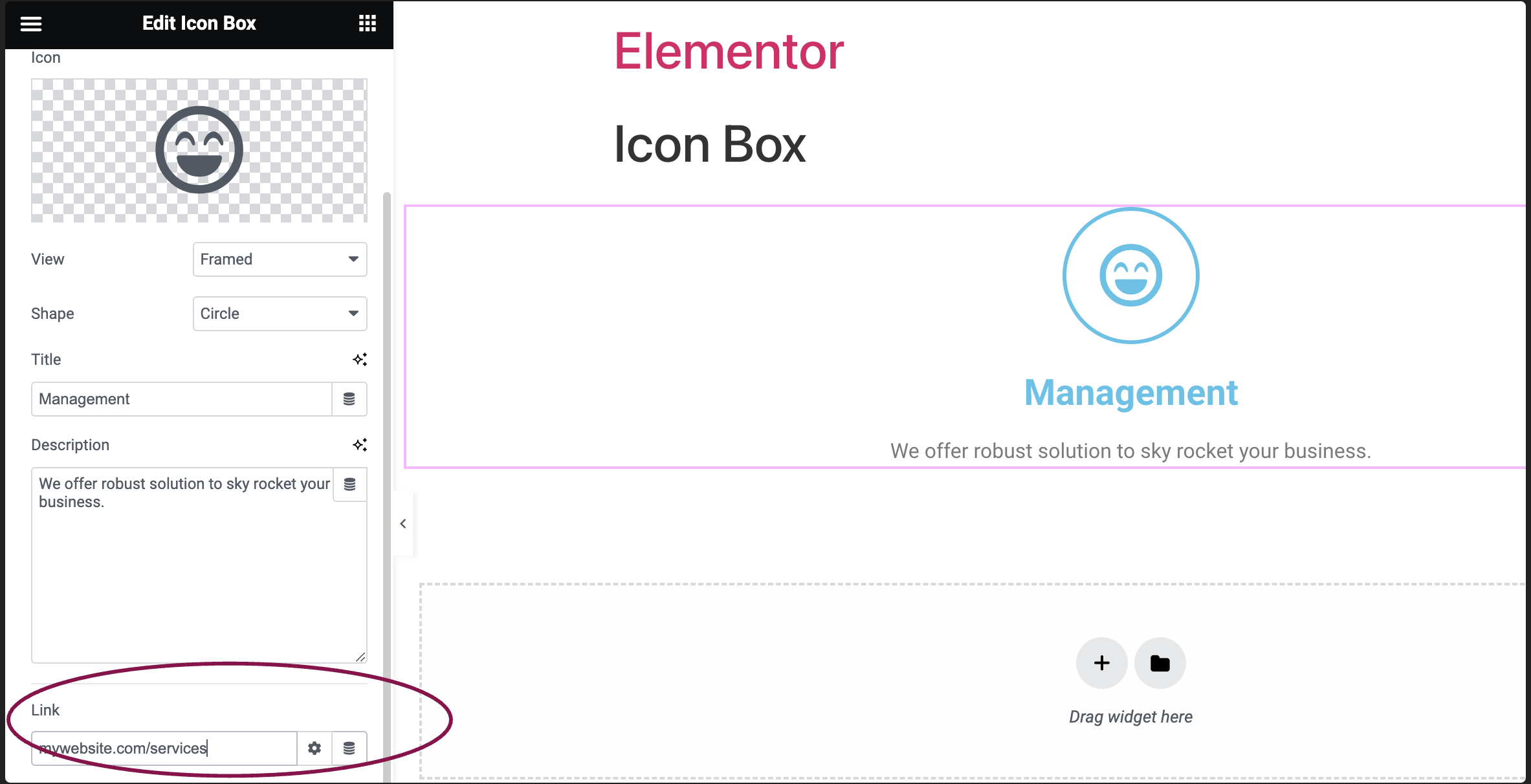
  6. (Optional) In the Link field, add URL for the icon box content.
    icon box link Icon Box widget 19
    1. Click the ⚙️ to set the link to either open in a new window or to add rel=nofollow to the link.
    2. Use the Custom Attributes option to assign custom attributes to the link element. Use the | (pipe) for key-value separation and commas to separate pairs.
  7. Use the Title HTML Tag field to choose the title’s HTML tag, such as H1 to H6, div, span, or paragraph.
    title html link Icon Box widget 21

Settings for the Icon Box Widget

You can customize your widgets using content, style, and other advanced parameters, offering you great flexibility in tailoring them to your needs. Click the tabs below to see all the settings available for this widget.

Content tab

In the Content tab, you can fully manage and customize the icon box information and elements.

content tab of icon box Icon Box widget 23

Choose the icon. Either select from Font Awesome’s entire icon library or upload SVG.

Select Default, Stacked, or Framed view for the icon’s appearance. Stacked option covers the full background, while Framed includes a surrounding frame.

Add a title for your icon box.

Add a description for your icon box.

Add a clickable link for the icon box. Click the Settings icon ⚙️ to select:

  • Open in new window to open the link in a separate window.
  • Add nofollow prevents search engines from associating your site with the linked site. This can help prevent your site from being associated with bad actors, lowering your SEO score. 

In the Style tab, you can customize your icons and text’s colors, fonts, and other design elements.

Style tab

In the Style tab, you can customize your icons and text’s colors, fonts, and other design elements.

Style tab box 1 Icon Box widget 25

Set the icon position – left, top, or right. 

Define the alignment of the box. 

Use the slider to control the distance between the icon and the title.

Use the slider to control the distance between the title and the description.

Style tab icon Icon Box widget 27
  • Primary Color: Choose icon color. When using a stacked or framed box, also select a secondary color. For more details, see Choose a color or Use global fonts and colors.
  • Size: Resize the icon as needed.
  • Rotate: Turn the icon to your preferred angle.

Determine how the icon appears when moused over.

  • Primary Color: Set the primary color for when the icon is hovered over.
  • Hover Animation: Pick an animation effect for the hover.
style content Icon Box widget 29
  • Spacing: Adjust the gap between title and its description.
  • Color: Modify the title’s color.
  • Typography: Customize the font style of the title. For more details, see Typography.
  • Text Stroke: Click the 🖋️ icon icon to apply a stroke effect to the title. Learn more about Text Stroke.
  • Text Shadow: Click the 🖋️ icon to add a shadow to the title. Learn more about Shadows.
  • Color: Change the description’s color.
  • Typography: Adjust the font style, and size for the description.
  • Text Shadow: Click the 🖋️ icon to add a shadow to the title. Learn more about Shadows.

Advanced tab

The Advanced tab provides options to control icon box position, adjust spacing, add custom code, and
more.

advanced tab of icon box Icon Box widget 31

Learn more about the Advanced tab settings.

Have more questions? We’re more than happy to assist.

Link is copied to clipboard!
On this page

Is this article helpful?

Share this article