Create a Hero section with the Flex Hero widget — Step-by-Step
- Drag the Flex Hero widget to the canvas. For details, see Add elements to a page.
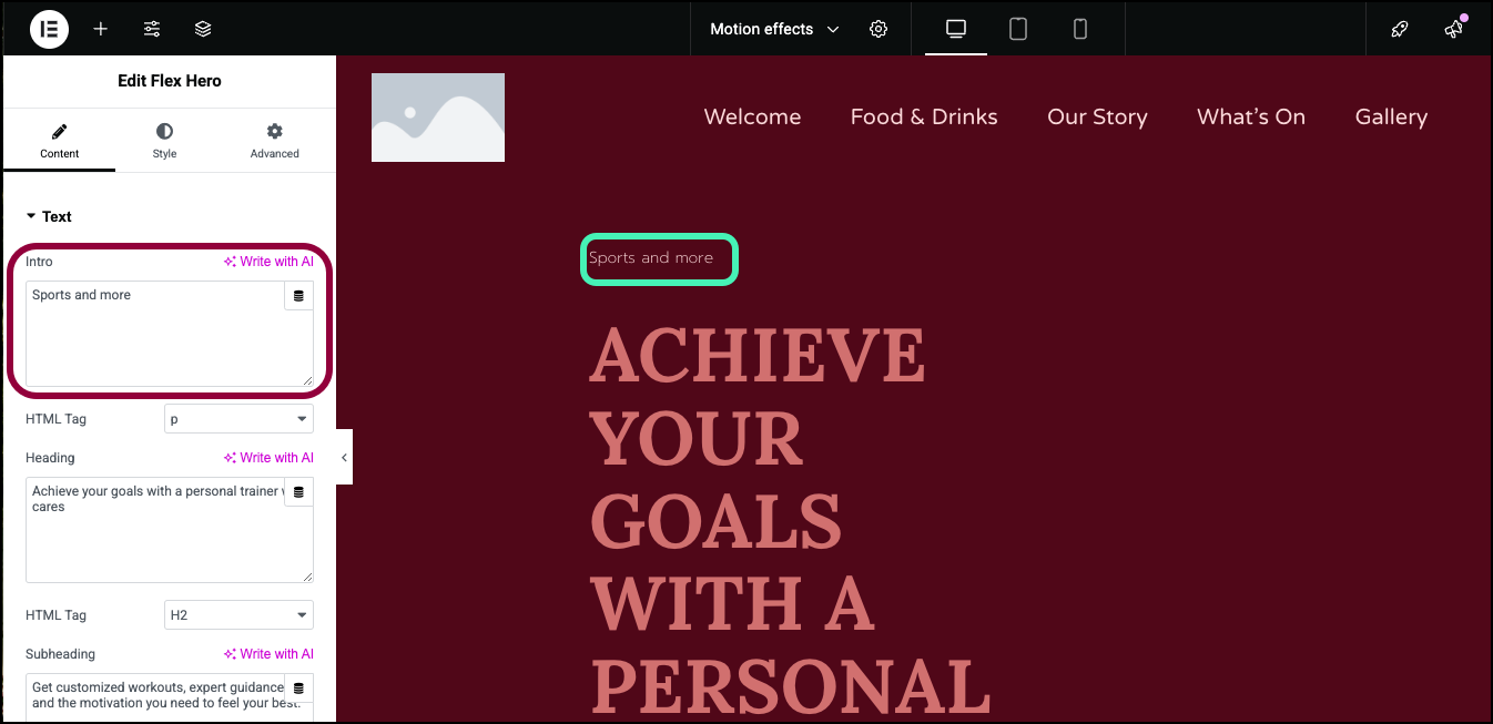
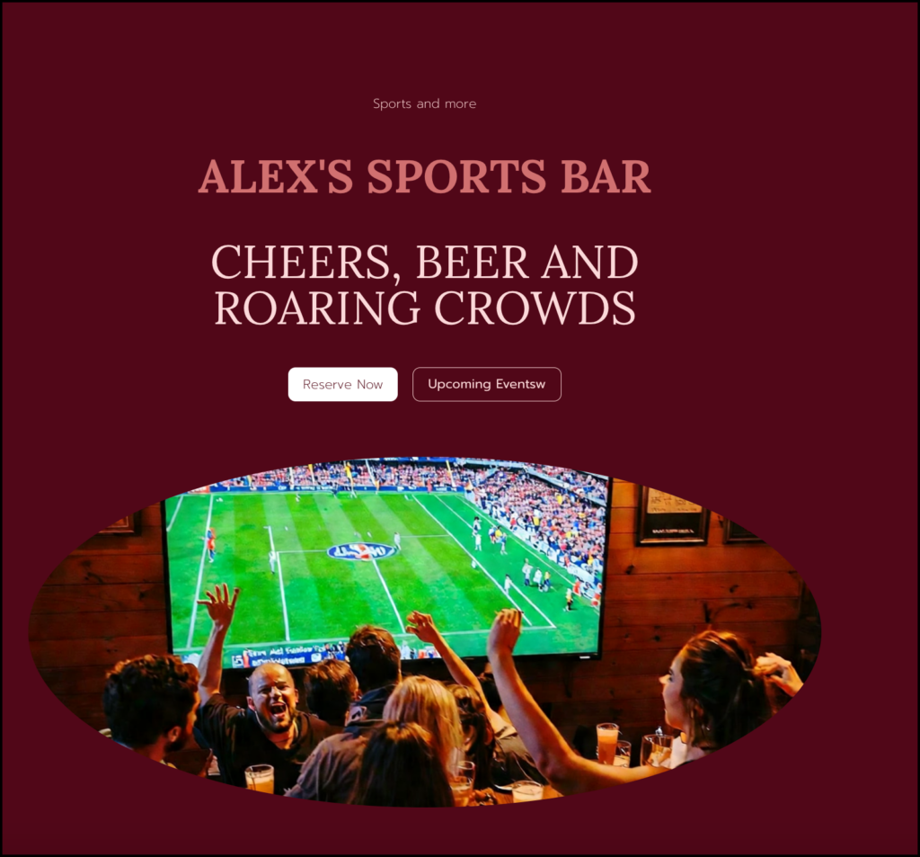
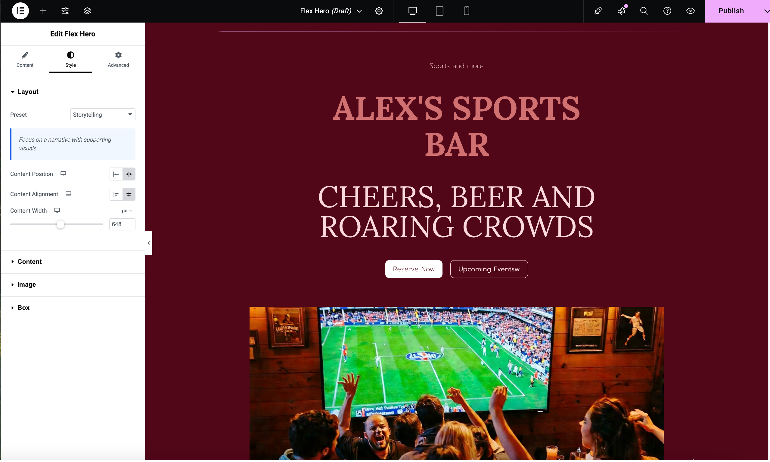
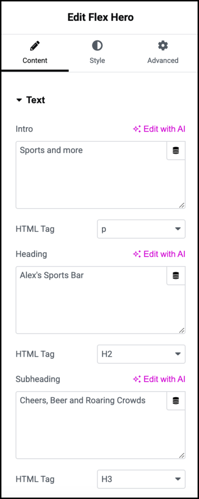
- In the panel, in the Intro text box, enter, Sports and more.
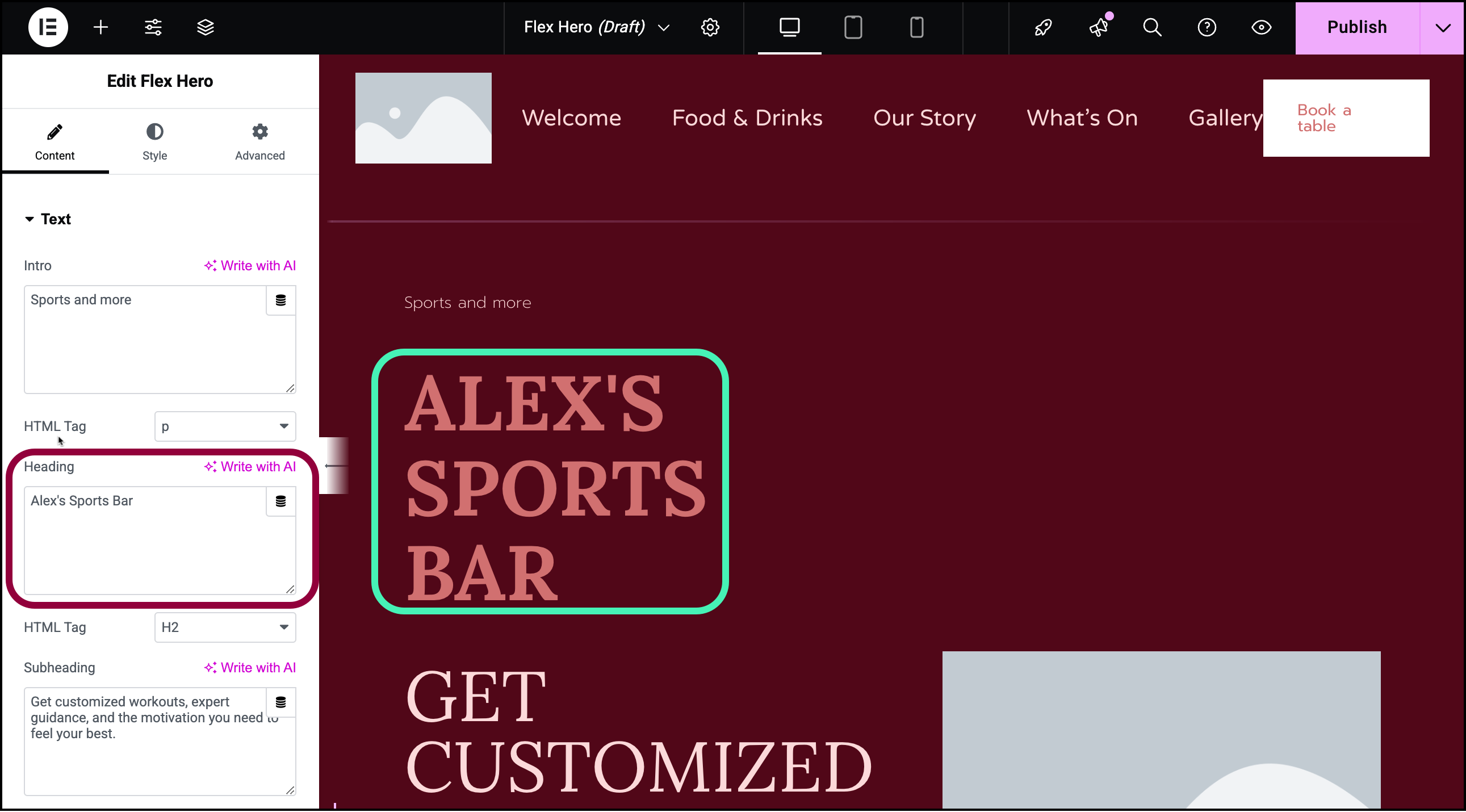
- For the Intro, we’ll use the business’ name – Alex’s Sports Bar.
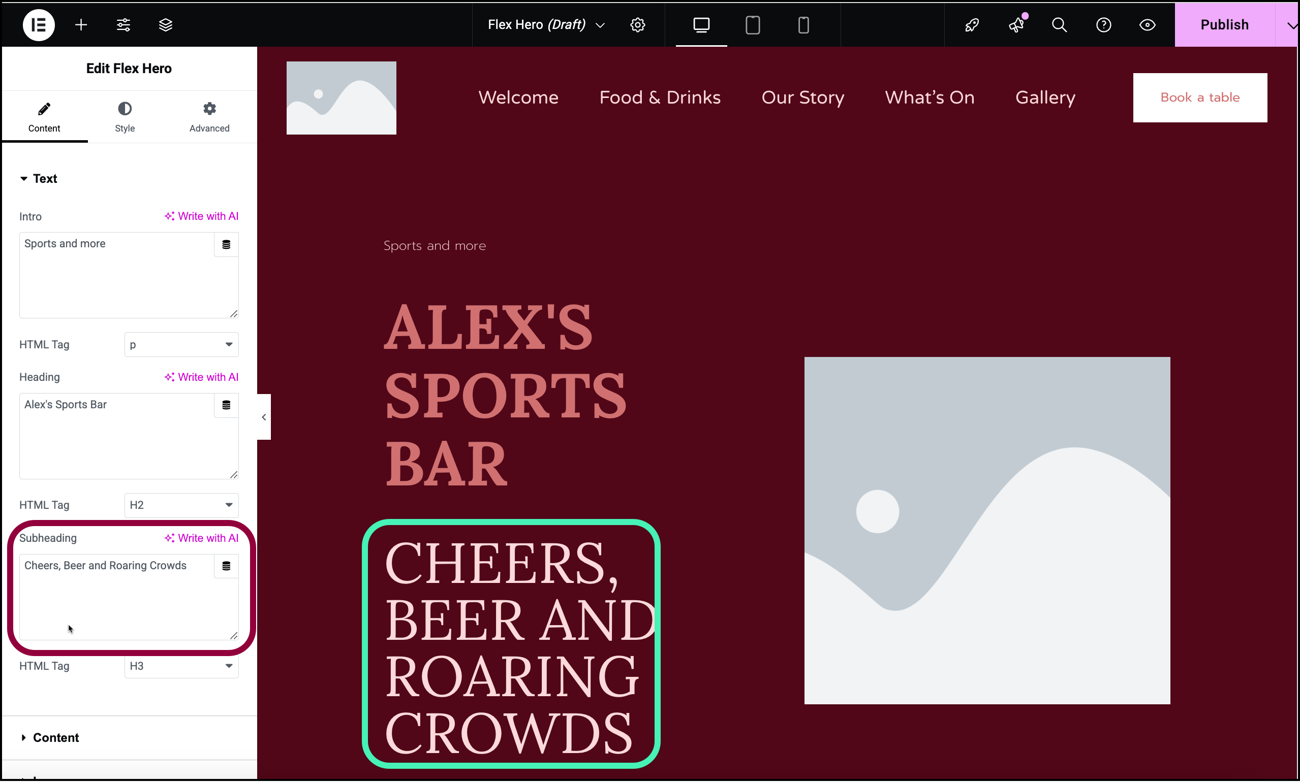
- For the Subheading we’ll use the pub’s tagline – Cheers, Beers and Roaring Crowds.
Now let’s add a couple buttons to the Hero section, one linked to a reservations form and one linked to upcoming events page.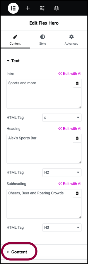
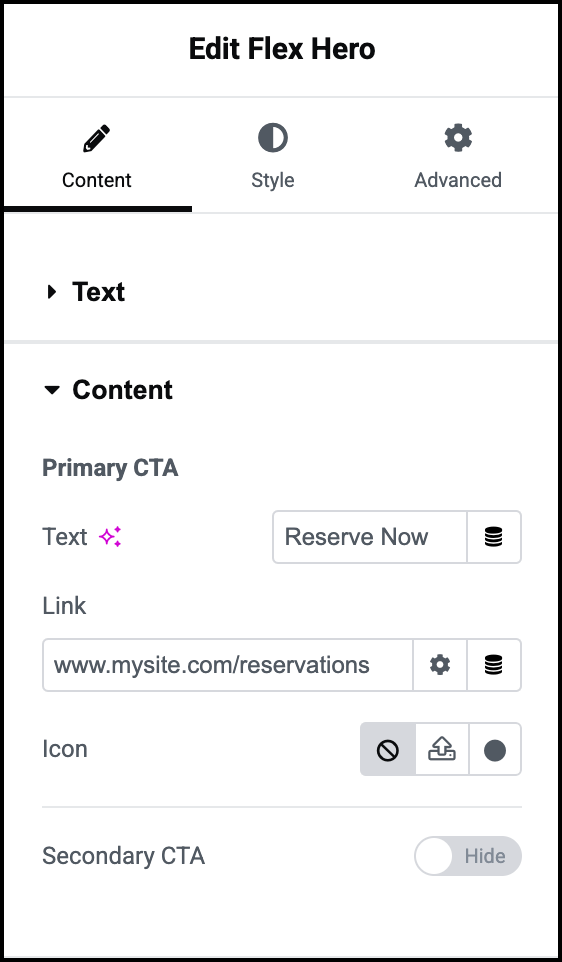
- In the panel, open the Content section.
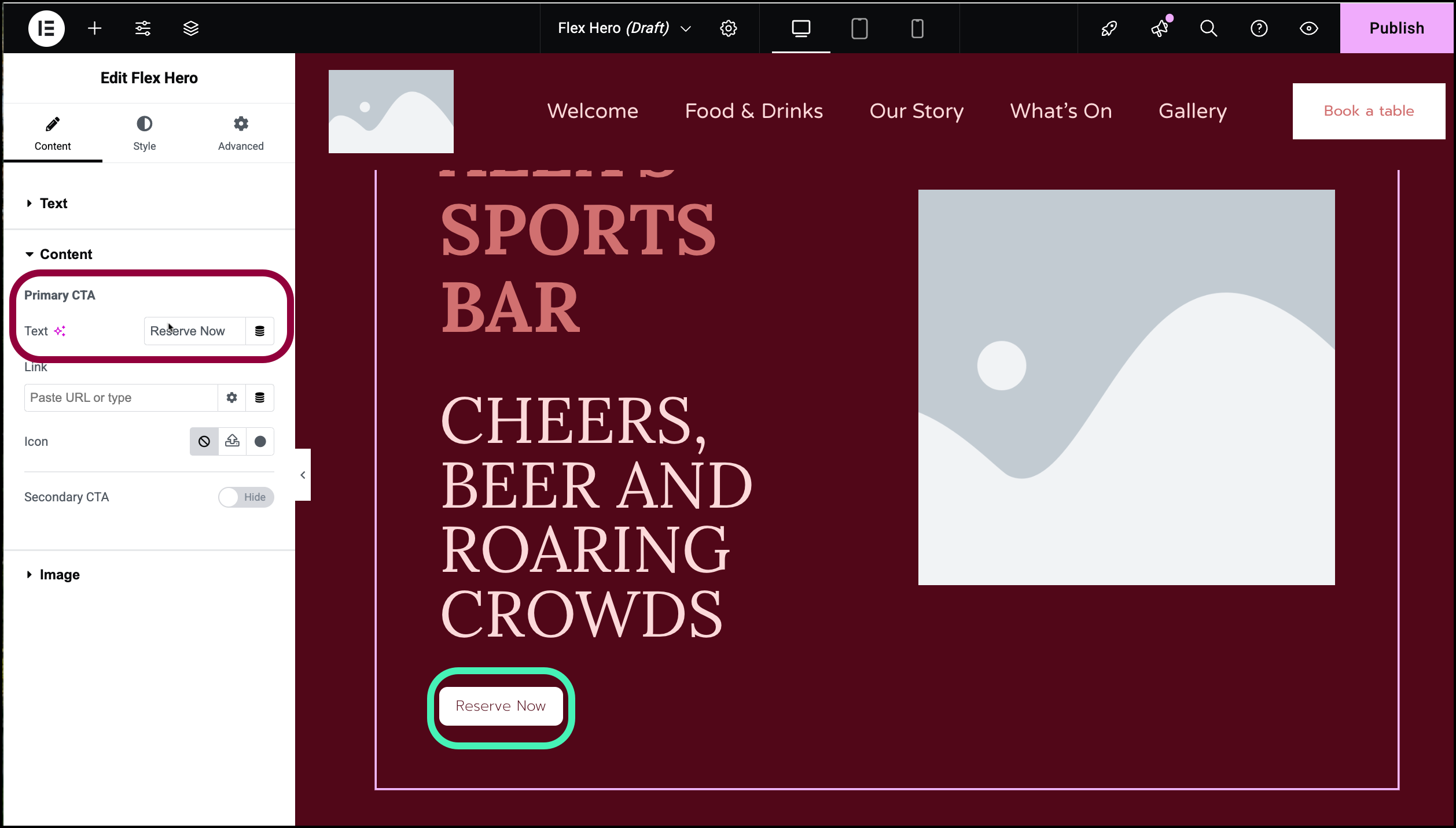
- Under Primary CTA, use the Text box to enter Reserve Now.
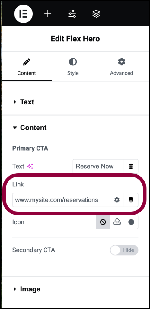
- In the Link box, enter the URL of the reservation form.
Now we’ll create a second button with a link to the schedule page.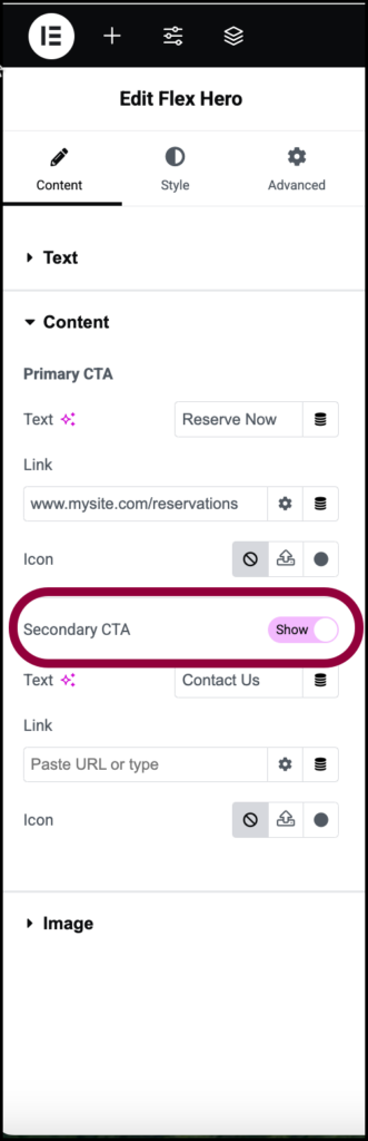
- Toggle Secondary CTA to Show.
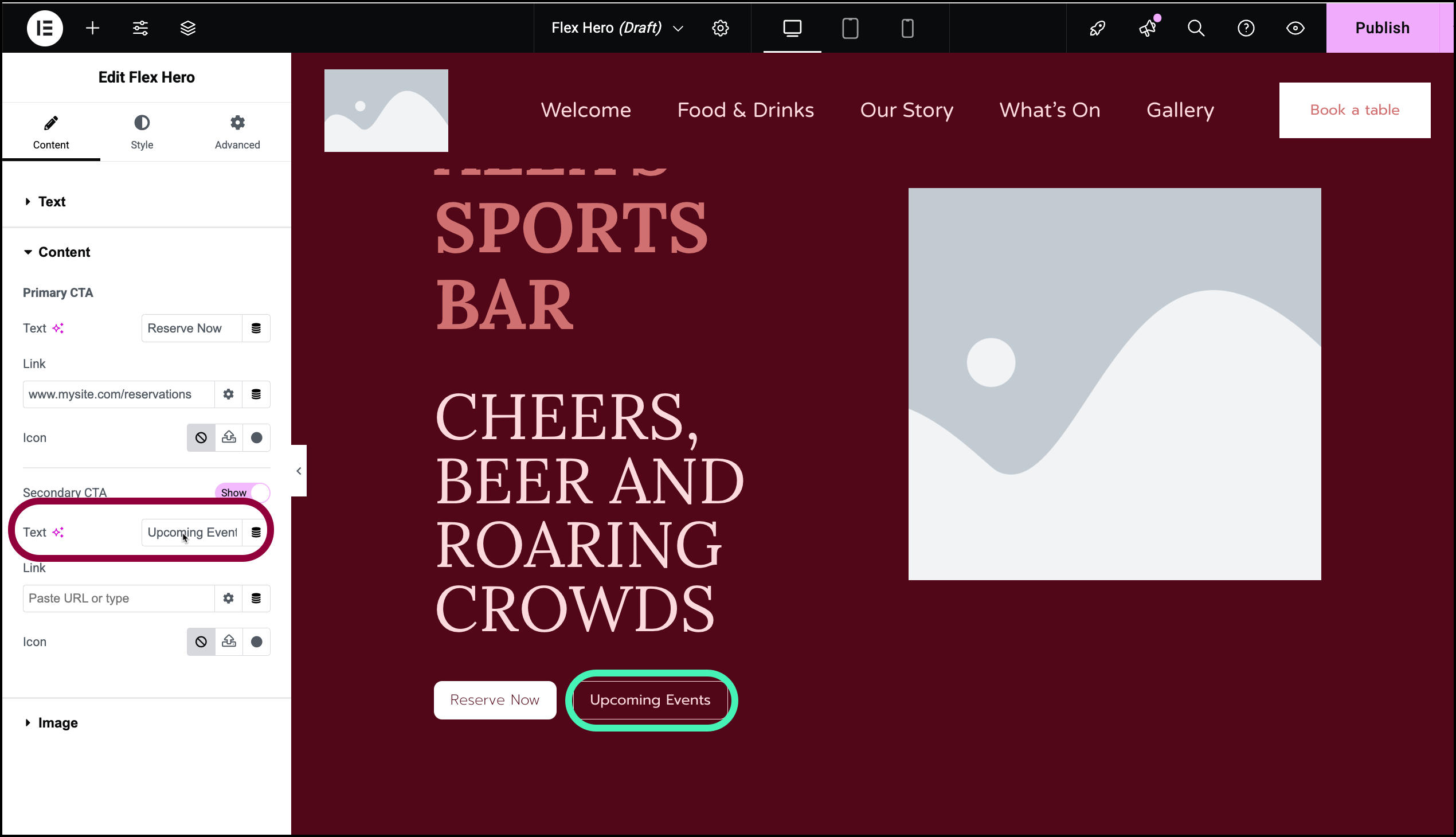
- In the Text area, enter Upcoming Events.
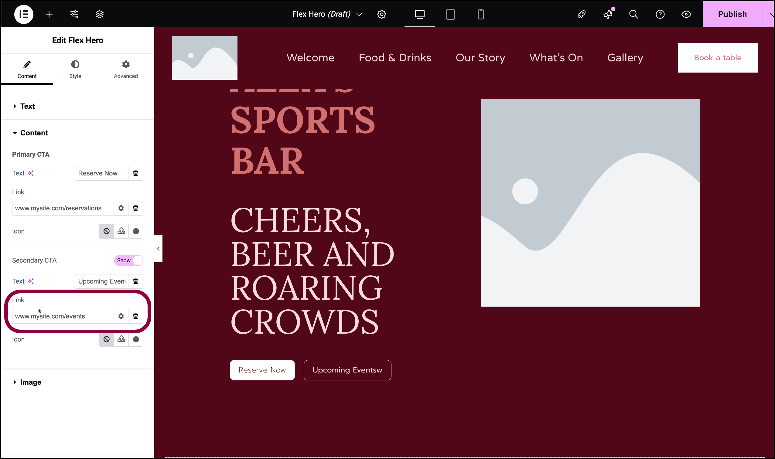
- In the Link text box, enter the URL of the events page
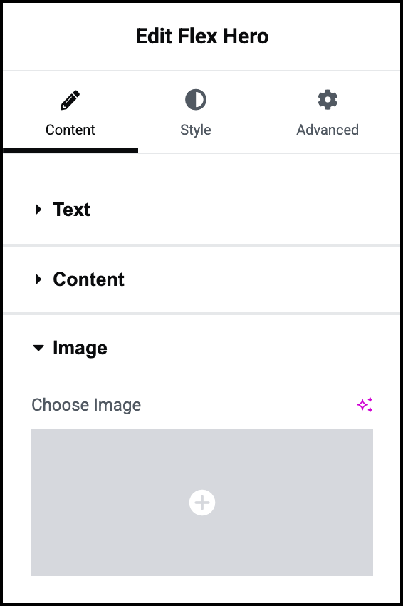
Hero sections usually include an eye-catching image. Let’s add one now.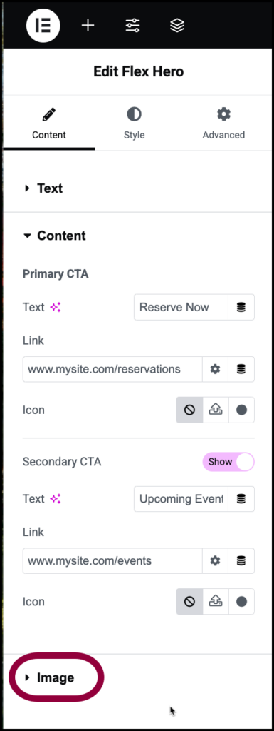
- Open the Image section.
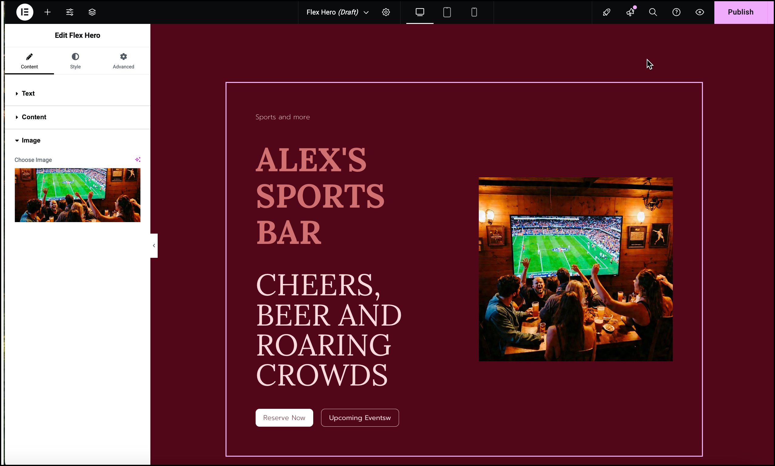
- Add an image. For details, see Add images and icons.
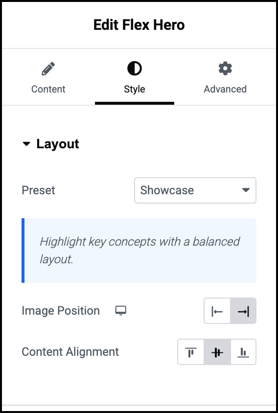
Let’s change the look of the of the Hero section to see how that looks.
- In the panel, click the Style tab.
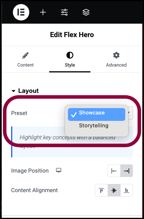
- Use the Preset dropdown menu to switch to Storytelling.
The Hero section changes appearance.
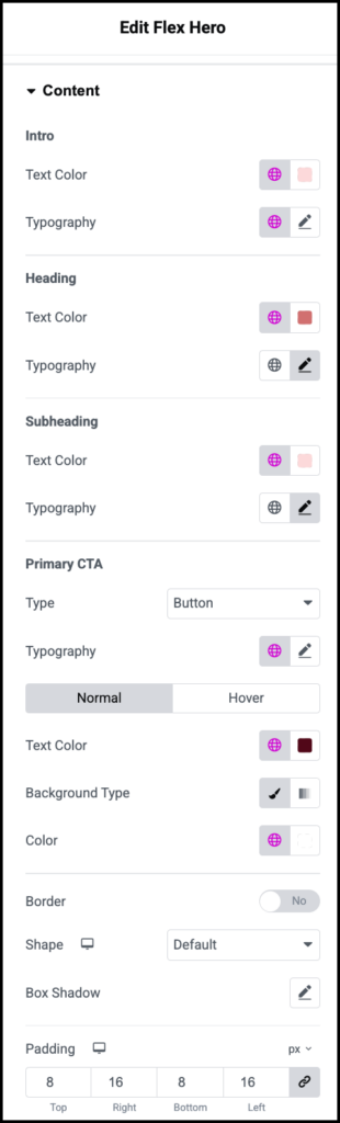
The Heading and Subheading take up a bit more space than we’d like so let’s change the font size.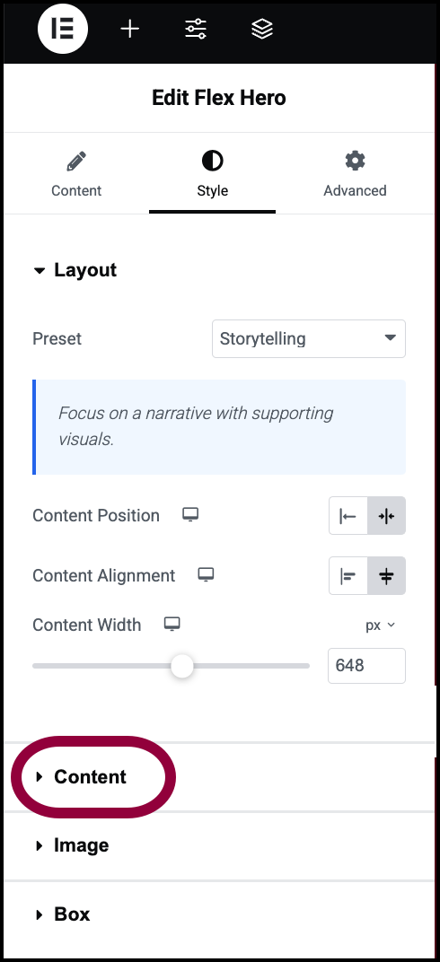
- Open the Content section.
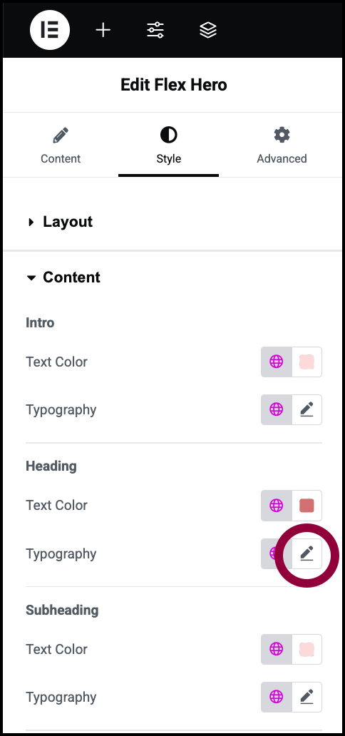
- Click the pencil icon next to Heading.
- Make the font size smaller. For details, see Typography. For details about changing the font color, see Pick a color.
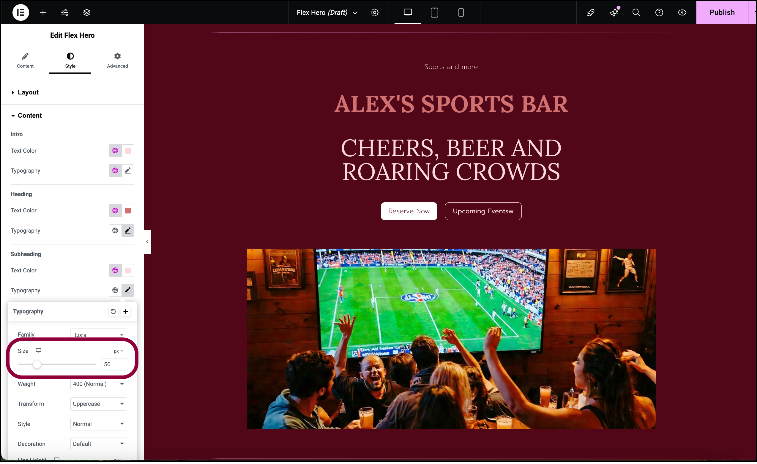
- Repeat the above process with the Subheading.
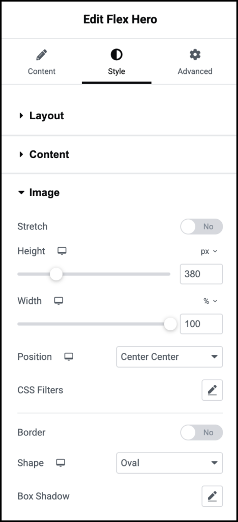
Finally, let’s change the image shape to make it look like an (American) football.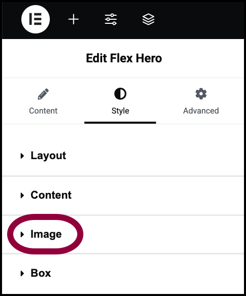
- Open the Image section.
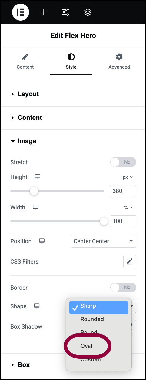
- Use the Shape dropdown menu to select Oval.
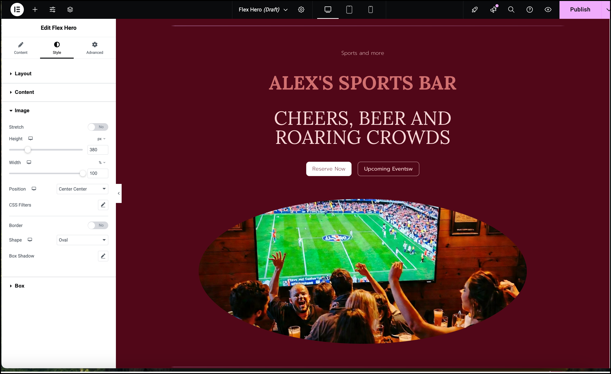
The Hero section is ready.
Primary CTA
Control the Call to Action (CTA) button in the Hero section.
- Text: The words that appear on the button. Leave blank if you do not want a button to appear.
- Link: The URL you want to take users to when they click the button. Can also be used for mail and phone links. For details see How to make clickable phone or mailto links.
- Icon:
 : No icon.
 : Upload an SVG icon of your own.
 : Select and icon from the icon library.
Secondary CTA
Preset
Image Position
Set the image to the:
 Left
Left  Right
Right
Content Alignment
You can align the Hero section to the:
 Center of the container.
 Start of the container.
 End of the container
Center alignment is the most common choice.