To customize your Header:
- Go to WP Admin.
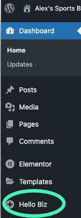
- In the panel, click Hello Biz.
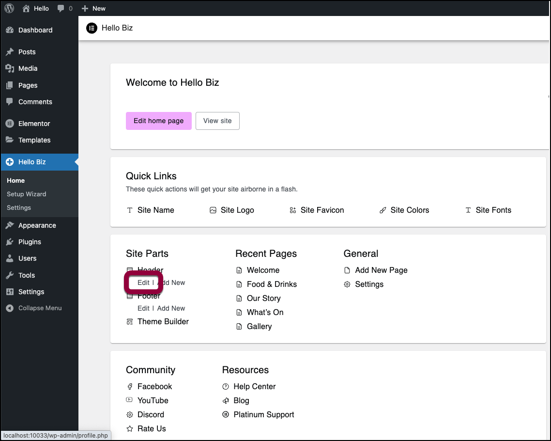
- In the Site Parts section under Header click Edit.
The Elementor Editor opens with the Header visible.
The Header options appear in the panel.
Customize the Header options
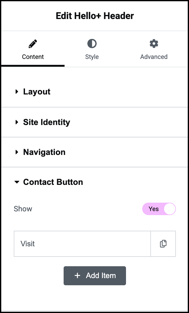
The Header has five sections:
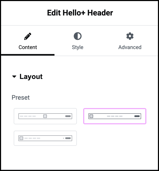
- Layout: Select a basic layout for your header.
- Site Identity: Use a logo or business name to identify the site.
- Navigation: Create quick links to the site’s pages.
- Contact Button: Optionally add a button giving visitors an easy way to get in touch with you.
- Call to Action: Provide visitors a quick way to interact with you.
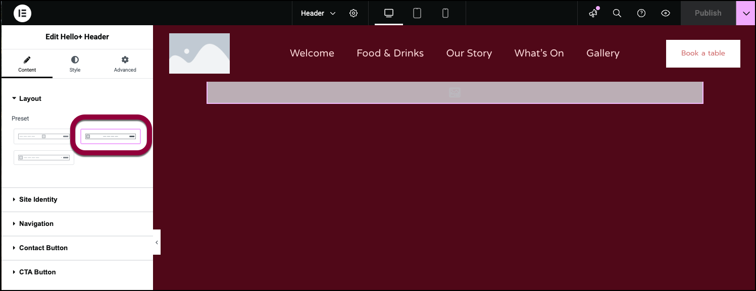
- In the Layout section, give your header a basic structure by selecting a basic design.
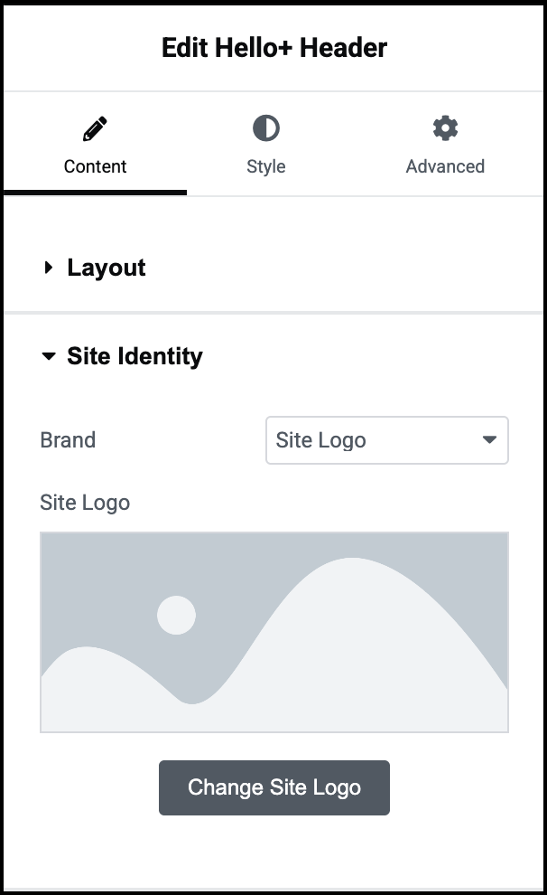
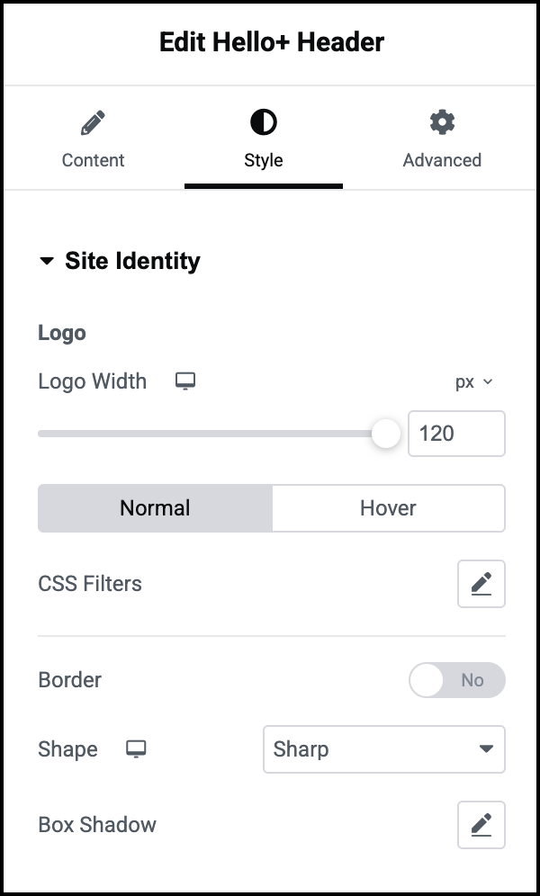
- In the Site Identity section in the Brand Field, the dropdown menu should be in the default position of Site Logo.
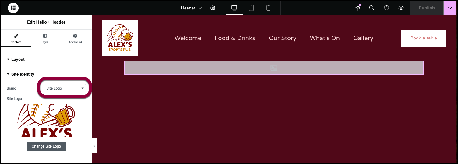
Selecting a logo is part of customizing your site.
You can change your logo by clicking Change Site Logo in the panel. For details, see Adding images and icons.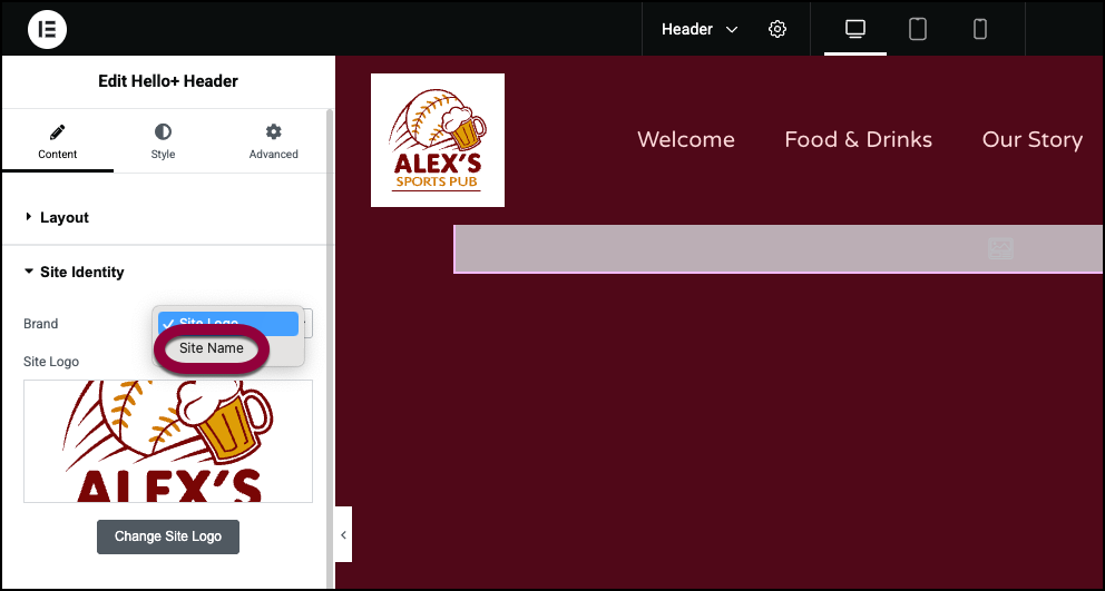
If you prefer to use the site name in the Header, use the dropdown menu to choose Site Name. - The Navigation section controls the quick links to the site’s other pages. For now, we’ll leave that at the default settings. See below for all the navigation options.
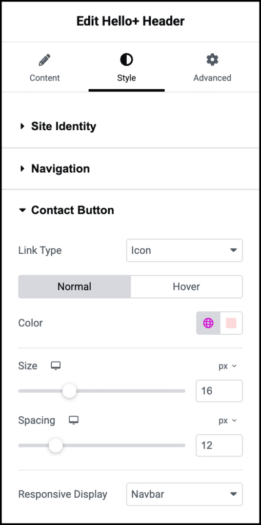
The Contact button gives users a chance to either contact us or navigate to our pub. We’ll give users an easy way to find us by using Waze.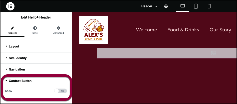
- Open the Contact Button field and toggle to Yes.
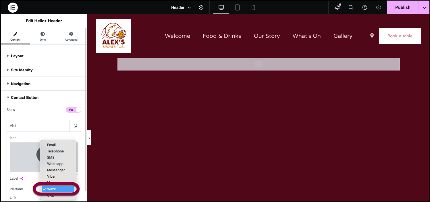
- Select Waze from the Platform dropdown menu.
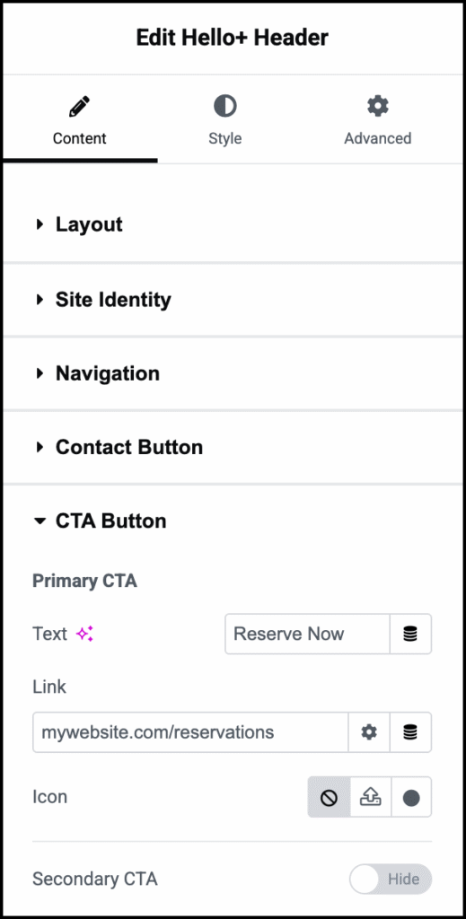
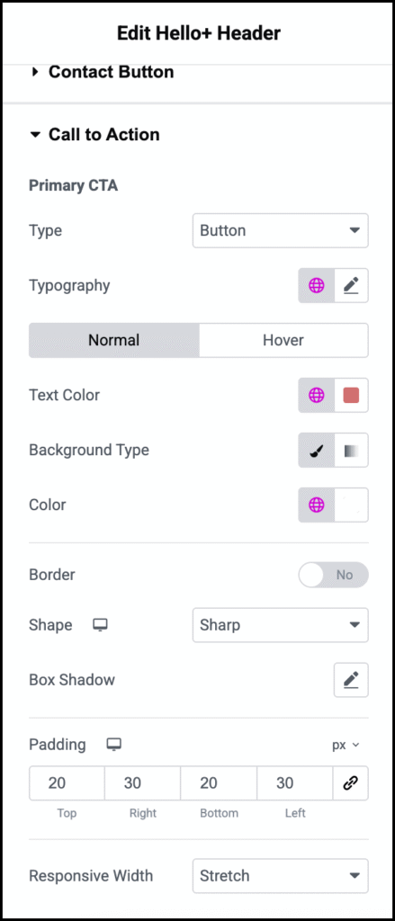
The Call to Action section controls the button in the Header. Since this is a Header for a sports bar, we’ll put a link to the reservation form here.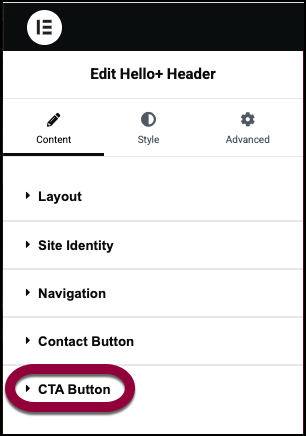
- Open the Call to Action section.
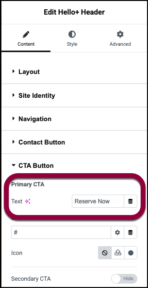
- In the Primary CTA text box, enter Reserve Now.
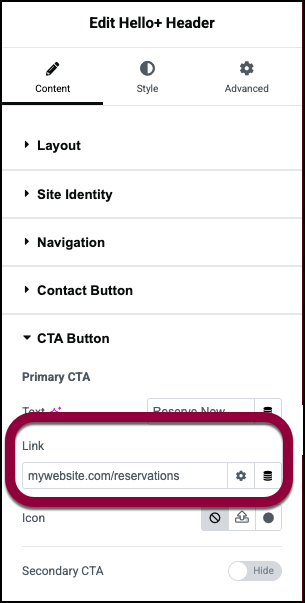
- In the Link field enter the URL of the reservation form.
Now let’s change the style of the Call to Action button so that it changes when users mouse over the button.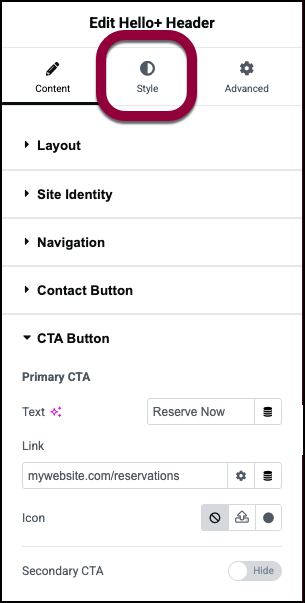
- Click the Style tab.
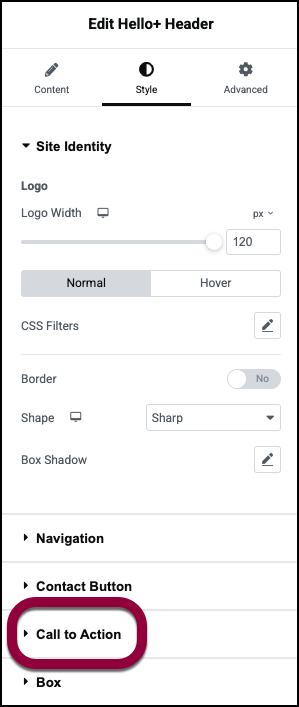
- Open the Call to Action section.
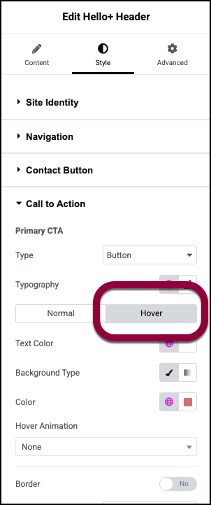
- Click Hover.
Clicking Hover means that you are editing the style when users mouse over the button.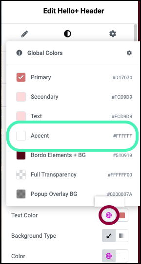
- Click the globe icon next to Text Color and select Accent.
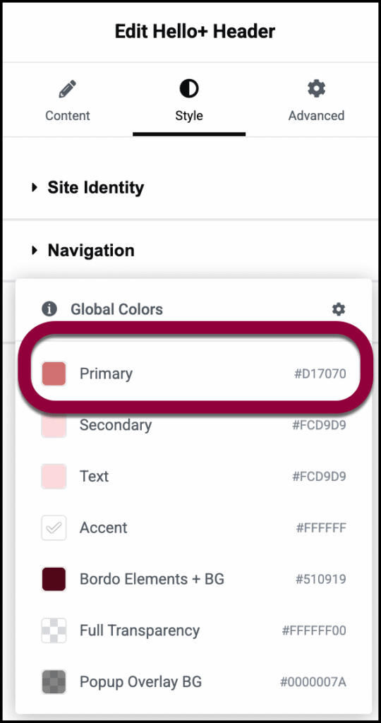
- Click the globe icon next to Color and select Primary.
When users mouse over the button the background and text colors will flip.
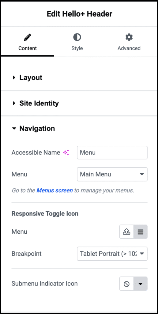
Accessible Name
Menu
Responsive Toggle Icon
Controls the navigation when the site is accessed from a mobile device.
Menu: By default, the menu is represented by a hamburger icon. To change this:
- Click the upload icon
 to upload and use your own svg file.
 - Click the hamburger icon
 to open the icon library and choose an icon from there.
Breakpoint: Use the dropdown menu to choose:
- Mobile: Have the Header use its mobile settings when accessed from a device less than 767 pixels wide.
- Table: Have the Header use its mobile settings when accessed from a device less than 1024 pixels wide.
- None: Don’t use the Heading mobile settings.
Submenu indicator icon: Menu sometimes contain submenus. For example, the menu for Contact Us may contain submenu items such as: Reservations, Parties and Employment Opportunities. By default, these submenus are indicated by a down arrow, but this can be changed:
- Click no icon
 to remove this indicator.
 - Click the down arrow icon
 to open the icon library and choose an icon from there.
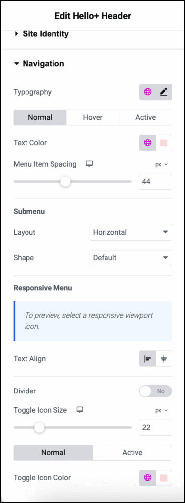
Typography
Normal/Hover/Active
Text color
Menu Item Spacing
Submenu
Responsive Menu
You can see how your site will look on different devices by clicking the Mobile, Tablet and Desktop icons in the top editor bar.

Text Align: When the site is accessed from a mobile device, determine if the menu items appear at the start of the header or in the center of the header.
Divider: Toggle to Yes if you want to add a divider between the menu items when the site is accessed from a mobile device. If you add a divider, you will also be able to choose:
Color: The color of the divider. For details, see Choose a color or Use global fonts and colors.
Weight: The thickness of the dividers.
Toggle Icon Size: On mobile the menu is replaced by a toggle icon. Visitors tap the toggle to open the menu. Use the slider to adjust the size of the icon.
Normal/Active:
- Normal: Determine how the toggle that displays the menu appears by default.
- Hover: Determine how the toggle that displays the menu appears when moused over.
Toggle Icon Color: Determine the color of the toggle that displays the menu. For details, see Choose a color or Use global fonts and colors.
Primary CTA
Typography
Normal/Active
Text Color
Background Type
(Button only)
Use the to switch between:
 Solid background (Classic)
 Blended background (Gradient).
For details, see Create a Background.
Color
Border
Box Shadow
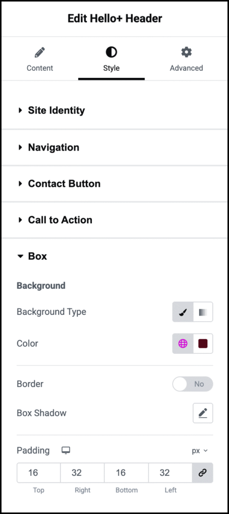
Padding
Responsive Width