Table of Contents
- Table of Contents
- Why Are Website Fonts Important?
- What Do the Different Font Types Mean?
- How We Chose the Best Font for Websites
-
- 1. Arial
- 2. Lato
- 3. Montserrat
- 4. Neue Helvetica
- 5. Roboto
- 6. Lora
- 7. Merriweather
- 8. PT Serif
- 9. Spectral
- 10. Times New Roman
- 11. Abril Fatface
- 12. Calendas Plus
- 13. League Gothic
- 14. Nexa
- 15. Raleway
- 16. Black Jack
- 17. Brush Script Mt
- 18. Milkshake
- 19. Mission Script
- 20. Pacifico
- 21. BoldPrice
- 22. Clement Numbers
- 23. Didone Room Numbers
- 24. Leaner Typeface
- 25. Old Standard TT
- 26. Brixton Sans
- 27. FreeLine
- 28. Hikou Outline
- 29. Ostrich Sans
- 30. Portico
- 31. American Captain
- 32. Burford Rustic
- 33. Hillenberg
- 34. Lazer 84
- 35. Nathan
- 36. Aqua Grotesque
- 37. Exo 2
- 38. Noir
- 39. Privus
- 40. TimeBurner
- Wrap-Up
The task of finding typography for the website you are designing can be daunting. At the time of writing this article, there are over 1,000 Google font families, almost 2,000 Adobe fonts, 15,000 fonts at Fonts.com, and almost 35,000 fonts at MyFonts.com
With additional requirements for the fonts, like font pairing, their weight, readability, range of styles, and more, the task of finding the right fonts for your website can be an overwhelming challenge, to say the least.
Luckily, this guide is here to help you find the best fonts for you. We’ve researched and found 40 of the best fonts for websites
Table of Contents
Grow Your Sales
- Incredibly Fast Store
- Sales Optimization
- Enterprise-Grade Security
- 24/7 Expert Service
- Incredibly Fast Store
- Sales Optimization
- Enterprise-Grade Security
- 24/7 Expert Service
- Prompt your Code & Add Custom Code, HTML, or CSS with ease
- Generate or edit with AI for Tailored Images
- Use Copilot for predictive stylized container layouts
- Prompt your Code & Add Custom Code, HTML, or CSS with ease
- Generate or edit with AI for Tailored Images
- Use Copilot for predictive stylized container layouts
- Craft or Translate Content at Lightning Speed
Top-Performing Website
- Super-Fast Websites
- Enterprise-Grade Security
- Any Site, Every Business
- 24/7 Expert Service
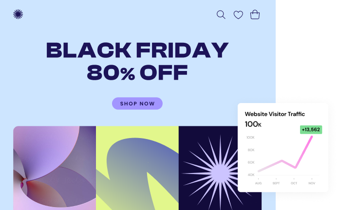
Top-Performing Website
- Super-Fast Websites
- Enterprise-Grade Security
- Any Site, Every Business
- 24/7 Expert Service
- Drag & Drop Website Builder, No Code Required
- Over 100 Widgets, for Every Purpose
- Professional Design Features for Pixel Perfect Design
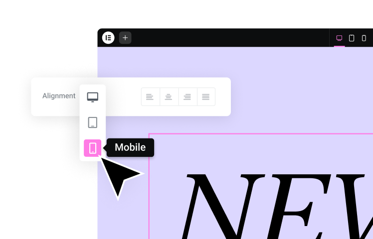
- Drag & Drop Website Builder, No Code Required
- Over 100 Widgets, for Every Purpose
- Professional Design Features for Pixel Perfect Design
- Marketing & eCommerce Features to Increase Conversion
- Ensure Reliable Email Delivery for Your Website
- Simple Setup, No SMTP Configuration Needed
- Centralized Email Insights for Better Tracking
- Ensure Reliable Email Delivery for Your Website
- Simple Setup, No SMTP Configuration Needed
- Centralized Email Insights for Better Tracking
- Ensure Reliable Email Delivery for Your Website
- Simple Setup, No SMTP Configuration Needed
- Centralized Email Insights for Better Tracking
Why Are Website Fonts Important?
Website fonts account for 90% of the design. Therefore, choosing the right one with knowledge is critical to your site’s success. Here are some of the key reasons why:
1. Font Choice Reflects Your Brand Character
Most marketers know their brand’s message, but your font choice needs to reflect and represent your brand’s character. For instance, a romantic font like calligraphy or a quirky meme will not reflect your brand if you have a formal charity organization.
Similarly, if your font needs to reflect a bank, playful fonts will not build trust, and your readers may not take your brand seriously. Therefore, brand choice also revolves around understanding your target audience.
2. Readability and User Experience
These issues are intertwined. Often, readers have to press their faces up against the screen to read the text. Having to do so does not positively affect their user experience. If the font is too tiny, potential leads may vanish in seconds. Similarly, choosing huge fonts is bad practice as they “shout” at the reader, which is deterring.
Also, having too many fonts comes across as confusing and unprofessional, especially if they are on the same page. The best practice is to choose a maximum of two or three fonts to ensure uniformity and clarity throughout your site. Fonts not only affect user experience but interests, navigation speed, and many other aspects.
3. Business Growth
UX is directly related to business opportunities. If your visitors feel comfortable reading your site content, they might stay longer than planned – especially new visitors.
Sites that provided readers with engaging content written in a premium, reliable font catch and retain attention. Achieving this helps you build consumer trust, increase your competitive advantage, and improve business opportunities and profits.
Fonts are essential for your brand or company because you want them to evoke positive emotions, provide easy readability, and improve your bottom line.
What Are the Different Font Categories?
There are different types and categories of fonts, and each variation has its place depending on your brand. Some fonts are more elaborate and noticeable, while others are relatively more simplistic and versatile.
Some font categories are ideal for a bold, eye-catching header, while others are best used in a long paragraph of text. The various font categories are as follows:
1. Sans Serif Fonts
Sans serif fonts are those without (French: sans) markings at the end of the letters (serifs).
Sans serif fonts are usually simple in design, which makes them versatile in terms of placement and use. They go well in the body of a page or in header text. They can also be used to tame an otherwise unique-looking website design.
If you want to give your text a clean, minimal look and to encourage visitors to read the page all the way through, then sans serif is the font for you
2. Serif Fonts

Serif fonts are similar to sans serif fonts in terms of having a stable and predictable structure, only they come with markings at the end of the letters (serifs).
Serifs have a long history in typography which is why the style of these fonts often feels more traditional and sophisticated than others. In terms of where you can use them, serifs can be used in either the body or header text of a web page.
Another reason you might opt for a serif over other fonts is accessibility. Because serifs come with markings at the top and bottom of their characters, letters that sometimes resemble one another (like the capital “I”, lowercase “l”, and number “1”) are easily distinguishable.
3. Cursive Fonts
Cursive is a centuries-old style of handwriting that was originally designed to make writing quicker by hand, and more pleasing to look at. But, in modern times, cursive (or script) has become a unique web font style, designed to mimic hand-drawn writing.
Several iconic brands, such as Vimeo, Ray-Ban, and Kellogs use cursive fonts for their logos. If you want your titling and web logo to have a similar striking, and memorable twist, then cursive is the font for you. However, it may not be ideal for longer texts, especially as younger generations aren’t required to learn to write in cursive anymore.
4. Number Fonts
In web typography, how you display numbers requires the same degree of care and consideration as letters. Although, finding an ideal font for numbers can be a challenge.
Numbers are often used for data visualization, i.e. pricing tables, infographics, or special offers on landing pages. How you display these numbers can have a profound impact on the success of your webpage.
For example, if you’re using them in tables or calculations, they should use tabular lining figures. This means each figure comprises the same width and height so that the numbers line up properly next to and on top of one another.
Another thing to look for is whether the font family includes number symbols that are related to what you’ll use them for (e.g. punctuation, currency, calculations, etc.). And similar to choosing regular fonts, you’ll want to ensure that none of the numbers too closely resemble one another, like the “1” and “7” figures.
5. Outline Fonts
Let’s say that the more traditional styles of the serifs and sans serifs here doesn’t really fit the unique style of your brand. And cursive doesn’t seem to quite fit either.
You might consider using outline fonts in that case.
Because outlined fonts somewhat degrade the readability of text (since you’ve essentially taken the guts out of the characters), you’ll only want to use these in larger header or title texts. But that’s fine. When you have short, punchy headers that need to grab a visitor’s attention, then outline fonts will certainly get the job done.
6. Vintage Fonts
It always seems like what was old is new again, so it’s no surprise when retro or vintage fonts appear on websites despite their dated look.
One of the reasons why retro always seems to be cool is because of nostalgia. When consumers are reminded of the “good old days” through typography, they’re likely going to feel a strong emotional attachment to whatever they’re reading.
And it’s because of this association they make to the past, even if it’s not done in an obvious way.
7. Modern Fonts
It’s easy to call any fonts that are popular today “modern” fonts, but that’s not really what we mean. Modern fonts have certain characteristics:
- They’re based on simple geometric lines and patterns.
- They’re minimally designed at their core.
- The form must follow the function.
- They break with classical and traditional styles.
Essentially, what modern fonts end up being are geometric styles with a slightly futuristic edge. They’re easy to read, but there’s a certain amount of excitement that comes with them as well.
What Do the Different Font Types Mean?
Every font has its unique character, and font designers inject specific meanings in the fonts they create. So, when a site designer picks a font, it elicits a particular emotion, such as happy, welcomed, relaxed, daunted, positive, enticed, or earnest.
For this reason, designers need to understand the psychology behind each font type to design the website correctly. Fonts also provide audiences with a taste of your company culture as quickly as website colors and graphics.
Although the typographical features of serifs often classify fonts, they can also be described as having more human-like personalities. In other words, the appearance of the font (irrespective of what the words say) gives off a specific mood and feel, which can alter the effectiveness of your content.
Therefore, learning to predict how your font might make your audience feel is another assurance that your content achieves the optimal effect. While there is no predictive equation (no Times New Roman always equals THIS specific mood), we have grown up in a culture where personality associations have developed. Therefore, much of the prediction may be based on awareness and instinct.
How We Chose the Best Font for Websites
When choosing the best web fonts for this list, we wanted to make sure that they each meet specific requirements and characteristics.
- Legibility: Fonts, where each character is easily distinguishable from one another — a characteristic that will help you improve accessibility and the reading experience.
- Readability: Fonts that are designed for use in specific parts of the site (i.e. big, bold fonts in headers vs. clean, simply styled fonts in the body).
- Comfort/Familiarity: Fonts that make readers comfortable. Web design choices that deviate too far from the norm, can create an unnerving experience for visitors and unexpected or uncommon typefaces can contribute to that.
Another factor we considered was the weight of the font. Many web fonts aren’t pre-installed with WordPress, your theme, or your drag and drop page builder plugin.
This may cause issues with loading speeds depending on how your site is optimized (as well as consistency in how they’re displayed from browser to browser). So, if this is a major concern for you, we’ve tried to include at least one lightweight web-safe font in each category.
Including typefaces that cover a wide range of styles (e.g. grotesque, geometric, slab, etc.) was also important. It’s just like any other element in web design — you need your typeface to blend with the overall personality of the website and sometimes the most basic and popular fonts won’t do.
The 40 Best Fonts For Websites
1. Arial

According to FontReach, Arial is the #1 font used on the web, with over 604,000 websites currently using it. Google, Facebook, and Amazon are just some of the popular websites that use Arial.
Originally created by Monotype designers for use in IBM laser printers, this web-safe font is one of the best choices for a highly readable UI.
Maybe this font isn’t as beautiful as some of the other fonts on this list, but it’s very common and regularly used.
2. Lato

Lato is a Google Font that was originally designed for a corporate client. Although the corporation passed on the font designer’s creation, Lato was repurposed and given life as one of the most popular typefaces on the web. Lato is used on websites like Goodreads, WebMD, and Merriam-Webster.
Thanks to the balance it strikes between gentle curves and sturdy design, this font gives off a powerful yet welcoming vibe.
3. Montserrat
Montserrat is a Google font inspired by signage from the Montserrat neighborhood of Buenos Aires in the early 1900s. Considering the rich architectural history of the city and the unique beauty of its narrow streets (much like the narrow characters of the font), it’s clear why the typographer found inspiration in it.
This lively and beautiful sans serif font was designed specifically for fast reading, so it does really well in smaller body text on the web.
4. Neue Helvetica

Neue Helvetica is the second most popular font on the web, with over 218,000 websites like Facebook, Yahoo, and eBay using it. Its popularity makes sense not only when you look at its lengthy history in typesetting, but also at the greatly expanded and revamped digitized “Neue” version of it. It’s simple, easy to read, and works equally as well in header and body text.
The font family comes with 128 different typefaces, covering light, heavy, roman, outline, condensed, and other stylings.
5. Roboto

As our world becomes more connected and technologically advanced, there are going to be more and more websites that would benefit from typefaces like Roboto. While this typeface does have a techy, machine-like feel to it, the wide-open characters also give it a friendly touch.
Originally designed by Google to be an Android system font, this neo-grotesque sans serif is now used on websites like YouTube, Flipkart, and Vice.com.
6. Lora
Lora is a contemporary serif font. While it certainly gets the job done in terms of helping website visitors read through a lot of content, the unique brush strokes at the character end give this particular font a more artistic vibe than other serifs.
As such, it works really well in the paragraph text of news and entertainment websites, like FOX News, The Kitchn, and Urban Dictionary.
7. Merriweather
Merriweather is a Google Font that was designed specifically to improve readability on screens. You’ll see evidence of this in the kinds of websites that use Merriweather to style their paragraphs, like Goodreads, Coursera, and Harvard.edu.
Merriweather also has a sans serif counterpart, so if you’re building a blog or other text-dense website, the pairing of these two fonts would work well in keeping the focus on the text and not on any surrounding distractions.
8. PT Serif
PT Serif was originally created for websites with heavy Russian readerships, which is why a full Cyrillic character set is available within this font family.
That said, a complete Latin alphabet is also available, so this well-proportioned font can just as well be used on English-speaking websites like it is in AARP, Lifehack, and Hongkiat use PT Serif.
9. Spectral
Spectral is one of the newer fonts on this list, but it deserves a spot because of how beautifully it handles long-form content on the web. What’s particularly nice about this font is how it feels less heavy-handed than many of its serif siblings (notice the gentle curve of the “j” or how the top of the “f” curves around).
With 14 different styles to this font family, you have a variety of ways you can put this simply-styled serif to use.
10. Times New Roman

When the Times of London newspaper needed a new typeface in the earlier part of the twentieth century, it worked with a Monotype designer to custom-create Times New Roman.
To this day, the digitized TNR is one of the most recognizable, popular and legible fonts on the web. Websites like the Daily Mail, Huffington Post, and Wayfair all use it. As a bonus, it’s web-safe (one that universally installed across all devices), too.
11. Abril Fatface

Abril Fatface is a Google Font based on advertising headlines from Britain and France in the 1800s.
The weight of the font brings strength to any title or header you apply it to. On the other hand, the curves of the lettering and numbers also convey a sense of elegance. If you have a website you want to bring a flare of classic, old-world flair to, this would be a beautiful choice.
12. Calendas Plus

By looking at the sample above, you’d think that Calendas Plus is nothing more than a basic serif font. However, it’s actually an upgrade from the original Calendas. This one font family now includes special characters that will give any website or blog the look of a book of classic literature like:
- Oldstyle figures with varying heights
- Discretionary ligatures that combine two or more characters in a calligraphic style
- Swash characters where the ends of certain letters swoop over or under the rest
- Pre-designed mathematical figures, like fractions, superscript and ordinals
- Small caps
13. League Gothic

The League of Moveable Type decided to take an old classic font that got lost in the public domain after the original foundry went bankrupt (Alternate Gothic #1) and gave it new life for the twenty-first century.
Despite its early twentieth-century origins, League Gothic works well on the web, especially when used for titling more serious ventures. Websites like Chron.com, FOX Sports, and The Blaze use it.
14. Nexa

Nexa isn’t just a clean and stylish font to use for titles or headers on your website. If you’re helping clients design their branding — their logo as well as future branded material — this font works really well in graphic design, too.
There are 18 total font styles in the family, so you can use this across a number of websites and never really have any of them end up looking the same.
15. Raleway

Originally, Raleway was designed to be a single font, thin in weight. Over the past decade, however, this display font family has been expanded to include nine weights, ranging from thin to black. In addition, it comes with old-style features, similar to Calendas Plus. It also has an alternate style that turns this neo-grotesque font into a geometric sans serif.
As you can imagine, this variety in styles and character availability gives web designers some flexibility in terms of where and when they decide to use it.
16. Black Jack

Black Jack has a natural and casual feel to it, thanks to the handwritten letters not always connecting — much like when someone’s written in cursive for a while and adds their unique spin to it.
This font would work well on a website for a service provider or agency that offers a personal touch or white-glove service.
17. Brush Script Mt

Brush Script Mt is a web-safe Adobe Font. It’s marketed as being peppy, informal and unabashedly confident, which is a spot-on description.
If you want any of the text on a website to look like an informal but professional handwritten note from the founder or CEO, this would be a nice choice for that.
18. Milkshake

If you’re looking for a thick cursive font that fills up space well, Milkshake is a good one to consider.
Unlike some cursive fonts that are useful because of their close resemblance to actual handwriting, this one is better suited to placement in title text and logos. Just make sure the brand you’re using it for has a bold and fun personality. This wouldn’t work well for more formal or traditional brands.
19. Mission Script

Mission Script is a warm and friendly font with its playful brushstrokes and, yet, very down-to-earth styling.
It feels like the kind of font you’d use to invite people to a local mom-and-pop shop or eatery that’s been around forever. This would also work well on websites for consultants, coaches, or freelancers who serve a female audience.
20. Pacifico

Pacifico is a handwriting font available through Google Fonts.
It was originally inspired by American surf culture from the 1950s, so don’t be surprised if you find a lot of use for it when designing websites for vintage stores or other types of businesses with a retro, laid back vibe.
21. BoldPrice

BoldPrice is a number and currency font designed with a vintage edge. It comes in two styles. The one you see here is a regular weight, solid typeface. The other style available is bold with a woodcut engraving look.
These fonts would look nice in logos or on websites for diners or restaurants, consignment shops, and other businesses with an old school vibe.
22. Clement Numbers

Clement Numbers is a number and punctuation font set with just one style.
The typographer rescued this font from a type specimen book from the early 1800s. It’s been repurposed for today’s digital users, though it carries with it a sense of old-world elegance, thanks to the unique swirls at the ends of the open characters.
23. Didone Room Numbers

Didone Room Numbers is a numeric font, styled in a similar fashion as Clement Numbers (i.e. Didone style). If you like the look of Clement, but feel like it’s too intense for your logo or display text, this could be a nice alternative.
Just keep in mind that it only comes with numbers and currency symbols, so if you need other kinds of punctuation, you’ll need to get it from another numbers (or your regular) font.
24. Leaner Typeface

Leaner is a simple yet quirky numbers and punctuation font. Notice how some of the characters use irregular angles (like the “3”) or use an alternate design (like the “$” symbol).
It comes in six weights, ranging from thin to bold. It also comes with a complete alpha (uppercase only) character set, so you can use this single font to style your alphanumeric logos, display text and header tags.
25. Old Standard TT

Old Standard TT is a versatile number font that also comes with a complete Latin character set.
This classic serif style draws inspiration from old books, giving it a clean, sturdy, and trustworthy appearance. Given this, it would work well on an ecommerce site for a smaller, more niche retailer.
26. Brixton Sans

Brixton Sans isn’t just a multilingual outline font done up in a hand-drawn style. It’s actually part of a family of six fonts that include the following:
- Light
- Outline light
- Regular
- Outline regular
- Bold
Because of this variety, you can pair and even layer two of these styles together in the header or titling of your website.
27. FreeLine
Although the designer of FreeLine suggests that this font would work well on fashion websites and branding, the outlined lettering and open-air style applied to the characters gives this font a futuristic feel. There’s also something about the geometric lines that make this font feel “fast”, like it could zoom past the screen in a flash.
As such, FreeLine would be a smart and stylish choice for website titling and branding in the technology, aviation, and automotive spaces.
28. Hikou Outline

There’s nothing super out of the ordinary when it comes to Hikou Outline at first glance. It’s a cleanly designed outline font that’s easy to read and will look great in a variety of header and title sizes.
That said, the font family includes 10 styles and 2 weights. Of the 10 styles, there are actually 4 very unique outline styles available:
- Inline
- Outline (what you see above)
- Corroded
- Diagonal
29. Ostrich Sans

Ostrich Sans is part of a font family with eight styles, one of which is the outline font you see above.
What sets this particular family apart is the elongated (like the long neck of an ostrich) all-caps character sets. This design choice is sure to give title and header text a big presence on any page. Unlike the filled styles, though, the outline font feels less domineering as most of the characters are open at the ends.
30. Portico
Portico is a huge font family with 27 styles. But these aren’t your typical light, regular and bold styles (though those are available as well). This family of all-capped character sets seems to offer a style for everyone: vintage, grunge, western, futuristic, artistic, contemporary and more.
The outline font, in particular, looks like it belongs in a Star Wars movie, though you could probably use it for businesses with a retro vibe.
31. American Captain
The American Captain font doesn’t just take its name from Marvel’s Captain America. It shares many of the same characteristics as the Avenger: It’s tall, strong and instantly recognizable.
It’s also quite versatile and includes characters for small caps, fractions, alternate glyphs, ligatures and so on.
32. Burford Rustic
There are 20 styles in the Burford Rustic font family. 18 of them are variations on the rustic and grunge style of this font. So, if you want some vintage-style icons to place around or within your text, this family should cover it.
As for when you can use this, this would work great for small or family-owned businesses that are located in rural or rustic settings, like camping grounds, lakeside retreats, B&Bs, etc.
33. Hillenberg

Hillenberg is a font family with 10 different vintage styles. The one you see above looks like something out of the Old West. There are grunge fonts that can give your site’s lettering a rustic, wood-carved look. There are lined fonts that might make your text look like an old Hollywood marquee.
If you’re playing around with different retro styles, this is a good font to check out as it has a variety of options built in.
34. Lazer 84
Lazer 84 calls to mind a very specific time period: The 80s. Roadhouse. Child’s Play. Baywatch. It wasn’t uncommon to see brushed fonts used at the start of movies or TV shows back then.
If you find yourself designing a website for a company formed in the 80s that wants to play upon the styles of that time, this font would work great for your titling and headers. You could also use it for any tech-friendly website with a retro video game look to it (think Street Fighter).
35. Nathan

Nathan is a vintage script font with a hand-lettered look. Because the characters have inconsistent spacing and height, this font would be best used for the titles on your website. It would also look great in retro-style logos.
Because of the natural feel of the lettering, you could use this on websites for vintage brands as well as brand new companies that make hand-crafted products for local customers.
36. Aqua Grotesque

Aqua Grotesque is a reimagining of Futura, a font that was originally designed back in the 1920s and was based on the simplicity and functionality of Bauhaus. This easy-to-read yet funky looking font would work equally well on sites with a retro vibe as well as on fashion and ecommerce sites.
37. Exo 2

In 2013, the designer of Exo decided that it was time to give the futuristic-looking font a facelift, and thus, Exo 2 was born.
The two fonts are nearly identical geometric sans serifs. The main difference between them is that Exo 2 isn’t as stretched out and has softer edges, which improves the readability of the font. Although Exo 2 does have a futuristic edge to it, it’s still a clean font that would do well on a variety of websites trying to make a powerful statement.
38. Noir

There are actually a number of Noir fonts out there. This Pro Noir font, however, comes with 12 fonts, so you have a lot of flexibility in terms of how you use it.
The light version of the font — which you see above — is a simple sans serif that could realistically be used anywhere on a website. On the other hand, the dramatic bold and heavy styles could be used to create titles and logos that resemble old film noir marquees.
39. Privus

Privus is a neat geometric font that comes in three styles. The one you see here is called “Light”. Really, though, it turns each character into a maze. Then, there’s the “Medium” font, which is a heavily outlined font with random openings in the characters. And “Bold” is a large, filled font.
If you’re looking to do something creative with your titles or logos, this font has a lot to offer. You could use just one of the distinctive styles or layer two of them for an unusual optical effect.
40. TimeBurner

TimeBurner is an interesting font. While it’s easy to read thanks to the geometric lines and curves that make up the letters, there are unique twists throughout.
The lowercase “e”, for instance, comes up short on the end. It doesn’t appear incomplete, it just looks as though a certain segment length was used to complete the bottom of the letter. That same segment appears to be the tail in the letter “g” as well. Your visitors and readers might not pick up on that specific detail, but they’ll certainly take notice of this eye-catching font.
Wrap-Up
There are tens of thousands of fonts available online. Narrowing down the choices and finding the ones that will fit your website the best, can be challenging, but, luckily, this guide will aid you in the process.
When choosing fonts, remember that you should aim to pair no more than two or three for each website you design. This will give your interface a consistent look from start to finish, which helps strengthen brand recognizability. It will also encourage readers to focus on reading what’s written as opposed to marveling over all the crazy selection of fonts littering your pages.
For additional guidance on how to choose the right font for your website, read this comprehensive article. And when you find the font that’s right for you, you’ll learn that adding custom fonts to WordPress is an easy task, especially with Elementor.
Looking for fresh content?
By entering your email, you agree to receive Elementor emails, including marketing emails,
and agree to our Terms & Conditions and Privacy Policy.
