The “homepage is where the art is” in this September’s spectacular showcase. Featuring websites across the board from all around the world, this is a collection as refreshing as a spring shower.
Making this month’s list are various creative and branding agencies, a lifestyle coach, a digital marketing institution, an art gallery, a luxury real estate organization, a commercial interior design studio, a coffee machine manufacturer, and an avian-inspired shop.
Be inspired by delicate fonts that underscore prestige, expert scrollytelling, color schemes that match messaging, clever uses of sticky columns on inner pages, intricate scroll effects, subtle Lottie animations, perfectly contrasted gradient colors, and impressive clickable website elements.
Let’s study them together!
Katherine Maslen
by Five by Five
Katherine Maslen’s mission is to empower women to “rise and shine.” She believes that within each woman is the power to be who they want to be, aspire to better things, reach their full potential, and help others do the same. Katherine believes when women are empowered, in touch with themselves, and tuned in to what they need, they can make a massive impact in the lives of others, and ultimately the wider community.
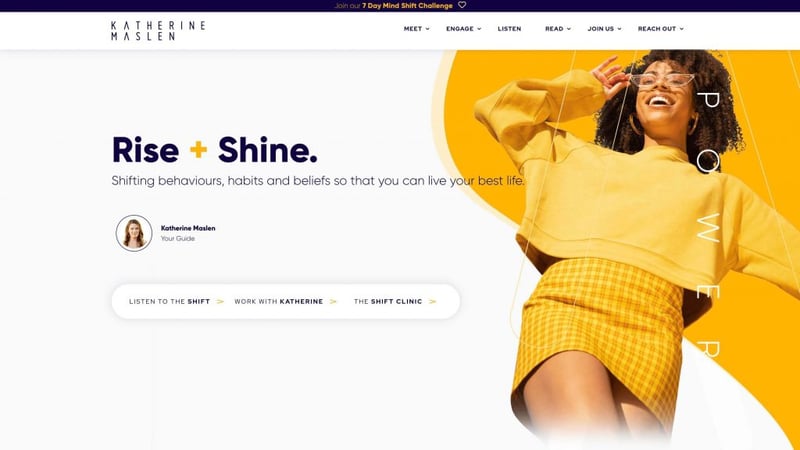
The website uses scrollytelling beautifully, dynamically sharing its mission through stories as users scroll. Subtle lines and arrows take viewers on a colorful journey as the website unfolds through a series of background images, custom fonts, mask shapes, and shape dividers.
Clever scrolling effects combined with bright blue and yellow colors create a warm and lively user experience. As we’ve previously noted with colors, blue signifies confidence and stability, while yellow produces joy, intelligence, optimism, and happiness. Together, they pinpoint mature professionals looking to shift their lifestyles.
Since the main goals of the website are lead generation, brand exposure, and blogging, using a minimalist design, parallax effects, it perfectly encapsulates the Australian business’ main value proposition of promoting positive habits for a healthier, more balanced lifestyle.
The website’s great composition of images and parallax effects makes it easy on the eyes, perfect for its middle-aged target audience. A page that stands out is the “speakers kit” page which expertly uses masks in composition with motion effect, along with large transparent title outlines.
The word that pops up most is “shift,” which also happens to be the name of the business’ podcast and clinic. Combined with the website’s design, this is an effective way to push Katherine Maslen’s message.
Design & Development: Five by Five
Theme: Custom base
Plugins: ACF Content Analysis for Yoast SEO, Advanced Custom Fields PRO, AJAX Thumbnail Rebuild, Blubrry PowerPress, Custom Post Type UI, DynamicConditions, Essential Addons for Elementor, Gravity Forms, Gravity Forms Zapier Add-On, Five by Five Form Steps, Five by Five Media Boxes, Post Types Order, Pretty Links, Redirection, Safe SVG, Unlimited Elements for Elementor, WordPress Importer, WP Cerber Security, Antispam & Malware Scan, WP Control, WP Engine Automated Migration, Yoast Duplicate Post, Yoast SEO.
09
JumpIn
by Tomer Izraeli
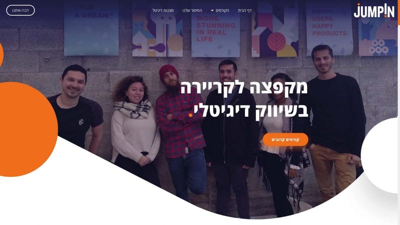
Jumpin is a digital marketing college in Israel. In order to meet the nation’s increasing demand for marketers, the college is designed to better prepare and integrate its graduates to integrate into the job market of the future. Employers recruit matching talent from Jumpin, which acts as a springboard for helping job seekers realize their professional and economic potential.
The website is professionally executed and uses its space intelligently. Incorporating testimonials from clients, and widely using human faces throughout its messaging, the college adds plenty of credibility to its service. This is cleverly done considering its target audience is professionals looking to launch a career in digital marketing and the design industry.
Right from the animated loading screen, we see orange and blue logo colors. In fact, orange dots are used right throughout the website like a motif, visible in period marks. Orange is also dominant in the website’s CTAs. Blue generally signifies advancement and technological innovation which is a smart choice for a marketing college.
Background gradients, overlays and images add depth, while big texts and subtle scrolling effects and a touch of fun, making it appeal to any prospective student.
The Israeli institution employs a great UX experience which creates a generally smooth impression. Add to this the website is very mobile responsive and the result is a very well layered hierarchy of information coupled with professional yet simple branding and lead generation assets.
Design & Development: Tomer Izraeli – TomerArt
Theme: Hello
Plugins: Yoast SEO, MouseWheel Smooth Scroll
08
Modern Creatives
by omni.agency
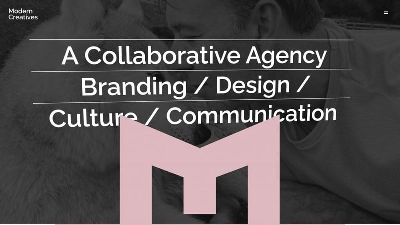
Modern Creatives work with corporates who wish to appear boutique, and start-ups who compete with global businesses. Their business is built on experience developed over time and by nurturing valued relationships with clients who continuously challenge them to explore and deliver.
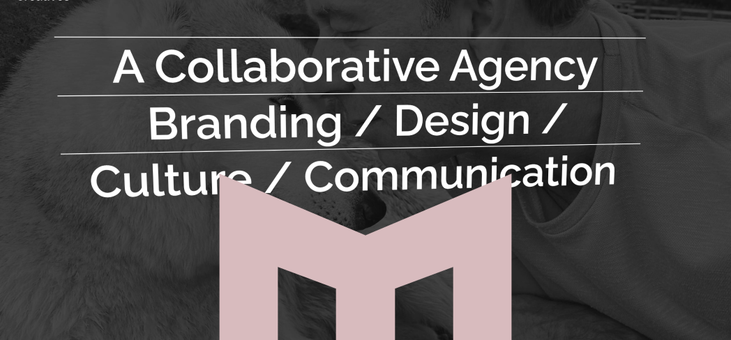
Starting from the top, the hero’s mouse-rotate effect is subtle yet just noticeable enough to grab visitors’ attention. Blending this in with their oversized and rather conspicuous logo fixes it into the minds of the viewer which is exactly what a website designed for lead generation and brand exposure should do. Similarly, the popup menu also employs the same visible “M” logo.
Hovering over the running script pauses it while clicking any word takes visitors to its relevant page. Diving deeper into any of the UK company’s case studies, visitors will notice the use of sticky columns which keep the reader perfectly synced between images and text.
The “approach” page, in particular, deserves special praise for using animated headlines in a unique way to highlight its messaging.
The level of detail is noticeable as each internal page has its own color scheme, and all in all the website is a perfect example of a simple portfolio that employs nice casual fonts that makes its information easy to read and digest.
Design: Andrea Sebestyén & Shaun Taylor – omni.agency
Development: Andy Hoyland & Ben Wilde
Theme: Hello
Plugins: Dynamic Content for Elementor, Advanced Custom Fields, CPT UI.
07
Mallorca Hem
by Misha Moro
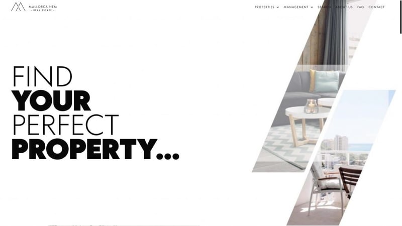
Mallorca Hem is a local real estate agency in Mallorca, Spain. They hold a large portfolio of properties, from magnificent villas in the countryside to urban penthouses in central Palma. Their real estate agents offer expert assistance and local knowledge about the island’s property market and their team speaks several languages. They also have a wide network of interior designers, construction companies, and suppliers as well as connections with local legal and financial institutions.
What strikes visitors most is how the website’s logo is visible from the loading screen. As you scroll, you get the feeling you’re peering through a glass window onto your dream home on the island of Mallorca. In fact, it is the logo that is ingeniously integrated here as a parallax effect in the form of right and left-leaning rhombus-shaped “windows”.
The use of thin fonts in listings and floating menu and minimalist look gives it an air of prestige that correlates with its intended target audience. The website also employs a minimalistic, elegant black and white color scheme of varying shades. To meet its prospective clients on the same level, all the colors, therefore, come from hi-resolution images using image boxes and image carousels. Custom fields are used to create listings, along with custom icons to present each property’s key details at glance. A nice touch here is the option to print a listing next to the contact link.
This truly is a prestigious-looking website that is perfectly crafted for its established target audience — those over 30 years old with high purchasing power looking for a luxury Mediterranean island home.
Design & Development: Misha Moro – 22MW
Theme: Hello
Plugins: Dashboard Welcome for Elementor, EWWW Image Optimizer, Extras for Elementor, JetElements For Elementor, JetEngine, JetSearch For Elementor, JetSmartFilters, LoftLoader Pro, MailOptin – Lite, ToolKit For Elementor, WPCasa,em
06
Kreate
by Kreate. Agecny
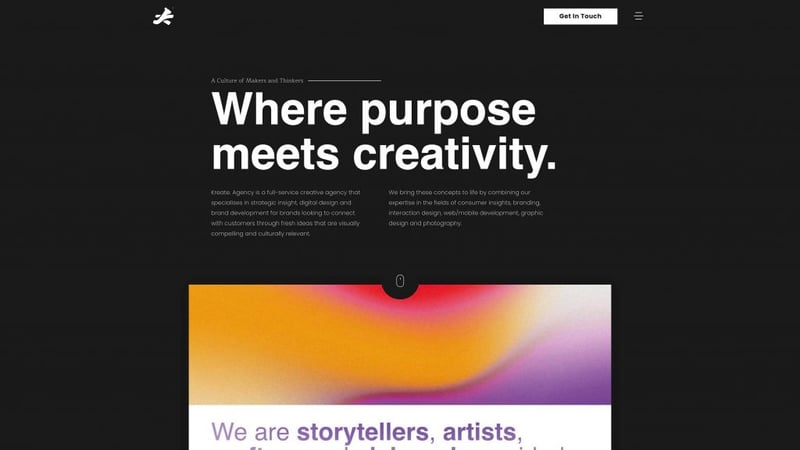
Kreate. Agency is a full-service creative agency that has been at the forefront of digital marketing and brand development for over 10 years. They work with brands to create smart, inspiring campaigns across all mediums: from video production and animation to print design and branding, that connect them with customers in today’s world of constant change.
First off, we’re really big fans of the South African company’s “kreative“ logo, which resembles not only a running bear and their national flag but also the letter “K.” Pay attention to the text next to the logo, which changes with every page, creating a more friendly user experience. This is, however, only a sign of the messaging to come.
There’s a clear content hierarchy with clear, intentional messaging populated at strategic points on the page. In fact, it reads like a well-written article, given its minimalist design structure. As the white text is placed on a black canvas, the text never feels overwhelming.
The standout element, however, is the impeccable use of multi-colored gradient effects, which change on every page. There’s a variety of ways to employ this effect in unique and original ways. Using contrasting it on a black background is certainly one of them.
Design & Development: Kreate. Agency
Theme: Hello
Plugins: Happy Addons, PowerPack Pro, Crocoblocks, Premium Addons for Elementor
05
Mou Aussi Art Gallery
by G-OPEN
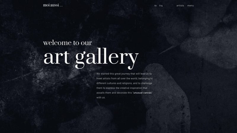
Mou Aussi Art Gallery started their journey to lead them to meet artists from all over the world, belonging to different cultures and religions, and to challenge them to express the creative inspiration that assails them and decorate an “unusual canvas” of eyeglasses together.
Every artwork in their gallery is rigorously created by hand, unique and non-reproducible and this is clearly seen throughout the website. The website’s dark, blackboard-like canvas, is brought to life with its artworks.
Each individual artist page uses a rotating video of their work which acts as the page’s hero. This 360° video introduces the art before the artist in a visually pleasing way which immediately draws viewers’ attention.
Scrolling effects are used in the texts and images of the “projects” page while a video of an artwork in progress act as the homepage’s footer, evoking the feeling of being inside a classic Italian maestro’s workshop.
Design & Development: G-OPEN
Plugins: WP Fastest Cache, WPML, WP YouTube Lyte, Monster Insights
04
Four Stripes
by Cain Willing and James Woods
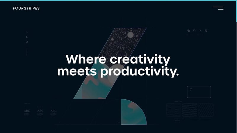
Four Stripes helps organizations improve credibility across all aspects of their visual identity. Their approach to creativity is steeped in equal parts of strategy, design, and execution to help organizations build trust with their customers. Whether launching a new brand, reinventing an existing one, or refreshing marketing materials, they help organizations reimagine how to present their business.
If you’re looking for an example of a technologically advanced website, look no further. Targeting corporate businesses, the company combines colors, diagrams, and a video mask to display a truly modern website.
Clever copy is displayed in a modern sans serif font giving the website a contemporary feel. Notice the Lottie animations above “Strategy”, “Brand”, and “Web” as well as the same colors used in the footer as three rotating circles. These subtle micro animations add life to the website.
Check out the refreshing and highly contrasting turquoise scroll bar against the dark canvas, which makes navigating the page easier. Likewise, the turquoise popup menu is well contrasted, catching the viewer’s attention. The Australian-based company also employs a nice gradient border for its testimonial frame near the bottom of “the studio” page, which makes it stand out.
Every project page is decked out in the colors of the project, meaning there’s been a lot of thought put into these pages from the hero to the headings.
This is a very advanced-looking website that gorgeously shows off its proof of work, creating brand exposure and drawing in potential clients. It’s modern and appeals to its targeted corporate business market.
Design & Development: Cain Willing & James Woods
Theme: Hello
Plugins: Rank Math, WP Rocket
03
Wiedemann Coffee
by Jona Eisenberger and Jonas Käppeler
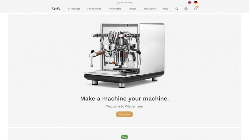
Wiedemann wants to give all those who celebrate the preparation of espresso as a daily ritual, the opportunity to enjoy it even more. Whether through their hand-made barista tools or handle sets, they believe every detail should enhance the coffee experience.
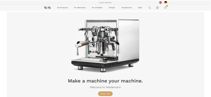
How do you showcase the beauty of natural wood with the polish of stainless steel? This German manufacturer shows us how. A website that is very well made — it’s clean, classic, inviting and minimalistic. It beautifully showcases its meticulously crafted products using high-resolution images.
Each of the images is laid on a gray background which brings attention to it. There are also charming custom icons for each product. The only colors besides the images are the wood-colored CTAs and notifications which draw viewers’ attention.
Pop over to the “all products” page and notice promotional banners placed alongside products. This is a clever use of the page’s real estate, acting to push users to purchase.
There are subtle animation effects in places that only accentuate the prestige of the website which itself reflects its intricate product. This is German precision at its best.
Design & Development: Jona Eisenberger and Jonas Käppeler
Theme: Astra
Plugins: Flexible Shipping, WooCommerce additional Product Options, Autoptimize
02
Het Blok
by Roel Stoltenborg (RS Vormgeving)
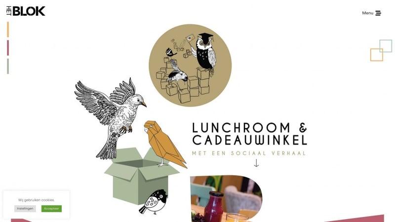
Located in the town of Lichtenvoorde in the Netherlands, at Het Blok you can enjoy a nice lunch, drink coffee, eat ice cream, have a drink, or have a high tea. You will also find the most original gifts, often handmade by their own employees. Besides a cozy lunchroom, they are also a gift shop. A visit to Het Blok is an experience!
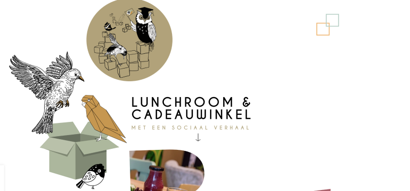
One thing’s for sure, there were a lot of human hours put into this website. Look quickly and it’s easy to see the bird motifs used across the page. Look closer and you’ll notice different types of birds are used throughout the website. Birds seem to appear out of nothing including smooth animations, 3D diagrams, classic illustrations, and vector graphics.
Light playful fonts, clickable images, and floating doodle effects likewise create an incredibly fun website that generates a lot of interest from all kinds of visitors — tourists, locals, and eco-friendly consumers.
The website employs a trifecta color scheme of which is introduced on the top far left-hand side of the page. As you scroll down, the three colors are beautifully presented throughout the side in different tints and shades. Images are cleverly shown using Elementor’s mask feature that spells out the word “BLOK” one letter at a time.
Design & Development: Roel Stoltenborg – RS Vormgeving
Theme: Hello
Plugins: Antispam Bee, GDPR Cookie Consent, Happy Elementor Addons, iThemes Security, Popup Trigger URL for Elementor Pro, ShortPixel Image Optimizer, WP-Optimize – Clean, Compress, Cache, Yoast SEO
01
Balma Estudio
by ABC Creación Digital
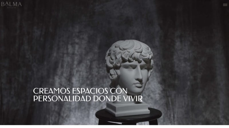
Balma Estudio is an interior design studio specializing in commercial premises,
interior design online and in person. They transform spaces into more attractive, profitable, and inhabitable places; turning daily ways of life into experiences. Design studio specialized in creating.
A modern masterpiece is how we would describe this breathtaking website. The hero peculiarly juxtaposes a renaissance-style sculpture with a clear nylon wrap flying off its face. Does it represent a reveal or antiquity and modernity meeting together? Artistic and authentic is what this is.
Starting off with a high-definition video, the website’s minimalistic design offers an art gallery look and feel. The messaging itself plays with scrolling effects fitting together from each side of the screen, giving the sense of almost like putting a structure together.
Large capitalized typography, Romanesque in style, gives it a truly Italian vibe. The main titles use serif, while the smaller ones use sans serif which makes for a fantastic font combination.
Images scroll up and down, more so, visiting the “inspiration” page you’ll notice each column scrolls independently, leaving its neighbors paused, and viewers awe-struck. This is a beautifully styled website that takes many creative cues from ancient Rome’s past. BALMA estudio, is what Italians would call, bellissimo.
Design & Development: ABC Creación Digital
Theme: GeneratePress
Plugins: LoftLoader, W3 Total Cache, Lightweight Social Icons, CookieYes | GDPR Cookie Consent & Compliance Notice (CCPA Ready), Yoast SEO
