Table of Contents
In this particularly hot time of the year, we spared no drop of sweat in our mission to find amazing websites for you to look at. Scouring the far corners of the world, we’ve managed to gather the most well-designed, unique, and diverse websites for you to be inspired by.
Our fine selection includes ten new websites from eight different countries, spread over four continents. And, for the first time, we are excited to announce that we have a winner from Japan. It is especially exciting for us because we discovered a whole new culture of web design.
Discover how you can take the user on a journey and tell a story using animations, or how you can elicit emotions of calmness or excitement through various color schemes. And, learn how to subtly use icons, emojis, and typography to convey your philosophy.
From fast-paced videos to scrollytelling-focused sites, to those that exude elegance — we’ve got them all, so get ready for your monthly dose of inspiration.
10
Graphity
by Kenji Matsuo
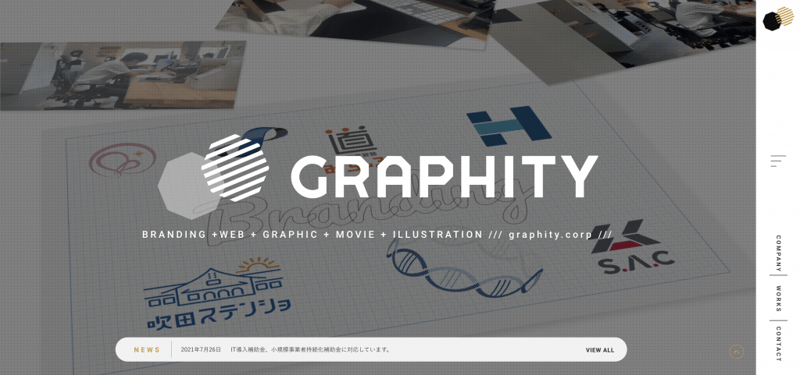
We’re thrilled to kick off this top 10 with our first winner from Japan. Coming from Osaka, Graphity is a design studio specializing in branding, web and graphic design, movies, and illustrations. Their philosophy — design fun and value for the happiness of everyone involved. This is the first time we feature a Japanese website, and we are very excited about it.
The site opens with a full-width hero section that shows in the background overlay their works, as well as a background pattern of dots that gives the illusion of the dotted web design notebooks that designers are so fond of. It also makes the background seem non-invasive and does not distract from other elements. At the bottom of the hero section, there’s a strip of news that points to their blog which is another great, non-distracting method of highlighting news or promotions.
Their sidebar menu is efficient and creative and includes three references to the most important pages. Above them, there is also a hamburger button, which opens a wider pop-up that is very reminiscent of structures from the print world where there is a clear grid.
Scrolling causes the viewer to enter a kind of game where they discover something new every time, whether it is their works, their services, or other important features.
To further highlight their fun-loving nature, one can look at their homepage and Philosophy pages. The bottom part of the homepage works like a stack of cards stacked when scrolling down. Just about everything is reminiscent of the gaming world with a wink to the real world. On their Philosophy page, the font is very different from what is displayed on the site and shows something very human. In addition, the text itself is full of humor that can be related to.
Overall, Graphity’s website exhibits a very professional language. It’s very precise and very detailed (even down to the daily routine of the interns).
Design & Development: Kenji Matsuo
Theme: Hello
Plugins: Happy Elementor Addons, Premium Addons for Elementor, Sticky Header for Elementor
09
Rachel Off Duty
by Lexie Hadley / ThaiFolk Studio
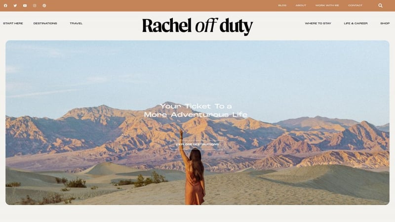
Rachel is a travel consultant and blogger, who offers advice about places she’s been to. Her target audience is: “ambitious, adventurous (or adventure-aspiring!) women”. Her advice and guides include anything from places to visit, to places to stay, to how-to guides and advice on life and career. The immediate sense one gets is of a free-spirited young woman who has set an aim to see the world and share her experience, and her website shows it.
Given that she’s a blogger, there’s a lot of content (pages and posts) and because readers spend a lot of time reading her posts, calming colors have been chosen to make reading more comfortable.
Furthermore, to make reading less boring, there are subtle animation effects that make the text look a little more alive. Even the images (or rather, their borders) have been smoothed via circular arches to provide a more comfortable reading experience.
The images are clearly of Rachel’s, and their choice is very good. One can get the feeling of adventure and comfort at the same time. Seeing Rachel smiling in a terraced rice field, or petting a whale can make one feel the urge to travel, while images of comfortable beds, chairs, and sofas create the sense that while travel is an adventure, it is by no means uncomfortable.
The Start Here page defines the purpose of the website, but also, tells a story (via scrollytelling) and that story is further reinforced with the animation of paper airplanes.
Design & Development: Lexie Hadley / ThaiFolk Studio
Theme: Hello
Plugins: Premium Addons for Elementor, Essential Addons for Elementor
08
Brand Label
by Eugen Mischiu
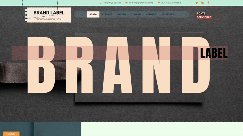
Brand Label is a label-making company based in Bucharest, Romania. It’s been specializing in providing a wide range of high-quality clothing labels for over 15 years. Their sense of style and aspiration to create high-quality labels can be clearly seen in their gallery and the range of products (and materials) they offer and their website only reinforces this sense.
From the very outset, the hero section of the home page imprints the ideas of style, tailoring, and quality all at once. The brand logo uses a playful mouse track animation in the form of a dotted line (a motif that appears throughout the website) to clearly allude to the sewing pattern of their labels.
In the very center of the hero section, the name of the brand is visibly stated in large, bold letters and behind it, an image of a label. The bright pastel color scheme produces a relaxing and happy vibe, for an otherwise, uninteresting topic.
The hero section further offers a popup menu (on the opposite side of the animated logo, yet somehow complementing and symmetrical). The menu is very well crafted, with colors that are seen throughout the website, dotted lines, and bold typography. What’s more, the button is sticky and always visible when scrolling up or down, allowing for better navigation.
The site uses a translate plugin that enables the user to change to any one of three languages thereby increasing its target audience substantially. Lastly, at the bottom, there is a large footer that incorporates a form to make communication easier.
Design & Development: Eugen Mischiu
Theme: Hello
Plugins: WooCommerce, Translate WordPress
07
Media Craft
by Ramon Kayo
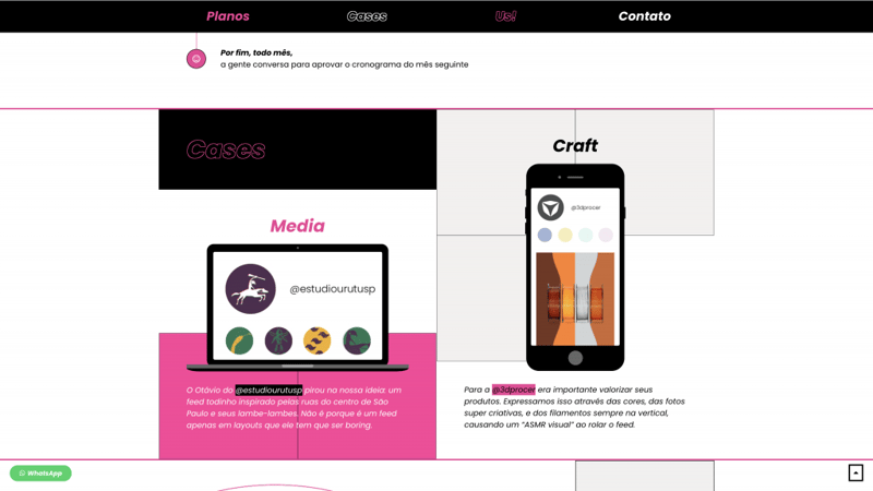
Media Craft is a social management company based in Sao Paulo, Brazil. Their portfolio includes very beautiful advertising content. The company is young (in terms of the age of the employees) and the young mindset is definitely visible on their website.
The one-page website features a very, very bright pink color. And with slogans like “kickass content for kickass people,” it clearly states its target audience — the younger generation.
But the pink-colored motif is not the only thing that supports their vibe. The trendy design includes a hero section with header animation and a pink smiley face (there’s also an emoji down the line) which reinforces the fact that it’s a social media agency. The typography is hip, clear but not at all boring. Additionally, there are hover effects that add to the playfulness of the website by introducing interactive color changes (pink to white and vice versa).
Another notable feature is the team’s images within the Elementor’s slider widget. Here, a tricolor filter is used to create a sense of motion/blurriness clearly for the sake of standing out and focusing the reader’s attention on the images and their accompanying text.
But, with all the fun and playful design, the team takes a no-nonsense approach to showcase their work. They display their work in the phone/computer mockup for a very real demonstration of what they offer.
Design & Development: Ramon Kayo
Theme: Hello
06
Brand Baker
by Anton Weber
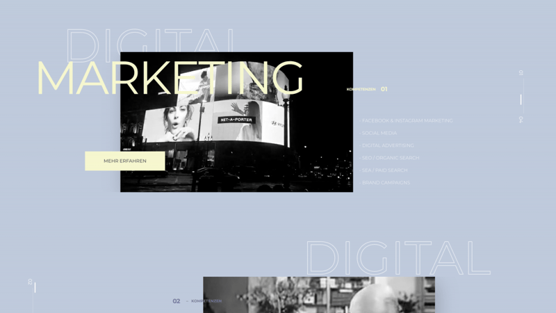
From Germany, we have Brand Baker — a Facebook-centric digital marketing agency that provides digital marketing services, digital strategy planning, design and development, and more. According to them “we face our constantly changing world with the necessary flexibility, appreciate the individual characteristics of our team, and share the incessant urge for perfection.”
Their website holds true to their vision of flexibility as it embodies both classical elements and new trends. The animated scroll icon playfully invites the user to scroll on, and enjoy the animated story they’ve created (something we’ll see again, later on).
Upon scrolling, the user is met with gentle animation of large text and accompanying, relevant videos for every section which are presented in a unique, non-uniform grid. Each section is also separated by the use of different colors for text, this composition, therefore, produces a dynamic flow and a clear hierarchy.
Design & Development: Brand Baker
Theme: Hello
Plugins: Element Pack, Rank Math SEO PRO, Classic Editor
05
SFG Tirol
by Raum 15
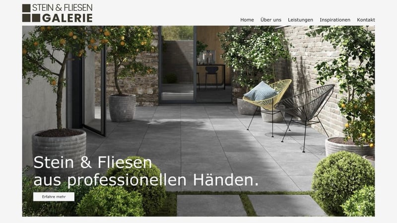
SFG Tirol is a stone and tile gallery from Austria. Their services include creating tailor-made concepts (providing counseling about tile choice) and implementing those concepts with in-house tilers. While this is a business-like website, it retains creative elements and gentle tones.
The tiles motif is spread throughout the website in the form of geometrical shapes (primarily, squares). A great example of this is seen in the About Us page and the Inspirations page. The About Us page uses a mosaic of images and text, purposely placed in such a way, so as to give the illusion of tiles. The Inspiration page, on the other hand, uses Elementor’s gallery with an animation effect to showcase photos in almost perfect squares, which again, gives the illusion of tiles being placed right in front of you.
The colors of the website are gentle green and grey. One can get the sense of nature from looking at it, and perhaps, this is designed to help the reader make the association of an environmentally friendly company.
There’s a nice use of the image fixed position option, to create an effect where, while scrolling down, an image stays fixed, while the surrounding scrolls away. This creates a sense of looking through a keyhole into a house which, perhaps, is a connection the website is trying to make in the reader’s mind — tiles = house.
The navigation on the website is well done. It’s very easy to navigate. There’s a clear hierarchy. The images are real (not stock images), of high quality and clarity to showcase the company’s services and products, and friendly disposition (look at these smiles!). The contact page is very personal and includes a very detailed form to fill.
Design & Development: Raum 15
Theme: Hello
Plugins: Autoptimize, Borlabs Cookie, Header and Footer, Redirection, WP Mail SMTP
04
Somos Avocado
Somos Avocado is a creative studio run by two young women — Alazne and Cris. The primary focus is design, or more specifically — “good design”. Their desire is to provide the sort of design that communicates and serves a purpose. Design that’s based on listening, communication, and long-term relationships with their clients. Their website embodies this non-generic approach to design.
From the very first impression of the hero section, it is clear that they value uniqueness. They employ unique fonts on an artistic background with an overlay animation effect. Right from the start, you feel their class and creativity.
But, white font on a black background isn’t unique. What they’ve done is a very well-executed transition. If you scroll down, you will see how the design changes from black colors, to grey, to more colorful — expanding on the idea that everyone is unique and that there is no one solution, but more than that — that they can deliver any design.
There are emojis scattered all around in the text, and when you go to the About page, you can see Lego figures in the image of Alazne and Cris. This clearly shows that while the girls are professionals, they are not without character (fun and playful) with which they, perhaps, would like to instill a sense of familiarity and comfort.
Design & Development: Somos Avocado
Theme: Hello
Plugins: CookieLawInfo, Sticky Header for Elementor
03
Key International
by Doodle + Code
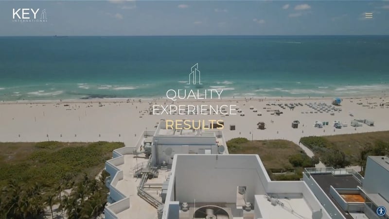
Key International is a real estate investment and development company based in Miami, USA with over 30 years of experience. The website’s key objective is to highlight the company’s diverse portfolio while also imparting a sense of prestige and high class.
To aid in this, quick property facts are displayed in a card that is presented to the user as they hover over each individual card. This gave the visitor a quick glance into each property without having to load a complete page.
Further, in the property detail pages, they showcase each property by using top photography and renderings via ACF gallery, slider, and image fields. To always showcase the property’s location they implemented a sticky sidebar that always displays this information vertically as the user scrolls down the page. Finally, we made use of dynamic display conditions to show or hide different content areas based on the available content.
The website is a good example of minimalist design. The information is focused, the design is clean and there isn’t unnecessary clutter. But, the minimalist design doesn’t mean it’s simple. The website provides a sense of prestige through the gold color scheme and delicate icons.
Design & Development: Doodle + Code
Theme: Hello
Plugins: Advanced Custom Fields, Custom Post Types, Ele Custom Skin, Elementor Addon Elements, Extras for Elementor
02
BVM Beratung
by Millefeuilles
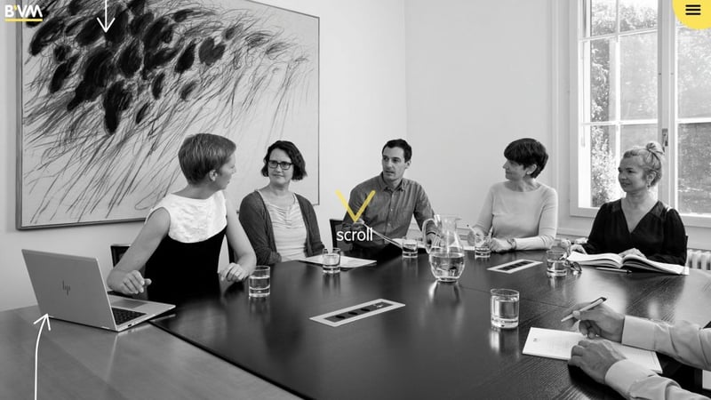
BVM Beratung is a consulting and service company with a focus on NPOs and it has achieved a leading position in German-speaking countries with more than 3,000 projects. The counseling industry demands a professional, business-like website, but the fact that they work with NPO requires some sort of familiarity and comfort, and this duality is shown in the website’s design.
The counseling industry demands a professional, business-like website, but the fact that they work with NPO requires some sort of familiarity and comfort and this duality is shown in the website’s design.
From the very beginning, this duality shows. On the one hand, the color scheme and black and white images provide a more business-like sense, but there are elements of yellow (to highlight important points). Additionally, to further provide a sense of fun, the website invites the user to interact with it. A large, yellow arrow points to the word Scroll, inviting the user to start the website’s story. This whole website is about scrollytelling.
Upon scrolling, arrow Lottie animations appear, pointing at a newly-appeared text (within a circle, which is a repeating motif here). The story has begun. As the user keeps scrolling, more animations appear, pointing to more text, highlighting it, and emphasizing the story of this consular for non-profit organizations.
The language of the website is very consistent throughout the whole website. It gives the impression of wholeness and professionalism. From the repeating motif of the circle, the complementing typography, and the black, white, grey, and yellow colors.
Design & Development: Millefeuilles
Theme: Hello
Plugins: Elementor Block for Gutenberg, Accordion Blocks, Adminimize, Crocoblock JetEngine, Crocoblock JetSmartFilters, Dynamic Conditions, MouseWheel Smooth Scroll
01
Grupo Graphic
by Alfonso Caravaca & Belén Lorca
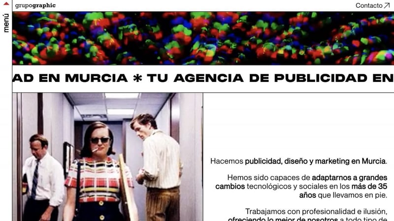
Grupo Graphic is an advertising agency from Spain that caters to anything from external advertising (on billboards and such), to media advertising, web development, graphic design, and digital marketing. The goal of their website is to clearly showcase their work and creative spirit.
The website starts with a very colorful, fast-paced video. The video clearly showcases their skills and is, perhaps, directed at their target audience of the younger generation. The images change quickly, as do the colors to provide a sense of haste or movement. One could also draw similarities between the video and a nightclub.
Upon scrolling down, the main elements of the design become more clearly visible. The font is bold san’s serif. Larger than usually expected. It comes together with gifs of memes (our favorite is of the French master of comedy — Louis de Funès) and of their work. Everything about this website is large, from text to images, to buttons and everything is inside a box grid.
There’s running text separating the sections with very large letters (in black) which brings up memories of the running text on news channels that convey urgency and importance. There is constant motion on the website and there isn’t a dull moment when visiting it.
Design & Development: Grupo Graphic
Theme: Hello
Plugins: Jet plugins by Crocoblock (engine, smart filters, elements), LiteSpeed cache, Yoast SEO, Permalinks Manager Pro
Looking for fresh content?
By entering your email, you agree to receive Elementor emails, including marketing emails,
and agree to our Terms & Conditions and Privacy Policy.


