Table of Contents
Web design has come a long way since the early static HTML websites. Today web designers are required to pay great attention to the interaction design element of the websites they create. One of the biggest parts of interaction design includes creating a separate style for hover states. The hover state determines how different website elements react when being hovered over by the user’s cursor.
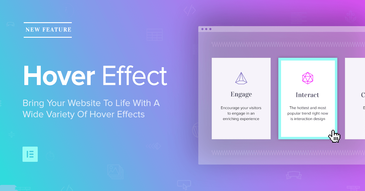
In our latest release, we’ve made adding hover effects to WordPress much easier, allowing you to incorporate a large array of hover effects with absolutely zero coding. In this post, I want to go over the various hover effects we’ve added, so you have an idea how to best incorporate them in your next project.
Types of Hover Effects
The hover effect variations we’ve added include:
- Background color hover
- Background gradient hover
- Image and video hover
- Color overlay hover
- Box shadow hover
- Border hover
These six variations are available across sections, columns and most widgets.
You may wonder what the impact hover effects have on site stickiness, bounce rate and possibly even conversion. We haven’t thoroughly checked this yet, but Envato did list hover effects as one of 4 top design trends to boost conversion rates.
Hover Effects in Action
Let’s go over some of the effects that can be added to WordPress using Element Hover.
Color Hover Effect
Background color hover effects
Visitors browse through your website not only with their eyes, but with their mouse as well. By adding a color transition hover effect to the section they hover over, you are giving them a much more rewarding and interactive experience. The section they hover over can suddenly light up and get an additional focus and emphasis.
Instruction: Go to Section > Style > Background > Hover, and set a color of #49a9e5, with transition duration of 1.5
01
HOVER
02
OVER
03
US
Background column color hover
In this example, you see how feature boxes get highlighted when you set the column hover color to a bright yellow instead of the previous gray. Feature sections are always more problematic when it comes to getting the attention of the user, because they are made up of mostly text. By creating high-contrast column colors you can keep your visitors’ attention at a constant high.
Instruction: Go to Column > Style > Background > Hover and set the color to #f1c40f

Border Hovers
Click edit button to change this text. Lorem ipsum dolor sit amet,
consectetur elit. Ut elit tellus, luctus nec ullamcorper
Border hover effect
Borders are also a great way to achieve focus and interest. Here is another example of creating an attention grabbing feature box using a simple left border color. This use of the border hover has a decorative and stylish feel to it, and is great when creating landing pages and websites in the fields of design and technology. It’s subtle, so it also fits minimalist styled websites.
Notice that in this example, we have added a left blue border to hover for the columns that on their normal state had no border. This causes the entire content of the column to be pushed to the right, adding to the overall movement effect.
Instruction: Go to Column > Style > Border > Hover and set a solid left border of 8 pixels
Overlay Color Hover
Background overlay hover effects
The hover overlay effect is a great addition to image, video and gradient backgrounds. Even though it is less predominant than the other types of hover effects, it is still effective in bringing added engagement to your sections.
Instruction: Go to Section > Style > Background Overlay > Hover and set the color to #3820a3, with opacity of 0.6 and transition duration of 1

Box shadow hover effect
By combining box shadows hover and grow animation hover, we’ve made the images appear as if they are elevated off the ground. I recommend you read this article in SmashingMagazine, explaining how box shadows can inform the visitor regarding the functional aspects of the design.
Instruction: Go to Image > Advanced > Border > Hover and set the color to #7F7E7F, with blur 30, spread 6 and vertical 20
Generating Motion
Image position hover
By using the same image on normal and hover states, and changing the position of images on hover, you can create a smooth animated motion when the image is hovered over.
Instruction: Go to Section > Style > Background > Hover, set the same image for normal and hover, and for hover set the position to Bottom-Center
Creative
Combinations
Before & after image hover effect
Hover effects let you experiment with image transitions: from black and white to colorful , from before to after images. The ability to switch between normal and hover images open up a lot of creative possibilities of design, that we only touch upon in this post.
Instruction: Go to Section > Style > Background, set the Normal image to be the black and white version, and the hover version to be the colorful version
How Element Hover Works
Element hover is actually not a new thing in Elementor. We had already included it in certain widgets, like in the button widget and with hover animation.
With the newly added hover, You can now add hover effects to any element inside the page, including for sections, columns and widgets. This greatly extends the possibility to introduce hover engagement with Elementor.
Using hover effects is great for a variety of widgets, including: buttons, social media icons, headings and images.
You can add section and column hover by going to the Style tab of the panel. For widgets, the hover settings appear under the Advanced tab.
Hover transition
What’s so cool about this feature is that the hover effect occurs with a smooth and animated transition. For color hover, the colors doesn’t simply flip over, but instead transforms to the new color. You can even set the speed of the color transition.
The same transition effect is true regarding image position, box shadows and borders. Let’s go ahead and go over each of these hover effects, with some concrete examples to help you get started.
Images, videos and gradients background don’t have the same transition effect as color backgrounds. You can still produce a similar effect by setting a color background overlay on top of the background.
Actionable advice for creative uses of hover effects
Here are some ways Element Hover comes in handy in your daily routine as a web designer.
Improve Static Content
You can supercharge plain text pages that don’t feature images or videos by adding virtually any hover effect.
Emphasize CTA
Add focus to your call to action headlines with hover effects, in order to increase the chance visitors will notice them.
Boost Buttons
By using box shadow hover, you can lift your buttons off the ground, making it clearer for the visitor to click on them.
Enhance Feature Sections
Add interaction to your boring old features sections by adding color, border and shadow hover effects.
Conclusion
I hope this guide sheds some light on how to improve your website interaction design by using the new Element Hover feature. Like any feature, this can be overused, so I recommend you start experiment and see how to use it while not overloading the page with too many hover effects.
This feature is not only relevant to new projects. You can go over websites you previously designed with Elementor, and make them all the more engaging by quickly adding some subtle hover effects. In the future, we plan to expand the hover options and effects, as well as extend them to other widgets.
It takes some know how to figure out which areas can be improved with hover effects. I suggest that if you’re new to this interaction feature, test it out first, and also get inspiration from this guide and from other websites around the web. You can find tons of examples of hover effects. I’d love to get some of your feedback and hover design examples in the comments, so drop me a note.
Looking for fresh content?
By entering your email, you agree to receive Elementor emails, including marketing emails,
and agree to our Terms & Conditions and Privacy Policy.


