Our February 2021 showcase focuses on a highly concise, yet effective type of website: one-page websites. This month, we’ve decided to take the opportunity to learn from some of our finest Elementor users and see how they present and design their content all within the space of a single web page.
The greatest virtue of these one-page website examples is the out-of-the-box approach used to adapt versatile features like anchor links and image galleries for user-friendly navigation. We’ve been truly inspired by this “less is more” approach, giving us lots of ideas and possibilities for creating a high-performing, lightweight website that in no way compromises its content or encompassing structure.
10
Rafa Gallego: Nostalgic Design
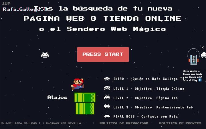
Rafa Gallegot is a Sevilla-based web creator who built his personal website with Elementor. Rafa’s website style and motif present his quirky, funny, yet professional approach to web creation. The strategic goal of his website, he shares, is to make people smile or laugh, even if they don’t necessarily hire his services.
The impact of the website is actualized by the old school Super Mario visuals and typeface, supplemented by his elaborately written story. The most iconic animations like Mario dropping into the green pipe is recreated with the slide-in entrance animation, and the niche Google Font Press Start 2P replicates the typeface that sparks nostalgia from the Super Nintendo days. Framed within a video game levels and targets theme, Rafa’s unique one-page site demonstrates how even the most modern web design features can visualize digital content from over 30 years ago.
Theme: Hello
Plugins: Full Page for Elementor
Design & Development: Rafa Gallego
09
Sprint Report: SaaS Design With Color
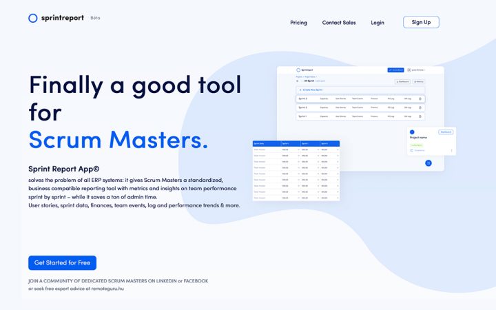
Sprint Report App is a SaaS reporting tool for scrum masters that generates metrics and insights on development and team performance. Sprint Report’s one-page site provides a brief, yet informative point of contact where users can log in to their dashboard, find out pricing options, or contact the sales department.
This B2B-oriented site uses a hi-tech, startup-style monochromatic color scheme to portray its tech-savvy, visually-pleasing product UI. A similar design approach is applied to the page layout, with subtle, faded blue shape dividers appearing around the interface screenshots as you scroll down. All in all, Sprint Report illustrates how to create an elegant, user-friendly website — even when showcasing the most technical of products.
Theme: Hello
Plugins: Essential Addons for Elementor, LiteSpeed Cache
Design & Development: Milán Varga-Márfy, Dániel Dobos
08
Tactics: Designing Text That Tells It All
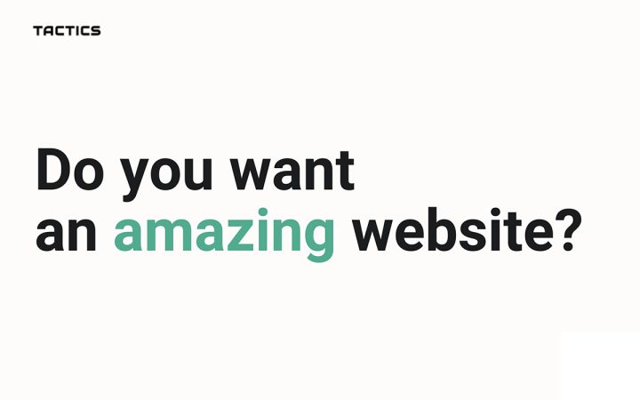
This website is the design portfolio site of web designer and developer Manas Agarwal. Manas shared that the goal of his website is to showcase his agency’s deep, specialized understanding of brands and to portray his clients with premium, out-of-the-box websites.
One of the website’s most unique design techniques is the text that ensues as you scroll down — creating a “coming from the bottom” effect. This is made possible by using the “fixed” value for each text section’s position property. Most commonly used for images and backgrounds, this technique is unusual (yet awesome) when used for bodies of text. Manas forms an engaging dialogue, despite it being purely verbal and image-free. Nonetheless, this visual conversation is just as captivating and thought-provoking as a detailed, impressive photograph or illustration would be.
Theme: OceanWP
Plugins: Ocean Extra, Join.chat, WPForms Lite, Premium Addons
Design & Development: Manas Agarwal
07
Eggshell Studio: Trendy Yet Original
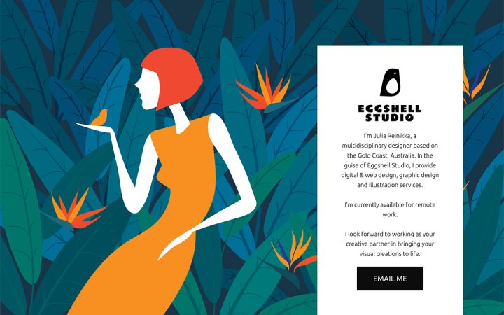
Eggshell Studio is the portfolio and services site of Julia Reinikka, a multidisciplinary designer based on the Gold Coast, Australia. Julia provides a wide range of creative and digital services: web design, digital design, graphic design, and illustration. Julia demonstrates how to execute your skillset and proficiency in web design trends using the Elementor Editor’s website building features.
The above the fold section’s background image, a fixed flat design illustration, invites the visitor to a low-key, yet exciting ambiance upon entering the page. Of particular inspiration to us is the way the Slides widget is used to showcase her best work. This is done by building a grid of multiple slide boxes, letting the visitor navigate each project image slide. This clever, yet casual methodology ensures potential clients can see the full scope of each project, without losing sight of the entire portfolio collection
Theme: Astra
Plugins: Yoast SEO
Design & Development: Julia Reinikka
06
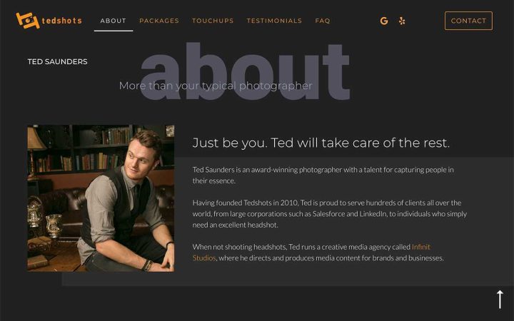
Tedshots: Powerful Portraits
Tedshots is a California-based headshot and portrait studio run by Ted Saunders. Ted’s website is a source of information for his services and pricing, as well as a point of contact for sending him a message or finding out the exact location of his studio on Google Maps.
This simple, yet vibrant one-page website exemplifies how to use a subtle, mellow tone to tell a dynamic story. Another monochromatic color scheme, the orange paired with black, white, and the shades in between — balances an atmosphere of emphasized, intricate details within each portrait sample. The entrance animations used for the headings (each one corresponding to the header menu items) adds a layer of excitement to the simple, grey words. The encompassing design effect used for Ted’s site lines up symmetrically with the nature of his profession: taking a single photograph of one person and maximizing its visual impact.
Theme: Hello
Plugins: OoohBoi Steroids for Elementor, Essential Addons for Elementor – Pro, Yoast SEO, SEO, Perfmatters
Design & Development: Ted Saunders and Douglas Campbell
05
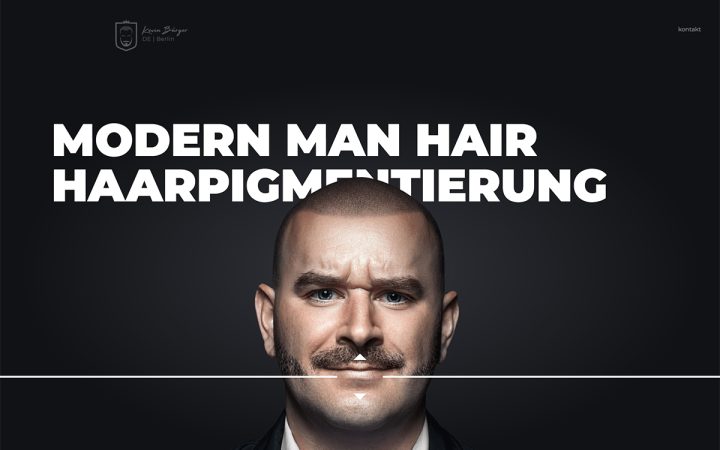
Haar Pigment: Design for Every Niche
Haar Pigment is the business landing page of MODERN MAN HAIR, a hair salon in Berlin that specializes in hair loss treatment for men. The website introduces pigmentation expert Kevin Bürger, an expert in men’s hair loss and styling. One of the key challenges in creating a website for this niche business-type is finding a design language and style that portrays the service in a positive, inviting tone.
The savvy design techniques applied to simple, straightforward content (plain words and social icons) succinctly solve this design challenge with interactive hero content, background overlay hovering effects, interactive timeline, among other techniques.
This is also true for the motion effects used for the various headings — adding flair to the site’s monochrome color scheme. The Flip Box widget used to display the social and contact icons is more than just engaging, as the QR code revealed when hovered on makes contacting the salon much easier. Once you reach the end of the page, the Berlin salon’s trendiness and high caliber of services become an object of appeal to every visitor.
Theme: Hello
Plugins: Dynamic Content, OoohBoi Steroids, LoftLoader, Rank Math SEO, WP Fastest Cache
Design & Development: BERSUS
04
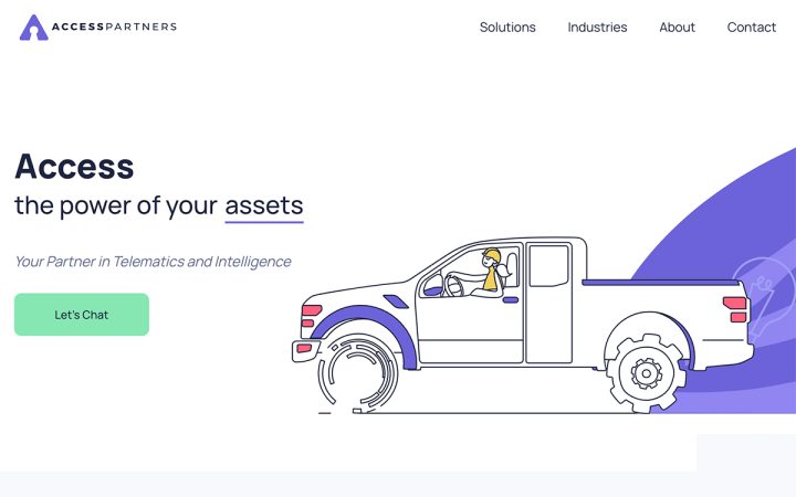
Access Partners: Technology Made Friendly
Access Partners LLC is a Florida-based technology company that focuses on bringing systems, data, and tools together to support businesses looking to improve their operation technologies and software. Examples of these technologies include tools in the analytics, big data, and business intelligence domains.
What’s unique about Access Partners’s business offering is that it adds the human factor to technologies that make business operations more accessible and easier. This value proposition is highly evident in their design motifs: friendly, stylish illustrations that represent highly technical products and use-cases. Further augmented with Lottie widget, animating the flat illustrations brings tempo to their two-dimensional design. This is also true for the choice of colors added to the black and white images — eliminating monotony with hints of bright, jovial colors.
Theme: Hello
Plugins: Yoast SEO
Design & Development: Design and Development Minds
03
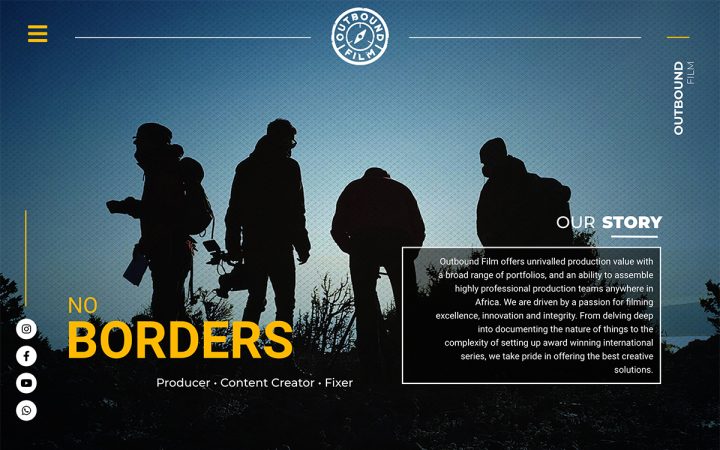
Outbound Film: Landscape Without Borders
Outbound Film is a South Africa-based video and content production company owned by Lesley-Anne Mulder. Lesley-Anne collaborates with executives, filmmakers, experts and creatives alike, to facilitate the production of content around the globe. The production company’s key website goal is not only to showcase projects, but also to capture the adventurous spirit that characterizes them.
The parallax background method chosen for the site illustrates what the production company represents: capturing and documenting scenes of nature and their passionate explorers. Essentially, the design elements travel down the page as we scroll down, but the landscape remains. What’s more, the subtle transitions between background photographs that correspond to the users’ scrolling emphasizes the element of exploring and discovering wonders of nature.
Theme: Astra Pro
Plugins: Custom Fonts, Gravity Forms, Preloader Plus
Design & Development: Shaafik Nordien, Woww Digital
02
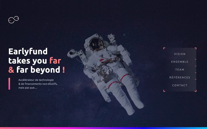
Earlyfund: Exploring and Excelling in Creativity
Earlyfund is a publicly-funded technology accelerator based in Lyon, France. Founded in 2007, EarlyFund helps startups secure the necessary fundings to “launch their innovative business and fulfill their dreams.” Earlyfund’s one-page site is part of their company rebranding initiative, conveyed with “a simple and creative space exploration metaphor … visible with a clean, modern, and meaningful image.”
The website uses many customization features to set apart its unique design presence, such as its customized nav menu. This sidebar menu is not just any ordinary navbar, as it uses the icon list widget to represent the menu items. Each list item then corresponds to the relevant part of the webpage, made possible by creating anchor links in the necessary locations.
Theme: Twenty Twenty
Design & Development: Matthieu Fernandes & Chris Pastor at Bear Design & Art Ltd.
01
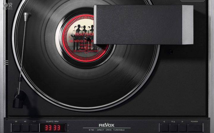
Worldrecords: The Soundtrack of Life
Worldrecords is the portfolio website of Kai Schaefer, a German photography artist. Kai’s photography work consists of “perfectly displayed vinyl records on matching turntables.” Kai’s target audience is future customers who would like their personal favorite music album on a matching turntable, otherwise referred to as “the soundtrack of their life”.
Many unique forms of visual storytelling are subtly weaved throughout the entire site. For starters, the hero section’s background videos show German celebrities listening to their favorite vinyl albums, along with different showcases. Once we scroll down to the content that follows, the use of transparency scrolling effects increases the elements’ transparency and visibility in correlation to the visitor’s scroll. This web design approach aligns perfectly with one of the key differentiators in Schaefer’s photography work, as explained by site’s web creator Holger Ingenschay: Kai often uses unique backlight foil to enable his photo content to shine in the dark.
Theme: Hello Child
Plugins: Smart Slider 3 Pro
Design & Development: Holger Ingenschay
Think your Elementor-based website or landing page should be featured in our next Top 10 Websites column? Give it a shot!
