Table of Contents
A great portfolio is probably the most important asset creative professionals need to get sorted if they want to leverage their services and get more clients.
Focusing on creating a great portfolio often gets neglected. Many designers put more priority on their work, and neglect this crucial element. Creating a successful portfolio isn’t an easy task. There are many ways to display creative works. A UX designer’s portfolio is not the same as a print designer’s, and deserves a different style.
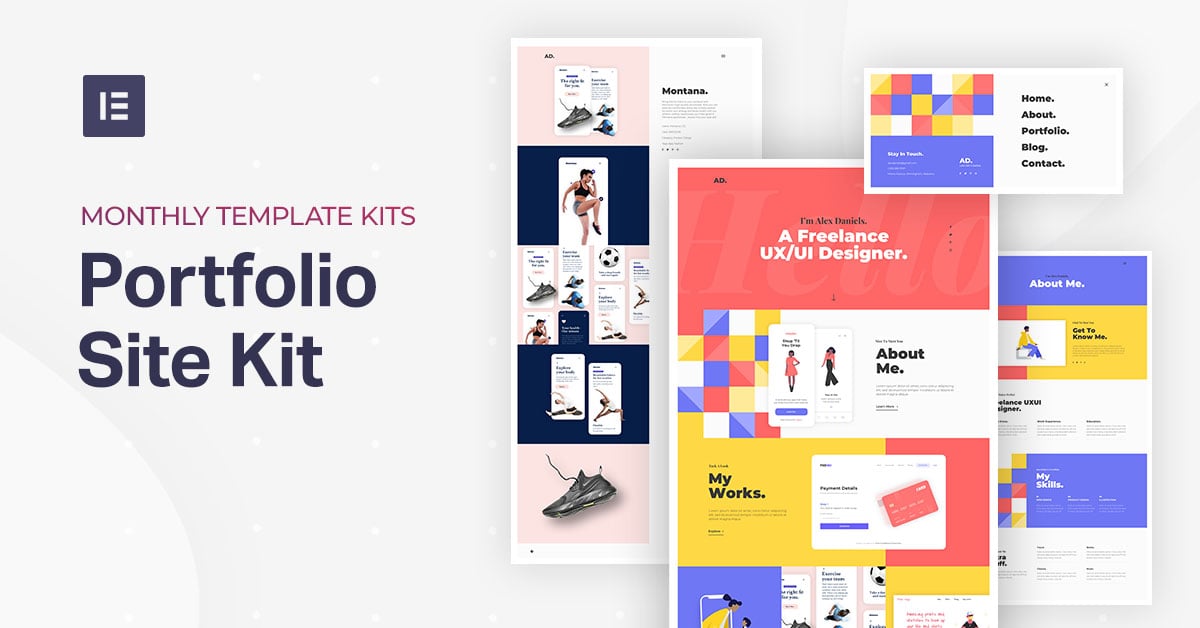
This is why, for our third template kit release, we decided to deliver a glamorous portfolio template kit, one that will fit a variety of tastes and will enable you to showcase your work in the best way possible (and don’t miss these beautiful examples of web design portfolios if you need inspiration).
Meet the Portfolio Template Kit
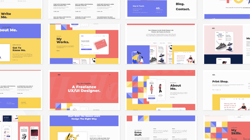
Any creative professional can enjoy this kit, from photographers, marketers, consultants. Freelancers and businesses can take this kit and make it their own with a few small customizations.
All the illustrations, as always, have been taken from free resources. Apart from the illustrations, all the graphics, mockups, backgrounds and other visual elements have been created by our team.
Homepage
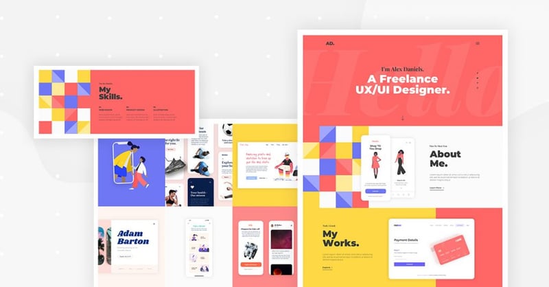
Glancing at the homepage, you immediately can tell it’s a designer-oriented site. Bold and vibrant colors, large typographical elements in the background and a prominent message set using a sans-serif font.
Scrolling down, you will notice clever uses of our recently released background slideshow feature, as well as motion effect, seen in the appearance of the credit card.
Projects Page
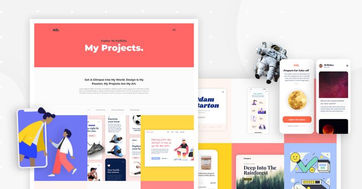
The projects page is why we built the site in the first place, right?
In the Portfolio Gallery widget, we have three categories to filter through: illustrations, product design, and web design.
We designed 9 initial mockups for projects and elaborated on the first 3. Each of the three projects is built differently, with the description of the work appearing in various locations across the screen.
BTW, each of the single templates can be used with Elementor’s Theme Builder and dynamic content, so the same design can be instantly applied to multiple projects with one click.
Single Template #1: Illustration (Types)

Befitting an illustration project, this template grants the maximum available space to the visual material. The description text sits neatly at the bottom of the screen as a sticky element.
Single Template #2: Product Design (Montana)
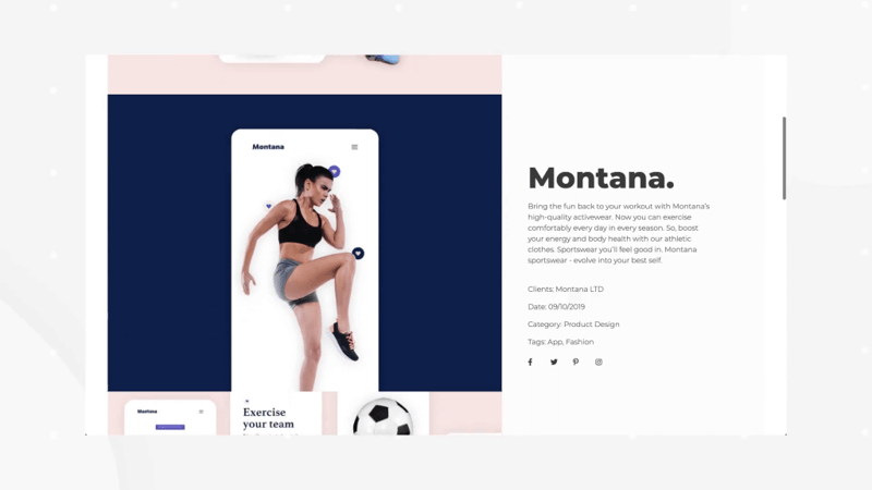
Here, we see that the project assets appear on the left, and a sticky sidebar describing the project scrolls with the user to the right.
We recently received a comment from a user asking for a social share floating sidebar. As seen in this template, it’s easily done using Elementor’s sticky column and social share buttons / social icons.
Single Template #3: Web Design (Print Shop)
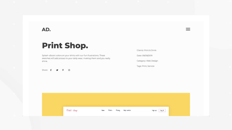
Yes, we really created a website template to appear inside a website template. We didn’t go full ‘inception’, though, since the website template inside our website template doesn’t feature a website template.
This is a classic portfolio project page, with no sticky elements. The description of the project appears in detail on top, and the website design assets appear below. The pages are surrounded by a yellow border to set them apart from the background.
Note that while we designated the templates to specific design categories, you are by no means restricted by those categories. No matter your field, the question you should be asking yourself when deciding on the template is whether your content will be best featured on full screen, boxed and bordered or set beside a text explanation.
About & Contact Pages
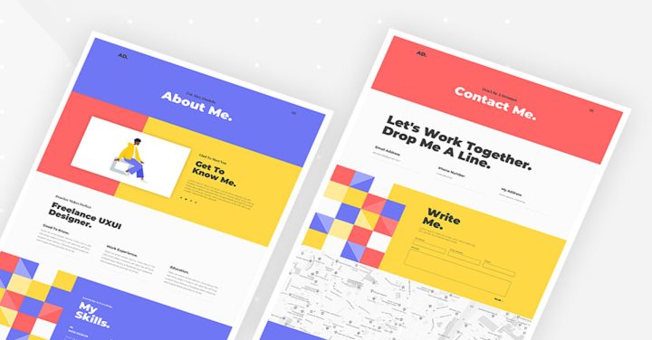
The about page in portfolio sites is usually more solid and textual, leaving the striking visuals to the projects page.
It’s always a challenge to structure text-heavy pages, especially for sites that are oriented towards design. This is why we built several content layouts throughout the page.
It starts with the classic section, with an illustration on one side and one column text on the other. Then, another cleaner section featuring a 3-column content layout. Then again 3 columns, but pushed to the right. Finally, a less common structure featuring the left column vertically centered, and 4 text boxes spread to the right.
We talked about getting your contact information right as part of the crucial steps to get leads. This is something often disregarded, even by professional designers. With this contact page, your visitors won’t be puzzled regarding how to get to the next step and make the connection.
Main Blog Page and Single Blog Post
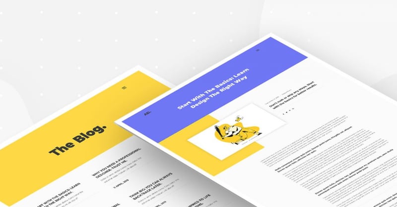
We mentioned already that the site is filled with visual content, and this is why we chose to simplify the look and feel of the blog. It’s a clean, minimalistic blog layout that only displays the title, description, and date of publication.
Going into a single blog post, we see the same color boxes appearing at the top.
404 Page

We tend to include our most outrageous tricks in our template kits’ 404 pages. I challenge you to guess how we reached the sliding people with interchanging pant colors. (Hint: they are actually separate images).
If you can’t come up with how we did it, just insert this template yourself and reverse engineer it by exploring the panel. There’s a 10-minute fun activity for you right there!
Popup Menu
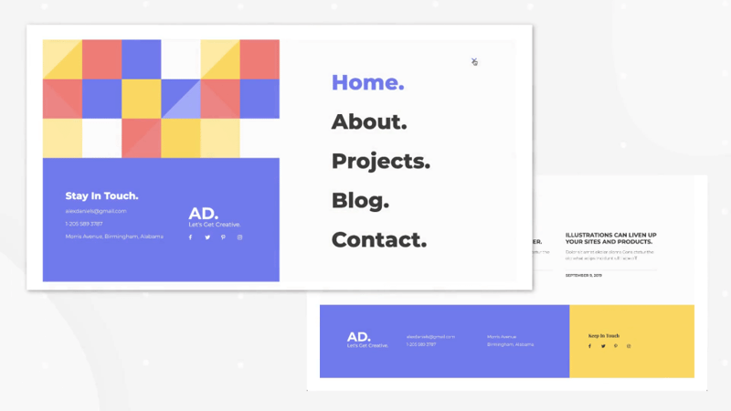
In case you are wondering which menu plugin we used to create the popup menu, the answer is – none!
It’s actually an Elementor popup that we connected to an image of the hamburger.
Check out the tutorial about building a popup menu we released a while back.
Get Cracking on Perfecting Your Portfolio!
There’s no excuse. I don’t want to hear: “I’m too busy working on my client’s projects”.
Take this portfolio template for a spin and create a tantalising site that draws clients.
This template has quite a different style than the previous two released kits: the digital agency kit, which featured the prominent shapes, and the gym kit, which featured bold colors and movement. With this kit, we went for a much more subtle, clean and minimalistic style, since the visual aspects should be achieved through the work being showcased.
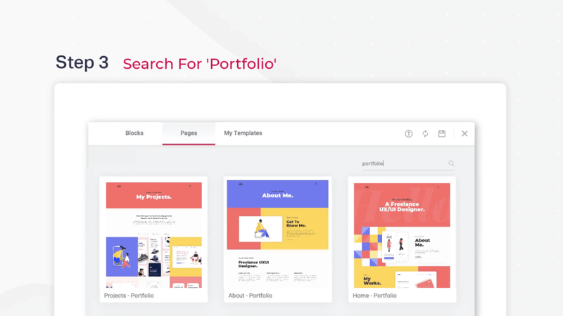
How to install the kit? If you have Elementor Pro, all you have to do to enjoy this cutting-edge kit is to go into Elementor, open the template library, and search for ‘Portfolio’.
Looking for fresh content?
By entering your email, you agree to receive Elementor emails, including marketing emails,
and agree to our Terms & Conditions and Privacy Policy.
