Table of Contents
Minimalist designs for websites aren’t just fashionable, they are practical, they are fast loading, they are very clear and easy to navigate, potentially making them great for user experience.
Having graduated our two-part masterclass on improving our site speed and page load time, Minimalism also seems the most natural way to keep moving forward to building faster, more appealing sites for our clients and businesses.
What Is Minimalism in Design?
Renaissance artist Michelangelo, is said to have explained that the way he created sculptures, was to clear away every little piece of the marble block, to expose the statue hidden deep within.
In a nutshell, Minimalism takes this idea several levels further, presenting designs that have been stripped down to its most basic essentials, to reveal its content perfectly distilled, and clear, to the viewer.
As an art movement, Minimalism began in the late 1940’s, and became very popular in the 1960’s.
It then seemed to make something of a comeback as we moved out of the Twentieth century and into the first two decades of the Twenty-First century. This is especially prevalent in Software and UI design. Which is why we’re discussing it here.
Originally, it all came about to promote the idea that art should exclude the unnecessary, and as a reaction to the energy-filled, emotionally charged paintings of other artists at the time.
As such, Minimalism tends to avoid festive illustrated illusions and focus on the literal, simple and succinct truth of the message, idea or emotion.
It continuously pushes the limit, trying to find the absolute minimum content that we need to convey a clear and concise message, while disregarding anything that could possibly detract or distract from it.
Minimalism can be found in every form of art and design; in architecture, literature, and even music.
In design, it holds to the same ideals. Unlike art however, design has a responsibility to appeal to the audience, or the consumer, at the very least. So there’s a limit to how sparse we should allow ourselves to be.
Minimalism in Web Design
To achieve minimalism in web design, web creators prefer to use fine, delicate lines, short astute text, hidden content accessible by clicking on abstract icons, subtle nuances and motifs that are barely noticeable.
Of course, as web creators, we also need to find a way to balance the design plan with the content that our client wants us to showcase. Something that is true regardless of the type of style we’re using, but obviously more so if that style is Minimalism.
Essential Characteristics of Great Minimalist Web Design
The following is a list of common characteristics that are a direct result of putting minimalist ideology into practical design.
Essential 1: Negative Space
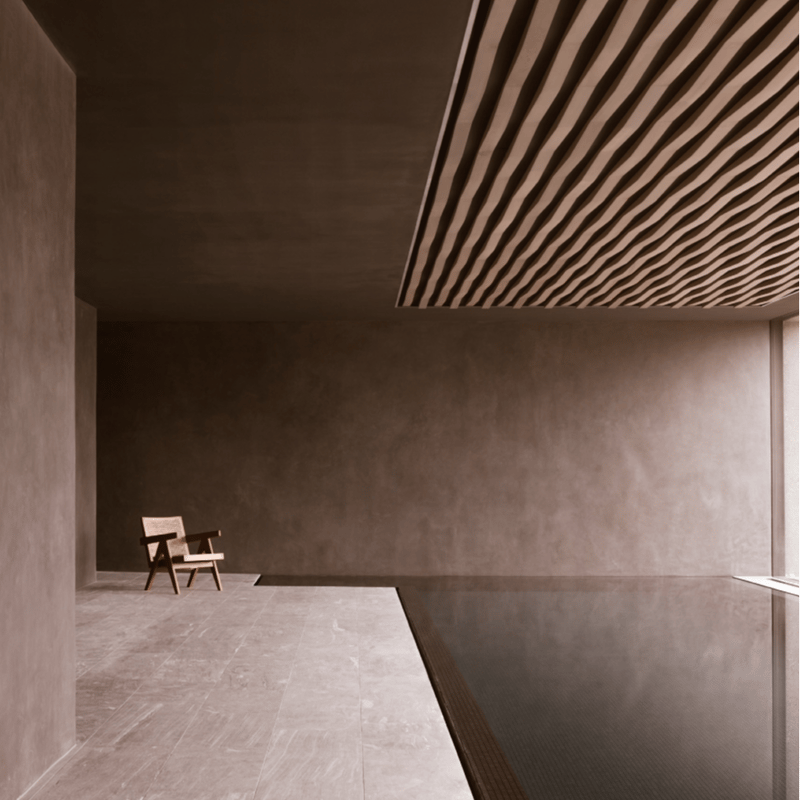
The first thing we notice, once we’ve stripped a site bare, is the vast empty space that surrounds a graphic element, or what professionals call negative space. So called, because it is the opposite of the space taken up by real objects.
Having so much of it, creates a confident relaxing feeling. Like, a quiet breath of fresh air.
In minimalist design, the main purpose of negative space is to keep the viewer focussed on a specific point.
But being void of distractions, a page full of negative space goes even further and drives users to an important element or feature on that page.
As web creators, it also forces us to be more precise with the few details that remain in the space. And as we’ve pointed out many times in our Masterclasses, it’s within the limitations that our creativity truly thrives.
Elementor’s grid system of vertical sections and horizontal columns, makes establishing this negative space for our page designs very simple and efficient.
The best way to do this is in the Editor panel, and in the advanced tab, use the margin and padding settings to create all the space we need around our elements.
This is also where we can make the adjustments we need, to assure that our design looks just as good in responsive mode.
True minimalists see negative space as equally important to design as the content; the images, the graphic elements and text.
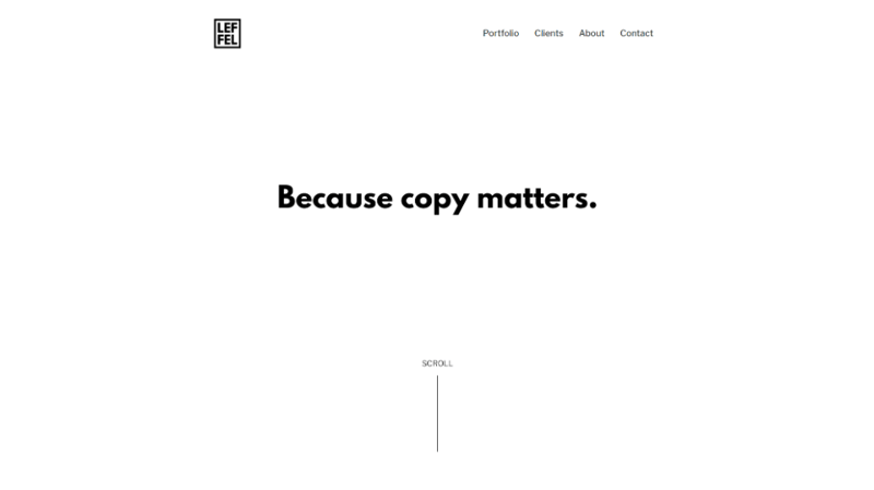
Essential 2: Text
When it comes to written content, we’ll want to rely on as little as possible, keeping it to a slogan or two; lean but clever copy.
With the text being one of the very few elements left to dominate our negative space, it becomes far more valuable as a graphic element.
Minimalist designers explore and expand on the shapes and lines of the fonts, styling the letters themselves to convey the visual narrative or main idea of the site
We’ve seen many wonderful examples of this in the sites that our community members have designed. Examples where they have taken advantage of the typography and custom font options that we’ve examined in detail in a previous Masterclass.
Some minimalist designers prefer to go even further and create, and upload their textual assets as actual images.
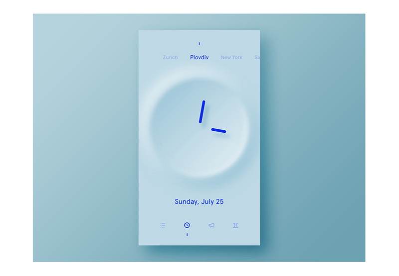
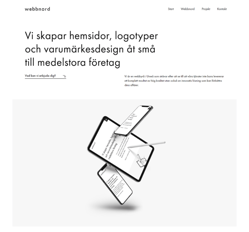
Essential 3: Vivid Images/Photos
This brings us to our next essential characteristic of this style of design, to what many refer to as vivid imagery.
Images are not a prerequisite of minimalist web design. Then again, these days we’d have a hard time finding a site with no images at all.
But when these sites do include images, they are so few and sparse, that each one is meticulously selected.
When hand-picking the right image for your site, we want to consider every property of the image, and ask ourselves — does it convey the main idea or emotion of our site? Does it convey it clearly?
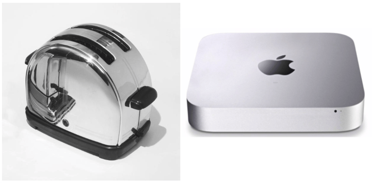
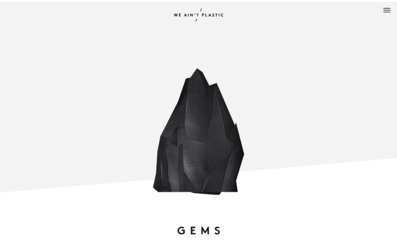
As for the style of the image itself, many believe that flat images or images without three-dimensional shading and lighting are a standard of minimalist design.
But I’m sure that, just as much as I have, you’ve also come across some great examples of minimalist website design with skeuomorphic graphics that create the illusion of realistic, three-dimensional images.
But, once you’ve found the perfect image, you can upload it and stylise it using Elementor’s CSS filters and blending options, in the image widget’s style tab.
Essential 4:Visual Hierarchy
Whether or not our hand-picked images are the most important elements of our page’s design, maintaining a simple and very clear visual hierarchy is another essential characteristic of Minimalist design.
Both the vast negative space and the few elements that it envelopes, already give us a head start.
Many designers prefer to adopt the Nielson Group’s F-Shape pattern, as it is a pattern that users tend to follow: Beginning in the top left-hand corner of the screen, then scanning to the right. Returning back to the left before moving a step down and repeating the left to right scanning movement, and so on.
It allows us to give every one of our rarefied elements a chance to shine in the spotlight, in accordance with its importance.
Obviously, this type of design pattern is not recommended for content heavy sites. But if our site were content heavy, it wouldn’t be considered minimalist.
As you may know, I prefer to work with the Navigator open, whenever I create sites in Elementor. I find that it’s especially convenient, when I am setting up or reorganizing the order of the sections and elements to further perfect the visual hierarchy of the design.
Essential 5: Symmetry
Another reason for using the navigator in Elementor, is to assure symmetry, another essential characteristic of minimalist design.
Symmetry promotes visual balance and order, making the visual hierarchy clearer. It also helps us to create a single focal point, where we can place our main message or image.
But most importantly, symmetry helps to ensure a better user experience.
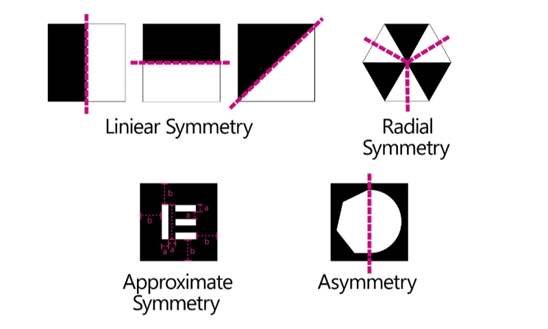
There are several types of symmetry that we can rely on:
Linear Symmetry — symmetry created along a vertical, horizontal or even diagonal line.
Radial Symmetry — symmetry that radiates from the center outwards in multiple directions.
Approximate Symmetry — when we create a sense of balance by relying on similar sizes or distances within the space, but without the objects appearing to be mirrored.
Asymmetry — the lack of symmetry.
Again, all of this can be simply and accurately built along the grid when working in Elementor. Even when we’re creating asymmetry or what some refer to as “Broken-Grid” design, we still use the grid to get our graphic and text elements aligned according to our design plan.
A great pro-trick to saving time and making sure that we’re creating the symmetry that we’re after, is by duplicating sections, columns, widgets etc., or by using the copy/paste-style option in the option menu, to allocate the exact same attributes, to another element, without affecting the widget’s content.
Essential 6: Color
There’s a great misconception that monochrome is the most essential characteristic of minimalist design.
This is why we’ll find people mistakenly labeling a site’s design as minimalist, just because it’s all in black and white.
So let’s just burst that bubble and say that color is a characteristic of minimalist design.
A monochromatic design could be considered minimalist, a minimalist design doesn’t have to be monochromatic.
We could use an image that could include many colors. So long, as they work together in a way that conforms to a minimalist ideal.
Traditionally, minimalist designs rely on a modest set of colors, usually two or three. Commonly, these colors form a subtle scheme, with delicate contrasts among colors of the few elements, and a much less subtle contrast with the background color.
Sometimes designers employ color fields, vast shapes of a single color, to help create these contrasts, establishing and directing the user to the main areas of the page.
A fashionable way that this is achieved is by relying on less vivid, subdued colors; much like pastel colors. Colors with a relatively high luminosity and low saturation;
As profesional web-creators, we’ll be figuring out our color palette in the pre-planning stage, before we sit down to create our site with Elementor.
However, as professional Elementor users, we know that there’s a great deal of pre-planning that we can do in Elementor. Especially when it comes to selecting default colors and setting up our color palette.
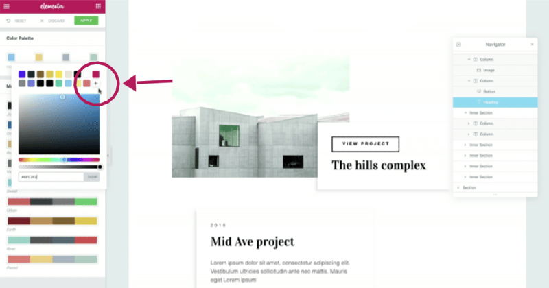
For instance, clicking on the menu icon in the Elementor editor panel takes us to the several options, and where we can access the Default Colors settings. There we can select predefined color palettes, or by clicking on a color swatch in the default colors, in the color picker select another complimenting or contrasting color.
Notice that when we click on the plus symbol, we’ll not only add it to the default colors, but it gets added as a preset, so that every time we need this color, it will be right there, in the color picker’s favorites, making our workflow so much easier.
Essential 7: Modernism
Besides being an essential characteristic of Minimalism, Modernism probably serves as a good guideline as to when we should turn to Minimalism for our designs.
Minimalism appeared in design around the same time, during the last century, that as a society we were getting very excited about new modern technology, like TVs and time saving household gadgets.
So you could say that minimalism has its roots in the streamlined, almost surgically clean designs of the modern era that peaked in the nineteen-fifties and sixties.
It’s precisely because Minimalism became so synonymous with advanced, reliable technology that years later, industries revived this design trend to promote high-tech, advanced environmental technology, and modern office spaces, and so on.
This is probably why we rarely, if at all, see minimalism in designs for businesses and products that have tradition as its central concept, such as with designs for a traditional family run pizza restaurant, for example.
In short
This week we reviewed Minimalism, what the concept means as an artistic ideal, and how it manifests in web design.
If you’re looking for inspiration and further material on minimalist design, we highly recommend checking out the links in this article.
You may also want to look up the work of artists of the Bauhaus and De Stijl movements, such as Piet Mondrian, Yves Klein.
If you would like to share minimalist designs and artists that have inspired you, perhaps a minimalist design of your own, then by all means, please share this in the comments below, along with any tips and advice that could help other users.
Should you have any criticisms, we are equally interested in your thoughts.
After all, our goal is to be the best at helping others excel at their craft.
Looking for fresh content?
By entering your email, you agree to receive Elementor emails, including marketing emails,
and agree to our Terms & Conditions and Privacy Policy.


