Table of Contents
When it comes to web design, no matter the trends, one thing is certain — today’s Internet users are smart, time-starved, and have high expectations when it comes to addressing their requirements. Not only is a flawless user experience crucial for having a good website, but it can also be a matter of survival.
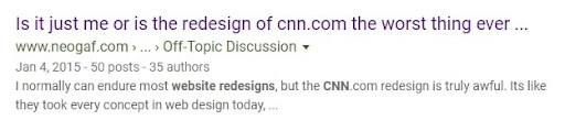
There are many examples of companies that lost a significant amount of users (and money) due to the mistakes they’ve made with their website’s UX. Popular examples include the website redesign of Marks & Spencer and CNN a while ago. Some sources claim that Marks & Spencer experienced a £55 million loss in sales at that time, and the CNN critics weren’t encouraging either.
We at OSM have over a decade of experience fulfilling the needs of all sorts of clients that operate in various industries, geo-locations, etc. We’ve learned that an ideal online user journey consists of a website that meets all the essential criteria of a responsive web design and provides exceptional navigation and reading experience across different devices.
However, we are aware that a seamless user experience across a plethora of different platforms and viewport sizes can be challenging. This is why Elementor’s new, additional breakpoints are a feature we are really excited about.
First Things First — The Desktop Version
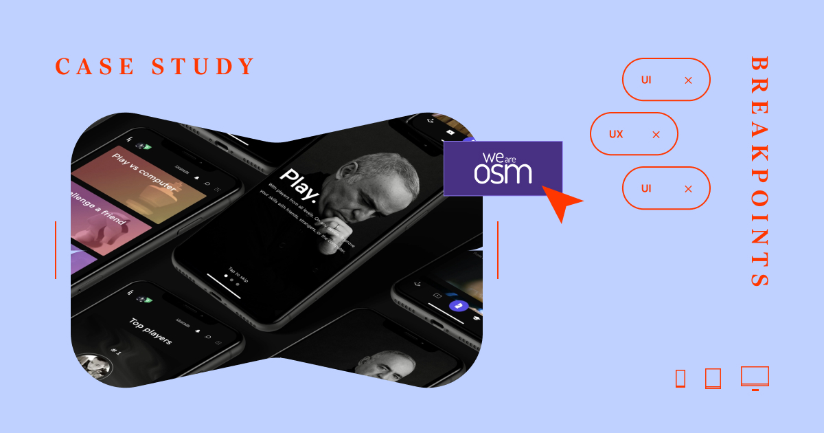
Web designers love big screens, and the majority of them start their design process on a desktop screen version. The same goes for Jovan Lakic, the magician behind the showcase page dedicated to our most recent project, Kasparovchess.
This was a project entrusted to us by the one and only Garry Kasparov, the Russian chess grandmaster, and former World Chess Champion. The Kasparovchess platform itself has plenty to offer: games, videos, live streams, interviews, master classes, and much more. We wanted to present all these benefits on our dedicated page and showcase the hard work behind the OSM team, so our potential clients see what we could do for them.
Here’s how he created the desktop version of the Kasparovchess’ dedicated page on our website, with Elementor, of course:
The landing page’s design needed to be compatible with the overall project’s design (check on kasparovchess.com), and that meant a lot of black colors, a touch of purple, and a lot of grayscale visuals. Certainly, a tricky combo when it comes to responsive design, you must agree.
The desktop version has a video in the hero section and in various other interactive sections. Again, a challenging moment for smaller screens.
(CSS) Breakpoints are useful when it comes to creating a responsive web design since they offer a good user experience on various screen sizes. When talking about responsive design, a breakpoint is a point at which a site’s design and the content will adjust to the best possible user experience for that specific screen.
Here’s how we’ve leveraged Elementor’s additional breakpoints to create a seamless user experience for our website visitors browsing on their laptops and mobile devices.
Laptop Screen Adjustments
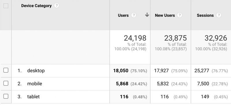
We’ve decided to start by optimizing the screen for laptops since, according to our statistics, most website visitors are browsing on their laptops. Of course, there are various laptop screen sizes, but Elementor’s laptop breakpoint seems to cover them all!
The first thing we did was make adjustments to the size of the fonts, especially headings. The goal was to highlight the importance of a particular sentence but also make it adjustable to a smaller screen size.
The second step was to fine-tune the text paddings and text box size.
and voilà:
Mobile Phone Screen Refinements
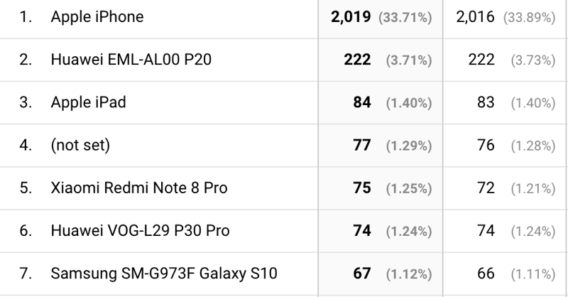
According to Google Analytics, weareosm.com’s visitors browse the website on their mobile phones quite a lot. To be more specific, our visitors seem to be iPhone lovers. That’s why we’ve decided to start customizing mobile screens based on the dimensions of the
iPhone12MaxPro.
Once again, the main headings needed to be adjusted to the smaller screen size, the text box size, and paddings. It is harder to read content on smaller screens, so it is crucial not to follow the desktop/laptop settings but focus just on the mobile screens. Double-check if the icons and all visuals are in place and forget about the interactive stuff — mobile phone users want to find information at first glance/tap.
That’s why we remind you about the Advanced section of the Image Editor, where you can find the Positioning option. Here’s what we’re talking about:
Okay, so after all the refinements, we hope that we’ve done a good job when it comes to user experience for our mobile phone visitors:
Final Thoughts
“The amount of effort that goes into defining responsive breakpoints is directly proportional to the experience of the end-user,” as explained at Browserstack.
Once again, users expect that a website is perfectly complementary with all devices they are using. For websites built with Elementor, the additional breakpoints feature is surely helpful, but it’s up to you to polish every single website element.
Did we do a good job with the Kasparovchess dedicated page? Let us know.
Looking for fresh content?
By entering your email, you agree to receive Elementor emails, including marketing emails,
and agree to our Terms & Conditions and Privacy Policy.


