Table of Contents
Usually, if you want to change your website’s global style settings, you’ll need to edit its Cascading Style Sheets (CSS) or deal with complicated theme customizer tools. Plus, if you change themes, you’ll likely have to start all over after the switch.
Fortunately, Elementor can help you design your site easily, and preserve your stylistic choices for the long term. When using Elementor, you can manage some of the most common global settings straight from the plugin’s user panel. Those settings include:
- Backgrounds
- Heading and link styles
- Form fields
- Buttons
- Images
Combine all of those elements together, and you have the foundation for a unique website design. With Elementor, you can customize each of these options in a matter of minutes. In this post, we’ll show you how to use the theme’s panel to make those changes (and don’t forget to check out our powerful Theme Builder).
If you want to check out the video featured above, it covers the same steps we’re about to discuss here. So you’re free to follow either tutorial along as you start working on your site’s styling.
How to Access and Change Elementor’s Theme Style Settings (In 5 Steps)
All of the magic happens within the Elementor panel. So let’s get started by looking at how to access it.
Step 1: Access Your Elementor Panel
You can find Elementor’s theme style settings by opening up the editor for any of your website’s pages. Once you’re in, access the menu in the top-left corner of the screen, and select the Theme Style option under Global Style:

Before you can make any changes, Elementor will warn you that you’ll need to disable its default color and font settings. Otherwise, the theme style changes you make won’t stick. To disable those settings right away, click on the Elementor Settings link:

Elementor’s settings include options for which pages you want them to affect, as well as the default color and font choices for your site. If you disable both of those settings, Elementor will inherit the styles from whichever theme you’re using instead:
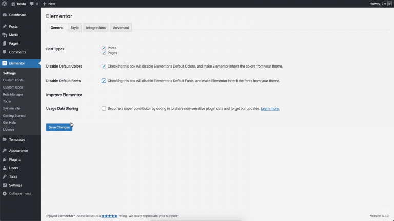
However, since you’re going to override those styles using Elementor’s theme settings, you don’t need to worry about that. Go ahead and disable both settings, then save your changes and return to the Theme Style section within the Elementor panel.
Step 2: Change Your Theme’s Background Style
At this point, you’re ready to start making changes to your site’s styling. Let’s start with something simple, such as changing your default background using Elementor’s theme style settings.
If you open the Background tab, you can set your website’s backdrop to be either a solid color or a gradient:

For our example, we decided to go with a friendly salmon pink color. If you’d rather use a background image, you can select or upload a file by clicking on the plus (+) sign.
Remember that although you’re looking at a single page right now, any changes you make through the Theme Style tab will be applied globally. If you want to see this effect in action for yourself, you can jump to another page without closing the Elementor panel.
To do that, click anywhere within the open page and press either the Command or the Control key plus E. That will trigger the Elementor search bar, which enables you to quickly find pages:
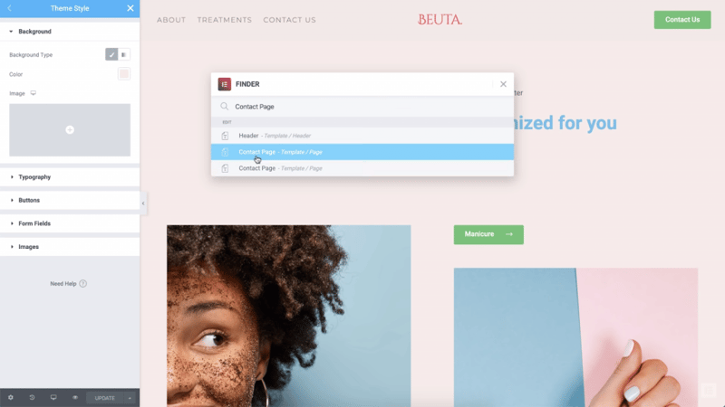
Using this menu, you’ll be able to see the Contact Page with its brand new background. The same applies to any other page you visit:
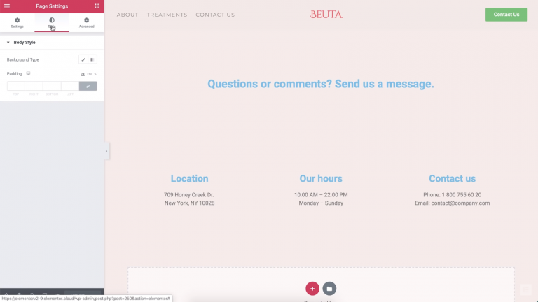
Any changes you make through the theme style settings become the default for your site. However, specific design settings for each page will still override them. To save time, we recommend setting a default background first. Then you can decide on individual choices for particular pages if needed.
Step 3: Tweak Your Website’s Typography
The Typography section within the Theme Style tab covers quite a lot of ground. There, you can change your website’s default fonts and text colors. On top of switching fonts, you can tweak your paragraph spacing settings:

If you scroll down, you’ll also find options to change your link and heading styles. You can set unique fonts for different levels of headings, so they stand out from the rest of the text on your pages.
In the example below, we switched the color of our links to red:
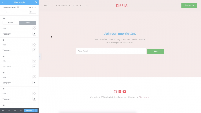
As a rule of thumb, you’ll want links to be easy to spot. Changing their typography can accomplish that, but can also be jarring if you tend to include links within text-heavy content. However, changing your links’ colors is a safe choice in most cases.
For all of the elements listed in this tab, you can customize their fonts, sizes, weights, and even the spacing between each letter:

In the event that you want to tweak the settings for your site’s headings, remember that there should be a hierarchy when it comes to size. It’s also a good idea for your various headings to have a similar style. That means using the same font family and colors, and reducing the size as you make your way down from H1s to lower-level headings.
Step 4: Change Your Button Styles
No modern website is complete without buttons. With Elementor’s theme styles, you can quickly customize your buttons’ typography and colors, using the same types of settings we’ve seen throughout the previous sections.
When it comes to buttons, you can set background colors, tweak typography, and choose from among multiple border types. You also get to play with simple effects, such as box and text shadows:

Since we’re talking about buttons, you’ll want to make sure the text they contain is easy to read. That means selecting a text color that contrasts well with the button’s background. It’s also a good idea to add a little padding, which is the extra space between the text and the button’s border.
Step 5: Modify Your Form Field Settings
If you use forms on your site, you can play around with the settings for both the text and the fields themselves. To get started, let’s switch up our form’s typography and colors:
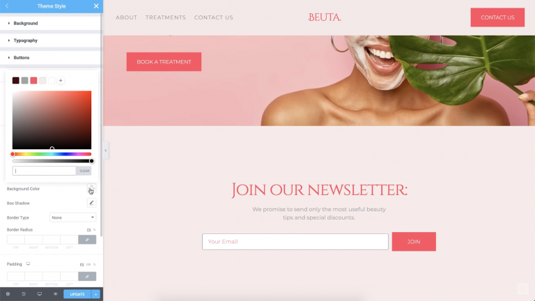
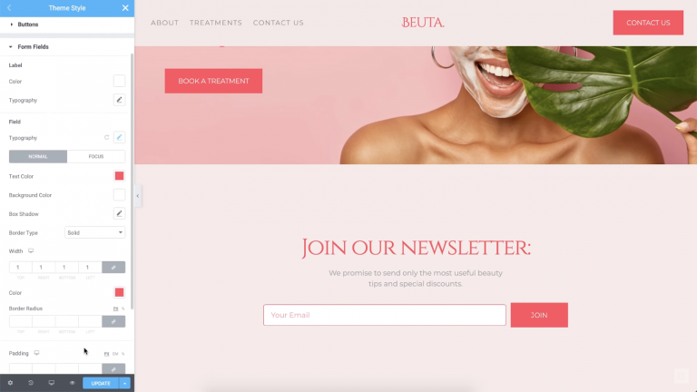
Moving on, we can change the field’s border style and color as well. In our example, we set it to a red that matches the rest of our page’s elements:
One fun aspect of form settings is that you can set different styles for when visitors ‘focus’ on a field by mousing over it. Once they click on the field, you can also set a transition effect. In our example below, when users click on the field, it will change the border style:
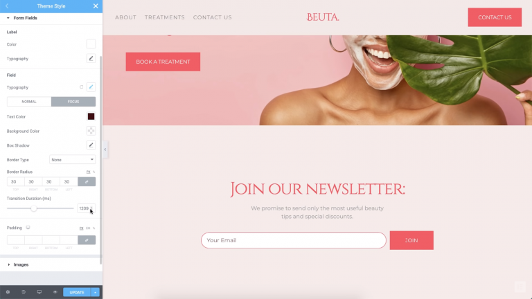
Focus animations are great from a usability standpoint because they reassure users that the field is working properly. Even a subtle animation can add a unique touch. Plus, since you’re working with the global theme style settings, you’ll only have to configure these options once.
Step 6: Transform Your Image Styles
You might assume that there aren’t many ways to style your website’s images. After all, images themselves are a cornerstone of each site’s unique style. With Elementor theme styles, however, you can easily add customizations such as global borders, shadows, and custom CSS filters:
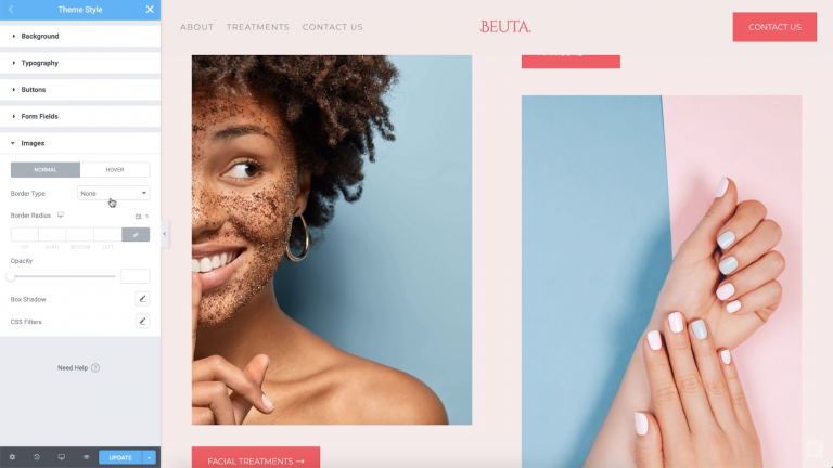
These options enable you to make your images really stand out. Plus, they can help you ensure that your images integrate neatly into the rest of your website’s styling.
And That’s It!
The stylistic choices you make throughout your website will impact the way visitors feel about it. By being consistent, you tell the world: “This is my brand style, and it looks good.” Of course, tweaking every single element on your website usually takes time.
With Elementor theme style, on the other hand, you can create a consistent design quickly. Plus, these theme styles are modular — if you want to change specific settings for each page, Elementor enables you to do that as well. Those individual design choices will override the global settings, so you’re in full control of how your website looks!
Looking for fresh content?
By entering your email, you agree to receive Elementor emails, including marketing emails,
and agree to our Terms & Conditions and Privacy Policy.
