Table of Contents
We’ve always been proud of our flexible mobile design capabilities. But getting the background image position just right was still a challenge for Elementor users.
If you’ve ever built a website, you have probably faced this common issue:
On mobile, you want to focus on the dog’s face, but end up only showing its tail.
With the recent release of Core v2.4, we are introducing a full set of capabilities to help you customize background images for any device. Meet Responsive Background Image controls.
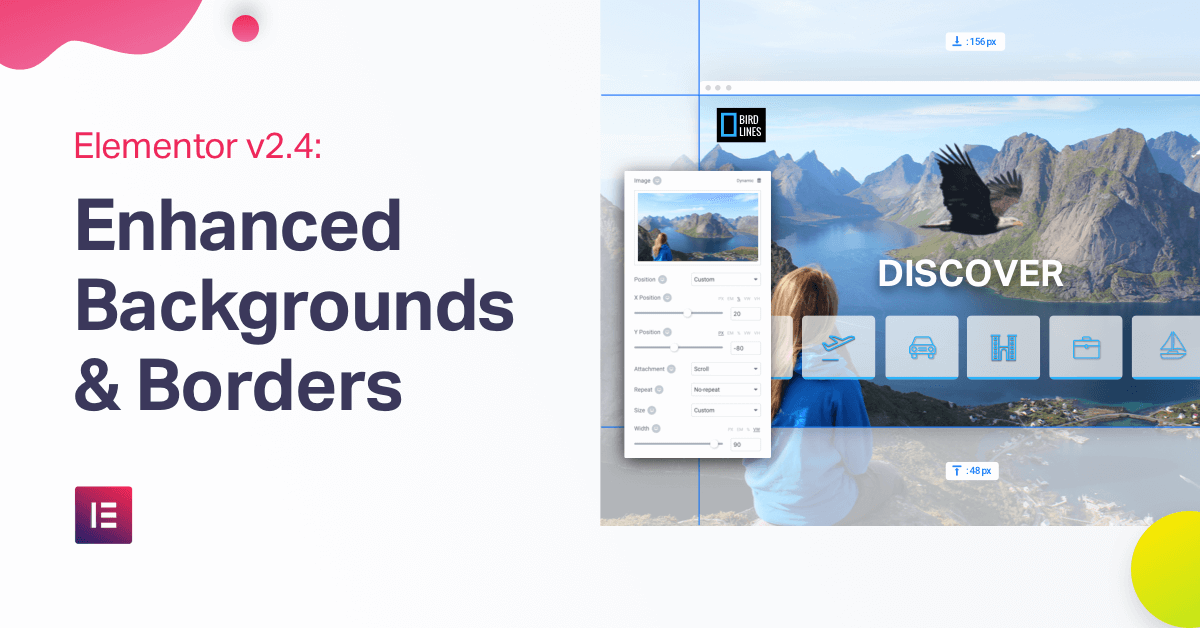
Your images look perfect on any device, with Responsive Background controls.
Responsive Background Image Controls
The new version of Elementor lets users have complete control over the background image controls on desktop, tablet and mobile devices. This control includes device-specific settings over background image controls (image, position, attachment, repeat and size).
Now, you can finally set different positions per device. Set ‘center-center’ for desktop, and ‘center-top’ for mobile, so all devices show a similar area of the image. You can also designate a different size for each device. Set ‘cover’ for desktop and ‘contain’ for mobile.
This was a huge pain for many users, and I am sure they will appreciate this new feature (you’re welcome ☺️).
Besides size and position, we added the option to set completely different images per device. Device-specific size and position were the first additional responsive controls. We took it a step forward and also added custom size and position, to give you an even more flexible design experience.
Custom Background Image Size & Position
Previously, you had to make do with 3 background image size settings: auto, cover or contain. Similarly, you could only define general background image positions like ‘Top Left’.
We are now adding two new custom controls: background size and background position.
With custom background position, you can manually set your desired background position on an X & Y axis. This way, you now have the option to set the exact of alignment for the background.
Besides position, you can also set custom background size. Set an exact width for your background image width for your background image.
These settings, custom background size and position, are especially crucial when it comes to responsive design. Use these custom settings to get a specific focus on the image’s main focal point for desktop, tablet and mobile devices.
Responsive Border Controls
Besides background images, we also added the ability to set different border-radius and border width per device.
An everyday use of device-specific borders is when you have an inline row of links, separated by a column border. This border becomes redundant on mobile, since the row stops being inline and the links get separated into separate rows.
In this scenario, the obvious choice is to remove the border from the mobile layout. Luckily with the new responsive borders feature, this can easily be achieved.
No more of those weird ‘orphaned borders’ on mobile!
Elementor Safe Mode - An Easy Way to Troubleshoot Issues
Here at Elementor, we care about offering our users a bug-free and flowing experience.
There are tens of thousands of plugins and themes, with millions of combinations for setting them up to work together. These combinations cause inevitable conflicts, related or unrelated to Elementor.
We continuously try to reduce these issues for our users, to create a better workflow.
A recurring issue occurs when users can’t load the editor.
This issue has been given many names: white screen of death, can’t edit, stuck on loading…
Our solution: meet Safe Mode!
Some of you might remember that Windows used to have a safe mode option that proved helpful in fixing a lot of the errors that occurred in Windows.
We created a similar solution for Elementor.
From now on, if you run into a never-ending loading page, you’ll have a button to switch on ‘Safe Mode’.
Consider ‘Safe Mode’ a safe environment that isolates Elementor and WordPress from the themes and plugins that might be causing the error.
With Safe Mode, over 80% of loading issues will be temporarily solved.
Safe Mode switched on and everything is loading properly?
This means the cause of the error was probably your theme or one of the plugins. Go ahead and deactivate them one by one to find the guilty party.
Safe Mode switched on and it’s still not loading?
This means you should look elsewhere for the solution, it’s most likely a custom-code or hosting related issue.
Safe Mode turns every Elementor user into a mini Sherlock Holmes.
‘Elementor-y, my dear Watson!’
“Will Turning On Safe Mode Affect My Site?”
Rest assured that safe mode won’t have any effect on your site visitors. They’ll be able to use your site as usual, and your site will display your normal theme design, as well as all the installed plugins.
The only thing that changes is that the Elementor editor loading process is done without any activated Plugins or Themes.
Safe Mode is a huge step forward for Elementor users in terms of getting a far more stable, seamless and error-free user experience.
External Video
In version 2.1, we added the option of adding self-hosted videos to the video widget. Why settle for YouTube and Vimeo right? But hosting video is expensive.
So now we’ve also added the option to add videos using external links.
This is great in two ways:
You can embed videos from other services like Coverr.
You can host your video files on a cheaper video hosting and add it to your site.
Read More Tag & Widget
One of the first requests we received was to add WordPress’s read more tag to Elementor.
This was a small request, but finally, we got around to pushing it through.
Read more is the tag you add to your blog post, that then translates to the cut off of the text in the archive’s post display. This allows you to show the teaser for your article on your main blog page.
Now you can easily add the read more tag in the text editor widget or as a separate widget.
We have also added a ‘Read More’ widget, that you can place between two text editor widgets, so your archive page will display an excerpt that cuts-off exactly where you want it to.
Please Note: This widget only affects themes that use ‘the_content’ in standard WordPress archive pages. It does not affect in Elementor-designed archive templates.
New Elementor & Templates Menus
To make it easier to handle the different Elementor dashboard screens, we’ve separated the previously named ‘My Templates’ menu, and renamed it ‘Templates’.
We’ve also positioned the Elementor & Templates side menus higher up on the dashboard menu, to make it more easily accessible.
Elementor Popups... Coming Soon
Elementor Popups are coming to Pro. Be sure to check out the sneak peek:
With Safe Mode, over 80% of loading issues can be easily identified.
Conclusion
It’s exciting to start-off 2019 with these helpful features, many of which have been requested by our community through GitHub.
Which of these features is the most helpful to your workflow? Is it Safe Mode, Responsive Background, or Read More? Please let us know in the comments below.
Looking for fresh content?
By entering your email, you agree to receive Elementor emails, including marketing emails,
and agree to our Terms & Conditions and Privacy Policy.


