Create a Loop Item
First we’ll create the Loop Item:
- From WP Admin, navigate to the Theme Builder.
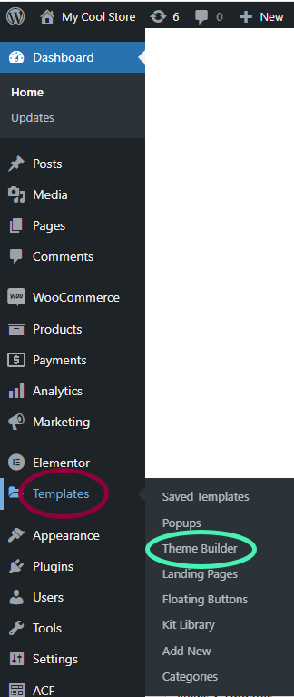
You must create the Loop Item using the Theme Builder.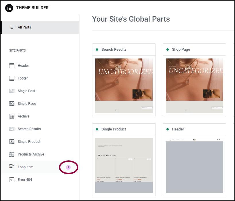
- In the panel, click the + sign next to Loop Item.
The archive library opens to the Loop items section.
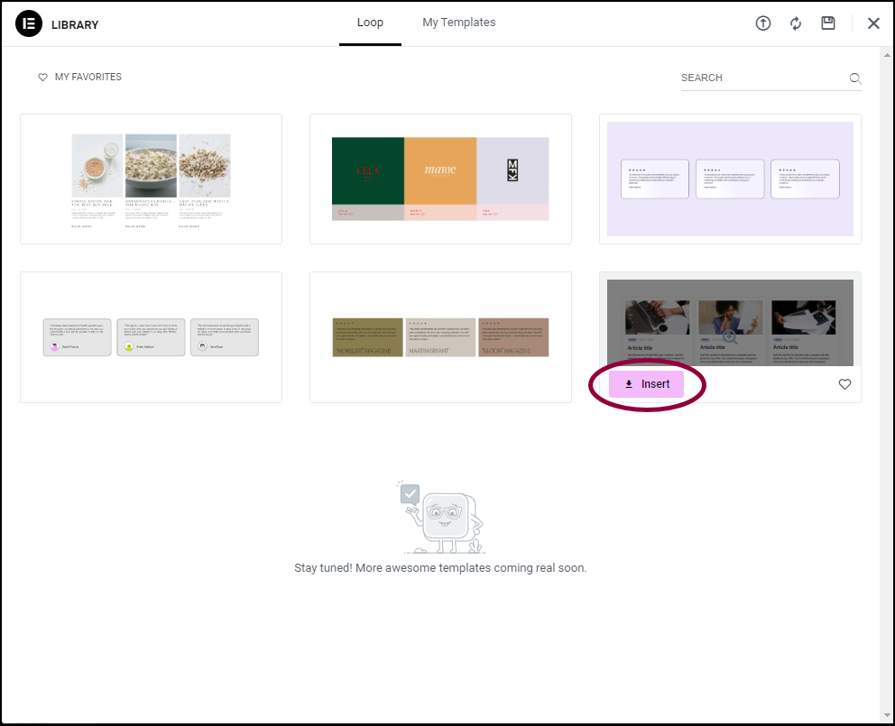
To keep things simple, we’ll use one of the Loop Item templates, but you can create your own Loop Item if you prefer.
- Hover over the template in the library that you would like to use and click Insert.
The live search results will appear in this item.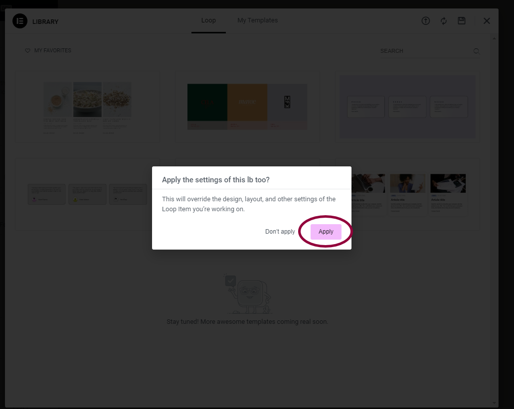
- In the popup, click Apply.
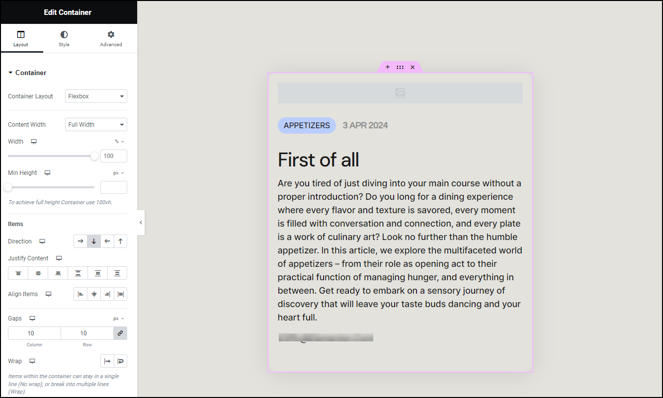
The Loop Item appears on the canvas.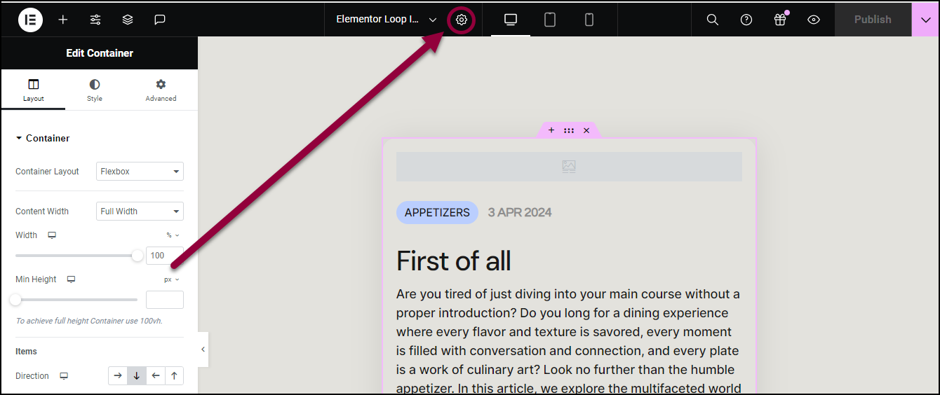
- In the top toolbar, click the Page Settings icon.
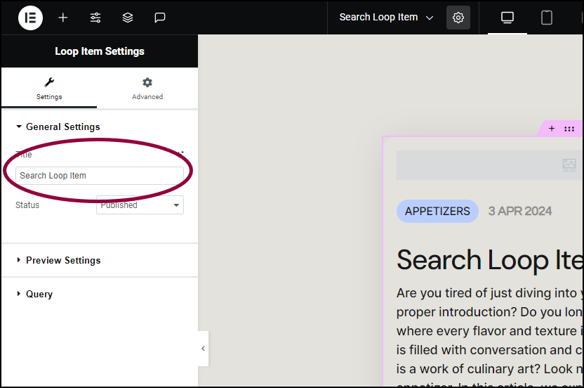
- In the panel, in the Title field, rename the Loop Item Search Loop Item.
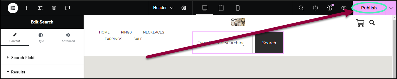
- In the upper right, click Publish.
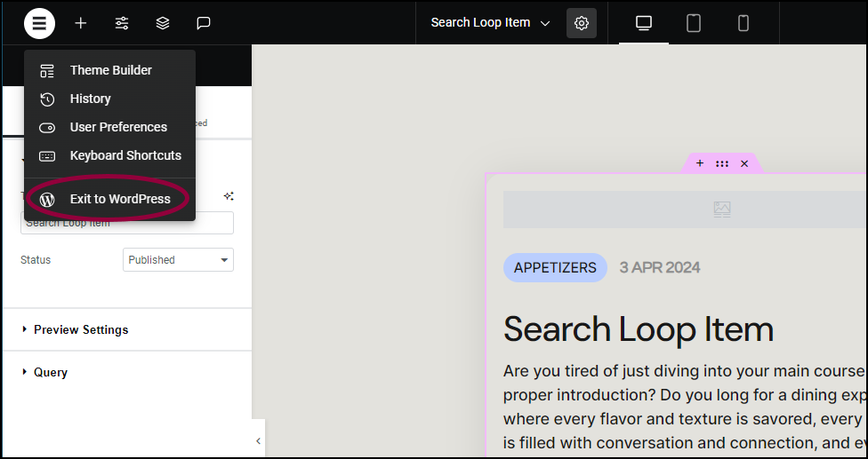
- In the left side of the top bar, click the Elementor Logo and exit to WP Admin.
- Return to the Theme Builder.
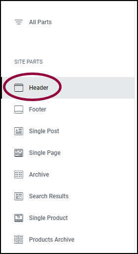
- In the panel, click Header.
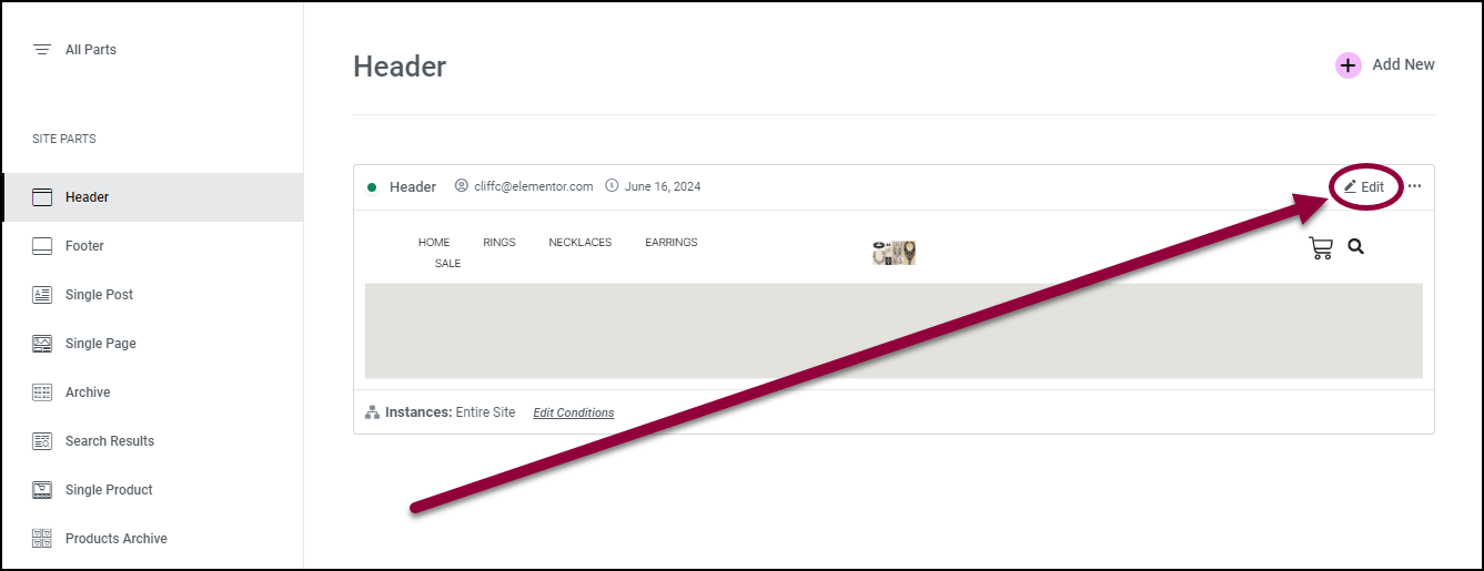
- In the right pane, click Edit.
The Elementor Editor opens with the Header in the canvas.
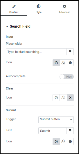
Add the search widget
- Add a Search widget to the Header in the canvas. For details, see Add elements to a page.
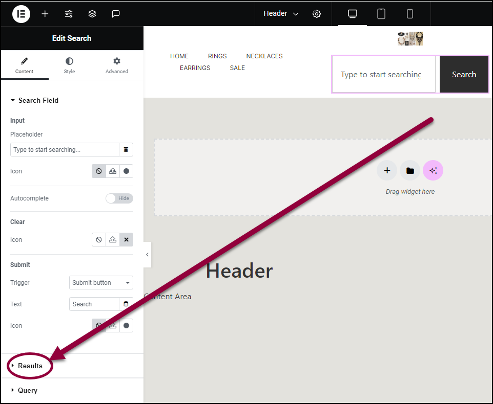
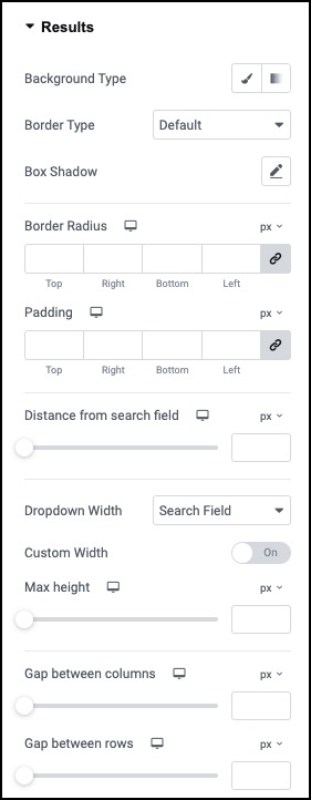
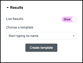
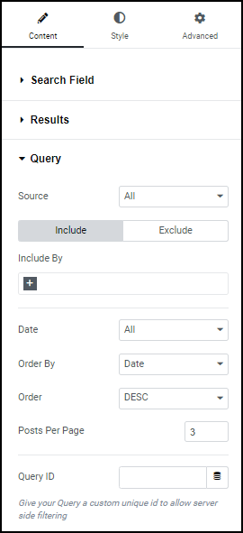
- In the panel, open the Results section.
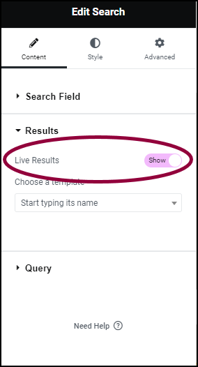
- In the panel, toggle Live Results to Show.
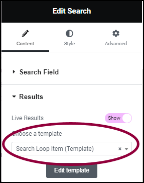
The Choose a template dropdown menu appears. - Use the Choose a template dropdown to select the Search Loop Item template.
Adjust the results
Right now the live results are set to display in one column. That’s good for mobile, but doesn’t look so nice on a PC.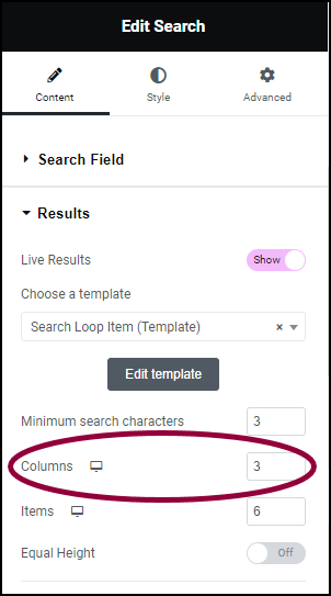
- In the Columns field, enter 3.
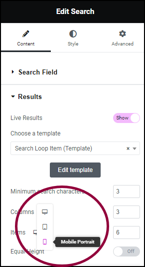
- Use the responsive icons to switch to mobile editing. For details about mobile editing, see Responsive Design.
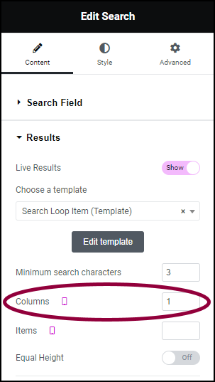
- In the Columns field, enter 1.
The live results will display as three columns on a PC and one column on mobile. - On the right site of the search bar, click Publish.
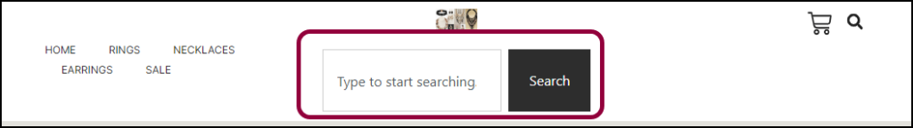
For some designs, you may want to narrow or widen the size of the Search widget.
To adjust the widget height:
- Select the widget.
The options appear in the left panel.
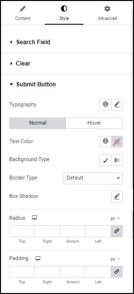
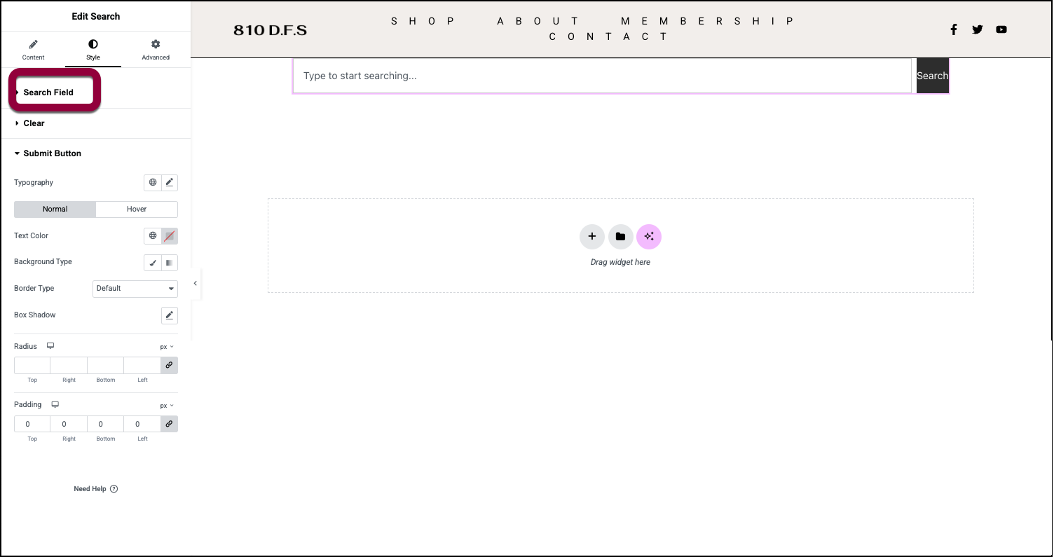
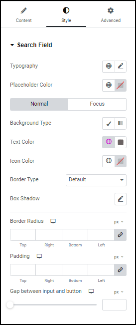
- Click the Style tab.
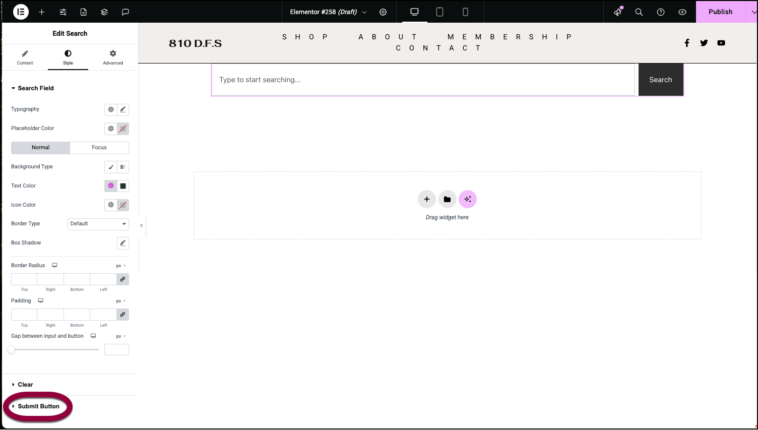
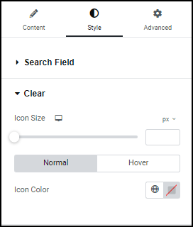
- Open the Submit Button field.

- In the Padding field, set the Top and Bottom to 0.
- Open the Search Field field.
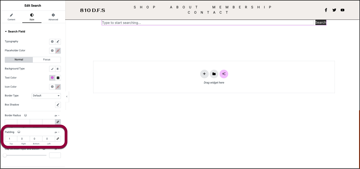
- In the Padding field, adjust the Top and Bottom padding to set the height of the Search widget.