Add the widget
Add the widget to the canvas
To access and use a widget:
In Elementor Editor, click +.
All available widgets are displayed.Click or drag the widget to the canvas. For more information, see Add elements to a page.
What is the Media Carousel widget?
The Media Carousel widget lets you display a series of media items, like photos or videos, in a rotating format. You can easily create and customize carousels with different skin types, various transition effects, navigation controls, and design settings to enhance your site’s user experience and engagement.
Common use case
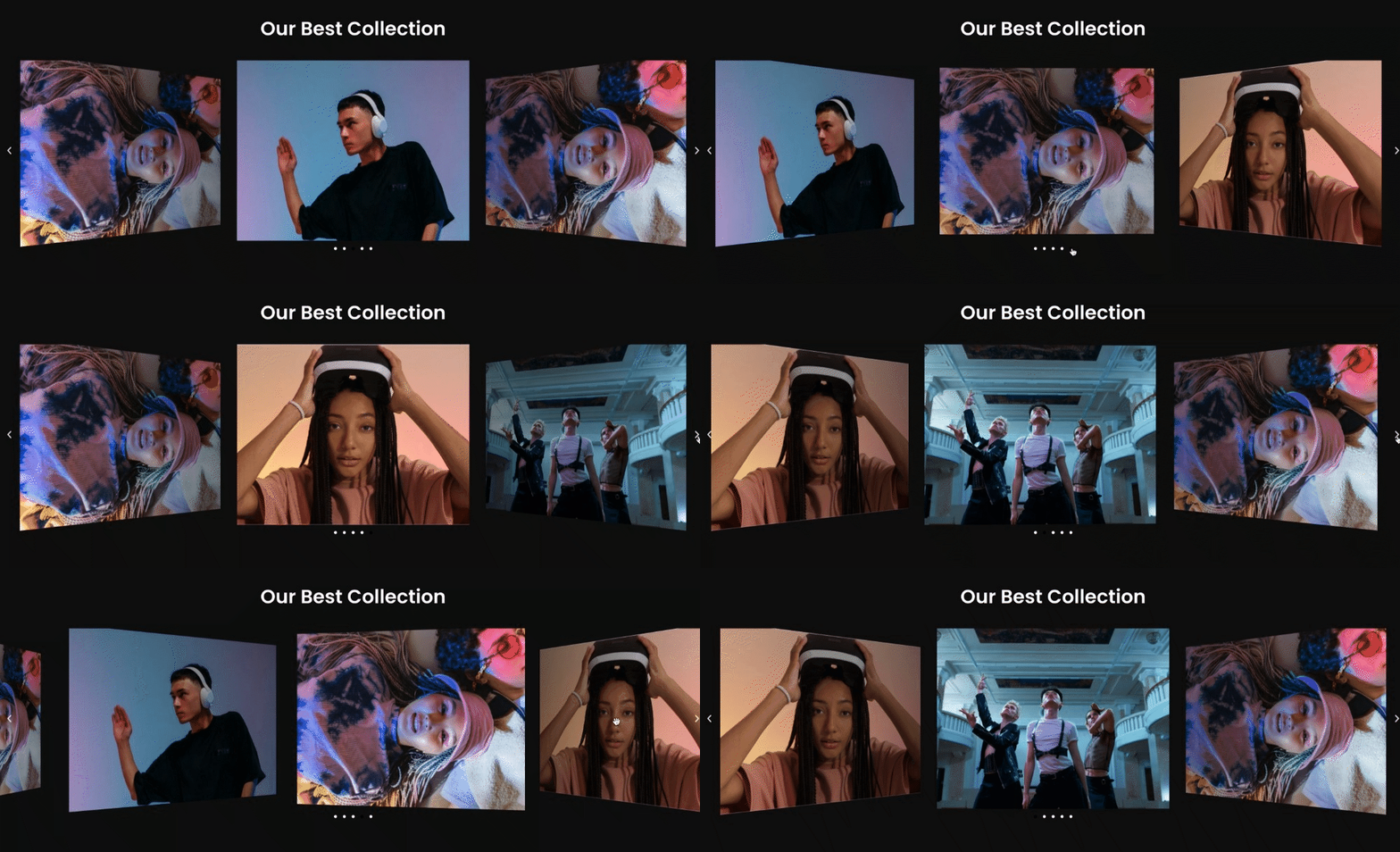
Ana is building a website for a renowned fashion brand. They want to showcase the latest collection in a captivating way. To achieve this, she uses the media carousel widget.
They created a carousel on the website featuring stunning model shots, each highlighting a different outfit or accessory from the collection.
Additional use cases
- Use the carousel to highlight ongoing promotions, discounts, or bundle offers
- Showcase customer reviews, testimonials, or user-generated content in a carousel format.
- Showcase logos of prominent clients or partners for portfolios.
Add a Media Carousel widget: Step-by-step
- Add the Media Carousel widget to the canvas. For details, see Add elements to a page.
- In the Content tab, under the Slides section, choose Skin from the drop-down options. The widget includes three skin types: Carousel, Slideshow, and Coverflow.
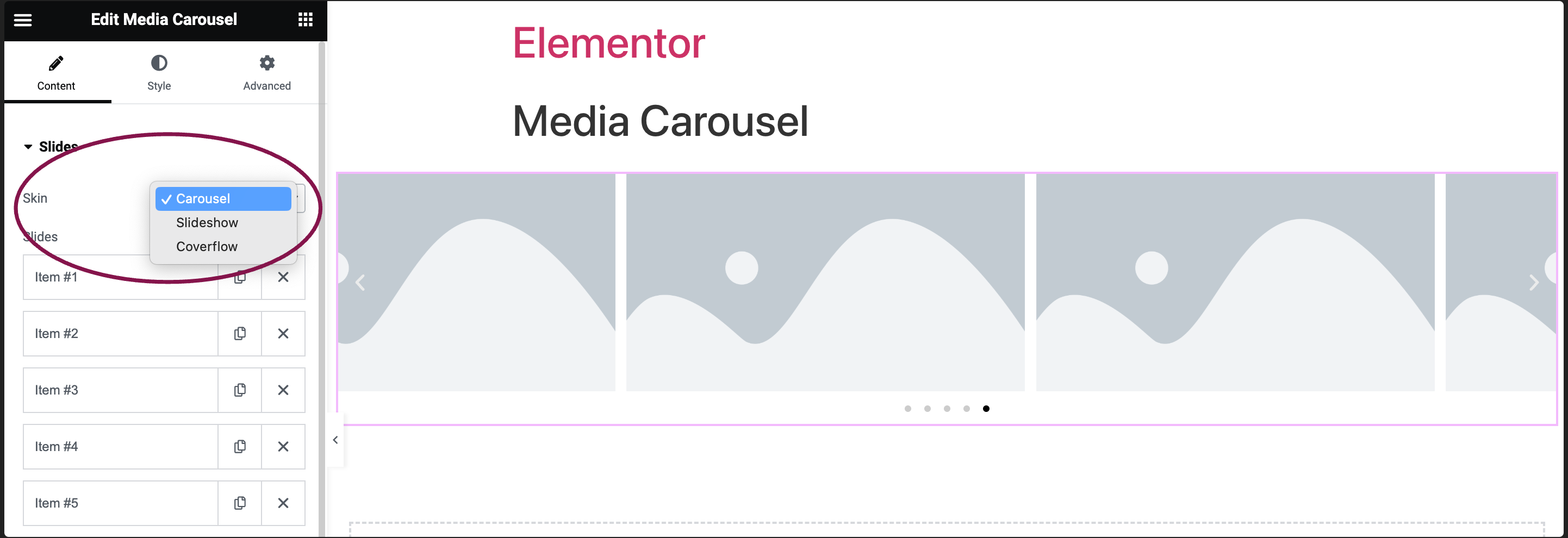
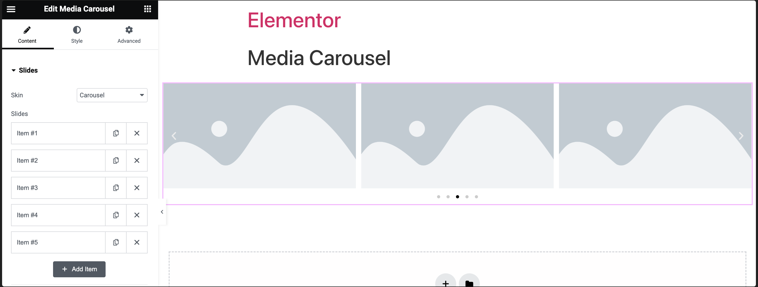
- By default, the media carousel widget comes with five slides: Item #1, Item #2, Item 3, Item #4 and Item #5. You can add or delete these slides.
- To delete the default slide, click the
 icon.
icon.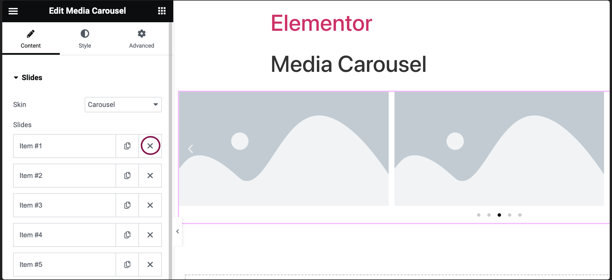
- There are two ways to add a new slide:
- Click + Add Item.
- Click the
icon next to one of the existing tabs. This will create an exact copy of the existing tab.
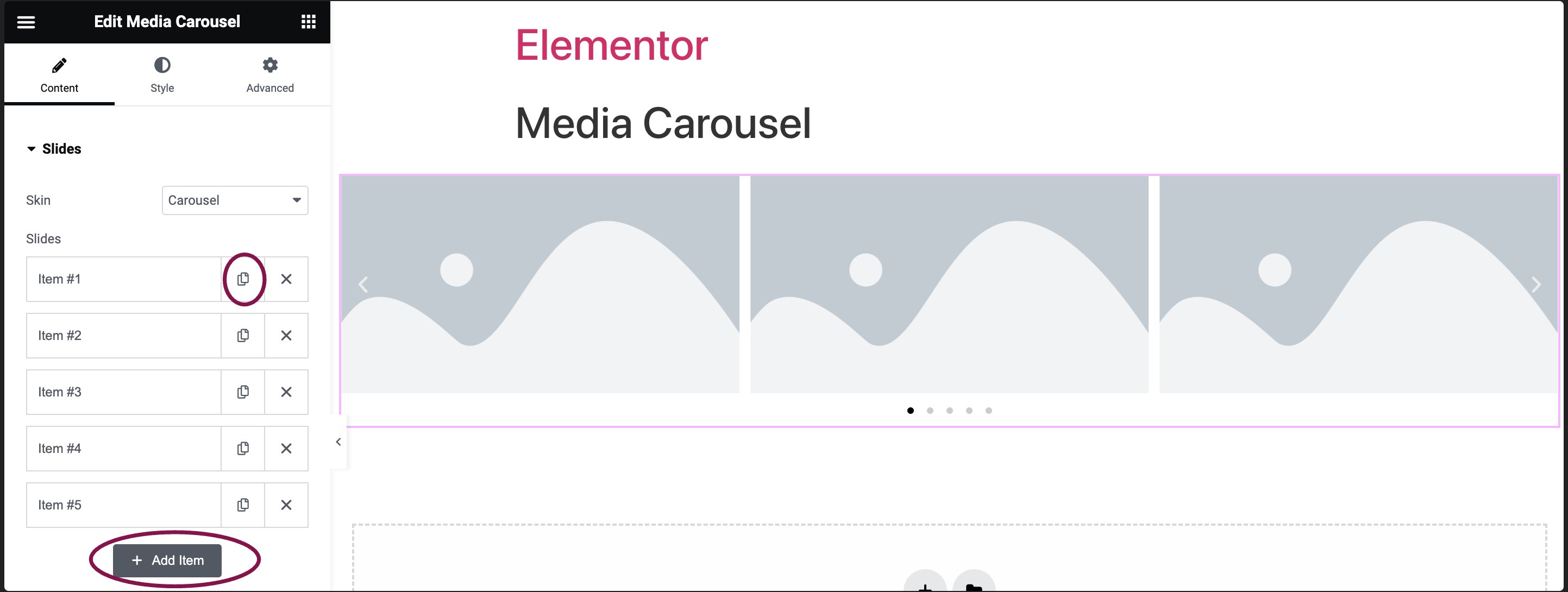
- Click + Add Item.
- By default, the media carousel widget comes with five slides: Item #1, Item #2, Item 3, Item #4 and Item #5. You can add or delete these slides.
Carousel Skin Settings
Carousel skin displays a rotating carousel that can display a set number of images or videos simultaneously.
- In the Skin field, from the drop-down menu, select Carousel.
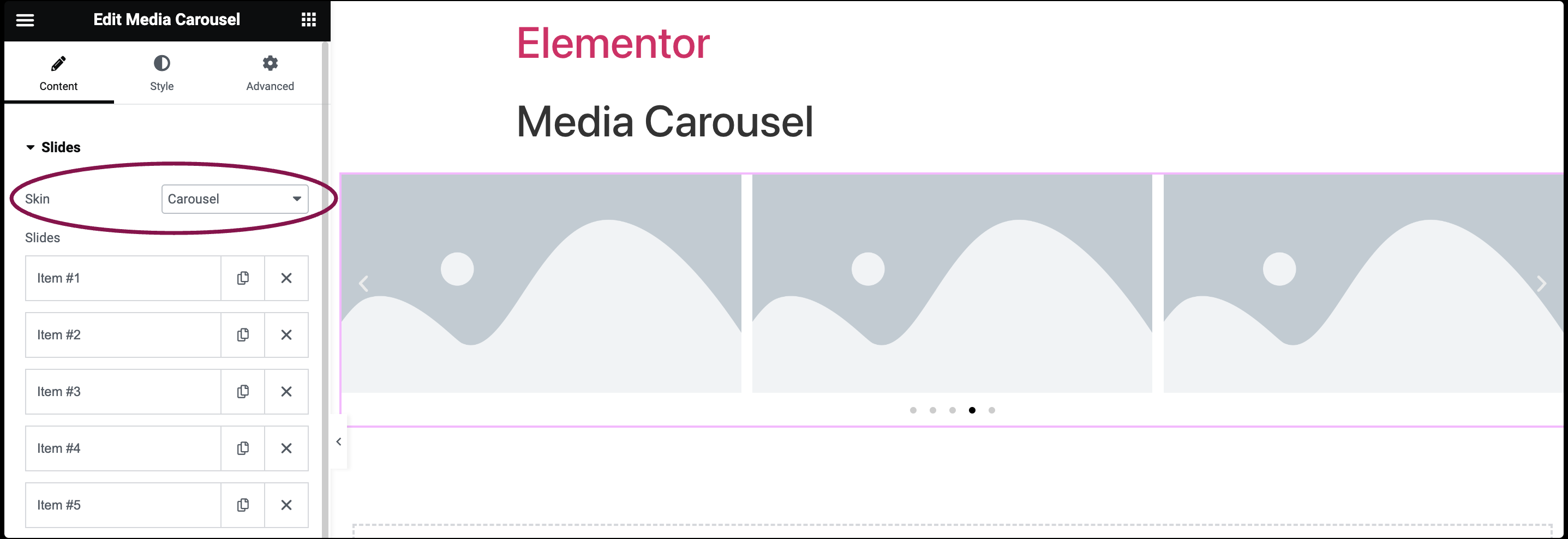
- In the Slides section, click the first slide labeled Item #1. Clicking the menu item in the panel opens up several options.
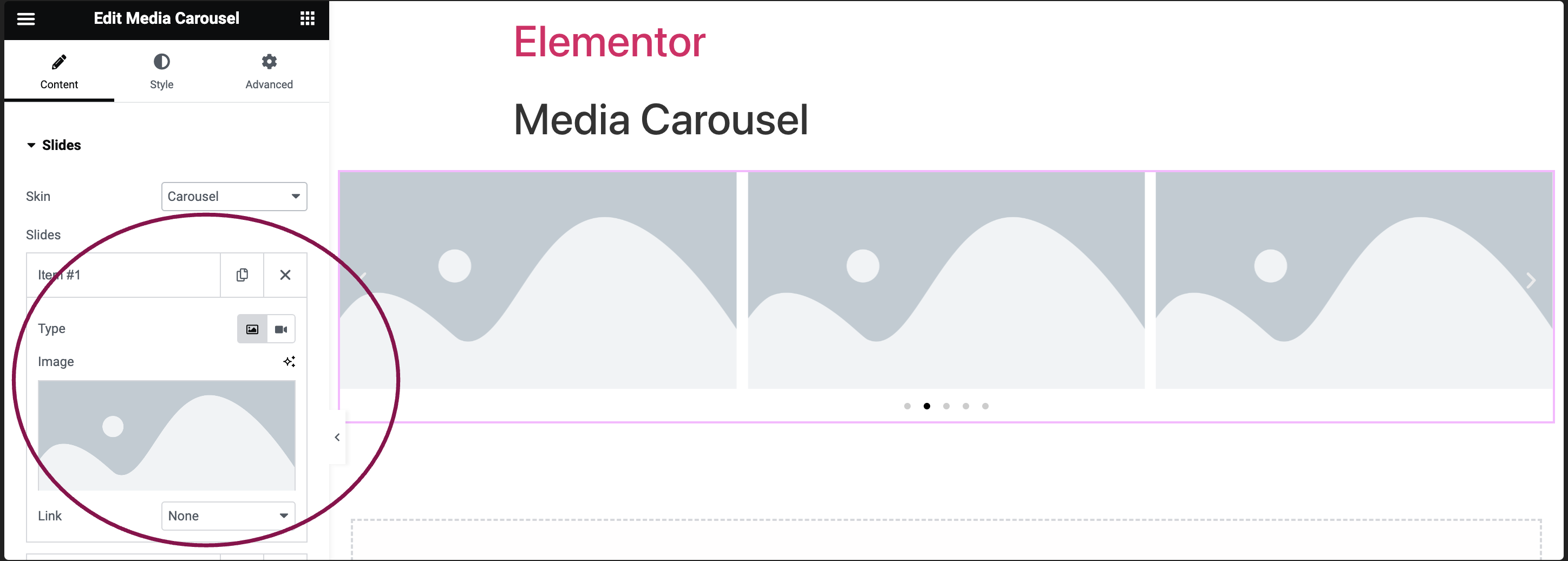
- Use the Type field to choose your media type: Image or Video.

- To add a image to the carousel, click the
 icon.
icon.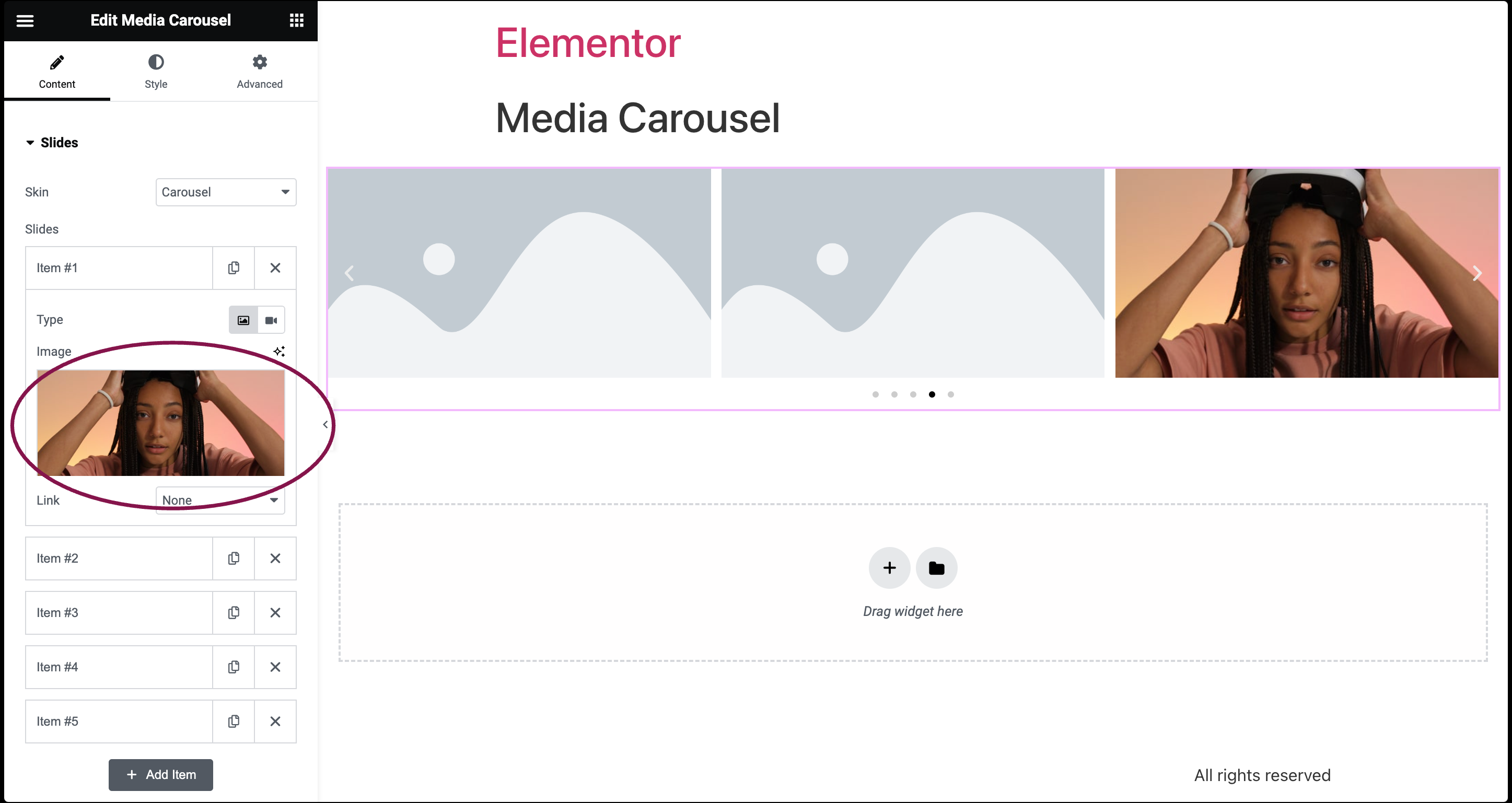
- Use the Link option to link images to their respective Media Files, add Custom URLs, or choose None.
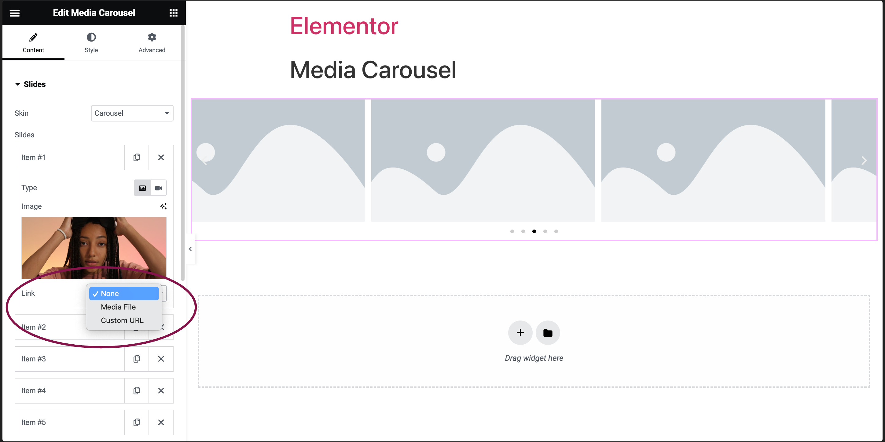
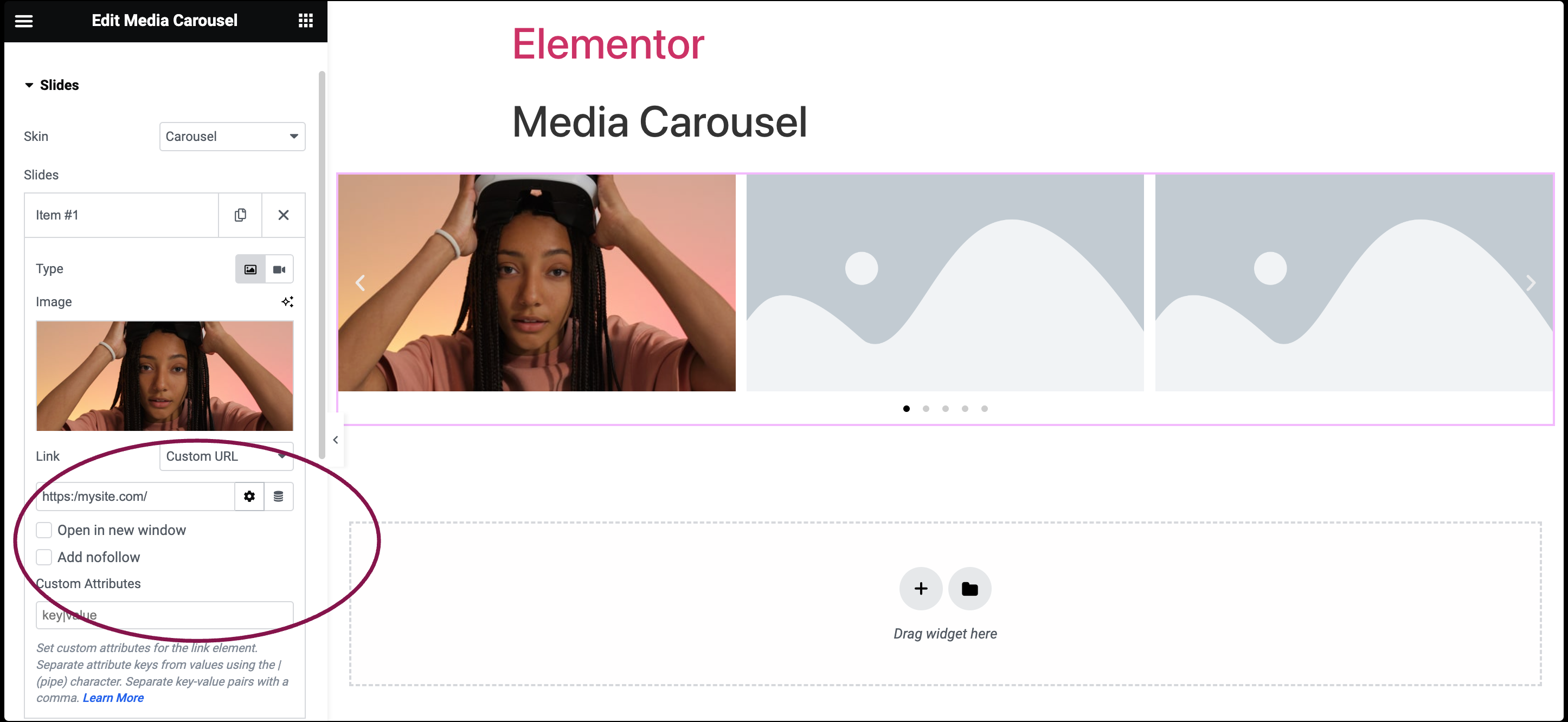
If you’re adding a Custom URL:
- Click the ⚙️ to set the link to either open in a new window or to add rel=nofollow to the link.
- Use the Custom Attributes option to assign custom attributes to the link element. Use the | (pipe) for key-value separation and commas to separate pairs.
- To add a image to the carousel, click the
- To add a video to the carousel, click the
 icon and paste the video link into the Video Link field.
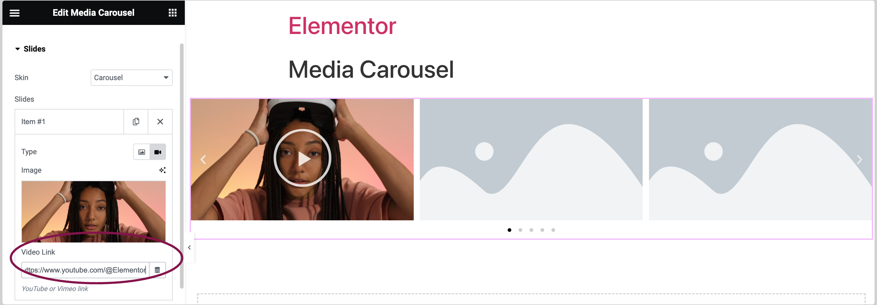 Note: The lightbox feature is enabled by default for the video content. You can switch it off by going to its settings and unchecking the checkbox. Learn more about Lightbox.
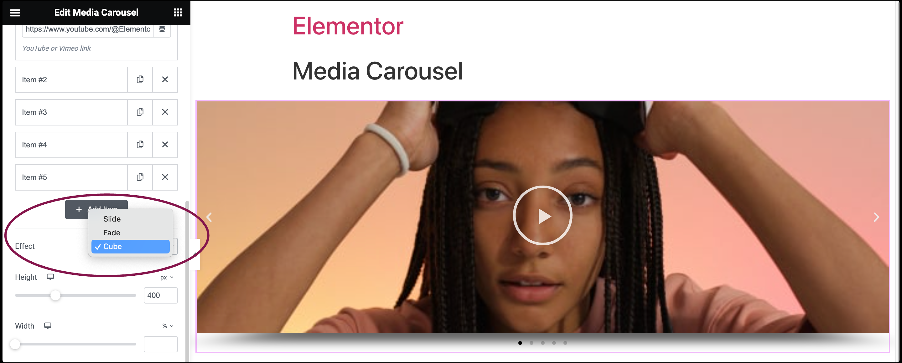
 - In the Effect field, choose between Slide, Fade, or Cube for the transition effect.
- Use the Slides Per View field to specify how many slides will appear at once in the carousel, from 1 to 10.
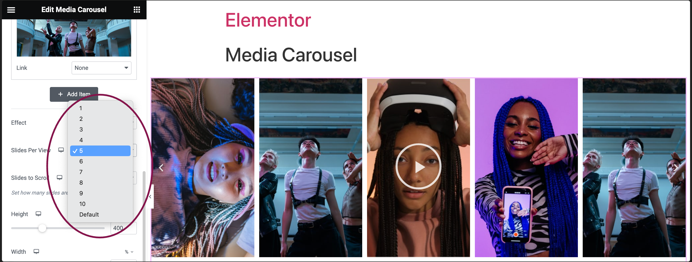
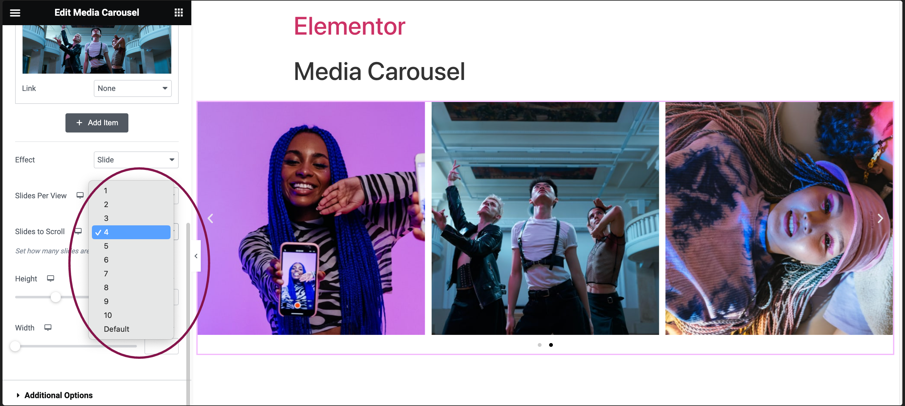
- In the Slides to Scroll field, define the number of slides to move during each interaction (up to 10).
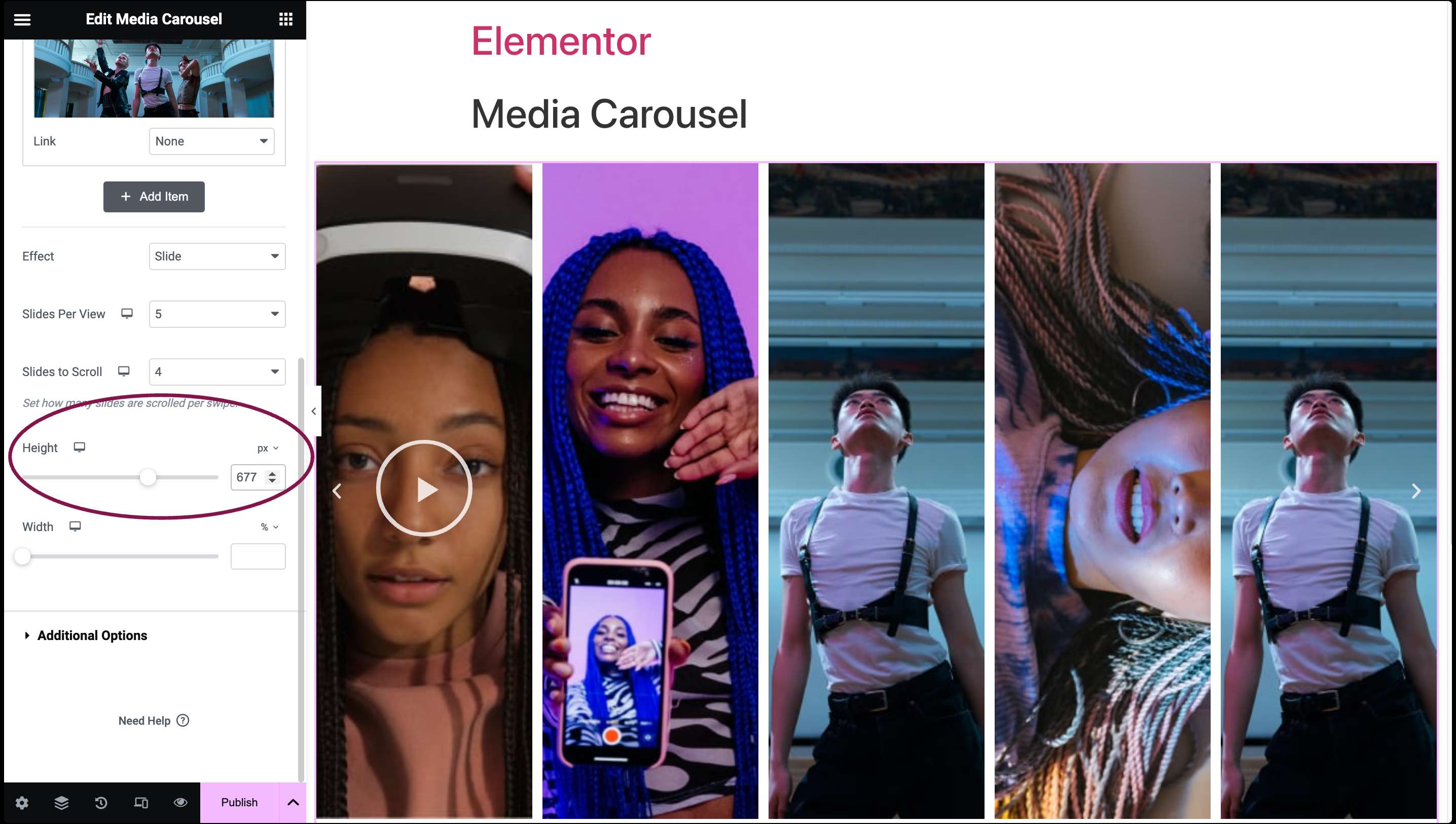
- In the Height field, adjust the slider to set the height of the carousel.
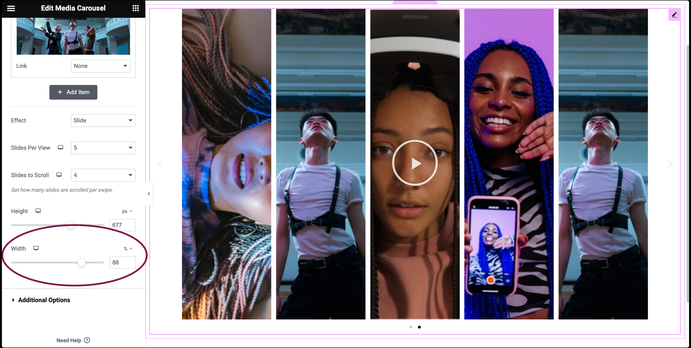
- In the Width field, use the slider to define the width of the carousel.
Slideshow Skin Settings
Slideshow skin displays a slider that presents a primary slide with smaller image thumbnails below it. This style is similar to a carousel but without pagination.
In the Skin field, from the drop-down menu, select Slideshow.
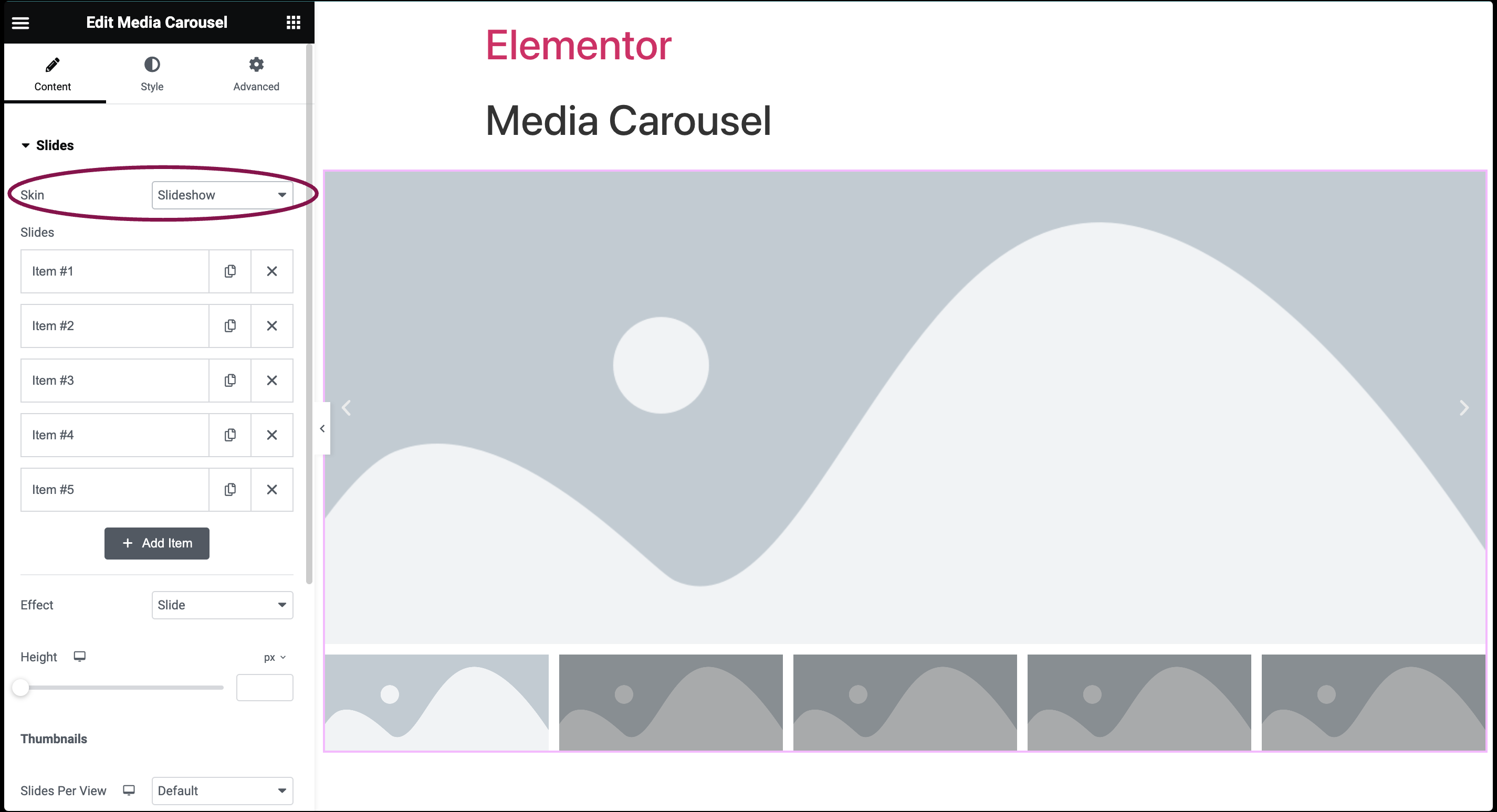
- To add content, follow the same steps we used for the carousel settings.
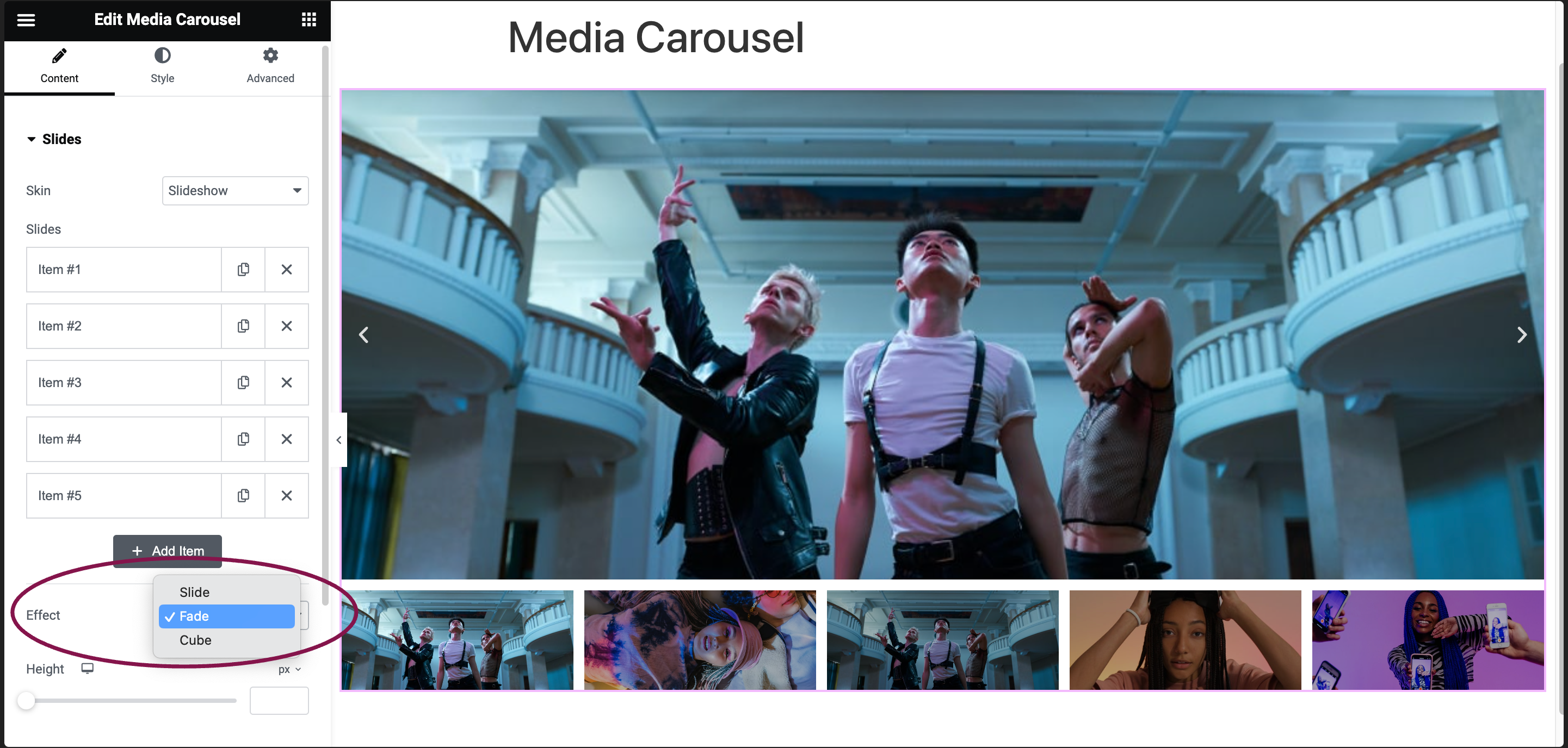
- In the Effect field, choose between Slide, Fade, or Cube for the transition effect.
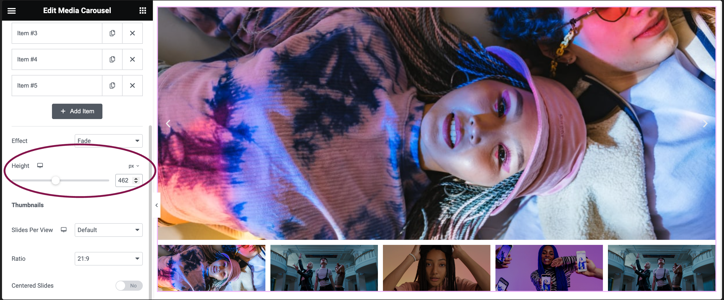
- In the Height field, adjust the slider to set the height of the slideshow.
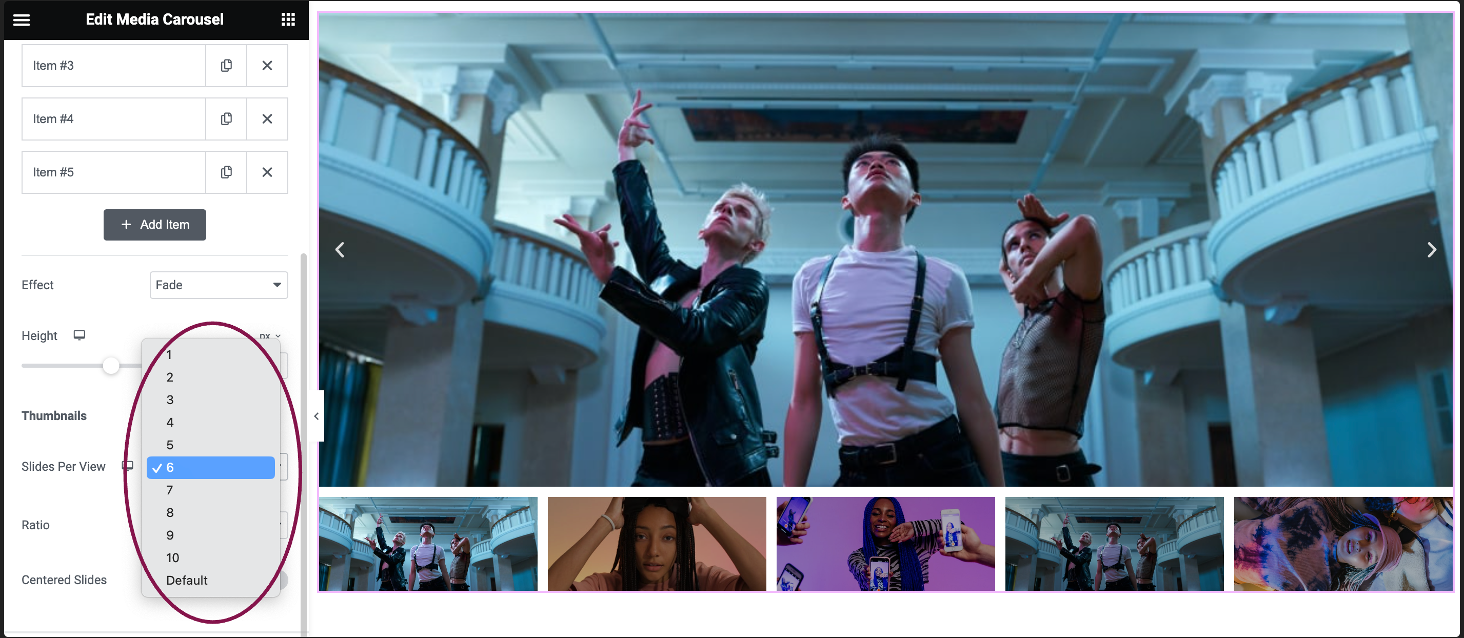
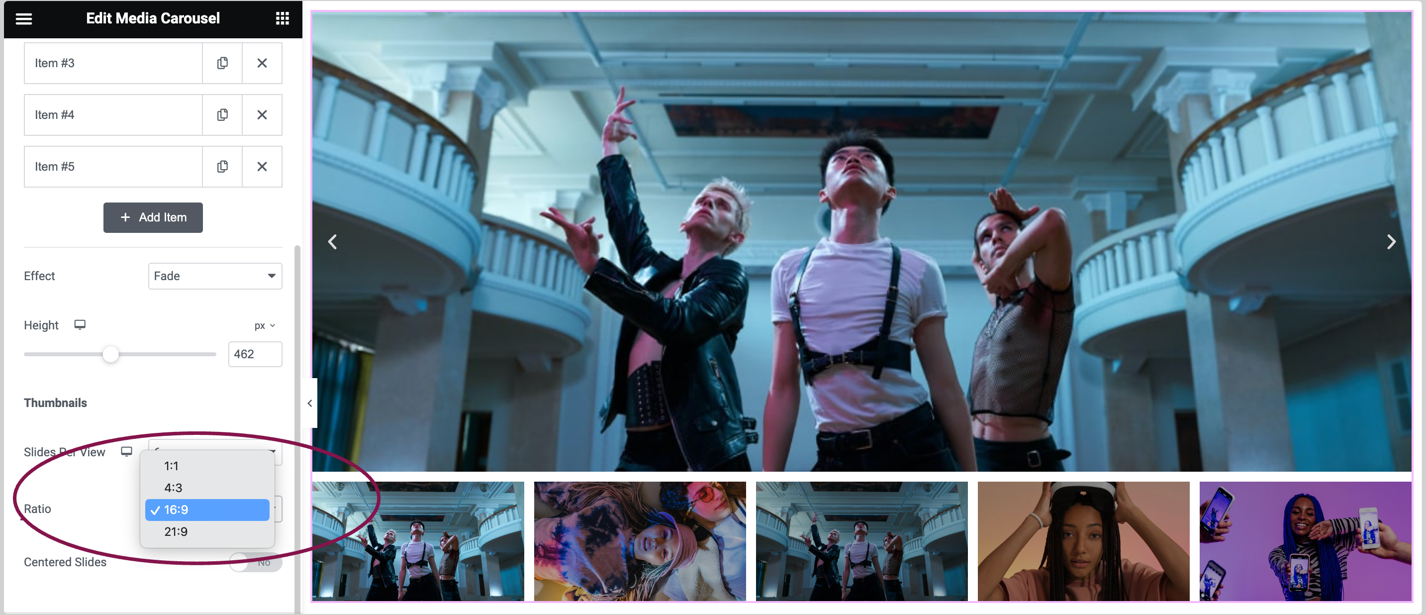
- Under the Thumbnail section, use the Slides Per View field to specify how many slides will appear at once in the slideshow, from 1 to 10.
- In the Ratio field to select the aspect ratio – options include 1:1, 4:3, 16:9, or 21:9.
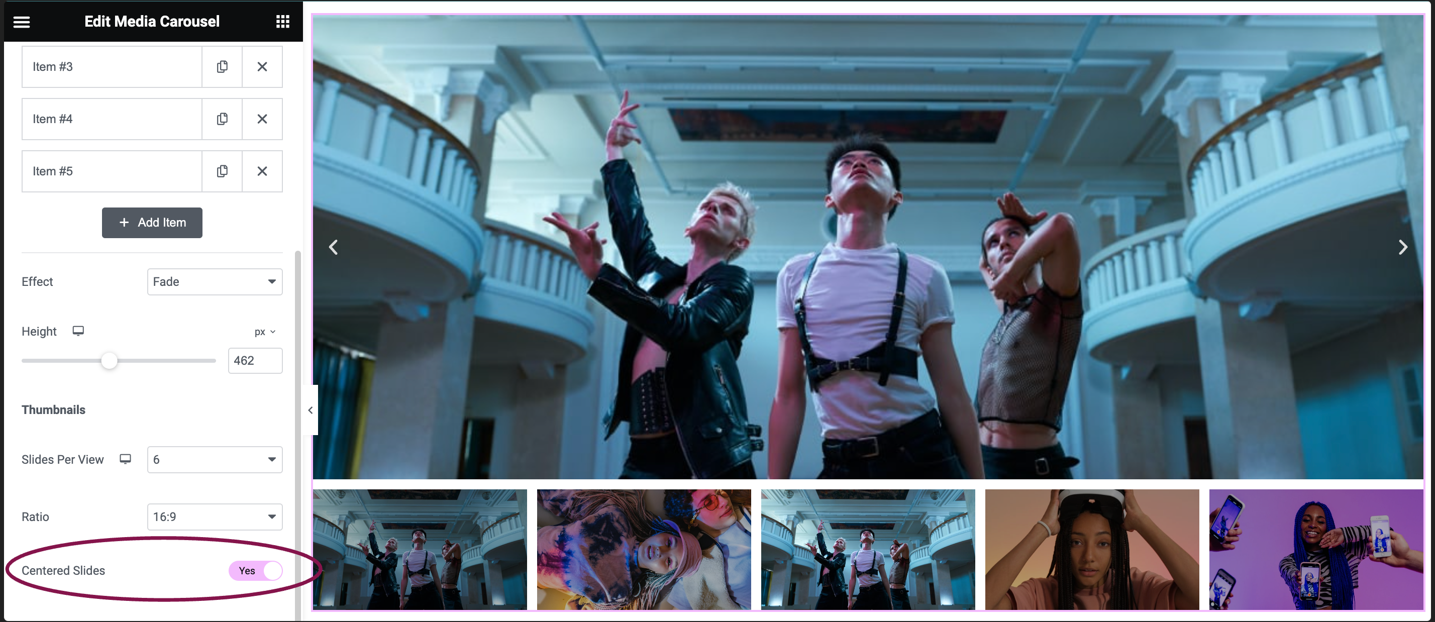
- Enable the Centered Slides toggle to position the currently displayed slide in the center of the slideshow view.
Coverflow Skin Settings
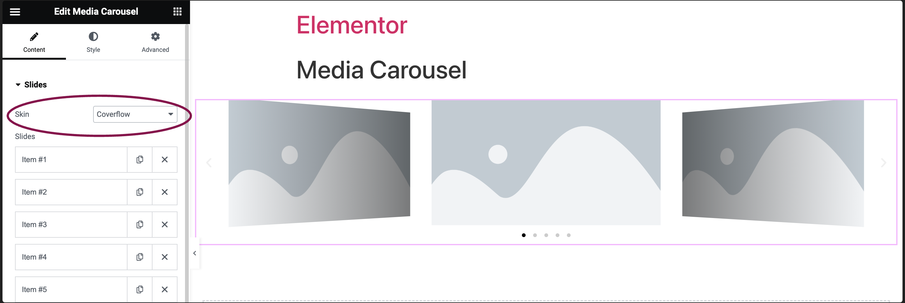
Coverflow skin displays a slider with a prominent central slide flanked by two adjacent slides.
In the Skin field, from the drop-down menu, select Coverflow.
To add content, repeat the same steps we used for the carousel settings.
- In the Height field, adjust the slider to set the height of the carousel.
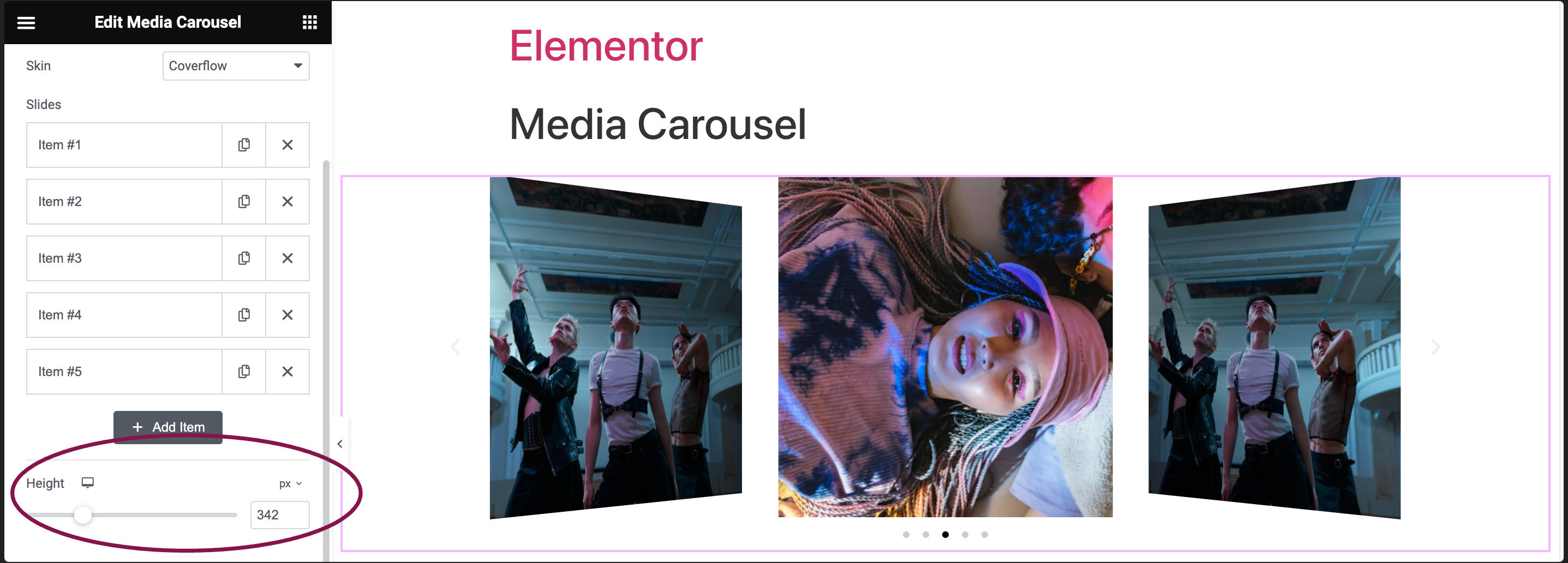
- In the Width field, use the slider to define the width of the carousel.
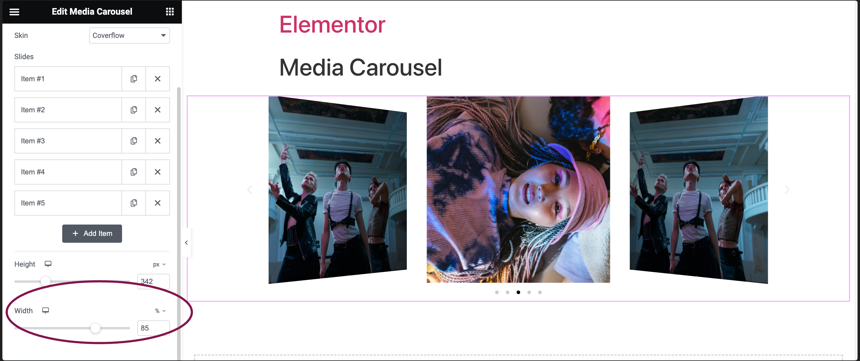
Settings for the Image Carousel widget
In the Content tab, you can customize various carousel skin designs and access other additional options.
Content tab
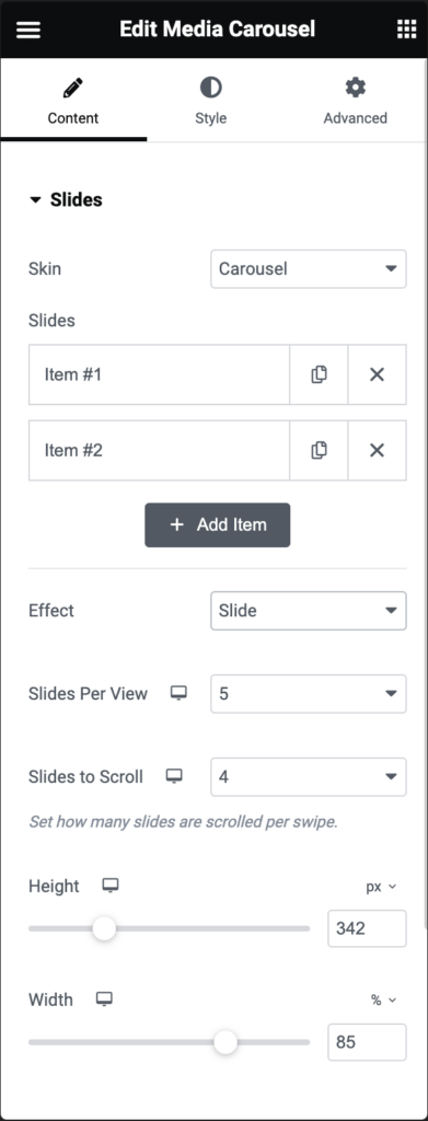
Slides
- Skin: You get different skin options to choose from. If you select Carousel, the further options are:
- Slides: Upload images or videos and set their respective URLs.
- Effect: Choose the transition style between slides: Slide, Fade, or Cube.
- Slides Per View: Decide how many slides are visible simultaneously, from 1 to 10.
- Slides to Scroll: Choose the number of slides that move during a single swipe from 1 to 10.
- Height: Use the slider to adjust the height of the carousel.
- Width: Use the slider to set the widget of the carousel
Additional Options
- Arrows: Enable the toggle to display navigation arrows.
- Pagination: Choose from various pagination styles: None, Dots, Fraction, Progress.
- Transition Duration: Set the speed of slide transitions in milliseconds (e.g., 1000 ms = 1 second).
- Autoplay: Decide if the carousel should automatically play slides.
- Autoplay Speed: Adjust the interval between each slide transition in milliseconds.
- Infinite Loop: Choose whether the carousel should loop continuously.
- Pause on Hover: Determine if autoplay should pause when a user hovers over the carousel.
- Pause on Interaction: Determine if autoplay should pause when a user interacts with the carousel.
- Overlay: Opt for an overlay style when hovering over slides: None, Text, or Icon.
If you choose Text:- Caption: Choose which text to display as the caption – Title, Caption, or Description
- Animation: Choose from Fade, Slide Up, Slide Down, Slide Right, Slide Left, Zoom In
If you choose Icon:
- Icon: Choose from a search icon, plus icon, eye icon, or link icon.
- Image Resolution: Pick an image size preference from Thumbnail, Full, or Custom.
- Image Fit: Decide how images should fit within their containers: Cover, Contain, or Auto.
- Lazyload: Enable the Lazyload toggle to load images only when they are about to be displayed. This feature helps in improving page speed. Learn more about Lazy Loading
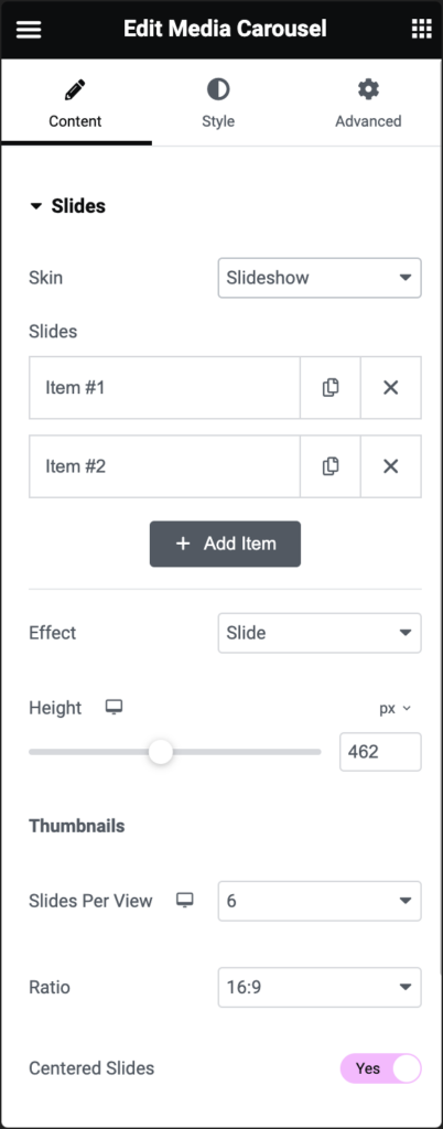
Slides
- Skin: You get different skin options to choose from. If you select Slideshow, the further options are:
- Slides: Upload images or videos and set their respective URLs.
- Effect: Choose the transition style between slides: Slide, Fade, or Cube.
- Height: Use slider to adjust the height of the slide show.
Thumbnails
- Slides Per View: Decide how many slides should be visible simultaneously, from 1 to 10.
- Ratio: Select the aspect ratio of the thumbnails from options like 1:1, 4:3, 16:9, or 21:9.
- Centered Slides: Toggle on this option to have the current slide appear at the center of the slideshow view.
Additional Options
- Arrows: Enable the toggle to display navigation arrows.
- Transition Duration: Set the speed of slide transitions in milliseconds (e.g., 1000 ms = 1 second).
- Autoplay: Decide if the carousel should automatically play slides.
- Autoplay Speed: Adjust the interval between each slide transition, in milliseconds.
- Infinite Loop: Decide if the carousel should play in an endless loop.
- Pause on Hover: Determine if autoplay should pause when a user hovers over the carousel.
- Pause on Interaction: Determine if autoplay should pause when a user interacts with the carousel.
- Image Resolution: Pick an image size preference from Thumbnail, Full, or Custom.
- Image Fit: Specify how images should be scaled within their containers: Cover, Contain, or Auto.
- Lazyload: Enable the Lazyload toggle to load images only when they are about to be displayed. This feature helps in improving page speed. Learn more about Lazy Loading
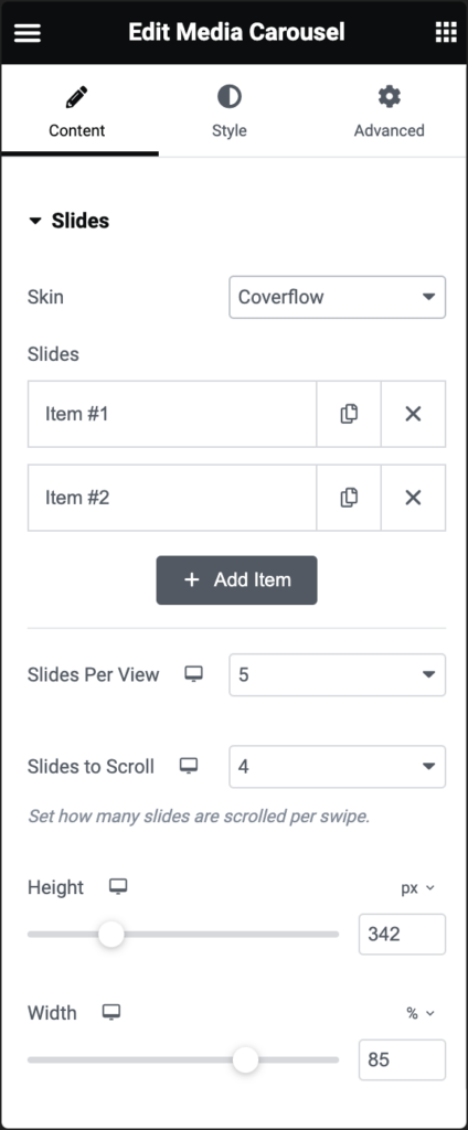
Slides
- Skin: You get different skin options to choose from. If you select Coverflow, the further options are:
- Slides: Upload images or videos and set their respective URLs.
- Slides Per View: Determine the maximum number of slides visible simultaneously, from 1 to 10.
- Slider Per Scroll: Define how many slides should transition during a single swipe, from 1 to 10.
- Height: Adjust the vertical size of the carousel.
- Width: Modify the horizontal size of the carousel.
Additional Settings
- Arrows: Enable the toggle to display navigation arrows.
- Transition Duration: Set the speed of slide transitions in milliseconds (e.g., 1000 ms = 1 second).
- Autoplay: Decide if the carousel should automatically play slides.
- Autoplay Speed: Adjust the interval between each slide transition in milliseconds.
- Infinite Loop: Decide if the carousel should play in an endless loop.
- Pause on Hover: Determine if autoplay should pause when a user hovers over the carousel.
- Pause on Interaction: Choose if the autoplay feature should pause when a user interacts with the carousel.
- Image Resolution: Pick an image size preference from Thumbnail, Full, or Custom.
- Image Fit: Specify how images should be scaled within their containers: Cover, Contain, or Auto.
- Lazyload: Enable the Lazyload toggle to load images only when they are about to be displayed. This feature helps in improving page speed. Learn more about Lazy Loading
Style tab
In the Style tab, you can customize slides, navigation arrows, and pagination dots by modifying colors, backgrounds, and other visual settings.
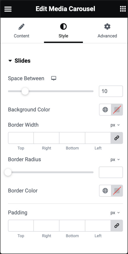
Space Between
Use the slider to adjust the space between slides.
Background Color
Select a background color for the carousel.
Border Width
Determine the thickness of the carousel’s border.
Boder Radius
To create rounded corners around the image, increase the border radius. For more details, see Border radius tools.
Border Color
Pick a color for the carousel’s border.
Padding
Set the internal spacing within the carousel.
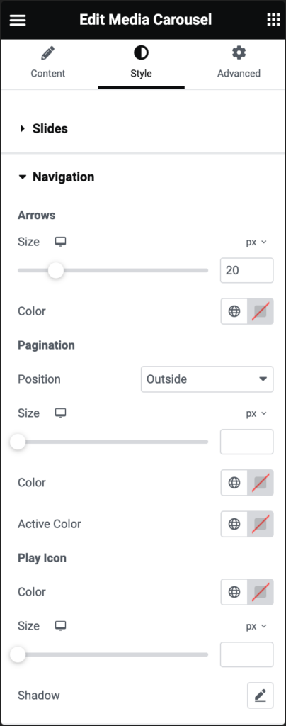
Arrows
- Size: Use the slider to set the size of the arrows. Size can be in PX, EM, REM, or Custom. Learn more about Units of measurement.
- Color: Select the arrow color.
Pagination
- Position: Decide if the pagination should appear inside or outside the slides.
- Size: Define the dot size in PX, EM, or REM, or add a custom size. Learn more about Units of measurement.
- Color: Choose the dot color.
- Active Color: Choose the color for the currently active dot.
Play Icon (applicable only when video slides are present)
- Color: Set the color for the play icon on video slides.
- Size: Define the play icon’s size in PX, EM, or REM. Learn more about Units of measurement.
- Shadow: Apply a shadow effect to the video play icon text.
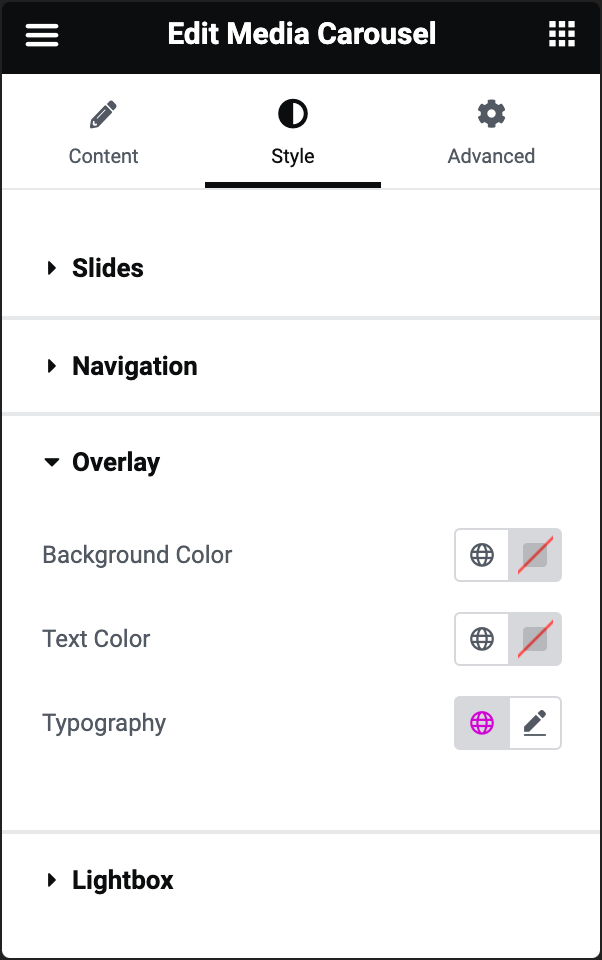
Overlay (not available on Slideshow type)
When selecting the Overlay feature, customization options vary based on the chosen overlay type:
For Text Overlay:
- Background Color: Set the background color for the overlay.
- Text Color: Define the color for the textual content within the overlay.
- Typography: Adjust font styles and other text-related properties of the overlay text.
For Icon Overlay:
- Background Color: Assign a background color for the overlay.
- Text Color: Select the color for any text associated with the overlay icon.
- Icon Size: Scale the size of the overlay icon. Size can be in PX, EM or REM. Learn more about Units of measurement.
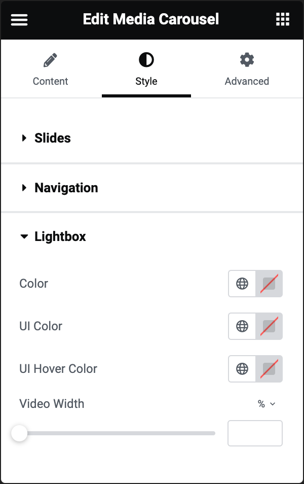
Color
UI Color
Specify the color for the lightbox’s UI elements, affecting the arrow, dot navigations, and the close (X) icon.
UI Hover Color
Determine the color change effect for the lightbox’s UI elements when users hover over them.
Video Width
Adjust the width dimension for displayed videos within the lightbox.
Advanced tab
The Advanced tab provides options to control the media carousel position, adjust the spacing, add custom code, and more.
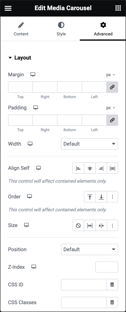
Advanced
Learn more about the Advanced tab settings.

