
Add a Contact widget
To add a Contact widget:
- Drag the Contact widget to the canvas.
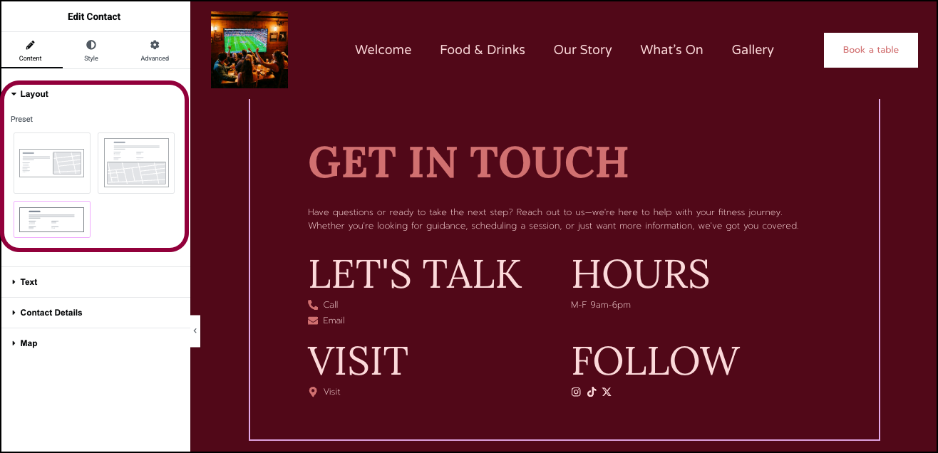
- In the Layout section of the panel, choose one of three presets for the contact information.
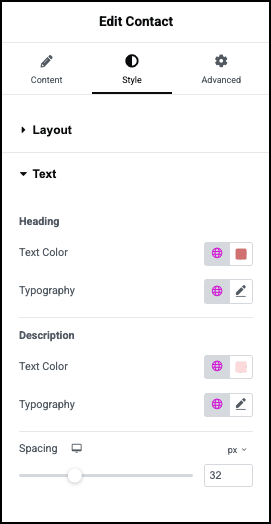
- Open the Text section.
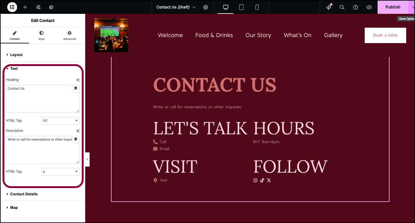
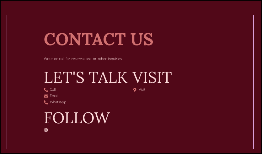
- In the Heading field, enter: Contact Us.
- In the Description field, enter: Write or call for reservations or other inquiries.
- Open the Contact Details section.
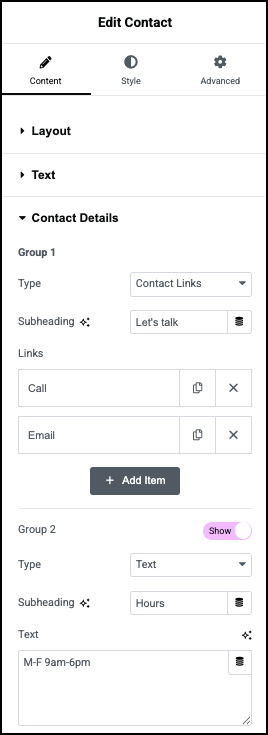
By default there are four sections to the Contact widget. There are three types of sections:- Contact Links: Designed to display email addresses, phone numbers and other contact details.
- Text: Designed to display free text.
- Social Icons: Designed to display links to various social media sites.
- Group 1 contains Contact Links, here we’ll add ways for customers to email or call the bar.
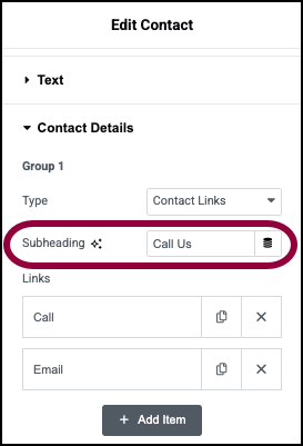
- In the Subheading text box, enter: Call Us.
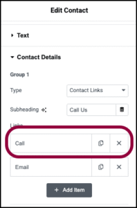
- In the Links section, click the Call field.
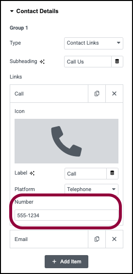
- In the Number field, enter your phone number.
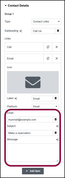
- Click the Email field and enter your Email and a Subject line. We’ll leave the Message field blank.
Contact details allows you to add different ways to contact you. Let’s add a Whatsapp number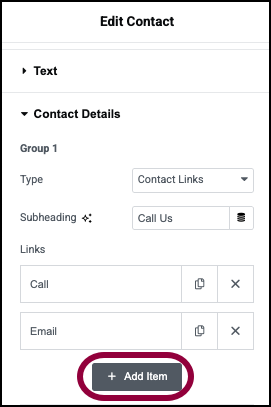
- Click Add Item.
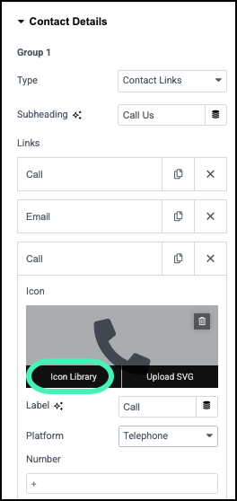
- Click the Icon field and select Icon Library.
This opens the Icon Library.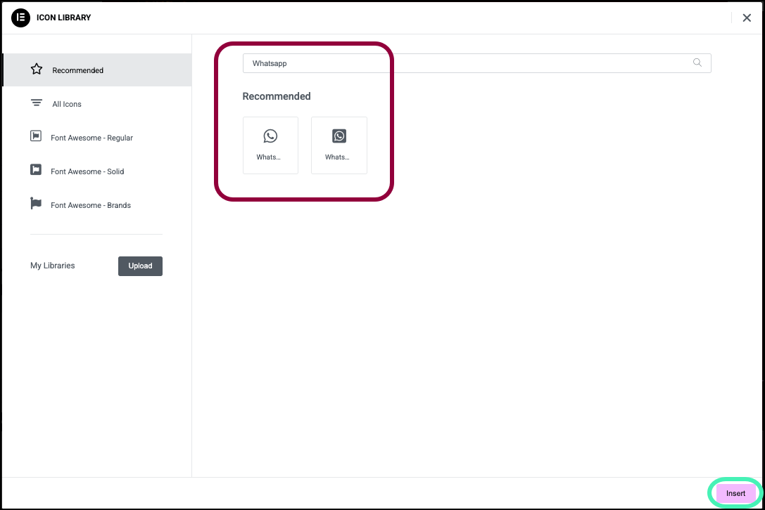
- Select the WhatsApp icon from the library and click Insert.
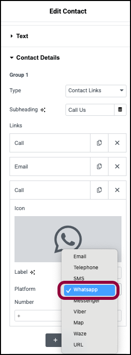
- Select WhatsApp from the Platform dropdown library.
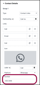
- Enter a WhatsApp number in the Number field.
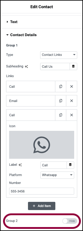
- In our case, we don’t want to show opening hours. Toggle Group 2 to Hide.
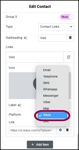
- Let’s add a way for visitors to find the bar. In Section 3, select Waze from the Platform dropdown.
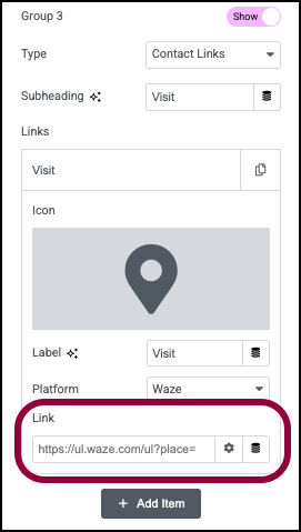
- In the Link field, add a Waze link. Consult Waze documentation for details on creating a Waze link.
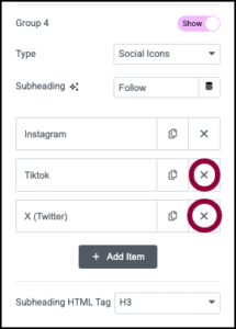
- Section 4 contains links to social media. The bar only has an Instagram account so first click the delete icons next to the X and TikTok icons.
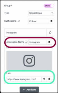
- Click the Instagram field and, in the Link field enter a link to an Instagram account.
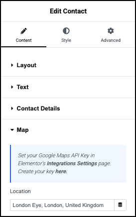
- In the Map section, you can add a link to Google Maps. For details, see Google Maps integration.

Group 1,2,3,4
Type
Subheading
Links
Links appear in Contact Details and Social Icons groups.
- Click a link to edit information in the link. For example, click on the Call link to add a phone number. You can also change the label of link and the type of link.
- Click the delete icon
 to delete a link.
 - Click the copy icon
 to duplicate a link.
Text

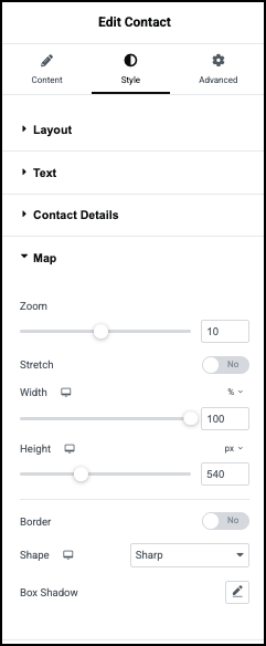
Zoom
Stretch
Width and Height
Border
Box Shadow
Click the pencil icon  to add a shadow to the map. Learn more about shadows.
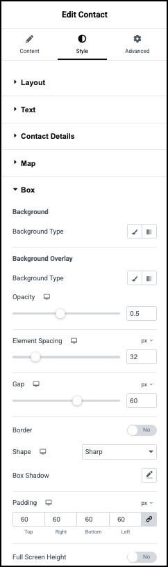
Background
Background Overlay
Element Spacing
Gap
Border
Shape
Box Shadow
Click the pencil icon to add a box shadow to the Contact widget. Learn more about shadows.
Padding
Full Screen Height


