Add the widget
Add the widget to the canvas
- In Elementor Editor, click +.
All available widgets are displayed. - Click or drag the widget to the canvas. For more information, see Add elements to a page.
What is the Accordion widget?
The Accordion widget allows you to display text in a collapsed, condensed manner, saving space while presenting abundant content. Visitors can see condensed titles and selectively expand items for more detailed information.
- If you are using nested elements, the Accordion widget incorporates the capabilities of Toggle widget and replaces it. This means the Toggle widget will no longer be available. Existing toggles are unaffected by this change and they can still be edited.
- If you are using nested elements, the Accordion widget can include nested elements. For details see, Add an Accordion widget below.
The default Accordion widget is similar to the Toggle widget, but there are two main differences:
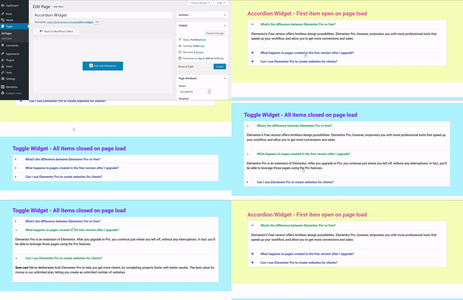
- The first item of the Accordion widget is expanded on page load, while all others remain collapsed. With the Toggle widget, however, all items are collapsed when a page is first loaded.
- Only one item of an Accordion can be expanded at a time, automatically collapsing the previously opened item. With the Toggle widget, however, visitors can open as many items as they want.
Common use case
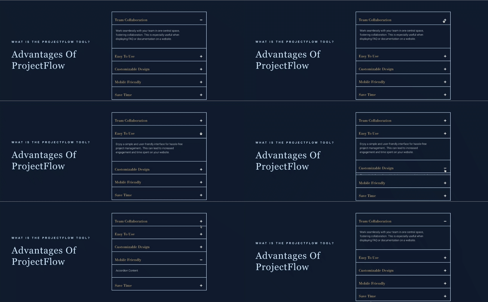
Sam is introducing a new project management tool on the company website. They are looking for a creative way to showcase the tool’s advantages.
They then plan to use the accordion to break down the tool’s advantages into bite-sized pieces. Visitors can quickly navigate through titles mentioning features like Team Collaboration or Save Time and explore each in more detail. This accordion format ensures a clean and organized presentation, allowing potential users to absorb the key advantages effortlessly.
They also leverage the power of schema by enabling the FAQ Schema feature of the accordion widget. They include a common question, “How to Get Started?” with a quick start guide accessible via a button. Enabling FAQ Schema helps search engines recognize and highlight this FAQ, improving the visibility of the tool in search results.
Additional use cases
- Use the Accordion widget to streamline and categorize frequently asked questions for efficient customer support on your website.
- Present event schedules and details in a collapsible format, enhancing readability and user interaction with the Accordion widget.
- Design an interactive travel itinerary planner, allowing users to expand and explore details about each leg of their journey using the Accordion widget.
- Enhance your cooking blog by organizing recipes with the Accordion, separating ingredients and instructions for a user-friendly cooking experience.
Video
See a video demonstrating the widget in action.
Add an Accordion widget: Step-by-step
- Add the Accordion widget to the canvas. For details, see Add elements to a page.
- In the Content tab, under Accordion, use the Accordion Items to add content to your accordions.
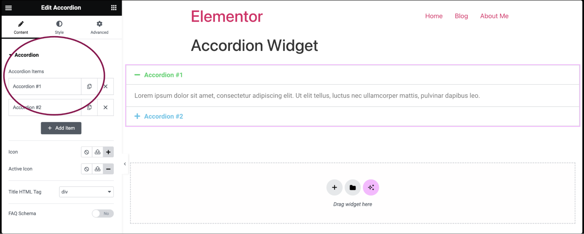
- By default, the accordion widget comes with five default accordions: Accordion #1, and Accordion #2. You can add content, delete the accordion, and add a new one.
- To add content, click on the accordion item.
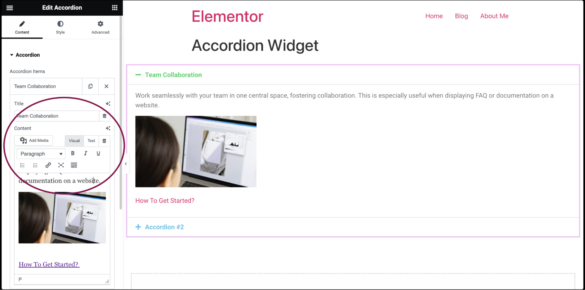
- In the Title and Content field, add the title and description for each accordion item. You can also include images and make text clickable by adding links.
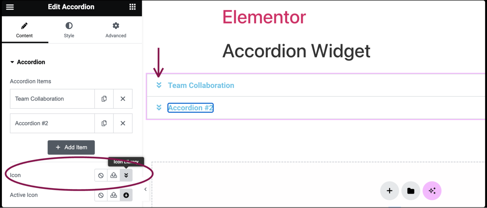
- Use the Icon field to select the icon to represent the action of expanding an item. Choose either None, Upload SVG, or select an icon from the Icon Library. If Icon Library is chosen, a Recommended tab is displayed in the Library which shows recommended icons to represent the expanding concept.
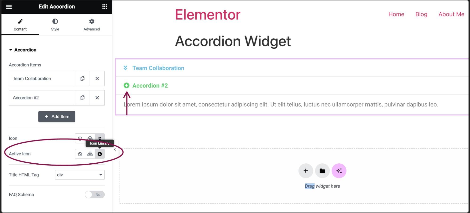
- In the Active Icon field, select the icon to represent the action of collapsing the active item. Choose either None, Upload SVG, or select an icon from the Icon Library. If Icon Library is chosen, a Recommended tab is displayed in the Library which shows recommended icons to represent the collapsing concept.
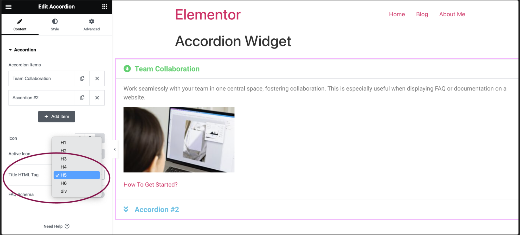
- In the Title HTML Tag field, set the HTML tag used for the title to H1- H6 or DIV.
- Toggle the FAQ Schema option to enable or disable schema usage.
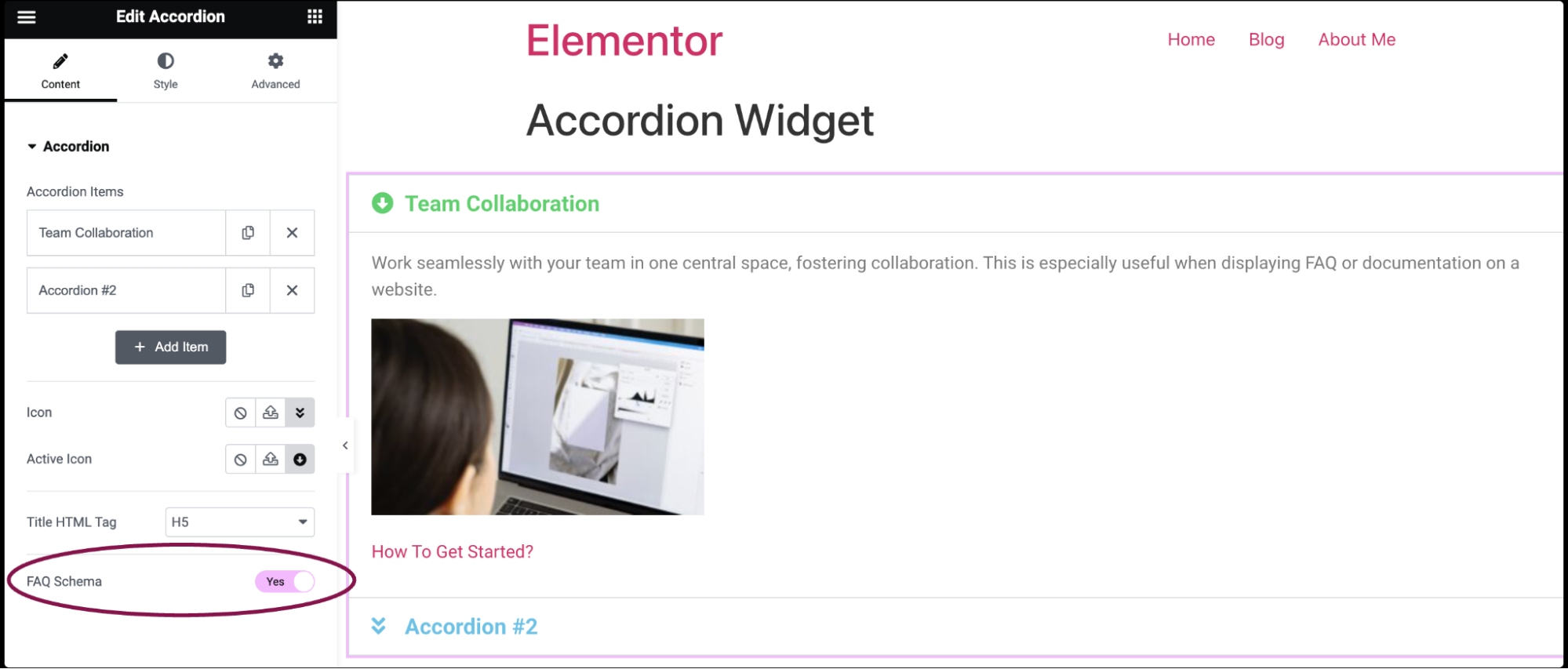
Settings for the Accordion Widget
You can customize your widgets using content, style, and other advanced parameters, offering you great flexibility in tailoring them to your needs. Click the tabs below to see all the settings available for this widget.
Content tab
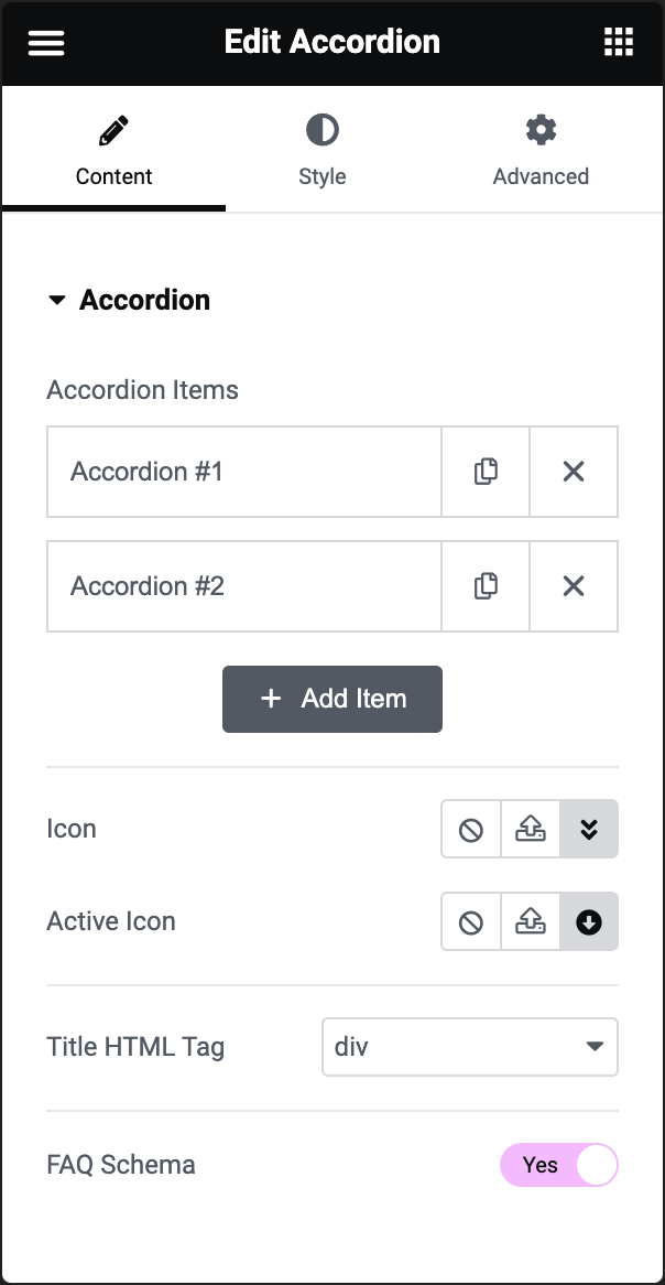
Accordion Items
Enter content such as titles and descriptions for each accordion.
Icon
Select the icon for expanding an item.
Active Icon
Select the icon for collapsing the active item.
Title HTML Tag
Set the HTML tag used for the title (H1-H6 or DIV).
FAQ Schema
Toggle to enable or disable the option to use schema.
Style tab
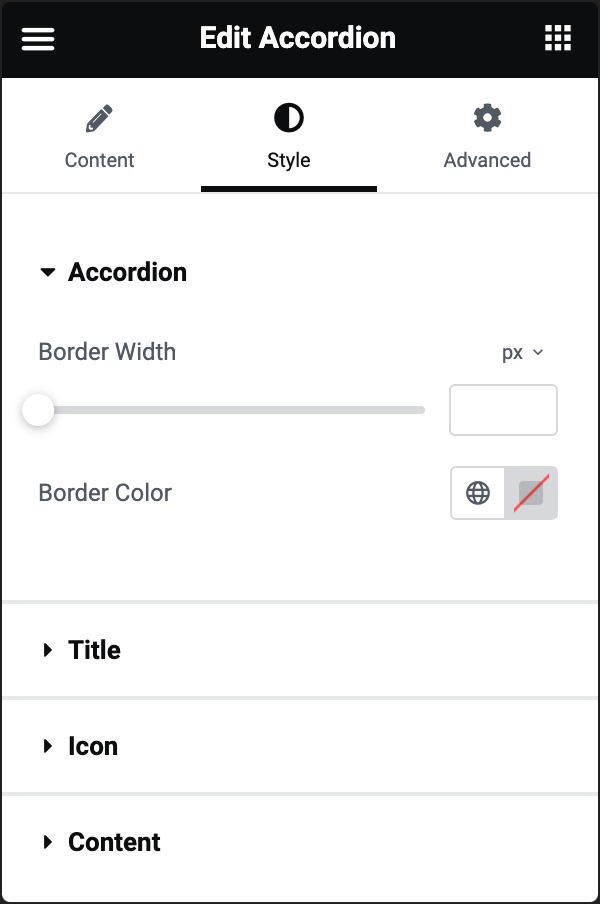
Accordion
- Border Width: Set the thickness of the border around the accordion and between each item
- Border Color: Choose the color of the border around the accordion and between each item
Title
- Background: Choose the color of the title’s background
- Color: Choose the color of the non-active titles’ text
- Active Color: Choose the color of the active title’s text
- Typography: Set the typography options for the titles. For more details, see Typography.
- Text Stroke: Click the 🖋️ icon icon to apply a stroke effect to the title. Learn more about Text Stroke.
- Text Shadow: Click the 🖋️ icon to add a shadow to the title. Learn more about shadows.
- Padding: Set the padding for the titles
Icon
- Alignment: Align the icon to the left or right of the title
- Color: Choose the color of the icons
- Active Color: Choose the color of the active icon
- Spacing: Control the spacing between the icon and the title
Content
- Background: Choose the background color of the content
- Color: Choose the text color of the content
- Typography: Set the typography options for the content
- Text Shadow: Click the 🖋️ icon to add a shadow to the description. Learn more about shadows.
- Padding: Set the padding for the content.
Advanced tab
The Advanced tab provides options to control widget position, adjust spacing, add custom code, and more.
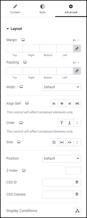
Advanced
Learn more about the Advanced tab settings.