Table of Contents
The ability to create stunning visual effects is immense with Elementor. Web designers can execute their creative ideas faster than ever, and produce designs that would otherwise take much longer before Elementor arrived on the scene.
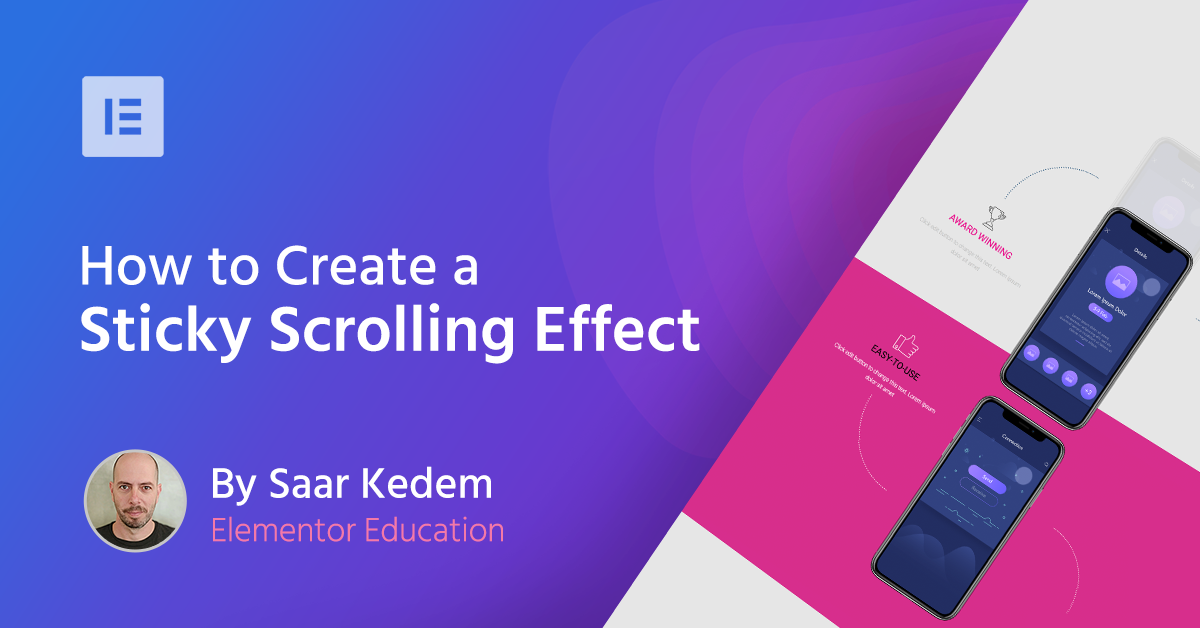
In this article, we demonstrate a trick for the sticky scrolling effect, which creates the illusion of a mobile phone sliding down vertically until it overlaps with a second phone.
This effect was first presented in a web design speed art video we released earlier this week. This optical illusion continues on into the next section where the second mobile phone merges with the third and last one.
The guide is divided into five steps, following the page structure. We do not go into technical details such as font settings, but instead, focus on the main elements that help us create the sticky scrolling effect. The full technical details appear in the video itself.
Let’s get started!
01 Apply a Sticky Scrolling Effect
After laying the foundations for a landing page — creating a page title, adding a new section with three columns, choosing and styling fonts — you will need to create the effect itself. Insert an image of a mobile phone into the central column. Then go to Edit Image > Advanced > Scrolling Effect > Sticky, and select the Top option.
This sticks the image on the top of the page. To determine the specific point from where the image will stop scrolling down with the page, adjust the offset function, located in the Scrolling Effect panel. We set the offset to 250px.
02 Set a Background Overlay Image
To complete the sticky scrolling effect, set a background overlay image. Then go to Edit Column > Style, and adjust the image size and settings, so the picture will perfectly overlap with the foreground image.
03 Adjust the Z-Index
First, duplicate the first section. Then adjust the mobile image’s z-index values, so it makes the mobile phone slide beneath the second phone in the following section.
If you’re interested in knowing how we designed the additional images and entrance animation, please watch the video tutorial.
04 Complete the Last Part of the Effect
Duplicate again the first section to create the third section. Here, as in the previous section, you need to adjust the z-index to higher values, so the second mobile phone will slide underneath the third phone image.
Since this is the section where you want the sticky scrolling effect to stop, go to Edit Image > Advanced > Scrolling Effect > Sticky, and select None.
05 Make the Mobile Disappear
Based on the scrolling effect settings in the two first sections, the mobile phone image will basically keep sliding down, and we don’t want that. This is why you need to apply another trick here.
First off, add a new section. Then add color to it and adjust the section height. Last but not least, adjust the z-index to give your section higher values than the images. This way the images disappear behind the last section.
Did it work for you? Were you able to recreate the magic? Let us know what you thought in the comments section below.
Looking for fresh content?
By entering your email, you agree to receive Elementor emails, including marketing emails,
and agree to our Terms & Conditions and Privacy Policy.


