April has done wonders for your creativity, so I have been impressed. We had so many great website submissions for this past month, that the mission of selecting ten Elementor websites was more difficult than usual this time. Maybe it’s the extra time that you spent at home which engaged you to outdo yourself, or maybe it’s just a coincidence. But I found far more than ten websites worthy of the top 10, so much so that I had to push some of them forward for next month because I could not give up on them.
And once again (the first time was in June 2019), we’re witnessing an Australian takeover with 5 out of 10 entries made in the land Down Under. Good on ya mates!
Now, let’s get started.
10
Relearn Digital
Relearn Digital delivers digital marketing courses for small businesses. The courses are designed to hand the power back to marketers and entrepreneurs alike by demystifying and unpicking digital jargon with actionable outcomes.
Relearn’s website teaches digital marketing, and as such, we could expect to see the usual choice of colors familiar to the digital world: bright blue or turquoise (or both). Thus, it is very refreshing to see a color palette of watermelon red and the deep purple/black, which also compliment each other very well. The result is “warm” and welcoming.
The colors, as well as the lovely icons, also help distinguish between the different courses. The warped patterns were introduced to provide the brand with fluidity, which is suggestive of the continual evolving nature of digital marketing. There’s an overall sense of clarity and modernity, reinforced by the use of Molly font for the body text, and the clear structure and hierarchy of the text that make it very simple to read and understand.
Design & Development: Chris Forsyth – Studio Grit
Theme: Hello
Plugins: Advanced Custom Fields, Ele Custom Skin, Make Column Clickable Elementor, Messenger Customer Chat, Piotnet Addons for Elementor Pro, Simple Custom CSS, SVG Support, Sticky Header Effects for Elementor, WP Fastest Cache, Yoast SEO ,
09
Flames and Roses
Flames & Roses are especially designed color grading LUTs and presets
that help your film footage or photographs look more cinematic. Flames & Roses LUTs and presets are easy to use – they are available for download and for use inside the most popular editing software.
An alternative source of livelihood for a wedding photographer, especially during times when holding large events like weddings is prohibited, we liked the idea and the execution. First off, this business addresses a specific target audience. This is not the conservative romantic audience, but a more alternative, even rough (and tattooed) audience, people who lead a different, more edgy, lifestyle. This is reflected in the logo, the brand’s name, the people photographed, the scenes taken, and the filters used (shades of gray).
The site also includes a small online store built with Elementor’s WooCommerce Builder, allowing them to sell the presets online. The wedding films displayed in the Editing Services page are more reminiscent of indie films than the usual conservative productions. There are no warm and soft colors here, nor elegant handwriting fonts. If you are looking for romance, look for it elsewhere.
Design & Development: Thomas Anderson
Theme: Astra Pro Whitelabel
Plugins: Premium Addons for Elementor, JetEngine, The Plus Addons for Elementor,
JetBlocks for Elementor, Ultimate Addons for Elementor, JetElements, Instagram Feed Smash Balloon, Make column clickable, WooCommerce, Rank Math Seo, Flexible Elementor Panel, Events Tracker for Elementor, LuckyWP Table of Contents, LiteSpeed Cache Free
08
Four Trees Media
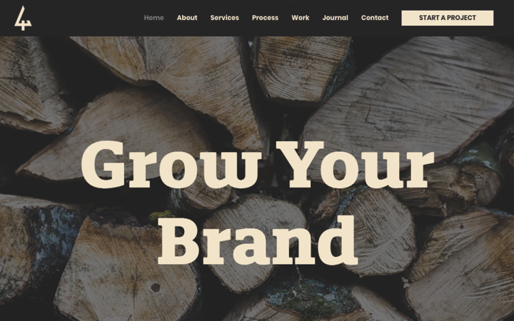
Four Trees Media is a family-run design company in Perth, Western Australia. Offering branding print and web services, they work with companies and individuals to create impactful brands and bespoke communication strategies.
When we build a new brand, we are actually starting a growth process
— from the idea stage to a strong and established brand. 4 Trees Media decided to apply this concept at the fullest. Throughout the site, the motif of trees and growth is visible, something that resembles sites dedicated to the topics of sustainability or recycling. The designer applied a brown-yellowish filter to the images, continuing the tree motif.
The modern edge that gives the site a studio site look rather than that of a sustainability site, comes from the texts written in modern Roboto font, and the square structure throughout the site — whether it’s in the intro designed inside a black box or the delicate black frames. There is also a combination of coarse design along with a delicate design that strikes a balance. This is reflected in the rough and heavy title font against the body text written in a light and pleasant font. Or the contrast between the dark and the ceramic colors.
Design & Development: David Forster – Four Trees Media
Theme: Astra
Plugins: All-in-One WP Migration, Contact Form 7, Custom Fonts, Elementor – Header, Footer & Blocks, Elements Kit Lite, Essential Addons for Elementor, GDPR Cookie Consent, Hotjar, myStickymenu, Premium Addons for Elementor, Really Simple SSL, Safe SVG, Site Kit by Google, Smush, Wordfence Security, WP Fastest Cache, Yoast SEO
07
Melbourne Health Psychology Centre
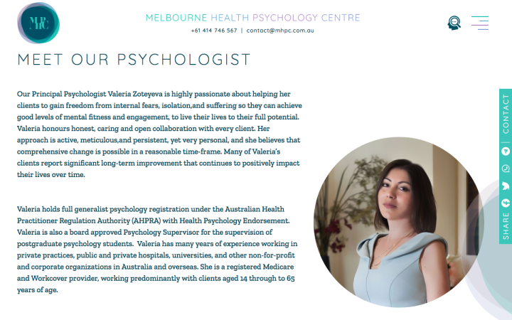
Melbourne Health Psychology Centre (MHPC) provides evidence-based treatment for a wide range of psychological problems.
Their website gets us into a therapeutic mindset. Although the designer chose green and blue tones that are normally associated with the world of medicine, the combination with the purple tones gives the site a more dreamy, and even introspective look and feel, and creates a kind of gradient that is very much associated with the world of psychology.
Applying a white mist filter and gradient touches also transmits the feeling of dreams and thoughts, much like the movies we watch, in which the lead actor is imagining or day-dreaming. The designer’s attention to small details is evident in the search icon, or in the loading icon.
Design & Development: Mikhail Morozov
Theme: GeneratePress
Plugins: Advanced Custom Fields PRO, Elementor Pro, Gravity Forms, Head, Footer and Post Injections, JetTabs For Elementor, LiteSpeed Cache, Redirection, Schema Pro, Simple Custom CSS and JS, Slider Revolution, Wordfence Security, Yoast SEO Premium, Yoast SEO: Local
06
Dettmann Homes
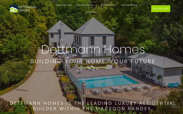
Dettmann Homes have been building prestige custom-built homes and renovating quality existing homes in the Macedon Ranges (central Victoria, Australia) since 2008. Dettmann Homes takes on a strictly limited number of projects each year to ensure quality and service standards are maintained.
The choice of white background combined with the lines that embellish the site, along with the large line icons, the modern sans serif font, and the elegant projects gallery, give Dettmann Homes’ site a modern and architectural feel. The relatively large texts and images depicting wide spaces and luxurious large houses, adds a sense of spaciousness.
Design & Development: Macedon Digital
Theme: Astra Pro
Plugins: Advanced Custom Fields PRO, Elementor Pro, Gravity Forms, Head, Footer and Post Injections, JetTabs For Elementor, LiteSpeed Cache, Redirection, Schema Pro, Simple Custom CSS and JS, Slider Revolution, Wordfence Security, Yoast SEO Premium, Yoast SEO: Local
05
Enjoy Group
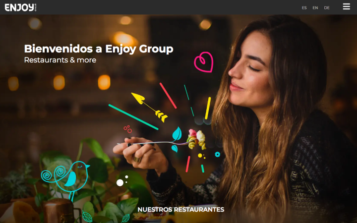
Enjoy group is a lifestyle hospitality group located in the Balearic island of Palma de Mallorca. It includes a variety of unique venues throughout the island, trendy restaurants, cafes, and bars.
The website welcomes the visitors with an attractive “visual list” of the venues: each venue gets its own unique color and image in their own spirit. Together, they create a cool, vibrant, and festive layout, putting us in a mood of freedom and fun. As the visitors enter the internal pages of each restaurant, a new world is revealed to them, and they are exposed “to the celebration inside.”
Design: Javi Lozano
Development: Enjoy Group
Theme: GeneratePress
Plugins: Premium Addons for Elementor Pro, MouseWheel Smooth Scroll, Preloader Plus, WooCommerce, WP Front Scroll Top
04
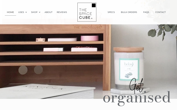
Since 2014, The Space Cube has been designing and selling its multi-functional organiser that works in finite spaces and looks appealing in multiple environments. It’s a functional product with a clean aesthetic that saves space, holds more than you ever thought possible, and looks great in any room of the home or office.
Space Cube’s designer took the cube motif, or more correctly the boxes-arrangement and applied it to every visual element. Each area of the site is divided and bounded in one form or another into a box. Whether it is the texts that are divided into two beautifully clipped columns, the lines that decorate the site and border each area in a different way, or even in areas with a background image — where there is also a white space bordering for the texts.
The overall look of the site is very clean and tidy and feels very “designed”. The choice of dark gray rather than black for the text, as well as the combination of the title font with the “handwriting” font makes the reading more pleasant and inviting.
Design & Development: Robyn Smart
Theme: Astra
Plugins: Akismet Anti-Spam, Checkout Field Editor for WooCommerce, Facebook for WooCommerce, Redirection, Smush Pro, WPMU DEV Dashboard, Twist, Ultimate Addons for Elementor, WooCommerce, WooCommerce Admin, Wordfence, WP Rocket, Yoast SEO, Yotpo Social Reviews, Google Analytics Dashboard for WP (GADWP), Head, Footer and Post Injections, ManageWP – Worker
03
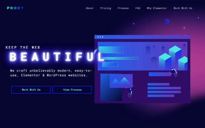
Proxy is an entirely-Elementor focused web design agency. They pride themselves on crafting modern, easy-to-use, Elementor websites. This is the first time we’re encountering an agency on the showcase that is fully dedicated to Elementor-based solutions, and uses them as the basis for their business model. Interesting concept ;).
As an agency that boasts “unbelievably modern, easy-to-use, Elementor websites”, they created a website showcasing Elementor capabilities with a complementary look and feel: a slick, space-age, cool retro design reminiscent of 80’s arcade games, with a fitting bluish-purple color, Roboto Mono font, floating characters, captivating animated icons and Lottie animations, and particle backgrounds. The result is an original website, keeping the users engaged without totally overwhelming or distracting them from the content.
Theme: Hello
Plugins: Animated SVG Icons for Elementor, Async JavaScript, Autoptimize, Better Search Replace, Cache Enabler, Disable “Big Image” Threshold, Easy Updates Manager, Element Pack, Happy Elementor Addons, Insert Headers and Footers, Make Column Clickable Elementor, Piotnet Addons for Elementor Pro, Simple Featured Video, Ultimate Addons, WP Redis, Yoast SEO,
02
3M Buckley Innovation Centre
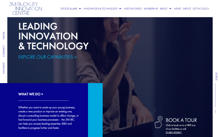
Based in Huddersfield, UK, the 3M Buckley Innovation Centre provides a space for enterprise and innovation for businesses across the region. They offer hot desking and meeting room hire as well as providing business with the lab space and technology to bring their creations to life.
3M BIC’s website conveys a clear message of technological innovation. This is achieved by using various elements: the video in the hero section which takes you through the 3M BIC building showcasing its state-of-the-art technology; the blue and gray colors strongly associated with the hi-tech world; the modern lightweight Futura font, and, of course, the hexagonal-shaped images that illustrate the activity inside the centre (and also implies on a place busy like a beehive. Throughout the site, a slight motion is visible as the visitor scroll down, increasing the sense of “progress”.
Design & Development: Sam – browndog.agency
Theme: Hello
Plugins: Advanced Custom Fields Pro, Mega Menu Pro, Gravity Forms, Events Calendar Pro, The Grid, Yoast SEO
01
Phio
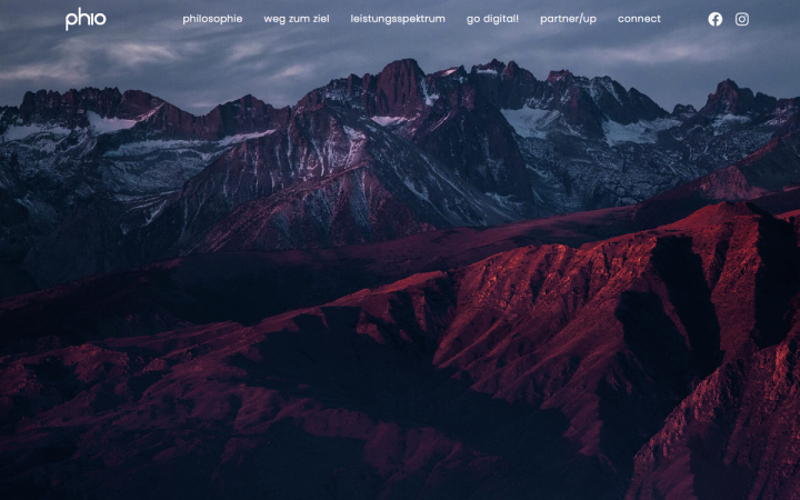
Phio is a German digital consulting and marketing company, with the goal to help small or medium-sized companies reach their goals through digitalization — analyzing the companies status quo, branding, building their web presence, social media management, social media advertising and finishing with a detailed consulting.
Landing on Phio’s above-the-fold gets us into a very dramatic atmosphere, thanks to a conspicuous full-screen image of an ice-covered mountain range in the horizon with the caption “It’s time for a change”. This intriguing headline makes us keep scrolling down to see what is hidden down the page.
As the visitors scroll down they “carve” their way inside the mountain, revealing new areas and information until they reach the end of the site, where the “Contact Us” form, or the light at the end of the tunnel, calls them to make the long journey to full digitalization together with Phio. What a great adventure!
Design & Development: Kristian Basic
Theme: Hello
Plugins: Borlabs Cookie – Cookie Opt-in, Hummingbird, PowerPack Elements, Smush, Sticky Header Effects for Elementor, Wordfence Security, Yoast SEO
Think your Elementor-based website or landing page should be featured in our next Top 10 Websites column? Give it a shot!
