This month, Australians are taking over! Not less than four entries from this lively nation down-under, so keep up the bonzer work, mates! Also making this month’s list are a Swiss web designer, a Canadian luxury Magazine, a large British sports website and more.
On top of that, we’re excited to see two website entries on this list that used Elementor’s Hello Theme. Since its official launch at the end of May, Hello has had over 40,000 installs and an average review score of 4.5. To be honest, we were surprised by the enthusiasm of end users who wanted to utilize Hello for their own creations. For more than a year, Hello had existed on Github addressing mainly developers, and apparently, the demand for light-weight themes is on the rise.
And now, let’s get down to business!
10
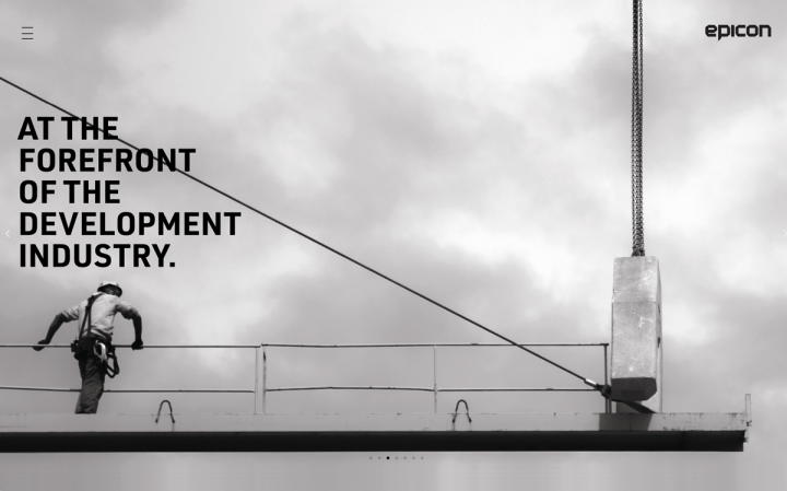
Epicon is a construction company based in Australia, involved in commercial and private home projects.
Their website is built in a way that resembles a presentation. While most of the pages, including the homepage, are designed entirely in black & gray colors, complemented by black & white background images of construction works or parts of buildings, the project pages present a complete contrast with dazzling colors and impressive whole structures. The architectural renderings are meticulously designed and help to produce an impressive experience. The images provide essentially almost all the required info, and if the visitor needs more data, they can scroll down to reveal a banner with additional details.
Design & Development: Artillery Group
Theme: Twenty Nineteen
Plugins: Limit Login Attempts Reloaded, Really Simple SSL.
09
Darps
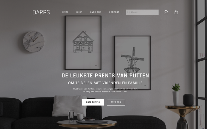
Darps is an online shop from the town of Putten in the Netherlands, selling posters, post- and greeting cards with sketches of well-known monuments and properties in Putten.
Darps’ site exhibits a modern North-European design: white, gray and black colors dominate the layout, with precise technical sketches that strengthen this urban look. The motion effects produce a fluidity as well as interest for the visitors. The designer also used Elementor’s WooCommerce Builder to set up their online shop.
Design & Development: Maurice van Riet
Theme: Hello
Plugins: ACF, WooCommerce, Loginpress
08
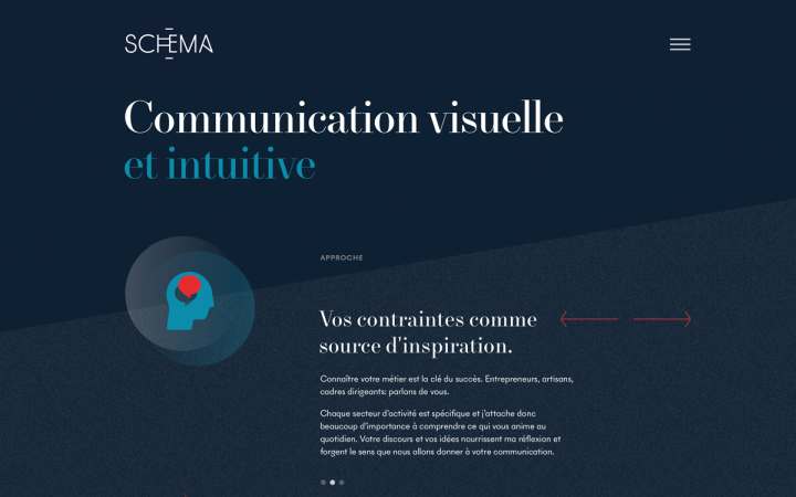
Michaël Baillot is a graphic and web designer with almost twenty years of experience, who recently opened his own studio. Specializing in visual identities, he had the opportunity to work for large-scale projects in the luxury, financial and institutional sectors.
Michaël’s one-page website has an elegant design that fits his potential clients. Three colors dominate the layout — dark blue, turquoise, and red, which contrast each other. Michaël also uses different color textures to reinforce this contrast and add depth. The use of the elegant font on the titles makes them pop out. The gentle parallax effects, along with the shape dividers, add a dynamic flow to the site, which is essentially static.
Design & Development: Michaël Baillot
Theme: GeneratePress
Plugins: All-in-One WP Migration, Co-Authors Plus, Complete Open Graph, Cookie Notice, Duplicate Post, Enable Media Replace, Favicon par RealFaviconGenerator, GA Google Analytics, Redirection, WP Super Cache, Yoast SEO
07
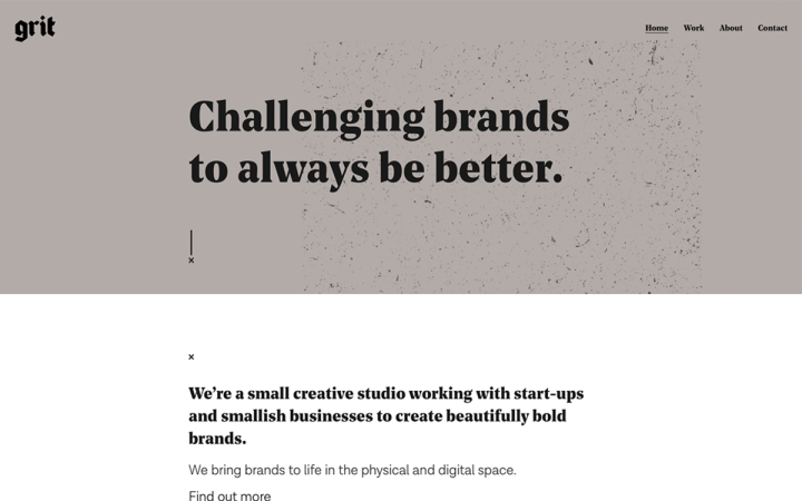
Studio Grit is a small creative studio from Geelong in Australia, working with start-ups and small businesses, helping them to shape their brand.
Grit’s website is big — big titles, big text, big images. It creates not just an impressive look, but also provides clarity. The font pairing helps to create a clear hierarchy. This hierarchy is kept in the project pages that have a grid of 2 columns; One column presents the kind of service provided, the second gives an in-depth description of the project. The use of mockups produces a ‘perfect’ look. We also liked the call-to-action, which in this case is not a button, but instead a small section that changes its color on hover.
Design & Development: Chris Forsyth
Theme: Bifrost
Plugins: Neuron Core, Smart Slider 3, Simple Page Ordering, Smush, WP Fastest Cache, Yoast SEO
06
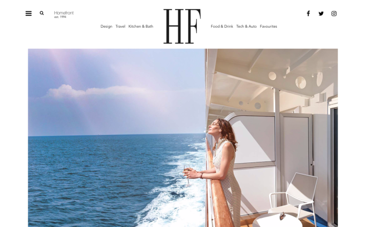
Founded in 1994, the Canadian premiere luxury lifestyle magazine HomeFront teases its readers with a sneak preview of the world’s finest in design, lifestyle, and travel.
Everything on their website screams luxury: the logo, the font, and of course, the high-resolution leisure photos. The text color is gray, adding even more to the atmosphere of prestige and refinement. The hover effect on the blog posts is almost playful, enticing the visitor to click on the post. The images inside the blog posts are huge and vibrant, transmitting the experience.
Design & Development: PixelCyan
Theme: OceanWP
Plugins: AdRotate Professional, ACF, Better Search Replace, Google Analytics Dashboard for WP, ManageWP – Worker, Ocean Extra, PowerPack Elements, SMTP, Smush Pro, TinyMCE Advanced, UpdraftPlus – Backup/Restore, User Role Editor, WP Post Redirect, WPMU DEV Dashboard
05
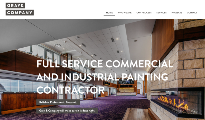
Founded in 1973 by brothers Paul and Phil Gray, Gray & Company provides a full-service commercial and industrial painting contractor.
Painting brush strokes is the central theme of the site design, and the designer made sure to incorporate them throughout the website. It is visible in the diagonal-cut images and shape dividers, the gray lines of color that are not uniform in size, and the blend mode effects applied to the images.
Design & Development: Bajillion
Theme: Astra
Plugins: AnyWhere Elementor Pro, Astra Pro, Ele Custom Skin, Element Pack, Gravity Forms, Pods, Powerpack Elements, SEOPress, Smush Pro, Wordfence, WP Fastest Cache, Pionet Addons for Elementor
04
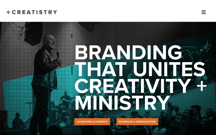
Creatistry is a branding & design agency for churches, nonprofit and faith-based organizations, helping them to communicate their message and fulfill their calling.
Demonstrating young spirit with almost Rock and roll aesthetics, Creatistry’s site is cool and trendy. The hero section displays a photo of a pastor preaching to a young enthusiastic crowd. He wears jeans and a leather jacket and could be easily mistaken for a startup entrepreneur or a stand-up comedian. Additionally, the image is edited using blend mode effects and background patterns. The color palette (appearing on the logo, too) implies the modern “start-upish” direction the designer took. Turquoise, for example, is often associated with websites of start-up or hi-tech companies. The designer took it even one step further, incorporating verses from the new testament with fitting visual elements, combining old and new.
Design & Development: Paul Povolni
Theme: Hello
Plugins: SEOPress, Duplicate Page
03
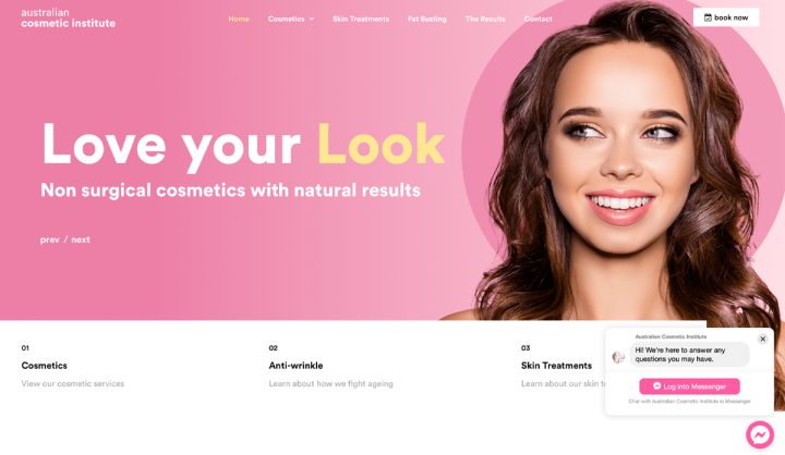
Australian Cosmetic Institute is a Melbourne-based clinic that offers a range of cosmetic treatments, assisting with anti-aging and the maintenance of a healthy and youthful appearance.
Their website conveys optimism, thanks to the bright and pleasant colors, the high-quality hero images and the funny copy. The way the hero images change, in combination with the motion effects (mouse track), adds to the fun and playfulness. The designer made efficient use of addons to present the services the beauty clinic offers in an interesting visual way. What’s more, the mix of amusing copy and cool photos contributes to this easy-going atmosphere (“Tell wrinkles where to go”).
Design & Development: Visual Tonic
Theme: Astra
Plugins: Custom Icons for Elementor, Elementor Extras, Jet Tabs for Elementor, Ultimate Addons for Elementor
02
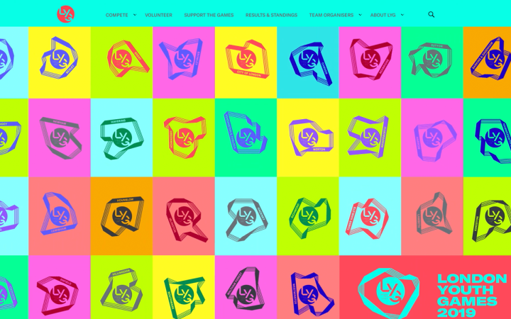
For some of the biggest names in sport, it all started at the London Youth Games. This organization has been inspiring young Londoners since 1977, when the London Youth Games were launched to celebrate the Silver Jubilee of Queen Elizabeth II. Since then, borough teams from all corners of London have been coming together every year to see who will win LYG’s Jubilee Trophy.
As a website that needs to display a lot of information, LYG’s website deals with it fantastically, maintaining a clear hierarchy and consistency throughout the entire website. To create a unified language, the designer used the striped medal ribbon as a central design motif, noticeable in icons and images. The duotone images together with the bright neon colors are popular trends that go hand in hand with the world of sports, giving LYG’s site the attention it deserves.
Design & Development: Loopmill
Development: Theme: GeneratePress
Plugins: ACF, Yoast SEO, Events Calendar, Enhanced Media Library
01
The Hopper is pioneering a combination of STEAM learning (Science, Technology, Engineering, the Arts and Mathematics) and a modern family gathering space. At The Hopper, visitors will find a menu of science and tech challenges alongside good food, craft beer, and wine. Coming to Boulder Colorado in 2020, The Hopper invites kids to rediscover play time with the parents, and parents to rediscover date night with the kids.
The inviting hero image that welcomes the site visitors — kids or their parents — perfectly conveys the essence of the entertaining experience awaiting them at the Hopper. Scrolling down reveals beautiful engraving illustrations in a style that flourished in the 19th century, and was widely used in science books. The designer applied various motion effects to these illustrations, which together with the bright and joyful (yet not childish) colors, the comics-like font and shape dividers contribute to the thrilling experience. The Team page is also worth a special visit — check out the team members’ gif images, showing them playing with ‘scientific experiments’. Like The Hopper’s concept, their website is innovative and cool.
Design & Development: Leo Borasio
Theme: OceanWP
Plugins: Yoast SEO, Jetpack, Updraft, Essential Addons, Lenix Leads
Think your Elementor-based website or landing page should be featured in our next Top 10 Websites column? Give it a shot!
