Table of Contents
Following the huge positive response we received after our Motion Effects tutorials, we decided to gather them into one article that will help you make more interactive websites very easily.
We will cover:
- Rotate, horizontal & scale effects
- Image transparency effect
- Rotate and scale images
- BONUS TRICK: Animated text overlap effect
So let’s get going…
Image Animation: Rotate, Horizontal Scroll, Vertical Scroll& Scale
1. Image Rotate: Making Images Swing
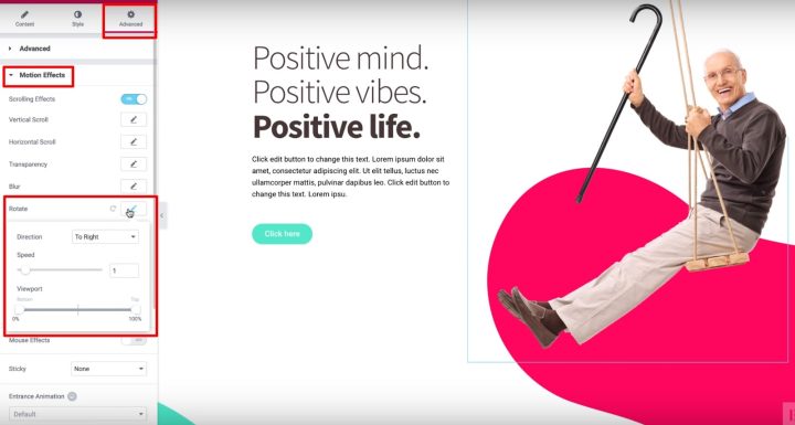
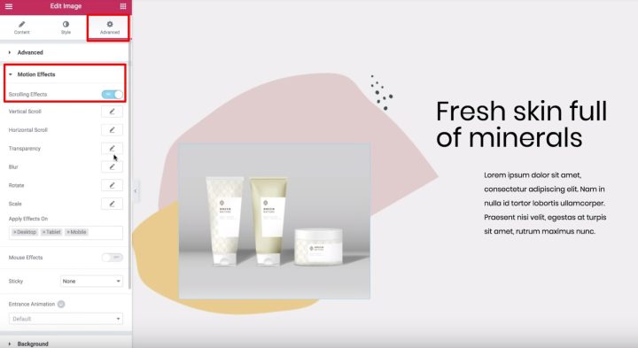
To make an image swing, click on the Advanced Tab, open the Motion Effects section, and turn on Scrolling Effects.
Then, click on the Rotate option and choose which direction to rotate your image.
To make the animation smooth, also set the Speed slider to 1.
Finally, you can leave the Viewport set to the defaults – 0% and 100%:
2. Image Horizontal Scroll: How to Make Images Slide
- Choose the direction you want your image to slide
- Set the Speed to 10
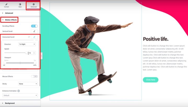
And that’s it! Your image will slide as a visitor scrolls down the page.
3. Image Vertical Scroll: How to Make Images Float
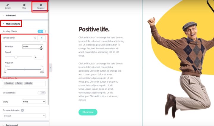
To make an image float, turn on Scrolling Effects. Then, enable the Vertical Scroll and set the direction equal to Down
4. Image Scale: How to Create an Image Zoom
With this last one, it will look as if the image is moving towards the visitor as the visitor scrolls down. Another way to think of this is as the image “sinking”.
To get started, turn on Scrolling Effects. Then, enable VerticalScroll and:
- Set the direction to Down
- Set the Viewport between 0% and 40%
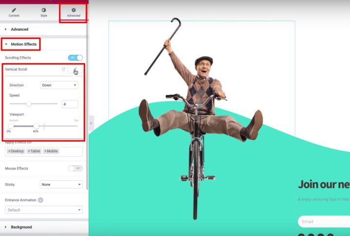
Then, click the Scale option and set the Speed equal to 6. Also, use the Viewport setting to make the bottom 20% and the top 80%.
Now that you know how to use scrolling effects, experiment with your own designs to create something awesome!
Image Transparency: Make Images and Backgrounds Disappear on Scroll
- Select an image
- Go to the Advanced tab
- Find the Motion Effects section
- Turn on Scrolling Effects
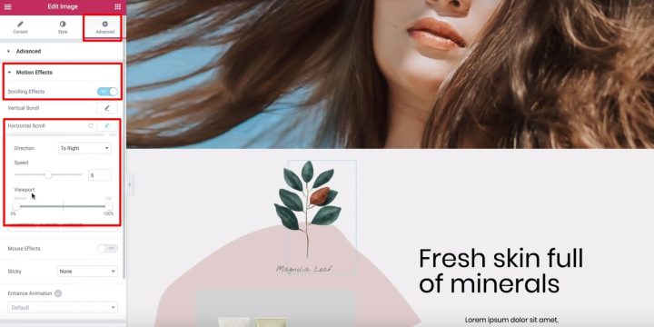
Next, let’s dig into the Viewport option and see how it works.
First, it’s important to define the term – a visitor’s viewport is the visible size of a user’s device screen.
The Viewport options let you choose when to begin and stop your chosen scrolling effect based on a visitor’s viewport:
For example, if you set the bottom of the viewport to 0% and the top to 100%, the image will start moving as soon as it becomes visible at the bottom of a visitor’s viewport. What’s more, the image will reach its “original” position when it’s in the middle of the visitor’s viewport (or, 50%), and it will keep moving until it reaches the top (100%).
So here’s the whole effect in detail:
- The image will start to the left of the original position when it first appears in a visitor’s viewport (visitor’s viewport at 0%)
- It will reach its original position at the middle of a visitor’s viewport (visitor’s viewport at 50%)
- It will continue sliding to the right of its original position as the visitor keeps scrolling (until it reaches 100%)
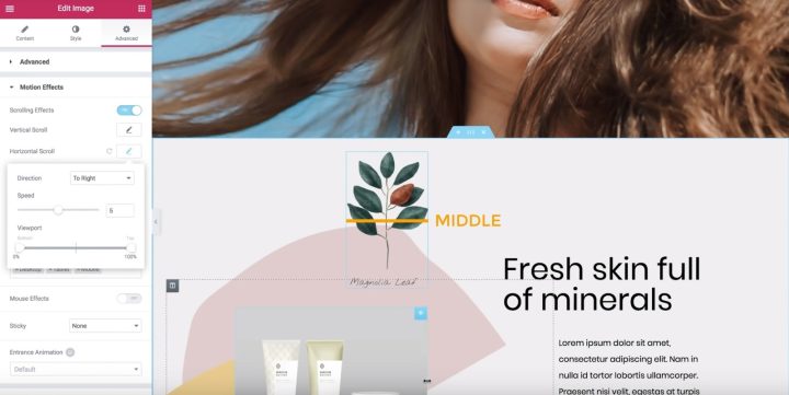
On the other hand, if you set the Bottom of the Viewport to 50% and the Top to 100%:
- The image will start at its original position.
- Once the image is in the middle of the visitor’s viewport (50%), it will start moving to the right until the image reaches the top of a visitor’s viewport (100%).
Let’s look at another type of scroll effect to drive home how the Viewport works…
Transparency Effect Example
- Set the direction to Fade In
- Set the Level to 10 (this makes the image very transparent to start)
- The image will fade out from 0% to 40%
- It will stay faded out between 40% to 60%
- Once it reaches 60%, it will start to fade in again between 60% and 100%
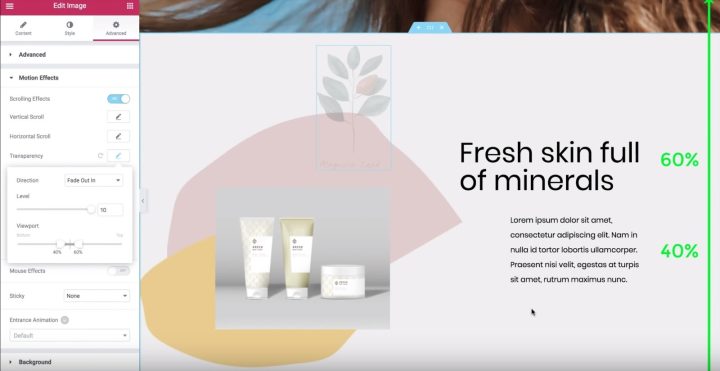
Now that you know how the Viewport setting works, you can play around with different settings to find the effect that you like.
Use X and Y Anchor Points In the Rotate & Scale Effects
In this video, you’ll learn about the X and Y anchor points for the Rotate and Scale effects in Elementor’s Motion Effects.
By the end, you’ll know how to apply these settings to create some cool motion effects at your site.
To get started, select the image that you want to add effects to and:
- Go to the Advanced tab
- Find the Motion Effects settings
- Turn on Scrolling Effects
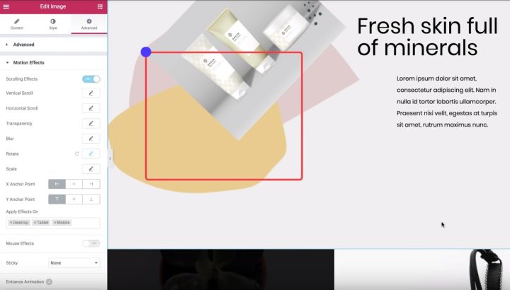
Anchor Points in the Rotate Effect
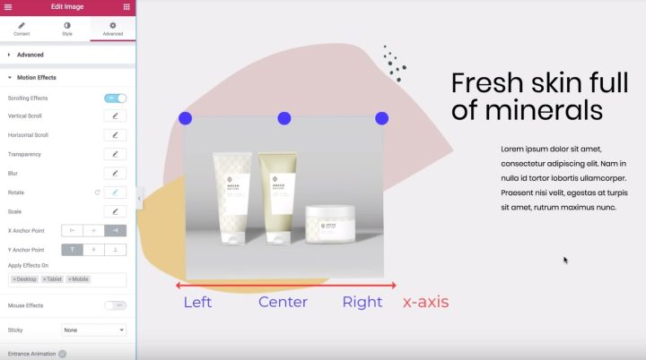
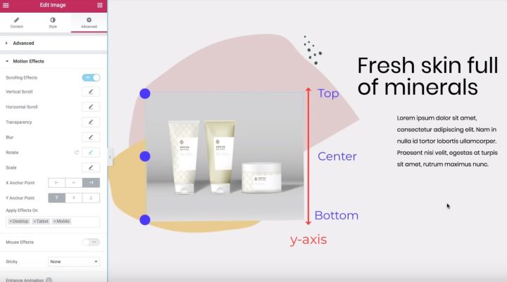
Anchor Points in the Scale Effect
Now that you understand the basic concept, let’s look at how this same idea works with the Scale effect.
To get started, disable the Rotate effect, turn on the Scale effect, and:
- Set the Direction to Scale Up
- Set the Speed to -5
By default, both the X Anchor Point and Y Anchor Point are set to Center, which means that the image scales down toward the center of the image widget.
On the other hand, if you set the anchor points to Left and Top, the image would scale down toward the top-left corner.
It’s the exact same idea as the rotate effect.
Now that you know how X and Y anchor points work, go ahead and play with these settings to create the exact effect that you want.
BONUS TRICK: Animated Text Overlap Effect
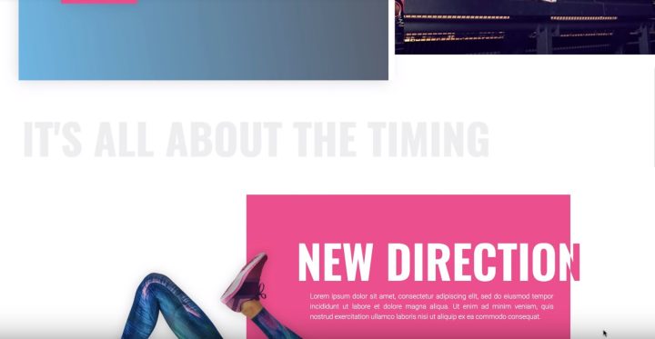
In this video, you’ll learn how to use the Horizontal Scroll feature in Elementor’s Motion Effects to create a neat animated text effect on your site.
You’ll be able to have text move across the page as visitors scroll. And with some tweaks, you can even make the text change color as it moves.
For this example, we’ll cover how to create multiple animated headings:
- A simple grey heading that moves to the right and stays the same color
- A white and pink heading that moves to the left and changes from white to pink once it crosses the pink background
Creating the First Header - Just Motion
Let’s start with the solid grey heading.
Select the heading, then:
- Go to the Advanced tab
- Find the Motion Effects section
- Turn on Scrolling Effects
Then, click the pencil next to the Horizontal Scroll effect to enter its settings:
- Change the Direction to the direction you want your text to scroll (“To Right” for our example)
- Leave the Speed and Viewport settings as the defaults
And that’s it! Your heading will slide to the right as a visitor scrolls down the page.
Creating the Second Header - Motion and Color Change
- Creating duplicate inner sections
- Using the Overflow: Hidden option to hide the heading from one of the sections once it passes outside the inner section
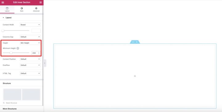
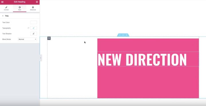
Now, edit the Heading widget and turn on Scrolling Effects in the Advanced tab. Then, enable the Horizontal Scroll setting and leave the options as the defaults.
Now, your header will move to the left, but it won’t change colors yet. You can see that it’s still white even on the white background.
Let’s fix that…
Next, duplicate the inner section. Now, you’ll have two identical inner sections and headings. You can use the Navigator to rename the sections to help you remember which is which:
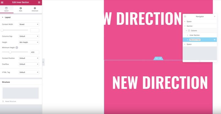
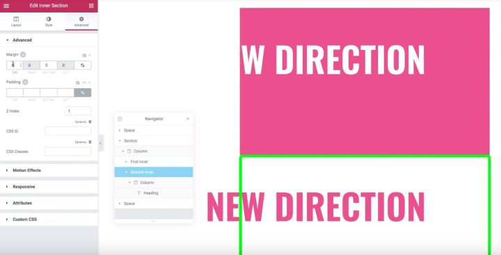
To achieve this effect, go to the settings for the original inner section. In the Layout tab, find the Overflow option and set it to Hidden.
And that’s it! Now, only the heading from the duplicate section will appear once it scrolls past the inner section, which creates the neat color-changing text effect.
We hope you found this roundup helpful!
Recently, someone from the Elementor community posed a question about utilising Motion Effects in their website. I hope this roundup guide helps you and encourages you to use Motion Effects in your next project.
If you still have any questions about creating animations and interactions using Elementor, please let us know in the comments below.
Looking for fresh content?
By entering your email, you agree to receive Elementor emails, including marketing emails,
and agree to our Terms & Conditions and Privacy Policy.
