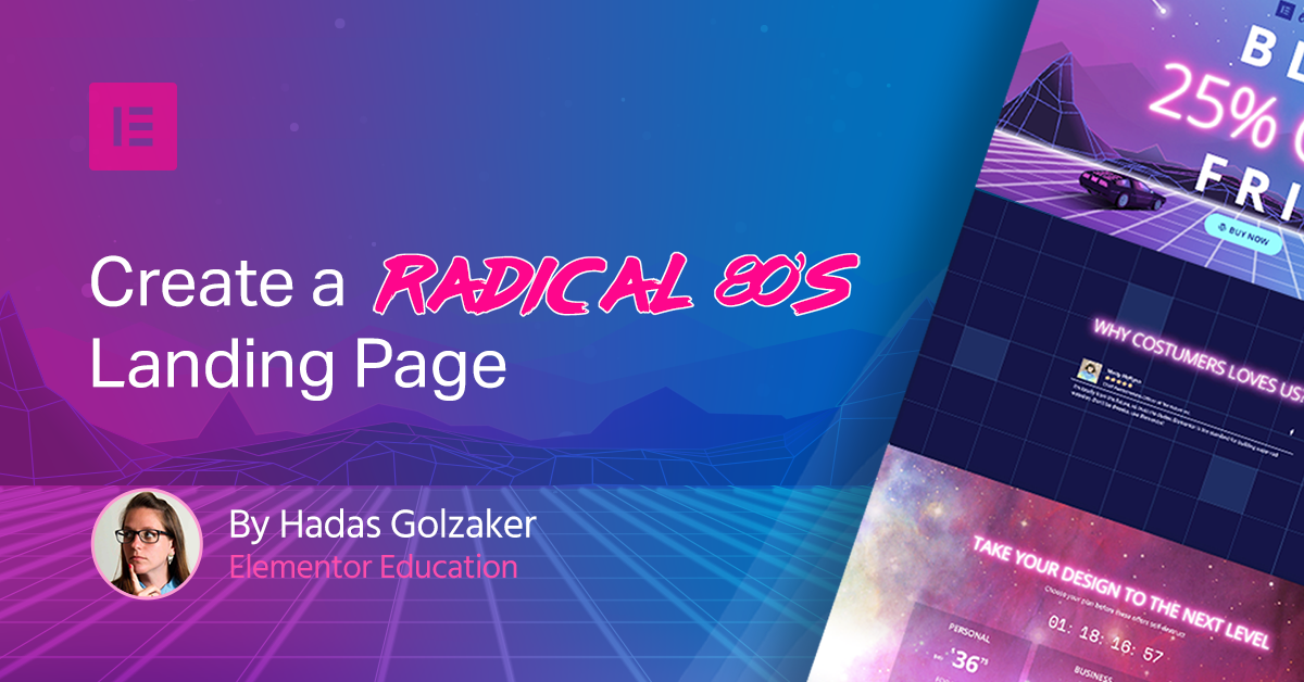
80’s design – we just love it! With all those geometric shapes, space backgrounds, and neon light effects, our Black Friday landing page couldn't look more rad! Let's show you how to do it.

Take off your headbands, turn on your neon lights, and put Tron in your VCR… the 80’s are back!

As a designer, I always had that fetish that nobody talks about – 80’s design. With all those geometric shapes, tons of patterns, space backgrounds with those cheap neon light effects.. (come on, you know you like it too).

Actually, you can see it everywhere. From Netflix’s “Strangers Things”, MineCraft, or Muse that just released an album with an 80’s flavor – or even the remake of Tron. Everything screams 80’s, and we love it!

So why not take this hot trend and show you how to implement it in a landing page built with Elementor?

This is not just a theoretical tutorial. We took elements from Elementor’s own upcoming Black Friday 80’s-style campaign and incorporated them in the design. Totally tubular!

Opening Section

Our opening section is a hero section. The first thing to notice here is the headline. I recommend putting a lot of effort into this area since it’s the first thing your visitor will see. Consider what exact message you intend to deliver. Having your title wide and clear will capture people’s attention. This first section also needs to entice users to scroll down and browse through the rest of the page.

Neon Effect

1St_Section

In the center of the composition, I placed the logo, message, and button.

You can see that the most important message is written in a bright “neon light”. To get to this neon look, you need to add some CSS to your design. The CSS will add a lot of pink shadow to the text. That’s the whole trick.

So what you need to do is add a heading widget, change the weight of your chosen font to light and set the color to white.

Then, open the advanced tab and paste in the custom CSS tab, add this code:

				
					selector {
    text-shadow: 0 0 20px #fff, 0 0 10px #fff, 0 0 50px #ff0fad, 0 0 50px #ff0fad, 0 0 40px #ff0fad, 0 0 100px #ff0fad, 0 0 75px #ff0fad;
}


If you want to use a different shade beside pink, simply change the number of the color after the pound sign. That’s all.

Vertical Headline​

Another cool aspect of this design appears next to the “FRI” letters, with the year attached to it appearing vertically (90 degrees).

To get this look, you need to add an Inner Section Widget. This is done to implement the vertical effect only on one column.

After adding the inner section, add a heading widget to each column.

Style your text and then open the advanced tab of the second column (the one that you wish to rotate) and in the custom CSS tab write this code:

				
					selector {
    float: left;
    transform: rotate(90deg);
}


Retro 80’s Background

When you finish working on the main message, start working on the background to give the text another boost and make that retro 80’s sci-fi look complete. Here I added a picture that was designed in Photoshop and used it as a hero background. In this design, the background has a Tron-like geometric grid with a touch of palm trees that are leaning to the left and a main gradient of blue-purple-pink to get that retro feeling. There are also some small touches like the “DeLorean DMC-12” (you probably recognize it from Back to the Future) The car, as well as the shooting stars, are all aiming at our section’s main text, underlining our main message.

Features Section​

2Nd Section Create An 80S Style Landing Page For Black Friday 1

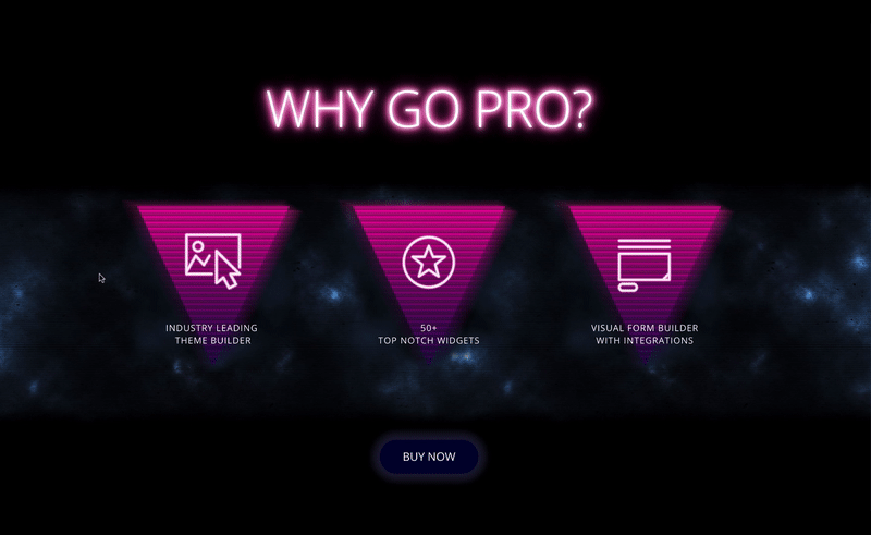
When you design a landing page, you need to think about how each section relates to the other. This is a more complicated task when dealing with a trendy design like retro 80s.

So after you design an amazing first section and raise the bar, you need to keep the level high and keep the same design theme, but still think of each section as a composition in itself.

The Design

In this section, I designed a more “stranger things” darker look as we “drilled down” the page. Here you can see a headline, 3 flipping bullets, and a button. To create this floating-3D effect, I used a bit of Photoshop combined with Elementor’s Flip-box settings.

Setting the Stage on Photoshop

So, the first thing I did is create the entire stage in Photoshop to see what everything would look like before I start to build it. In the headline, You can see the neon look from before, and underneath that, I added 3 triangles with icons and a title – the bullets. I added a blue-purple-pink gradient to each triangle. Above it, there is a line pattern to give it an 80’s tv look and a blur behind it, to create a glowy sci-fi look. The icons also get a neon look as well, and for the title at the bottom of the triangle – give it a floating effect in bold letters. The background has a smoky-cloudy-dark effect with the same line pattern that was used on the triangle. For the 3D animation, the triangles will have a see-through background. It means that the text in the back will show when it’s not covered. So I added a bit of black smoke on the sides of the triangle so the cover will blend in and still cover the back. So basically there are three layers to built in the editor: the background, the icon, and the title.

Building It Live​

In the editor, I added the flip-box widget. In the front content tab, I chose an image as my graphic element and added the title. In the background tab, in color, I changed the color to transparent and added the triangle that I designed in the image section and changed the position so that it will fit perfectly. Then, in the back tab, I did the same thing, but instead of adding a title, I added the text. Moving on to the settings tab. Here I played with the height of the box. I used the VH unit because it’s a relative unit so it will change the image relative to the screen the visitor will use. It makes it more responsive. In the effects part, I kept the flip effect, changed the direction to the left and switched on the 3D depth to get this amazing 3D effect.

CTA

The whole composition here aims down at the button – the thing that you want the user to do is – PRESS THE BUTTON. Here you can see that the button is not bold and “in your face”, but blends in with the smoky background with a small glow around it. But when you hover on it, the pink color pops out to play.

Reviews Section

3Rd_Section
If the user scrolls to the third section – it means you are doing something right. So after we talked about the product and how amazing it is, now it’s time for a different part to speak up. We decided to quote Marty Mc Flynn and the kind things he said about Elementor.

The Design

In this section, we have a reviews widget on a radical geometric background with a neon headline. The background was designed in Photoshop and then placed in the background of the section as a fixed background so it will have a scrolling hover effect. I wanted to give this section a “behind the scenes” look, so as you scroll down, you are exposed to it.

Pricing Table Section

4Th_Section
This section is the Pricing Table section. Here you can see all the elements that can support the sale. The headline, the countdown and of course – the price table. This is the finishing line of the landing page, so if your user doesn’t click something didn’t quite work.

The Design

The design in this section has more of an 80’s-galaxy touch. The background here was edited in Photoshop, giving it a bright radish-purple look and stands out from the black-dark background that was there before, giving it a punch at the end. Under the header and tagline, there is a counter that shows the time remaining until the end of the sale. Here I used a spacy font called “space mono” that I added via the custom font option. In the price table underneath it, each table has a light black background giving it a “floating in space” kind of look, and when you hover on it, the background turns darker, and there is a glow around it like a focus spot that directs you to read the text inside. When you hover over the button, there is another change of color for the button, so after you finish reading about the awesome plans we have, you will not miss the call to action, that is so important.

Get This Totally Awesome Template

It’s like, totally bitchin’! The template shown in this tutorial is now available in Elementor library, so you can use it with a click.

“Modern retro” will always look amazing. ironically, these days, we use all the best hi-tech tools to fashion a low-tech design. It will make some of your visitors remember their youth and for some of them to think how cool this era was.

But you know what? It’s soo cool so who cares?!? Psych!