Table of Contents
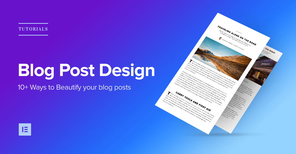
Your blog post design says a lot about your brand, and can have a crucial impact on your readers. In this article, we’ll give you inspirational ideas to improve the look and feel of your WordPress blog posts.
As such, incorporating unique and compelling design elements into your blog is a must. However, you may find inspiration hard to come by, and the task may seem overwhelming if you aren’t a design professional.
Fortunately, high-performing blogs are a great source of inspiration when you’re looking for design ideas. In addition, you don’t have to be a design professional to replicate and incorporate these elements into your own blog. Instead, you can use Elementor to make your job quick and easy.
In this post, we’ll highlight 12 top blog designs found on high-performing blogs. Then we’ll show you how to apply each design secret to your blog using our Page Builder. Let’s get started!
1. InVision (Drop Caps)

InVision is a top collaboration and workflow platform, and as such, they take their blog’s design very seriously. On the whole, this a very clean blog, with ample use of negative space, tasteful animations (such as the use of a parallax header), and readable, well-set typography.
We particularly like the use of drop caps in the introduction of their posts. This is a great way to call attention to the content, and the effect is very easy to replicate using Elementor.
How to Achieve Drop Caps in Elementor

Head to Elementor. From here, add a new section, then drag and drop the Text Editor widget. Finally, add the text you’d like into the editor and it should appear on the main screen.
To add drop caps, scroll down past the Text Editor on the left side menu. You’ll see a Drop Cap option – simply turn the feature On , and you’re all set!
Elementor lets you design and customize the Drop Cap with a wide array of design possibilities:
Choose the view to be either ‘stacked’ to ‘framed’
Change the primary and secondary color, Space between drop cap and paragraph, change the size of the frame and its border radius and change the drop cap typography.
Follow these steps:
- Add Text Widget
- Switch on Drop Cap
- Customize the Drop Cap style
2. Lifehacker (Colored Borders)

Lifehacker is a lifestyle and productivity blog with a strong following. Using a simple design incorporating lots of white space with a classic sans-serif/serif font combination, the blog has a content-focused feel. In short, Lifehacker knows how to keep readers engaged and coming back for more.
One method that Lifehacker uses to break up and offer focus to their content is with the use of colored left borders for certain elements. These provide emphasis, and are great to use for quotes or particularly important aspects of your content.
How to Add Singular Colored Borders in Elementor

Elementor enables you to create this effect using the Blockquote widget. This means you can implement it on your own site within a matter of seconds.
From the editor, drag-and-drop the Blockquote widget. Add the text you’d like to display, and choose the border skin, then customize the border color and width.
Follow these steps:
- Add Blockquote Widget
- Paste the content
- Choose the border skin
- Customize the border style
3. Sumo (Image Shadows)

As experts in the email marketing niche, Sumo is a blog with a strong understanding of content, design, and how to combine the two for best results. Their blog uses quite a narrow margin, with larger than usual text that looks to engage the reader.
Without any stylized depth, the blog could look pretty flat. Image shadows, while they may seem unnecessary, are the answer, and Sumo applies them to all images. This helps to further break up the content, and adds a professional touch to any blog or website.
How to Achieve Image Shadows in Elementor

To add this element, simply drag and drop the Image widget from the Elements menu into a new section of your page. Next, select the image you’d like to use, then adjust as you need. In our example, we’ve centered the image and made it full size:
To add the shadow, head to Style > Box Shadow and enable the setting. From here, you can adjust how the shadow appears by changing the various options (such as Color , Blur , and Spread ).
While Color and Blur are pretty self-explanatory, Spread is similar to a border, in that the value shows how far the shadow will extend on all sides of the image. Increase the value for an increased reach, or decrease for the opposite effect.
Follow these steps:
- Add Image widget
- Set Box Shadow
- Customize the different shadow settings
4. Gawker (BlockQuotes)

Gawker was a highly-active media blog network that shut down officially in August of 2016. However, there’s still much we can learn from the website’s design, such as its monochrome color scheme (which puts the content front and center), and the way quotes are displayed.
This is a great feature for quote-heavy blogs (such as news and politics blogs), though it can be used on just about any website to add emphasis to particular sections of content.
How to Display Quotes in Elementor

To achieve this within Elementor – albeit with a little extra ‘oomph’ than the original – first drag and drop a Blockquote widget onto your page and add the text as you’d like it to appear. You can adjust the text as you’d like – including the size, color, and font style.
Here are some of the settings we used to reach this look:
With regards to the Content tab, the Skin we chose is Quotation, alignment is to the center. For the tweet button view is icon and skin is bubble.
With regards to the Style tab, the font is Playfair Display for the quote, and Helvetica for the author. The quotation icon color is #004fce.
For the box, go to the Style tab, under box, choose color #ffedf6, add radios and box padding.
Feel free to play with the values until you’ve achieved the look you’re going for.
Follow these steps:
- Add the Blockquote widget
- Paste the text for the quote and author
- Customized box color, padding and radios
5. Huffington Post (Start Text)

The Huffington Post is a popular journalism site and, as such, its design elements are focused largely on delivering top-notch content. Unlike other blogs in this list, the Huffington Post uses a two-column layout, and packs a lot of content into them including ads, trending posts, and more. However, while the site is busy, it’s no less compelling to read.
One aspect that the site’s headlines gave us inspiration for was ‘start text’ – essentially a large opening line offering similar benefits to drop caps.
How to Achieve Start Text in Elementor

To begin, add a Heading widget below your main heading. Paste the text for the sub-heading, and start designing the typography.
Color is #000 (black), Helvetica font, font weight 300, and under advanced set padding to 0.
That’s it! Very simple to add, and makes it much easier for your reader to understand what your post is about.
Follow these steps:
- Drag a heading widget
- Paste the text
- Set the typography
6. Backlinko (Sub-Headlines)

Backlinko is a traffic-building blog with a focus on driving and engaging the traffic you receive to your website. Like the Huffington Post, this two-column blog is busy, but not at the expense of readability. The color scheme is also bright and inviting, which matches the conversational tone of its content.
This brings us to the design element that stood out to us: sub-headings. These are a much darker color than everything else on the blog, and their contrasting nature means they’re engaging and captivating.
How to Display Sub-Headlines in Elementor

Most articles have at least a couple of sub-headings, meaning you are most likely going to use this option a lot. This kind of sub-headline is great for step-by-step tutorial posts, because each step is clearly separated and it makes it easier for the visitor to follow along.
First, drag the Heading widget. Paste the text, center it using the alignment option. Then, go to the style tab, and set the color, font and other typography settings for the text. Now go to the advanced tab, and set the background color to #EC4950. Add top and bottom padding of 50.
I recommend you save this widget as a global widget, so next time you want to use it from the current post or from any other post you will create, it will be available with a simple drag and drop from the global tab in the widgets list panel. This step is relevant for all the blog effects listed in this article, but especially to background sub-headlines, since they are so frequently used.
Follow these steps:
- Drag a heading widget
- Paste the text
- Center the text alignment
- Set the background color
- Optional step: save it as a global widget
7. The Outline (Post Title With Background Image)

The Outline is a New York based digital media company with a rather unusual yet captivating blog. It features in depth article on a variety of subject, with the main focus on power, culture and the future.
While a catchy headline is an absolute must, sometimes that alone is not enough to hook readers. With a background image included in the post title, you can potentially offer a richer experience to the reader.
How to Display a Post Title With a Background Image in Elementor

Before we add in the background image, let’s firstly get the Heading and Text Editor widgets situated. Add a new section to the page, then add in three widgets ( Heading , Text Editor , and Text Editor ) stacked on top of each other:
To add a background color, click Edit Section (as you did for sub-headlines) and Style . Here, you can edit the layout of the background, including its color, image (which we’ll get to later), border, and more.
You can customize each of these widgets (and the layout) as you’d like. To add a top border, go back to the Layout settings, then to Style > Border and unlink the values. Choose the type of border you would like ( Solid , Dotted , Double , or Dashed ) and increase the value for TOP until it’s to your liking. Additionally, you can select the color below the values:
Next up, adding the background image is simple. Head back to Layout and go to the Style tab. Scroll down to Background Overlay and select the paintbrush. You can add an image by clicking the plus under Image , then either insert one your WordPress library, or upload one from your computer.
You now have a number of options, including Position , Repeat, Size , and Opacity . Play with these options until you’ve achieved the look you’d like.
To get blog details such as the date and author, use the plugin Press Elements to draw these attributes into Elementor.
Follow these steps:
- Set a background image for the section
- Add an image overlay
- Drag in the title and other elements.
8. Search Engine Land (Subscribe Forms)

A leading blog in the Search Engine Optimization (SEO) industry, Search Engine Land has a number of unique design elements incorporated throughout. The two-column layout is arguably the most packed in this entire list, and the design does well to still focus on the content. However, we were drawn to the subscribe form often featured at the top of posts.
To be optimally effective, subscribe forms should be as eye-catching as possible. Fortunately, Elementor enables you to create forms like Search Engine Land’s for your site. Here’s how!
How to Add Subscribe Forms in Elementor

To start, add two widgets to a new section of your page. The top widget should be Heading , while the bottom should be Text Editor . Add your text, and customize each to your own requirements.
Next, the most important element of the subscription form can be added with an upgrade to Elementor Pro: the Form widget.
To add this, drag and drop the widget to the section, alter the input fields and button text, then style them as appropriate. In our example, you’ll also notice there’s no gap between the two elements (the input box and form button). To achieve this look, simply go to Style > Form > Column Gap and set the value to 0 .
To add in a background image, go to Edit Section > Style > Background . You can then add the image of your choosing, or even select a background color or gradient.
Follow these steps:
- Drag 2 heading widgets, along with the form widget
- Remove all form fields except the email field.
- Set the field and button column width so they appear in one line
- Under Style, set the gap to 0
- Set the field top and left border radius
- Set the button bottom and right border radius
9. Neil Patel (Call To Action - CTA Box)

Neil Patel is well-known for his long-form content and pithy copy. However, he’s also uses a bold yet sparse design for his website, that matches his writing tone.
A Call To Action (CTA) is one of the most important additions to any website, due to their requirement of compelling the user to take action. They’re also incredibly versatile. Of course, the more eye-catching the design, the better conversions you’ll see.
How to Create a Call To Action Box in Elementor

Including the layout (which you learned how to style in previous sections), there are a total of five elements within this design. Our example is split into two even sections side by side, and this enables some further customization.
First up is the image to the left. This particular selection blends well into the background and adds a seamless flow to the design. This can be done by using a PNG image, a file type that incorporates transparency into the background.
Next is the right side of the design consisting of the Heading , Text Editor , and Button widgets. To add these widgets together seamlessly, simply drag and drop each widget – one by one – into the section. They will automatically stack to fit inside the section, and this makes it easy to keep the design looking flawless.
The Heading widget is designed just as the others we’ve featured: This one is set to H2 , aligned to the left, and set to a font weight of 900. Finally, the Button widget is simple to setup and customize. As with the other widgets, the button can be customized to align with your blog.
Here, you can edit the text, size, and alignment (within the Content tab), customize the shape, background, and text color (within the Style tab), and add a border or padding (within the Advanced tab).
Follow these steps:
- Set a two columns section
- Add the image to the left column
- Add two heading widgets and a button to the right column
- Set a gradient background and turn it into the split screen (You’ll find a video tutorial for this here)
- Customize the colors, spacing and typography of headings and button
10. Elementor (Dividers)

Here is another example that is taken from our own blog posts. Sometimes, when you create long form content, you need to separate between the different paragraphs. Titles and spacing are a good way to do that, but sometimes they are not enough. By using the Divider widget you can create a subtle separation between paragraphs, making it easier for the readers to understand where one part of the article ends, and another one begins.
How to Display Dividers in Elementor

To add a divider to your page or post, drag and drop the Divider widget into the area of your choosing. The default is a dark, solid line with a 100% width (this means it stretches the length of the content area), and there are four different styles to choose from, including Solid , Double , Dotted , and Dashed.
Our example uses a dashed style with a weight of 9 . However, you can experiment with the styles, divider color, gap (between dots and dashes), width, and weight.
Follow these steps:
- Drag the Divider widget
- Set it to dotted
11. Smart Passive Income (Related Posts)

Smart Passive Income is a wildly successful blog run by entrepreneur Pat Flynn. The website columns are very wide, which serves to spread its busy layout, and also means that design elements such as a Related Posts section have enough room to maneuver.
This is arguably the most complicated design on our list, but even so it should only take you a few minutes to put together using Elementor.
How to Display Related Posts in Elementor

Within the Page Builder , add a section and edit the layout. We used a background color and border in our design, but you can mix it up however you’d like. Next, add two Heading widgets, one on top of the other.
The last element to add is the Posts widget , an Elementor Pro feature with a variety of uses. To incorporate this into the section, add a new area to the section, then drag and drop the Posts widget into place. The default setting includes three columns and six posts in total, though you can change both settings to your liking.
In addition, the Posts widget will show the title, the publishing date, and excerpt for each post. However, you can easily change how this displays from Content > Layout . For example, the above image only shows the post image and title, and this works great for this specific design element.
Follow these steps:
- Drag the Posts widget
- Under Query set Order By > Random
- Add a heading with ‘Read More’ call to action text
Conclusion
Content plays a critical role in the success of your blog. However, how you display your content can be just as important as what it says. With this in mind, it’s easy to see why incorporating unique and engaging designs into your blog is essential.
In this post, we’ve introduced you to 11 design elements featured on high-performing blogs. We’ve also shown you how to implement each design trick into your own blog with the help of Elementor and its many features – including 28 (and counting!) widgets and over 100 pre-designed templates.
Do you have any questions about the design process or how the Elementor Page Builder can help? Let us know in the comments section below!
Looking for fresh content?
By entering your email, you agree to receive Elementor emails, including marketing emails,
and agree to our Terms & Conditions and Privacy Policy.


