help center

Search
Close this search box.
On this page

Form Lite

Last Update: March 17, 2025

Add the widget

The widget 1 Form Lite 377

To access and use a widget:

  1. In Elementor Editor, click +.
    All available widgets are displayed.

  2. Click or drag the widget to the canvas. For more information, see Add elements to a page.

What is the Form Lite widget?

Collecting information from visitors can be one of the more important things your website can do for you.

The Form Lite widget allows you to quickly and efficiently build a form which allows visitors to submit information which is emailed to you and stored in your WP Admin area. 

See all the options available with the Form Lite widget.  

Common use case

Alex wants to accept email reservation for their sports pub. They put a CTA on their home page which is linked to a reservations form. When users fill out the form with a reservation request, it is sent to the pub’s email address soAlex can reserve a table.

Additional use cases

  • Have visitors fill out a form to subscribe to your newsletter.
  • Collect job applications using a form on your site.
  • Visitors to your site can submit a form so that one of your representatives can get in touch with them.

Adding a Form Lite widget: Step-by-step​

In the example below, we’ll a reservations form. Customers wanting to reserve a table fill out the form and when they submit it the pub owner, Alex, will receive an email. The information will also be available in the WP Admin area. 

Add a form

To add a Form Lite widget:

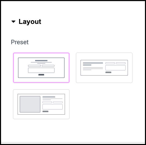
  1. Add a Form Lite widget to the canvas.
    1 change the heading Form Lite 379
  2. In the panel, in the Heading text box enter Reserve now!
    2 fill in description Form Lite 381
  3. In the Description text box enter Guarantee your spot be sending us a reservation request.  
    The Form Lite widget has fields for Name, Email and Message by default. However, we’d also like to call people to confirm their reservation so we’ll add a Phone field.
    3 Open form Fields Form Lite 383
  4. In the panel, open the Form Fields section.
    4 click add field Form Lite 385
  5. Click Add Item.
    5 Select telephone Form Lite 387
  6. Use the Type dropdown, select Tel.
    6 add label Form Lite 389
  7. In the Label text field, enter Phone.
    7 make required Form Lite 391
  8. Toggle Required to Yes.
    8 drag the phone field Form Lite 393
  9. Drag the new field so that it’s under the Email field.
    Now we’ll make sure that the form submissions go to the correct place.
  10. Close the Form Fields section.
    9 open actions after submit Form Lite 395
  11. Open the Actions After Submit field.
  12. In the To field, enter your email address.
  13. In the Subject line enter Reservation Request.
    10 Fill out to and subject 1 Form Lite 397
    When user submit their form by clicking the Send button, an email is sent to the address you entered. The submission is also stored in your WP Admin. For details, see Manage form submissions.

Settings for the Form Lite widget

You can customize your widgets using content, style, and other advanced parameters, offering you great flexibility in tailoring them to your needs. Click the tabs below to see all the settings available for the Form widget.

Content tab

Add, delete, and edit form fields, steps, buttons and controls. Determine what happens after visitors submit their responses.

Content tab text 3 Form Lite 399
  • Heading: Enter a heading for your form in the text box. The heading should be as short as possible, under five words.
  • Heading HTML tag: The HTML tag tells search engines and accessibility software the importance of the element. We recommend leaving the default setting but you can use the dropdown menu to change the HTML tag. 
  • Description: Enter any details you want to give about your form. 
Content tab form fields Form Lite 401

Give your form a name. 

Edit and create fields for your form,. Each field represents data you collect from your visitors such as Name, and Email.  

There are two icons that appear to the right of the field name:

Duplicate copy Form Lite 403 – Duplicate this menu item. Using copy helps maintain consistency in your menu.

x delete icon Form Lite 405 – Delete this menu item.

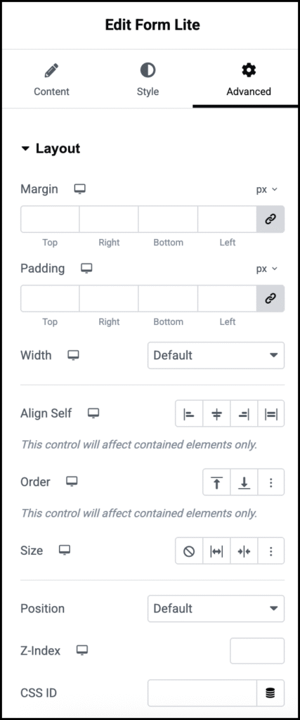
When you click a field name, additional options appear under two tabs – Content and Advanced.

In the Content tab, the following options are available:  

  • Type: Set the type of field to help filter out irrelevant data. For instance, setting the type to email, means visitors must submit valid email addresses. See Field types for more details. 
  • Label: Create a name for the field, such as Name,  to tell users what information to enter.  
  • Placeholder: Also known as ghost text, this is text that appears in the field to give more detailed information about the field, for example, in a field called Favorite movies,  the ghost text could be, “List your three top choices.”
  • Required: Use the toggle to determine if users must fill in this field to submit the form.
  • Column width: Set how much space the field will take up. This can be used for fields where you expect short answers or if you want several fields to appear on one line. For example, if you want two fields to appear on one line, give them each a width of 50%.

Create a blank field for your form.

Use the toggle to either Show or Hide the name of the field.

Use the toggle to either Show or Hide whether or not the field is required. Standard practice is to mark these fields so visitors know they need to fill them out. 

Content tab button Form Lite 407

Column width: Set the size of the area allocated for the button. This will affect the placement of the button. 

For example, If your column size is 100% and align the button to the right, the button will be on the right. However, if you set a column width of 50% and align the button to the right, it will appear in the center of the form.  

The Submit button sends the information in the form to the website owner. It is added to the last page of the form. 

If you don’t want to label the button Submit, use the text box to enter a different label. 

You can add a small image to the button:

  • For no icon, click No icon Form Lite 409
  • To upload your own .svg image to use as an icon, click upload svg Form Lite 411
  • To select an icon from from library, click the icon symbol.

Assign an ID for your button so you can identify it later. This will often help in processing the information you collect. 

Content Actions after submit version 1.4 Form Lite 413

Toggle to Yes if you want to show visitors a different page after they submit a form. The page could contain a sumple thank you or could include extra information such as: “We’ll get back to you in 48 hours.

If you toggle to Yes, you’ll need to add the page’s URL.

When a visitor submits a form, you can receive the submissions as an email. Use this section to define these emails.

  • To: The email address where the submissions will be received. 
  • Subject: The subject line of the email that will be sent to the email address in the To setting.
  • Message: Any text and form information that will be sent in the email. The default setting is [all-fields], includes all the form information in the email. 
  • From Email: Add the email from which the email will be sent.
  • From Name: Determine under what name the email will be sent. This may help you filter these emails later. 
  • Reply To: Edit this email address if you want to reply to these emails and have these replies sent to a different address. 
  • Cc: Send a copy of these emails to another address.
  • Bcc: Send a blind copy of these emails to another address.
  • Meta Data: By default, the emails sent by the form includes metadata such as the Time, Date, Page URL, User Agent (Browser information), Remote IP (IP address of the person submitting the form), Credit (the software that created the form).
  • Send As: Use the dropdown menu to determine if the email sent by the form is in HTML or plain format.

For Elementor Pro users only.

Toggle On  to activate the form submissions feature. This feature allows you to access form submission from WP Admin>Elementor>Submissions.

Content tab Additional Options Form Lite 415

Custom code can sometimes require you to give your form and ID.  

Make sure your Form ID is unique.

In general, browsers already have built in messages for form submissions indicating success or form errors.

Toggling Custom messages to Yes allows you to create your own messages that will display in case the visitor’s browser does not provide these messages or the messages fail to display for some reason. 

Style tab

Determine the look and feel of menu items and controls.

Style tab Text 1 Form Lite 417

Determine whether the heading and description will appear to the right, left or center of the form.

Control the look at feel of the Heading.

Control the look at feel of the Heading.

Style tab Form Form Lite 419

Control the layout of your form.

  • Columns Gap: If your form has more that one column, use the slider to set the space between the columns. This occurs when there is more than one field in a row.
  • Rows Gap: Use the slider to raise and lower the space between fields.

Control the look at feel of the form’s labels.

  • Spacing: Set the distance between the label and the field.
  • Text Color: Determine the color of the field name. For more details, see Choose a color or Use global fonts and colors
  • Typography: Determine the font and size of the field name.

    For more details, see Typography.

Style Fields Form Lite 421

This section determines the look and feel of the form fields. This includes the placeholder text, field border and more.

  • Text Color: Set the color of the placeholder text. For more details, see Choose a color or Use global fonts and colors.
  • Typography: Set the font size and type of the placeholder text. For more details, see Typography.
  • Background Color: Set the color of field box. 
  • or more details, see Choose a color or Use global fonts and colors.
  • Border: Toggle to Yes if you want a border around the field.
  • Border Color: Set a color for the field’s boder. For more details, see Choose a color or Use global fonts and colors.
  • Border Width: Delineate the field with a border. 
  • Shape: Select a border shape from the dropdown menu:
    • Round: Buttons appear with smooth corners.
    • Rounded: Buttons appear with evenly curved edges.
    • Sharp: Rectangular buttons.
    •   
Style tab button 1 Form Lite 423

Use the dropdown to select either:

  • Button: Will appear as a standard button.
  • Link: Will appear as text.

Set the font size and type for all buttons in the form.

You can have the button change when users move their mouse:

  • Normal: How the appears by default.
  • Hover: How the button appears when visitors mouse over them. Hover mode lets you set a transition duration. This is the length of time it takes for the button to change its appearance.

Following are the characteristics that can change:

Add a border to your button. If you add a border, you can also set:

Choose one of the following:

  • Round: Buttons appear with smooth corners.
  • Rounded: Buttons appear with evenly curved edges.
  • Sharp: Rectangular buttons.

Determine the spacing between the button border and the text. For more details, see Padding and margins.

Style tab Messages Form Lite 425

The Messages sections controls the style of the any messages shown to visitors after they submit a form:

  • Typography: Determine the size and type of the font used in the message.
  • Success Message Color: Set the color of the message if the visitor’s form was sent to the website owner. For more details, see Choose a color or Use global fonts and colors.
  • Error Message Color:  Set the color of the message if the visitor’s form was not sent to the website owner. For more details, see Choose a color or Use global fonts and colors.
  • Inline Message Color: This is only relevant if you chose to display custom messages. Some custom messages appear within the form itself, these are called inline messages and this setting determines their color. 
Style tab box 1 Form Lite 427

Add a background to your form. For details, see Create a Background.

Use the slide to determine the width of the form.

Create space between the contents of the form and the form’s borders. For details, see Padding and margins.

Advanced tab

Control the placement of your widget, insert links, add custom code and more.

Advanced tab Form Lite 429

Learn more about the Advanced tab settings.

Have more questions? We’re more than happy to assist.

Link is copied to clipboard!
On this page

Is this article helpful?

Share this article