The Flip Box Widget helps you create animated boxes that flip to the other side, when a visitor hovers over them.
Content
Front
Content
This tab controls the content of the front side of the flip box.
- Graphic Element: Choose between None, Image or Icon to display a graphical Element in the front of the flip box. For more details, see Adding images and icons.
- If Image is selected as the Graphic Element:
Choose Image: Select or upload an image
Image Resolution: Set the size of the image, from thumbnail to full, or set a custom size - If Icon is selected as the Graphic Element:
Icon: Select an icon from the FontAwesome library
View: Choose the default icon view, or select Stacked or Framed
Shape: If Stacked or Framed is chosen, choose Circle or Square - Title & Description: Choose the title and description that appears in the front of the flip box
Background
This tab controls the background of the front side of the flip box.
Background Type: Choose Color, Image or Gradient as the background of the front of the flip box. For more details, see, Create a Background.
If you choose an Image Background, the following options become available:
- Position: Select the position of the image, such as Top Center, Top Right, Center Center, etc.
- Attachment: Select from Default, Scroll, or Fixed
- Repeat: Choose from Default, No-repeat, Repeat, Repeat-x, or Repeat-y
- Size: Select from Default, Auto, Cover, or Contain
- Background Overlay: Choose a color for the overlay
If you choose Gradient Background, the following options become available:
- Color: Select the primary color of the gradient. For more details, see Choose a color or Use global fonts and colors.
- Location: Select the location of the primary color
- Second Color: Select the second color of the gradient. For more details, see Choose a color or Use global fonts and colors.
- Location: Select the location of the second color
- Type: Choose Linear or Radial
- Angle: Set the angle of the gradient
Back
The back side of the flip box has the same elements as the front side listed above, except for the graphic element that only appears on the front. The back side also includes a button.
- Button Text: Choose the text that appears inside the button
- Link: Choose where the button points to. The link needs to include the entire URL (including http / https)
- Apply Link On: Choose to apply the clickable link to the Button Only, or to the Whole Box
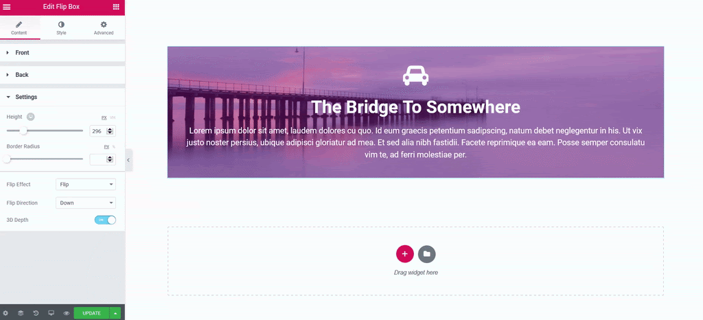
Settings
- Title HTML Tag: Use the dropdown menu to designate the title of the price list as a header (H1-6). This helps search engines find and understand the price list, boosting SEO. The title can also be tagged as a paragraph, span or div
- Description HTML Tag: Use the dropdown menu to designate the description of the price list as a header (H1-6). This helps search engines find and understand the description, boosting SEO. The description can also be tagged as a paragraph, span or div
- Height: Control the height of the flip box. For more details, see, Units of measurement.
- Border Radius: Set the border radius of the flip box, and make its corners round. For more details, see Border radius tools.
- Flip Effect: Choose between flip effects, including flip, slide, push, zoom in, zoom out or fade
- Flip Direction: If you choose the flip or slide effects, you can have the flip box flip right, left, up or down
- 3D Depth: Slide to On to give the flip box a 3D animation effect
Style
Front Side
- Padding: Add padding to the content area of the front of the flip box
- Alignment: Choose to align the flip box content to the left, right or center of the flip box
- Vertical Position: Align the flip box content to the top, center or bottom of the flip box
- Border Type: Set a border to the entire flip box
- Width: If a border type is chosen, set a width for the border
- Color: If a border type is chosen, select a color for the border
Icon
If an image is chose for the front of the flip box.
- Spacing: Control the space between the icon and the title
- Primary Color: Choose the primary color of the icon
- Icon Size: Choose the size of the icon
- Icon Padding: Set the amount of padding around the icon
- Icon Rotate: Rotate the icon to any angle
Image
If an image is chosen for the front of the flip box.
- Spacing: Control the space between the image and the title
- Width: Width of the image
- Opacity: Choose the opacity of the image
- Border Type: Choose a border for the image: None, Solid, Double, Dotted, Dashed, or Groove
- Border Width: If a border type is chosen, set a width for the four sides of the border
- Border Color: Choose the color of the border
- Border Radius: Control the border radius of the image border
Title
- Spacing: Control the space between the title and description
- Text Color: Choose the color of the title
- Typography: Set the typography settings of the title
- Text Stroke: Color the outline of your text and images. Learn more about text stroke.
Description
- Text Color: Choose the color of the description
- Typography: Set the typography settings of the description
Back Side
For the back side of the flip box, you get all the options listed previously for the front side, minus the graphical element settings. You also get control over the button settings.
Button
Button style controls will not appear if the flip box does not contain a button.
Click Normal to determine the button’s default settings and Hover to determine how the button will appear when visitors mouse over it.
- Size: Choose a size for the button (extra small, small, medium large and extra large)
- Typography: Customize the typography of the button text
- Text Color: Choose the text color of the button
- Background Type: Select between a Classic and Gradient background
- Color: Choose the button color.
- Border Color: Control the color of the button border
- Transition Duration: Determines the length of time it takes for the button to change appearance when visitors hover over it.
- Border Width: Control the width of the button border
- Border Radius: Control the border radius of the button
Hover mode lets you set a transition duration. This is the length of time it takes for the element to change its appearance.
Advanced
Set the Advanced options that are applicable to this widget