This year’s fifth showcase tantalizingly teases shifting trends in design, explores new twists on retro cultural icons, and celebrates the underrated power of subtle customizations. May’s websites include a variety of creative studios and agencies, a powerhouse tech entrepreneurial venture, one of Oceania’s most popular summer music festivals, a university digital exhibition portfolio, a sensual Greek beauty salon, a grassroots skating project, and a smile-worthy Montessori website.
Discover mysterious animations which reveal empty website content only on hover, take notes on how to implement classic designs into modern layouts, see how to meld a variety of scrolling and animation effects together, study how to keep an air of mystery by holding back content, and learn the power color has over emotion with dedicated inner pages.
Here’s your chance to get inspired by May’s meritorious websites!
10
Falls Festival
by Cruickshanks Agency
Falls Music & Arts Festival is a multi-day Australian music festival held annually in locations across Victoria, Tasmania, New South Wales, and Western Australia over the New Year period. It is one of the biggest musical festivals in Oceania, bringing together some of the biggest acts in the world. The festival hosts contemporary music performances, dance, comedy, theatre, circus, cabaret, and other art forms. Artists playing at the festival include rock, hip hop, indie music, electronic music, blues, and roots.
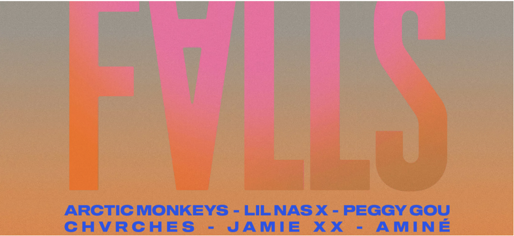
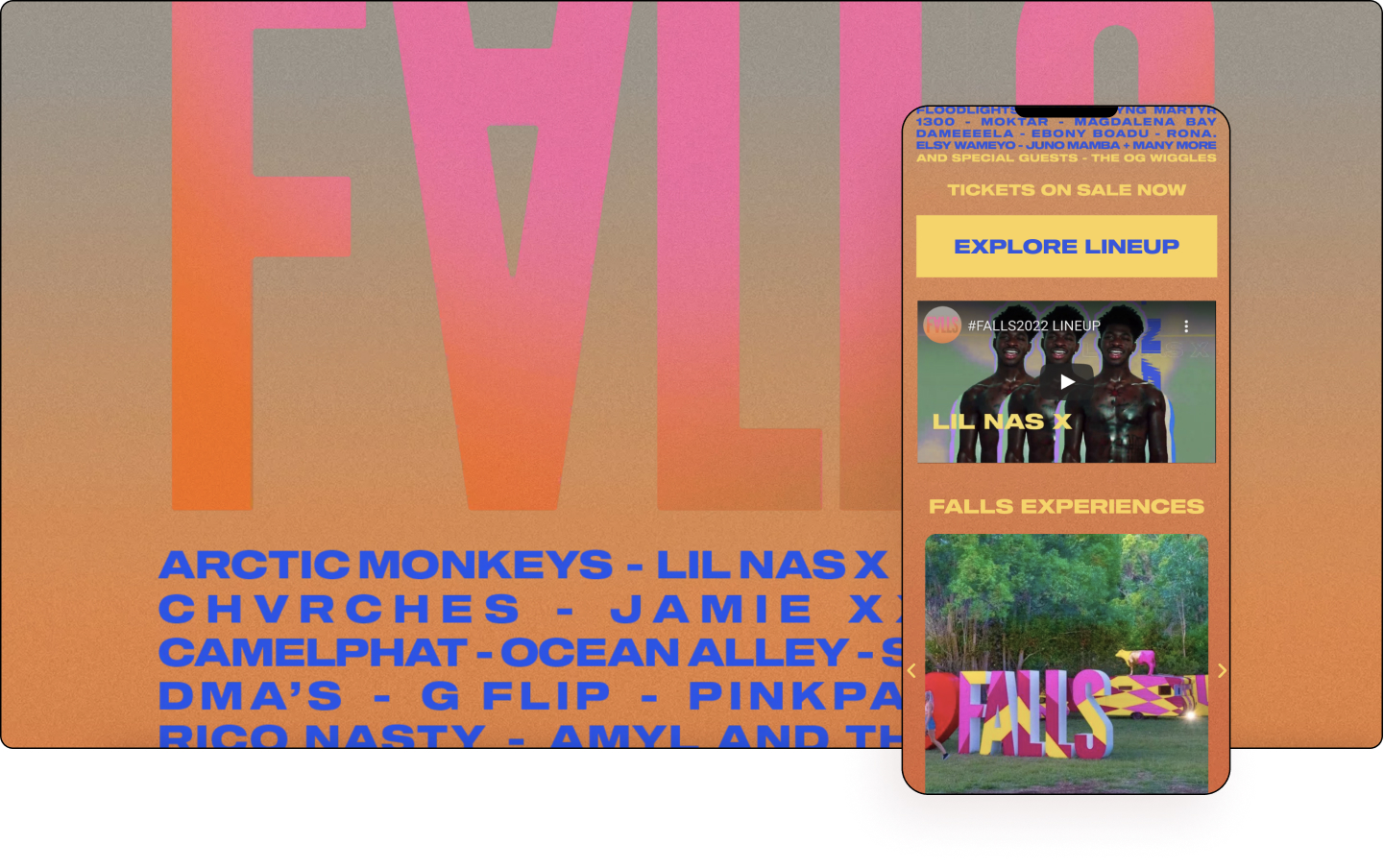
Taking a leaf out of music festival posters, the website was clearly designed to resonate with its younger audience. Implementing a nostalgic granular finish into a gradient background gives the page somewhat of a desert atmosphere.
Falls Festival implements a big type, a minimalist design, and a highly mobile responsive schema clearly aimed at its target mobile-first audience. Employing a spectrum of colors — pink, orange, yellow and blue — the festival evokes feelings of energy and excitement in line with its musical catalog.
Delving deeper into its inner pages, audiences will be able to find information about each of the performing artists, as well as links to each of their various social media handles. Offering a teaser of the sounds of the setlist, viewers will find a customized Spotify playlist embedded, including a throwback vintage static video effect.
Falls Music & Arts Festival speaks to its core demographic using a combination of contemporary techniques while keeping only the main stage of content. After two years of silence, the Falls Festival is once again ready to rock on.
Design & Development: Brett Cruickshanks – Cruickshanks Agency
Theme: Hello
Plugins: Elementor, Elementor Pro, Nitropack, Rank Math SEO, Insert Headers & Footers
09
Ulah
by BangLUXOR
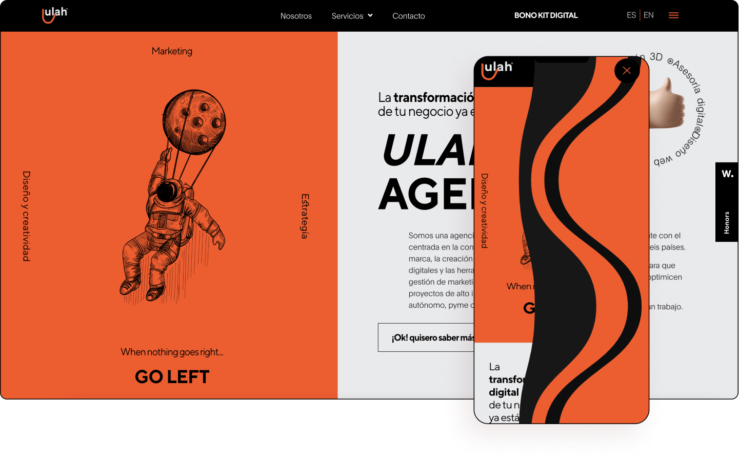
Ulah is a Spanish creative agency focused on brand consulting, the creation of digital interfaces, and marketing management tools for high-impact projects. They work globally with the support of clients in six countries. Their vision focuses on making a difference in each project as a result of a successful strategy in accordance with current market trends. Their work simplifies business, inspires new behaviors, and meets the needs of people.
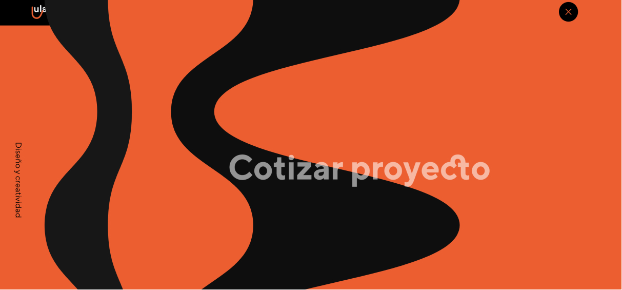
The first thing that’s hit the viewer is the unique hero section which is broken up rather unconventionally. From the way, it opens with its punchy copy making a grand entrance, to how employs strong bright reddish-orange, the website offers a refreshing take for creative agencies wishing to stand out.
Elements of retro computer-animated symbols such as a thumbs up, face with a fist bump, doodle sketches, and Lottie animations combine to give the website a playful vibe blended with professional polishes of sans-serif text, big type, and a flat minimalist design. The clever flashback-like hamburger menu effect feels a bit like an old-school television show. Also noticeable is the use of multiple CTAs, text paths, and a logo that resembles a smile, emphasizing a lighthearted approach to this professional industry.
Pay attention to the changing mouse cursor in the services section, which changes to orange, as well as the clever split three-page web design, branding, and digital marketing. There is an overall interactive and fluid look and feel to the website, nice use of masks on inner pages, and a unique take on a left-right motif.
Ulah is a fresh approach to standing out in the competitive landscape of creative agencies. By combining a professional finish with touches of playful delights, the agency shows its masterful hand to inspire, delight, and deliver.
Design & Development: Andres Florido Delgado – BangLUXOR
Theme: Hello
Plugins: Elementor Pro, Dynamicooo, Unlimited Addons, WProcket
08
Disraptors
by Amazual Media
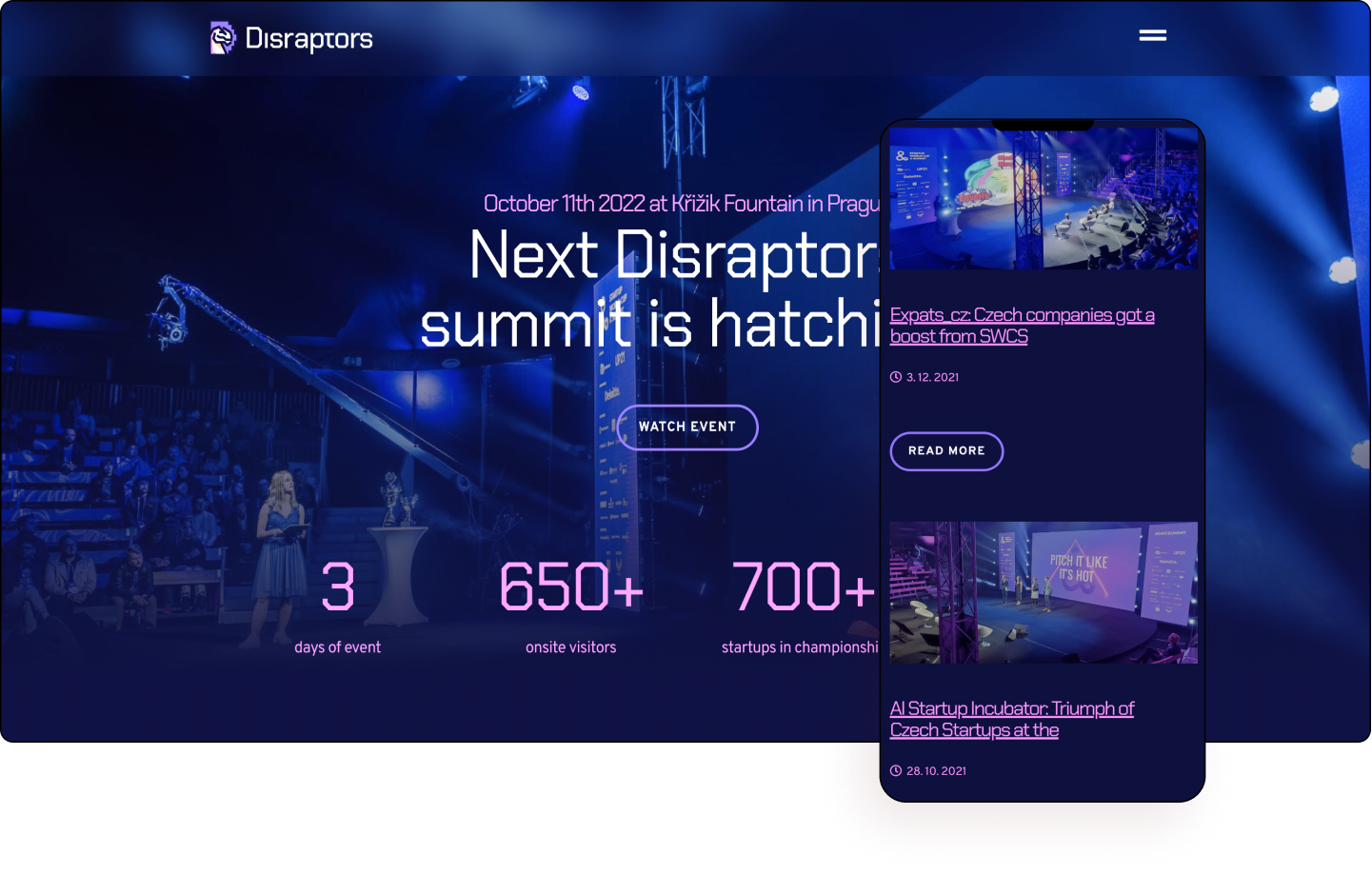
Disraptors is a group of people from various backgrounds — VCs, Investor banks, startups, NGOs, and space agencies. Together they stand, divided they sometimes work on other stuff. They produce a diverse fleet of content, the Disraptors Summit with the European Startup Championship Finale is our flagship. Their podcasts, local startup competitions, hackathons, and no-pitch meetups are their other prime vessels.
Displaying the face of one of the world’s most renowned tech gurus from your showcase event is a masterstroke that needs no explanation. With Steve Wozniak’s famous face plastered on the hero right beside its brand and key figures, this is a strategic way to show off the group’s best-selling points without the viewer even scrolling.
Using a sans serif ”Chakra Petch” font makes the page resemble old-school coding lines, and Mode 13h (VGA 256-colors), is clearly reminiscent of the computer software of the late 80s and early to mid-90s, which the website’s target audience would no doubt be heavily influenced by. Also noticeable is a pixelated computer animation effect on the inner pages.
There is a strong sense of scrollytelling via scrolling effects and animations, simple copy, a futuristic color scheme, and a logo inspired by a velociraptor. In fact, the entire website is intelligently framed to offer views a strong sense of social proof through big-name industry icons and famous partners.
Disraptors employs plenty of scrollytelling animations very much in line with the era-defining computing golden age now updated with a look and feel fit for the 21st century.
Design: Robin Stenczel
Development: Amazual Media
Theme: Hello
Plugins: Premium Addons, Elementor PRO, ACF
07
COMX
by Jordan Jenkins and Sam Carrier
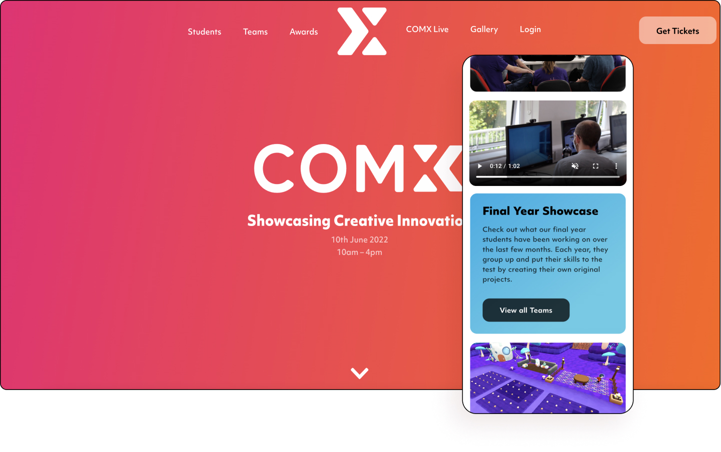
COMX is an incredible exhibition of digital projects spanning videogames, interactive technologies, animation, and art, all created by the talented students of the University of Gloucestershire’s School of Game Technologies. Each year, students group up and put their skills to the test by creating their own original projects leading to COMX becoming a unique expression of the creative, technical, and cooperative talents of the UK university.
Color is splashed throughout the website, from subtle gradients to vivid full-width canvases marking sections. Visitors will also be drawn by the aesthetical structure of box grids with rounded corners matching the overall smooth look and feel of the page. The website is bright, fun, vibrant, and evokes a sort of childlike wonder.
Each of the respective pages’ heroes is decorated in a specific color; the Awards page in raspberry-orange gradient, the Teams page in a blueberry-cerulean hue, the Students page in a teal aqua-green hybrid, the COMX Live page in a bluish to purple-lavender blend, the Gallery in a royal-fuchsia and rose mix, and the Login page in a salmon and atomic tangerine fusion. Each of these pages brings in its own personality and emits its own energy.
Fade-in text animations are used on several pages, which flow seamlessly upon scroll, most notably on the Awards page. Each of the teams is given its own color scheme and given space to detail its unique traits and qualities. The flat design of the website somehow works to keep the entire design system in check.
COMX is a textbook example of how gorgeous colors can bring life to a website without overwhelming the viewer as it expertly combines elements of minimalism, flat design, and gradients. COMX is here to play!
Design & Development: Jordan Jenkins and Sam Carrier
Theme: Hello
Plugins: Elementor, Elementor Pro, Anywhere Elementor, Anywhere Elementor Pro, ACF Frontend, Dynamic Conditions, Custom Post Type UI, Advanced Custom Fields, LoftLoader
06
MESSS
by Orlando Marconi
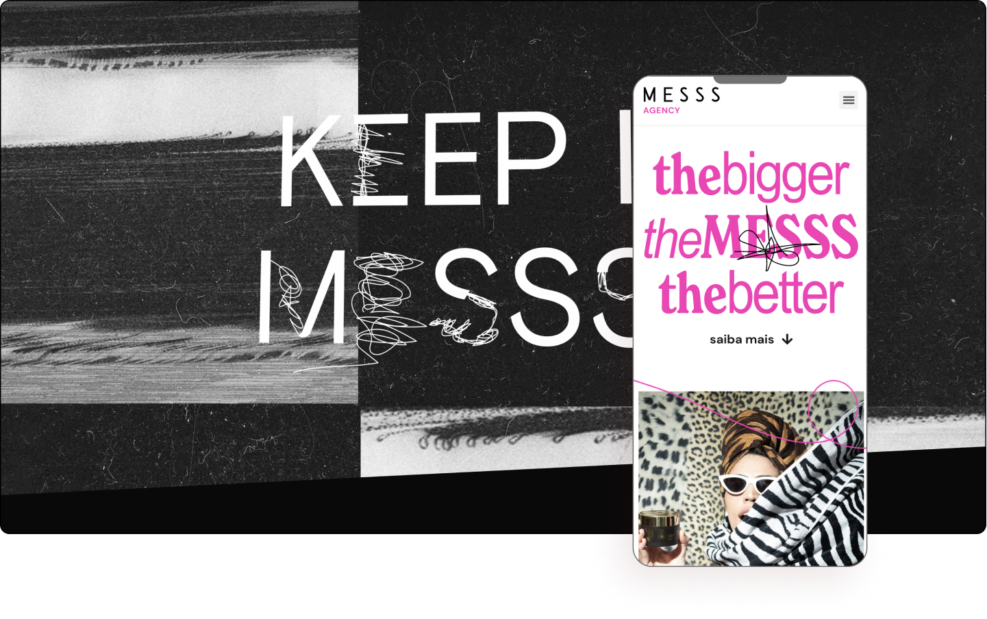
MESSS is a Brazilian creative agency and studio made up of a team of restless professionals ready to rethink their clients’ brand communication in the most original way possible. From strategy to execution, on, off, and even beyond the atmosphere: they promise total dedication to make their clients’ voices echo far and wide. They have their minds on the future but understand what the brand needs from yesterday. With a very attentive and unique look, they prove that it is possible to surprise down to the details.
MESSS presents two aspects: Agency + Studios, each with a target audience. Agency serves medium to large brands who want to use “digital influencers” to leverage their campaigns and sales, while the Studio is targeted at agencies that need video and photo production companies to complete their campaign.
Instilling credibility with creativity, the website uses a minimalist layout with rich vibrant media. The agency website shows off its creative side using a full-width background video, while its studio counterpart showcases its rich portfolio. Visible throughout the website is a dominant neon pink color used on a variety of elements influenced by the logo.
There is a nice hierarchy inside the case studies with almost a blog-like look and feel. Scrolling down to the footer, viewers will notice a nice custom Lottie animation, freestyle drawing lines, glowing pink shadows over boxes on hover, and an embrace of the word “mess” itself.
MESSS is a website that conveys credibility while still being creative and flexible in a creative mess that falls perfectly into place.
Design & Development: Orlando Marconi
Theme: Hello
Plugins: Elementor Pro, Crocoblock JetEngine, DynamicTags
05
Beauty Salon Thea
by OFFSCALE
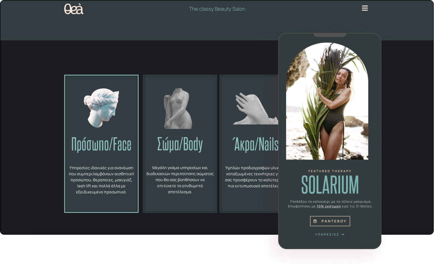
Thea hosts a warm, welcoming, space full of positive energy, where beauty salon services and products of high standards are provided in the port city of Thessaloniki. The Greek establishment has as their first concern the satisfaction and service of their customers and work hard in order to provide the best services and products.
Greece is the word on this magnificent website that has been kissed by the ocean. A unique color theme envelopes the website, reminiscent of the stony hills and turquoise waters of Thessaloniki. Bringing in plenty of elements from Greek’s rich cultural heritage, the salon uses these as motifs throughout the website.
Classical Greek aesthetics such as sculptures, icons, buttons, and illustrations, icons, buttons, illustrations, images, and mask shapes inspired by both the old and the new are clearly seen. A soothing ocean font is also used to convey the message, with feminine beauty artfully celebrated.
There are no points or edges, everything is refined. The use of a sculptured female head, torso, and hand is a beautiful way to highlight the facial, body, and manicure treatments offered by the salon. The salon clearly wants its clientele to feel as lavish as a mythical goddess.
Thea’s unified design language is as soothing as the Mediterranean Sea’s waves. Weaving an ancient tapestry of heritage into a modern world’s beauty treatments, the website is a celebration of the present as it is an homage to its famous ancient past.
Design & Development: Marios Natsos – OFFSCALE
Theme: Hello
Plugins: Elementor Pro, WP mail SMTP
04
Wodo
by Shyam Singh
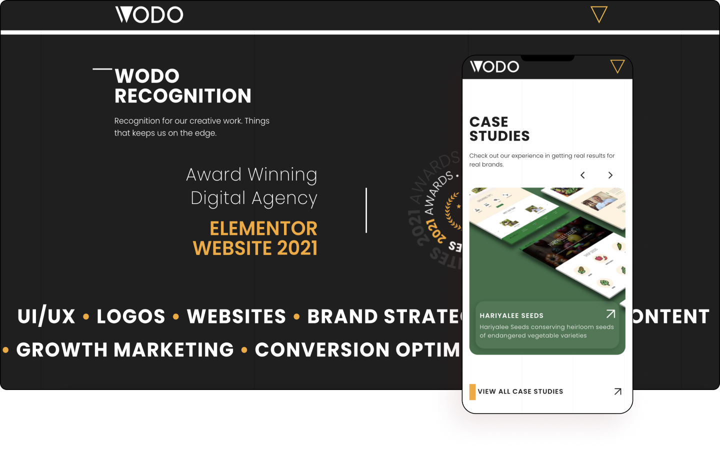
WODO is a team of passionate, creative thinkers, experienced entrepreneurs, and highly skilled executives to assist business growth. Based in India and working with clients all over the world, they stick to the fundamentals of creative web design and high ROI digital campaigns. In simple words – they know the game of launching a business online and growing it to profitability. By connecting the right dots for their clients’ businesses, they create digitally competent solutions that are impactful.
The website’s design is inspired by contemporary design guidelines, subtle animations, micro-interactions, and a mobile-first approach. Every element used was created with a cohesive brand identity in mind. Take the animated sphere, for example, which uses numerical highlights with a carousel effect.
As the viewer scrolls down, they’ll see an interactive emblem with rotating words. Right above it is a unique hamburger triangle menu that, on hover, changes the quick access links to black. Also worth paying attention to are the grid lines on the background, which add a bit of stability and order to the page.
The entire website demonstrates what the high-end creative agency is able to offer. Using Lottie animations and SVGs for the logo and icons, as well as a luxurious black mixed with a playful yellow color scheme, beautifully contrasts the website’s mix of chaos and order. Where relevant inner pages also demonstrate the mobile experience without ever needing to leave the website. Likewise, the results of the case studies on the page are a nice touch.
WODO gorgeously conveys its brand vision and message clearly through every project with detailed inner pages, and highly polished main pages exemplified by its use of the latest in modern design.
Design: Aravind Sudarsanan
Development: Shyam Singh
Theme: Hello
Plugins: Elementor Pro, Jet Engine, Steroids for Elementor
03
Aiurri Montessori
by Humanos Unidos
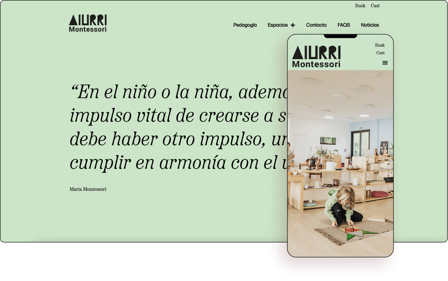
At Spain’s Aiurri Montessori they have created spaces that children can feel are their own. Spaces that take into account their needs in order to build themselves and where they can be free to follow their natural tendencies and thus develop all their potential by following their inner teacher. Montessori pedagogy focuses on the integral development of the person from birth, placing all confidence in their potential and offering a caring and reality-based environment so that each child becomes the best person they can be.
Capturing the freedom of the Montessori pedagogy, the website smartly presents a free-flowing moment on a full-width image in the page’s hero. Surrounded by a yellow pastel color, there is a very calm and pleasant atmosphere created by the design. High-definition images of engaged children enjoying a variety of educational activities, as well as smiling teachers evoke a sense of warmth and security that parents can immediately connect with.
Big typography, personal quotes, and minimalistic color change all come together to create a caring, cozy feeling, as do happy, smiling children. The use of whitespace,
big type and personal quotes from Maria Montessori help illustrate the child-centric approach of this teaching method.
Each of the inner pages employs a slightly different pastel color that highlights a different area of the website, including shades of yellow, green, and pink. Pay attention to the website’s logo, which appears to look like letters painted by a crayon which again celebrates the innocence of childhood.
Aiurri Montessori offers its target audience a welcoming and nurturing feeling of its revolutionary method by capturing the essence of the free nature of Maria Montessori’s child-centric, child-led classrooms and activities.
Design: Beñat Elizalde
Development: Miguel Angel Herrera – Humanos Unidos
Theme: GeneratePress
Plugins: Elementor Pro, Premium Addons, WPML, Essential Addons
02
Skateboarding Traunstein
by Bene Hofer
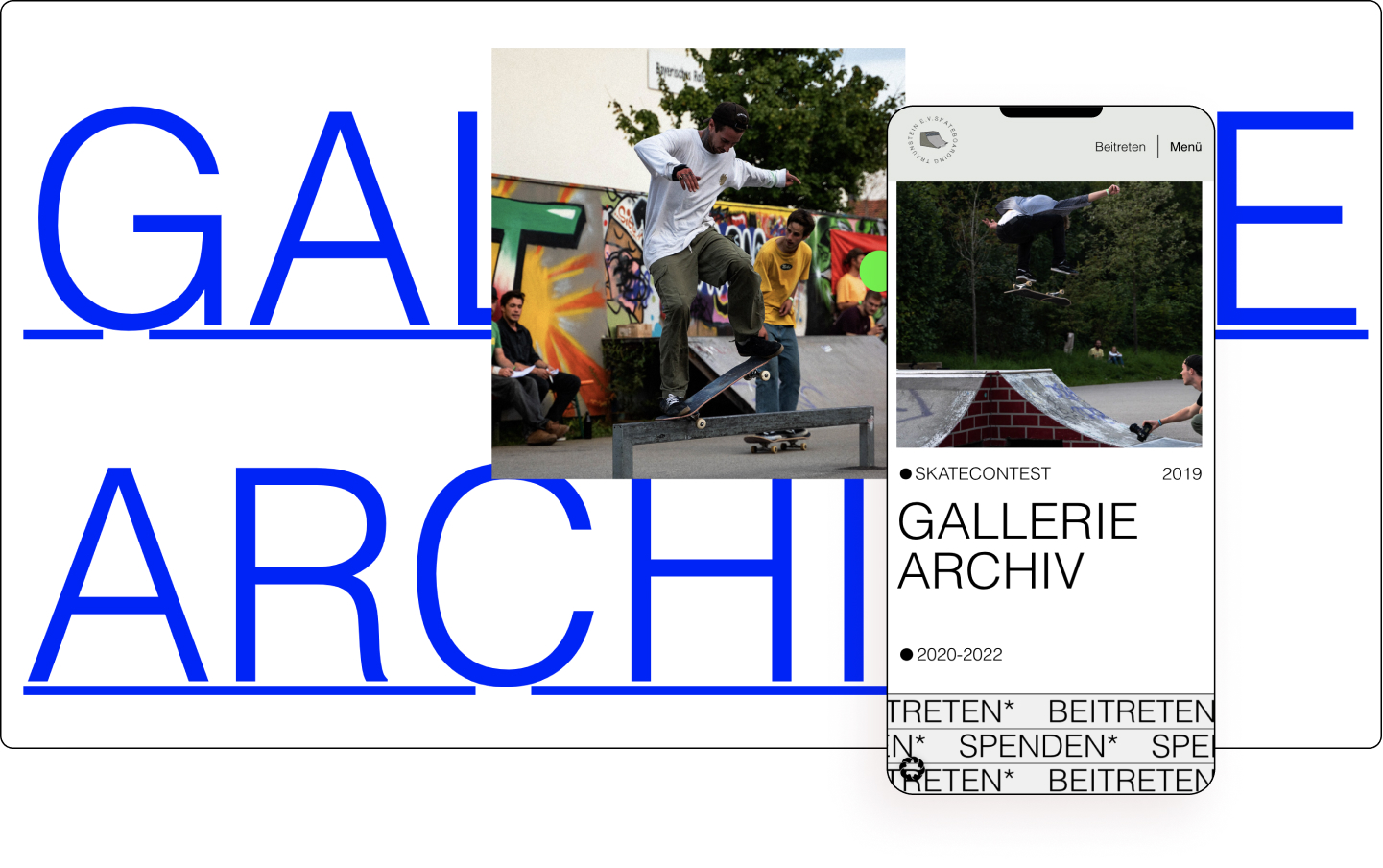
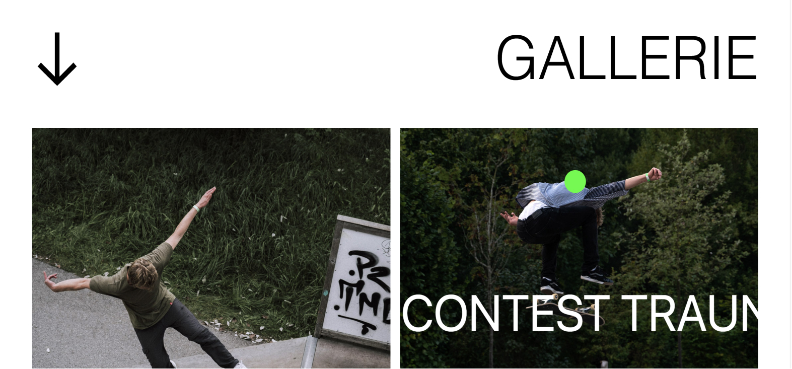
Skateboarding Traunstein is a freshly founded club that is highly motivated to get the skate scene in the German town and the surrounding area going again. Its mission is to create a place and a community where everyone can feel comfortable. They are a large community that wants to make a difference in Traunstein.
Staying true to its roots, the website bravely uses a handheld camera video as its full-screen hero. This makes it feel approachable to the local youth. The use of an asymmetrical grid similarly gives the website a contemporary feel.
As visitors hover over the logo, it begins to rotate for a split second, which, when clicked, brings us back up to the top of the page. Also unconventional is the coming soon list, which only on hover reveals images of what’s ahead.
One of the key features of the page is its skating influence. From the brutalist typography to its skate ramp logo, to the bevy of images and videos placed everywhere on the website. The color really comes from the rich media as the subtle mercury canvas brings forward the content.
Skateboarding Traunstein accurately captures its founding principles of gaining support for a bigger skate park, organizing skate contests, and providing opportunities for newer skaters access to skate lessons with a minimalist approach that confidently pushes skateboarding to the fore.
Design & Development: Bene Hofer
Theme: Hello
Plugins: Elementor Pro, Qi Addons, WP Custom Cursors
01
ZURU Edge
by Marc Day
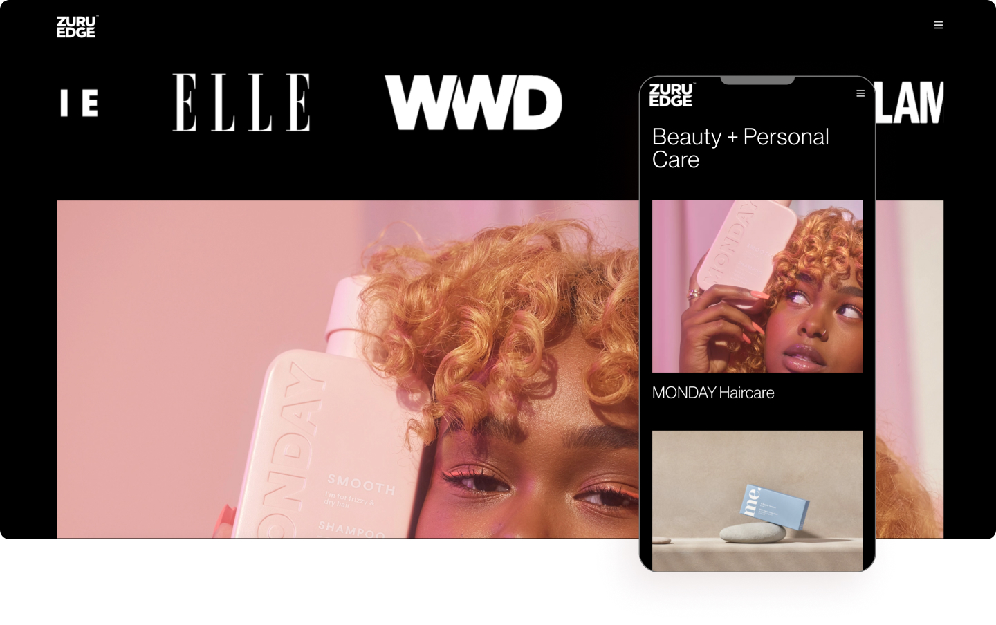
ZURU Edge is all about creating new age, disruptive brands in big stodgy consumer goods categories. Their team is committed to building purpose-driven brands that are relevant to Millennial and Gen Z consumers. These are the brands that its customers demand: brands with heart, purpose, and value. Headquartered in Auckland, New Zealand, at ZURU Edge, they’re building the brands of tomorrow and we’re bringing them to the world, today.
The full-width portfolio video hero is a dazzling harmony of color and showcases the agency’s vast array of clientele. There’s a touch of grandiosity with a high-definition video giving a larger-than-life look and feel to their branding capabilities. Yet there is also a feeling of approachability as elements of simplicity such as the footer, contact page, and overriding minimalist approach complement the website’s louder features.
The flat, minimalist design utilizes big type, and large images, which are set on a black canvas combined to give a contemporary look and feel to it. Furthermore, the design emphasizes the images and videos which provide the page its color, most of which are tinged in a neon filter. There is also a nice use of subtle scrolling effects bringing attention to the accompanying text.
A feeling of mystery surrounds the website due to its purposely limited gallery and minimalistic layout. For example, hovering over the empty boxes under “Brands” reveals its corresponding images. Similarly, the website’s “Our Brands” page also offers a tantalizing teaser of its portfolio, drawing the viewer to click. The detailed inner pages offer a deeper glimpse into each campaign which again follow the same design formula.
Creating the brands of tomorrow, ZURU Edge is moving with the energy, direction, and pace of today’s world; disrupting stale categories and leading them into the 21st century with brands driven by purpose, innovation, and data.
Design & Development: Marc Day
Theme: Hello
Plugins: Elementor Pro, Yoast, WP Rocket
