I know it’s not easy to stay productive or creative in stressful times like these. Your mind can be completely distracted by other things, whether it’s financial concerns, or the kids running around the house. And yet, many of you managed to come up with impressive new website creations, and luckily decided to share them with the rest of us. I hope these sites will inspire you to start working on your next project.
This month’s showcase includes a restaurant from the beautiful island of Sardinia, a music festival from the UK, a product design agency from Madrid, a construction company from Florida, and many others. So, without further ado, let’s check them out!
10
Art Academy Restaurant
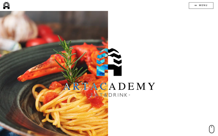
Since 2015, the Art Academy restaurant from the Italian island of Sardinia is the go-to destination for anyone who wants to spend an evening immersed in an environment with a refined design and a pleasantly welcoming atmosphere. This concept is present in every detail, starting from its post-industrial design, characterized by warm materials such as iron and wood. The cuisine, on the other hand, reflects the intersection and the reinterpretation of two different culinary traditions: Brazilian and Mediterranean.
Art Academy’s site appears simple and pleasant at first glance, but once you dig a little deeper, you begin to understand the concept behind the design. The restaurant strikes a fine balance between modern and traditional in its design and dining style, and this is also reflected in the site design.
The appetizing culinary photographs of traditional dishes with modern presentation, the simple and classic structure of the site, juxtaposed with the geometric sans-serif font (Circular), along with the classy, delicate combination of mustard yellow with the white and gray areas, creating an equilibrium between classic and modern.
The icons, familiar to the eye from menus of the original dining industry, have been updated to modern icons with clean lines. Designing the logo according to the same structure was a smart choice, and the decision to animate it while loading the pages even more so. This commonality causes the logo to register in our minds (You can see the comparison between the logo and the structure on their Concept page).
Design & Development: Contrast Advertising
Theme: Hello
Plugins: Loftloader Pro, Powerpack Elements, WPML, SG Optimizer
09
HIFIELDS Festival
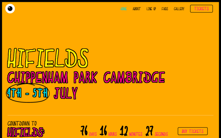
HIFIELDS Festival was born out of a love for music, founded by a group of friends seeking to dance together and leave all inhibitions at the gate. This festival takes place within the idyllic Cambridgeshire Countryside in the UK. Performers include future superstars and local legends.
Their site puts the visitor into a party mindset. The designer managed to do so by using a wild combination of bright colors, pop icons that seem to be taken from the last decades of the 20th century, coarse black borders and somewhat childlike illustrations that connect us to the inner child within us. Everything in this website connects to the source of your inner child, freedom, party, and naivety.
Design: Noel Lees
Development: Design for Online
Theme: Astra
08
Logimax
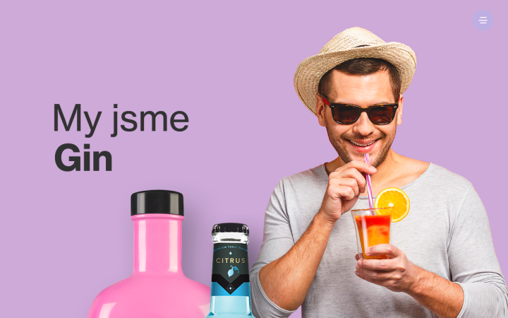
Logimax is a Czech company that imports and sells Tonic Original and Gin Sikkim in several flavors.
Like the previous website on our list, their site screams “Let’s party!”, matching the products it promotes and an atmosphere typical for cocktail parties.
This celebratory atmosphere only intensifies as the visitor scrolls down: the page becomes more vibrant and dynamic, thanks to the motion and variety of colors present among the range of products. The fusion of the clean parts (the menu and footer) and the more hectic parts is akin to the transition from the party to the after-party. The site once again “calms down” when the visitor ends up at the footer. After all, when the party’s over, there is still a product to sell.
Design & Development: Petr Vancura
Theme: Hello
Plugins: The Plus Addons
07
Sitely
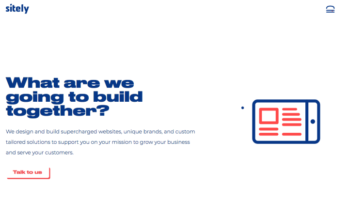
Sitely is a creative design and development agency in Boise, Idaho. Their goal is to craft a unique, compelling experience that elevates their clients’ brand while utilizing smart design and UX decisions to help accomplish their business goals. Sitely works with end clients and agencies alike, and offers ongoing maintenance and digital marketing services to support clients on their respective missions.
There is something very sleek and modern about this site, an outcome of their use of large texts, flat design, and simple text and images compositions. What gives it the ‘unique edge’ is the implementation of additional elements like the cool animations, “real-hamburger” menu icon, or the gently-floating bubble. This design gives proper focus to Sitely’s portfolio, but it’s these small details on the site that make it special (Check out the Projects page). The combination of the colors blue and red also works well and complements the design.
Design & Development: Casey McMullen
Theme: Hello
Plugins: The Plus Addons for Elementor, Pods, ACF, Ele Custom Skin, Make Column Clickable Elementor, Hubspot, Gravity Forms, Equivalent Mobile Redirect, A3 Lazy Load, Rank Math SEO
06
Eddie Graphics
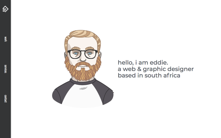
Eddie Scholtz is a freelance graphic designer and frontend web developer based in Gauteng, South Africa. Constant learning and knowledge-seeking fuels his abilities to deliver custom websites, graphic design projects, and brand development for his clients, including startups, online stores, and small businesses.
We loved this efficiently designed one-page portfolio website. There is always something captivating about the designer’s illustrated self-image, which invites us into his world. The design style indicates Eddie’s character; the text is straightforward, brilliantly concise, and interesting.
The portfolio gallery also illustrates the design efficiency; The images open in lightboxes with necessary information. In doing so, it keeps the visitors’ focus on the same page, rather than distracting them by linking to other pages. In short and lighthearted texts, he manages to market himself well. The vertical menu is a great and useful addition, and when the visitors reach the bottom of the page, it connects to the footer, giving them a sense of closure. Eddie’s site is an excellent example of a concise and practical one-page site.
Design & Development: Eddie Scholtz
Theme: Hello
Plugins: Headinger for Elementor, Sticky Menu (or Anything!) on Scroll, Tiny Portfolio Widgets For Elementor
05
Upciti
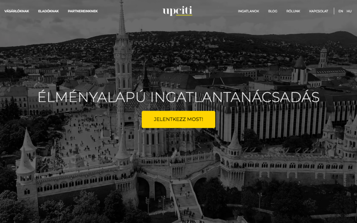
Upciti is a small real estate company based in Budapest that specializes in 3D mapping of properties, allowing potential buyers to visit listings without leaving their homes.
The intense combination of white, black, and yellow gives an upscale atmosphere to their multilingual website. The impressive bright video makes the visitors feel like a bird flying over the city. The brand name also connects to the video in the literal sense. The site is simple and clean with a fixed structure. The product page puts all the focus on the product as early as possible. Right at the Above the fold, the visitors are exposed to most of the valuable information — a smart move in a world where people want everything in the here and now. The blog pages have a very nice design and here too, the black-yellow combination comes into play.
Design & Development: Dániel Tóth-Lőrincz
Theme: Hello
Plugins: Elementor Extras, JetBlog, JetElements, JetEngine, JetSearch, JetSmartFilters
04
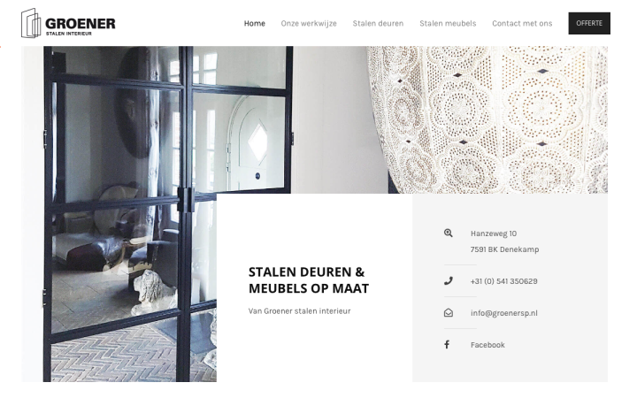
Groener Stalen Interieur (Groener Steel Interiors) is a Dutch company that manufactures custom steel doors and furniture. By using fully custom designs, high quality materials and coatings, a personal approach and loads of experience, the client is guaranteed a satisfactory end result!
Their site has an appropriately minimalist and clean design that focuses the visitor’s attention on the products. The use of the line motif is reflected in the logo, in the footer area, and also in the transition between the section, guiding the visitors down the page.
The frame motif is expressed in the composition between text and images. Speaking of which, it is worth noting the combination with other elements such as wood, and how the designer wisely applied a background image of wood. With light black and white tones, the site itself is free of visual stimuli, while the colors come from the products.
Design & Development: Ruben Peters
Theme: Astra
Plugins: Astra Pro, Cache enabler, Flying pages by WP Speed Matters, Post SMTP, Really simple SSL, SVG support, The SEO Framework, WPForms
03
Align Office
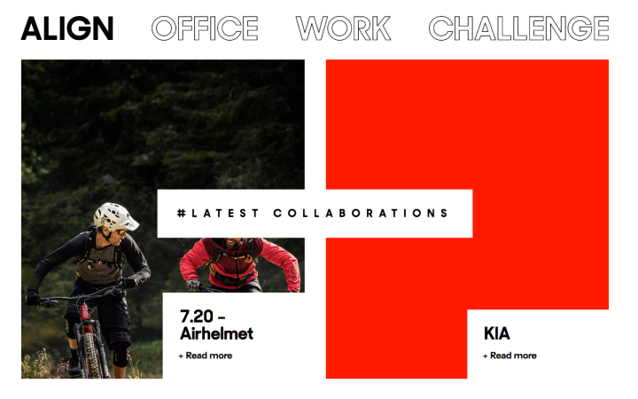
Align Office is a Madrid-based design company offering design consulting in concept design and surface, parametric, poly-modelling. Each project, from development through to completion, is taken care of by their team of designers, engineers, and 3D-developers dedicated to executing their clients’ briefs with efficiency and attention to detail.
Align Office’s designer created an attractive and modern site with minimalist elements, reflected in the large spaces, symmetrical shapes, sans-serif font and large titles. The menu and the Above the fold especially caught our attention. The project page shows a contrast between large and vivid images and white spaces. This game of contrast helps directing the visitors’ focus to the product.
Design & Development: Ignacio Merino
Theme: Twenty Seventeen
Plugins: ACF Pro, Akismet Anti-Spam, All-in-One Addons for Elementor – WidgetKit, Check Email, Code Snippets, Custom Post Type UI, Ele Custom Skin, Essential Addons for Elementor, Image Hover Effects Addon for Elementor, Jetpack by WordPress.com, Livemesh Addons for Elementor, Make Column Clickable Elementor, Premium Addons for Elementor, Really Simple SSL, Simple Custom CSS and JS, UpdraftPlus – Backup/Restore, WP Mail SMTP
02
Duckworth Construction
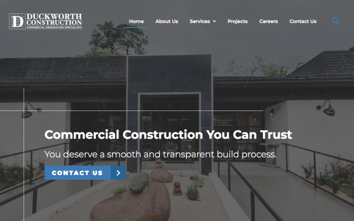
Duckworth Construction provides commercial construction services to businesses throughout Northeast Florida for over 30 years.
Duckworth’s site design features motifs taken from the world of construction and blends in great with the texts and images. The grid lines along the page help to separate the sections and support the content, just like building scaffolding supporting the building skeleton. Their symmetry, as well as the unified design language across all pages, reinforce the values of professionalism and precision that are crucial in this industry, and produce trustworthiness. The Serif font and the combination of blue and white, on the other hand, give a modern look to the site and indicate a technology-advanced company.
Design & Development: Design Extensions
Theme: Genesis
Plugins: Lazy Load
01
Melli & Shayne
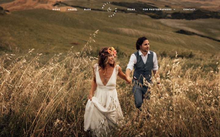
Melli and Shayne are a destination wedding photography and film-making married couple who live and operate from the south of Germany. Spending most of their time traveling around the world telling stories of people getting married, they are very much inspired by intimate, authentic moments and genuine good times.
Their site’s homepage is beautiful, just like the rest of its pages. It is indeed elegant, intimate and romantic. The different shades of brown and gold support the spectacular warm images. The menu in the header with the logo at its center is minimalist, as the motion created when hovering over it. The compositions of the pictures with the text and manual illustrations are impressive and tasteful. The combination of the handwriting font in the title gives this personal and intimate look & feel. The homepage structure and hierarchy is clear, helping the potential customers to quickly become a lead.
Design & Development: Shayne Thomas
Theme: Hello
Plugins: ACF, Anywhere Elementor, Auto image attributes, Autoptimize, Complianz, Custom Post Type, Post Order, QuForm, Rank Math, Smoother, Smart Slider, WP Mail SMTP, WP Real media library, WP rocket, Wordfence
Think your Elementor-based website or landing page should be featured in our next Top 10 Websites column? Give it a shot!
